
10 Tips to Print Logo Designs on Business Cards

Source: Mr.Mockup, Business Card Mockups, Dribbble, https://dribbble.com/shots/18449372-Business-Card-Mockups
A logo may look sharp on a website or presentation, yet printing it on a business card introduces a different set of challenges. The available space is small, colors can shift during production, and fine details may lose clarity once ink meets paper. A business card also places the logo beside contact information, background colors, and finishing effects, so every visual decision affects how clearly the brand is recognized. To print logo on business cards successfully, you need more than a clean layout. The file must be suitable for professional printing, the logo must remain readable at a reduced size, and the paper and print method must support the design. Careful preparation helps the finished card look intentional rather than compressed, blurry, or uneven. The following tips focus on the production details that have the greatest impact on logo quality.
Start With a High-Quality Logo File
The final print can only be as clean as the artwork supplied to the printer. A weak source file may create jagged edges, fuzzy lettering, or uneven shapes, even when the layout itself is well designed.
Use Vector Files Whenever Possible
Vector formats such as AI, EPS, and print-ready PDF files are usually the safest choices because they can be resized without losing sharpness. This matters when a printer needs to adjust the logo slightly or prepare it for a finishing process.
Avoid Enlarging Small Raster Images
JPEG and PNG files are made from pixels. If the file is too small, enlarging it can make the logo appear blurry. When a raster file must be used, make sure it is high resolution at the exact size required for printing.
Choose the Right Logo Version
A complete brand identity often includes more than one logo arrangement. The version used on a website header may not be the strongest choice for a narrow or vertically organized business card.
Compare Horizontal, Stacked, and Symbol-Only Versions
A horizontal logo can work well across the top of a landscape card, while a stacked logo may suit centered layouts. A symbol-only mark can also be useful on the reverse side when the full name already appears elsewhere.
Prepare Light and Dark Variations
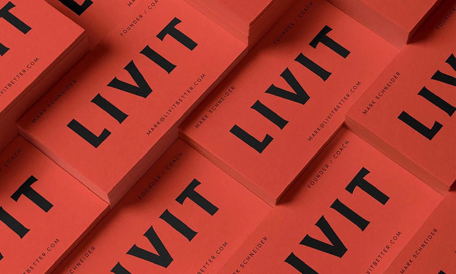
The background color should determine which logo version you use. A dark logo usually works best on a light background, while a white or reversed version may be clearer on dark stock. Select the variation that preserves every important shape and letter.
Keep the Logo at a Readable Size
A logo does not need to dominate the card, but it should remain easy to identify. Shrinking it too far can cause thin strokes, small lettering, or interior spaces to disappear.
Respect the Minimum Size
Brand guidelines often include a minimum reproduction size. Follow that limit whenever possible, especially for logos with taglines, intricate icons, or narrow type. If the full logo becomes unreadable, use a simplified version instead of forcing it into the available space.
Print a Physical Size Test
A screen can be misleading because you can zoom in. Print the design at 100 percent on ordinary paper, cut it to the final card dimensions, and examine it from a natural viewing distance. This quick test reveals readability problems before production begins.

Source: Mr.Mockup, Business Card Mockups, Dribbble, https://dribbble.com/shots/12719414-Business-Card-Mockups
Leave Enough Clear Space Around the Logo
Crowding weakens a logo even when the artwork itself is sharp. Contact details, decorative lines, and card edges can compete with the mark if they sit too close.
Follow the Logo’s Exclusion Zone
The exclusion zone is the minimum empty area that should surround the logo. It is often based on a specific letter, symbol, or proportion within the design. Keeping this space clear helps the mark feel confident and visually separate from nearby content.
Separate the Logo From Contact Details
Names, phone numbers, websites, and social handles should form their own information group. A visible gap between that group and the logo makes the card easier to scan. It also prevents the brand mark from looking like part of the contact text.
Set Up the Correct Color Mode
Color is one of the most common sources of disappointment in printed business cards. A logo that looks bright on a monitor may appear duller, darker, or slightly different once printed.
Convert Artwork From RGB to CMYK
Screens display color using RGB light, while most commercial printers use CMYK ink. Convert the artwork before sending it to production so you can review a more realistic color preview. Some bright RGB colors cannot be reproduced exactly in CMYK, so adjustments may be necessary.
Confirm Spot Colors With the Printer
Brands that depend on a precise signature color may benefit from Pantone or another spot-color system. Ask the printer which inks and paper combinations are available. A spot color can improve consistency across print runs, but the result still depends on the stock and finish.
Check Contrast Between the Logo and Background
A logo can be technically visible and still feel weak. Strong contrast makes the mark easier to recognize quickly, especially when the business card is viewed under different lighting conditions.
Avoid Similar Color Values
Light gray on white, dark blue on black, or muted colors on textured stock may not provide enough separation. Compare the lightness and darkness of the logo and background, not just their hues. Similar values can cause shapes to blend together.
Test the Design in Grayscale
A grayscale preview removes the distraction of color and shows whether the logo still has enough tonal contrast. If important details disappear, adjust the background, choose another logo variation, or simplify the surrounding design before sending the card to print.
Prepare Bleed, Trim, and Safe Margins Correctly
Production boundaries matter whenever a logo sits near an edge or appears as part of a full-background design. Small cutting variations can shift the final composition.
Keep Important Elements Inside the Safe Area
Place the complete logo inside the printer’s safe margin so no letters or symbols risk being trimmed. Each printer may use slightly different specifications, so download the correct template instead of relying on a generic setup.
Extend Background Graphics Into the Bleed
If a background color, pattern, or oversized logo extends to the edge, continue it beyond the trim line into the bleed area. This prevents thin white edges from appearing after cutting. The logo’s essential content should still remain within the safe area.

Source: Mr.Mockup, Business Card Mockups, Dribbble, https://dribbble.com/shots/15192289-Business-Card-Mockups
Select Paper That Supports the Logo Design
Paper changes the way a printed logo looks and feels. Color, texture, coating, and thickness can all affect sharpness, saturation, and contrast.
Match the Finish to the Logo Style
Gloss-coated stock can make bold colors appear more vivid, while matte paper creates a softer, controlled finish. Uncoated or textured paper may suit a handmade or understated identity, but it can reduce the crispness of very fine details.
Consider Ink Absorption and Surface Texture
Ink spreads differently across paper surfaces. On absorbent stock, narrow lines and small counters may fill in slightly. Ask for samples or test prints when the logo contains delicate elements. Choosing a smoother stock may produce a cleaner result without changing the design.
Use Special Printing Effects With Restraint
Foil, embossing, debossing, spot UV, and letterpress can make a business card more memorable. Their purpose should be to support the logo, not compete with it.
Choose an Effect That Fits the Brand
Metallic foil may suit a premium identity, while letterpress can complement a traditional or craft-focused brand. Spot UV can add contrast to a minimal card by changing the surface sheen. Select one technique that reinforces the brand character instead of layering several effects together.
Simplify Detailed Logos Before Applying Effects
Many finishing methods require thicker lines, wider spacing, or fewer tiny elements. A detailed logo may need a special production version for foil stamping or embossing. Work with the printer early so the artwork can be adjusted without weakening recognition.
Order a Proof Before Printing the Full Quantity
A proof is the best opportunity to catch problems before they affect hundreds of cards. Digital previews help, but they cannot fully reproduce paper texture, ink behavior, trimming, or finishing effects.
Review a Physical Proof When Available
A printed proof lets you evaluate the logo at its true size and under normal light. Check sharpness, color, alignment, and contrast. Also notice how the card feels in your hand, because thickness and coating contribute to the overall impression.
Check Every Production Detail
Review the logo version, dimensions, margins, spelling, contact information, bleed, and finishing instructions. Compare the proof with the approved brand files rather than relying on memory. Approving production only after this review can prevent costly corrections and inconsistent results.
Conclusion
A successful business card preserves the logo’s clarity while allowing the rest of the information to remain easy to read. The strongest results come from careful decisions made before printing begins: choosing the right file, selecting a suitable logo variation, maintaining readable sizing, preparing accurate colors, and respecting production boundaries. Paper and finishing choices should also support the artwork rather than overpower it. Most importantly, a proof gives you a chance to judge the design as a physical object instead of a screen image. When you prepare each detail carefully, it becomes much easier to print logo on business cards with consistent color, clean edges, and a polished finish. The result is a card that feels credible, recognizable, and aligned with the brand it represents.
Let Us Know What You Think!
Every information you read here are written and curated by Kreafolk's team, carefully pieced together with our creative community in mind. Did you enjoy our contents? Leave a comment below and share your thoughts. Cheers to more creative articles and inspirations!
Related Articles
Related Articles









Leave a Comment