Proper Logo Design Placements on Business Cards

Source: Rafael Silveira, Mustache DJ / Brand Identity, Behance, https://www.behance.net/gallery/170788209/Mustache-DJ-Brand-Identity
The business card remains a fundamental tool in professional networking, carrying the critical task of making a memorable first impression. Proper placement of a logo on a business card is more than just a design choice; it's a strategic decision that can significantly influence how your brand is perceived. The logo’s position on your card should reflect your company's style and values, harmonizing with other design elements to create a cohesive and effective presentation.
Choosing the right spot for your logo involves understanding both aesthetic balance and functional practicality. Whether it’s prominently displayed in the center, subtly positioned in a corner, or boldly covering the entire background, each placement option serves a different purpose and conveys a unique message. This guide explores various effective strategies for logo design placements on business cards, offering insights to enhance your brand’s identity and ensure your introduction is both professional and impactful. By carefully considering these options, you can craft a business card that not only stands out but also encapsulates the essence of your brand in a single glance.
Top Left Corner Emphasis
Positioning your logo in the top left corner of a business card is a classic choice that leverages the natural reading habits of most people. This strategic placement ensures that your logo is the first element that catches the eye, establishing immediate brand recognition. This approach is particularly effective for professional services and corporate entities that prioritize traditional values and stability. The top left corner provides a strong anchor for your logo, allowing the rest of the card's design to flow smoothly without competing for attention.
By placing the logo here, you create a visual hierarchy on the card that guides the viewer through the content in a logical sequence, from the logo to your name and contact information. This layout not only looks organized but also communicates efficiency and professionalism, making it an excellent choice for businesses aiming to convey trust and reliability.
Center Stage Position
Utilizing the center of the business card for your logo placement can make a powerful statement about your brand's confidence and distinctiveness. This central positioning is bold and demands attention, ideal for brands that want to stand out in a crowded market. The centered logo acts as a focal point around which all other card elements are arranged, creating a balanced and harmonious design. This setup is particularly beneficial for creative professionals, startups, and companies that want to project a modern, innovative image.
By placing the logo in the middle, you ensure it remains the most prominent feature, regardless of how the card is held or viewed. This method also offers flexibility in text placement, with ample space around the edges to include essential contact details without cluttering the design. A center-stage logo can transform a simple business card into a compelling piece of marketing, enhancing brand identity and recall.
Bottom Right Alignment
Opting for a bottom right alignment for your logo on a business card can be a subtle yet strategic choice, particularly effective for creating a lasting impression. This placement often appeals to those who wish to present their brand in a sophisticated and understated manner. By positioning the logo at the bottom right, it becomes the last thing seen after the viewer reads through your contact details, reinforcing brand identity just as the card leaves their sight. This method also allows the rest of the card to be used efficiently for contact information and personal details, arranged in a clean and unobstructed layout.
Furthermore, bottom right alignment can be particularly impactful in cultures where the reading pattern ends at the bottom right, making it a thoughtful consideration for international business relations. This logo placement can subtly signify meticulousness and attention to detail, qualities highly esteemed in sectors like luxury brands, high-end consultancy services, and bespoke craftsmanship.

Source: Arron Goh, CHARIOT - Branding Design, Behance, https://www.behance.net/gallery/93763625/CHARIOT-Branding-Design
Use the Back of the Card
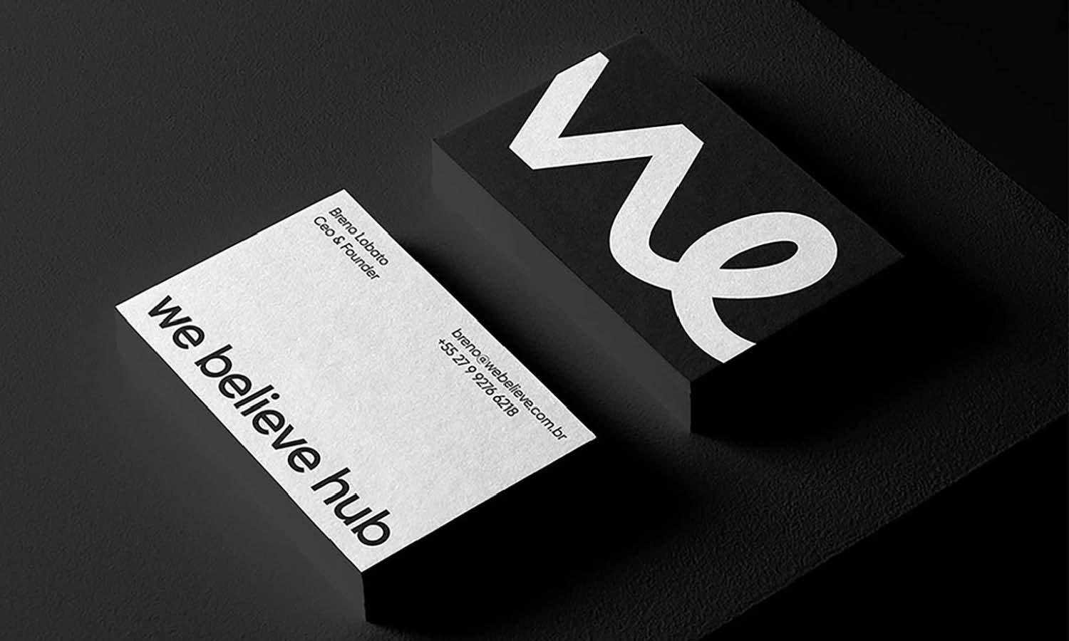
Using the back of a business card for logo placement opens up a realm of creative possibilities and can effectively double the available design space. This approach allows the front of the card to be dedicated entirely to contact information and essential text, maintaining a clear and accessible layout. Placing the logo on the back can also create a memorable reveal for the recipient, adding an element of surprise and engagement that can enhance brand recall. This strategy is particularly suitable for businesses that want to present a clean, focused front while still making a bold branding statement.
The back of the card serves as an exclusive canvas for the logo, potentially accompanied by a tagline or brand motto, which can resonate more deeply without the distraction of other elements. It's an excellent choice for companies looking to differentiate themselves through a smart and modern card design, appealing especially to creative industries where visual impact is paramount.
Overlay Techniques
Overlay techniques in logo design placement on business cards offer a dynamic layering effect that can significantly enhance the card’s visual appeal. By superimposing the logo over a background image, texture, or color block, designers can create a sense of depth and sophistication. This method allows the logo to integrate seamlessly with other design elements, making the card more cohesive and visually striking. The key to successful overlay is maintaining readability and balance; the logo should stand out without overpowering the background. To achieve this, consider using contrasting colors or adjusting the opacity of the overlay to ensure the logo remains prominent.
Overlay techniques are particularly effective for brands that want to convey creativity and innovation, as they break away from traditional card layouts. This approach not only catches the eye but also allows for a storytelling element, where the background and logo together convey the brand's identity. It's a sophisticated technique that, when executed well, can make a business card a memorable piece of your branding toolkit.
Minimalistic Approach
Adopting a minimalistic approach to logo design placement on business cards can communicate elegance and modernity. This style focuses on simplicity and ample use of white space, allowing the logo to stand out without competition from other design elements. By placing a small, well-designed logo in a strategic position, such as the center or a corner, the design remains clean and uncluttered, emphasizing the logo itself. Minimalistic cards are not only aesthetically pleasing but also convey a message of professionalism and clarity, making them ideal for businesses that value straightforwardness and refined branding.
This approach works well in industries where trust and precision are paramount, such as legal, financial, and high-end consultancy services. Moreover, a minimalistic design ensures that the focus remains on the essential details: the brand’s logo and the contact information. It appeals to contemporary sensibilities, aligning with trends that favor minimalism in graphic design. For brands looking to make a subtle yet impactful statement, a minimalistic business card can set the tone for a sophisticated brand identity.
Diagonal Orientation
Diagonal orientation of the logo on a business card offers a fresh, dynamic perspective that stands out in a stack of traditional placements. This unconventional approach adds an element of movement and energy, making it particularly appealing for brands that want to project creativity and forward-thinking. Positioning the logo diagonally can transform a simple business card into a striking marketing tool that captures attention immediately. This layout works well with logos that are symmetrical or have a distinct geometric shape, as it enhances the visual flow and makes the logo the focal point of the design.
The diagonal placement is not just visually engaging but also symbolizes innovation and uniqueness, qualities that are highly desirable in industries like technology, design, and media. By breaking away from the norm, a diagonal logo placement can signify a company’s willingness to think outside the box and challenge conventional norms. This approach is particularly effective for startups and young brands looking to make a bold statement in competitive markets.

Source: Mark Smith, Cimet Software Business Card, Dribbble, https://dribbble.com/shots/25648529-Cimet-Software-Business-Cards
Corner Cut
Incorporating a corner cut logo placement on a business card adds an artistic touch and can create a memorable visual identity. This technique involves extending part of the logo off the edge of the card, which introduces an element of surprise and sophistication. The corner cut is not just visually intriguing; it also utilizes the space of the business card efficiently, allowing for a larger logo without compromising the area needed for contact information. This placement is particularly effective for brands that want to emphasize their artistic flair or attention to detail.
It's a subtle yet powerful design choice that can make a business card stand out by adding a three-dimensional feel to a typically flat medium. Additionally, this innovative placement can be mirrored in other branding materials, creating a cohesive and recognizable brand image across all platforms. For businesses looking to push the boundaries of traditional business card design, a corner cut logo offers a unique and stylish solution.
Full Background
Using the full background of a business card for logo placement can be an impactful and modern approach to design. This technique allows the logo to serve as a backdrop, subtly dominating the visual landscape of the card while other information overlays it. Such a design can be particularly effective for brands looking to make a strong, immediate impression with a bold and distinctive logo. When using the full background, it's important to ensure the logo is subtly integrated so that it doesn't overwhelm the essential details like contact information.
The use of a watermark or a lighter tint of the main color can maintain the logo's presence without sacrificing readability. This approach not only maximizes the branding space but also enhances the aesthetic appeal of the card, making it more likely to be noticed and remembered. It suits industries where visual impact is crucial, such as creative arts, fashion, and design. The full-background logo placement turns the business card into a mini-billboard, showcasing the brand's identity at every opportunity.
Text Wrap Feature
Incorporating a text wrap feature around the logo on a business card can add both functionality and aesthetic appeal. This design technique involves arranging text, such as contact details and the company name, to flow around the logo in a cohesive and organized manner. It allows for the logo to be prominently featured while seamlessly integrating all necessary information without clutter. Text wrapping can enhance the readability of the card by guiding the viewer’s eye through the content in a natural, fluid progression. This approach is especially effective for logos that are circular or have irregular shapes, as it utilizes the space more efficiently and creates a visually interesting layout.
Employing text wrap not only maximizes the use of space but also elevates the design, making it look more professional and polished. It's a great option for businesses that want their cards to stand out while maintaining a clean and uncluttered look. This technique is particularly suitable for professional services, such as consulting and legal firms, where clarity and elegance are paramount.
Conclusion
Selecting the right logo design placement on business cards is crucial for maximizing brand impact and recognition. Each placement option, from the traditional top left to a full-background approach, offers unique benefits that can align with your brand's vision and values. Whether aiming for subtlety with a bottom corner alignment or making a bold statement with a central or full-background placement, the choice significantly influences how your brand is perceived. By considering these strategic placements, you can create a business card that not only stands out but also effectively communicates your brand's identity to every recipient.
Let Us Know What You Think!
Every information you read here are written and curated by Kreafolk's team, carefully pieced together with our creative community in mind. Did you enjoy our contents? Leave a comment below and share your thoughts. Cheers to more creative articles and inspirations!


Leave a Comment