
How To Create A Logo Design Even If You're Not A Designer

Source: Tornike Uchava, Logo Collection, Dribbble, https://dribbble.com/shots/19714466-modern-abstract-pictorial-symbolic-minimal-simple-logos
Creating a logo can feel intimidating when you have no formal design training. You may worry about choosing the wrong font, combining colors poorly, or producing something that looks generic. The good news is that a useful logo does not depend on advanced artistic skill. It depends on clear, deliberate choices. When you create logo design without designer support, the aim is not to imitate every step used by a professional studio. It is to build a simple identity that communicates the right message and works wherever the brand appears. By defining the purpose, choosing a manageable format, and testing each decision carefully, you can create a result that feels credible and consistent. The process becomes easier once you stop chasing complexity and focus on clarity.
Define What the Logo Needs to Communicate
Before opening a design tool, decide what the logo should say. A logo creates an immediate impression, so identifying the qualities that matter most gives the design a clear direction.
Identify the Brand’s Main Message
Choose two or three words that describe the brand, such as dependable, energetic, elegant, friendly, or inventive. These words will guide later choices involving typography, color, and shape. Avoid trying to express every quality at once. One focused message usually produces a stronger logo.
Consider the Intended Audience
Think about the people the brand needs to reach. A playful logo may suit a children’s product, while a restrained style may fit a financial service. The design does not have to follow every industry convention, but it should feel appropriate to the audience.
Decide Where the Logo Will Appear
List the main uses, including websites, social profiles, packaging, signs, or printed materials. Knowing these applications early prevents you from creating a logo that works only in one setting.
Choose a Simple Logo Type
The easiest way to create logo design without designer experience is to begin with a format that does not require complex illustration. A simple logo type gives you fewer elements to control and makes refinement more manageable.
Wordmark
A wordmark uses the business or project name as the logo. It works well when the name is short and distinctive. Choose a typeface that supports the brand’s personality while remaining easy to read. Small adjustments to spacing or capitalization can add character without reducing clarity.
Lettermark
A lettermark uses initials instead of the full name. It is useful when the name is long or the logo must fit into a compact space. Keep the arrangement simple and test whether the initials remain understandable at small sizes.
Simple Symbol and Name
Pairing a basic symbol with the brand name gives you more flexibility. Choose a geometric form, abstract mark, or familiar object that connects with the brand without relying on tiny details.
Collect Focused Visual References
References can speed up decisions, but too many examples often create confusion. Keep your research limited to designs that relate closely to the mood, audience, and purpose of your logo.
Look Within the Same Industry
Review a small selection of logos from similar businesses. Notice common colors, type styles, and symbols. The goal is not to copy them, but to understand what feels familiar and where your design can differ.
Choose a Few Descriptive Keywords
Use your brand words to narrow the direction. If the brand should feel modern and approachable, collect references that express those qualities. Avoid mixing several unrelated styles unless the contrast is genuinely relevant.
Create a Small Mood Board
Gather a few fonts, color samples, shapes, and logo examples in one place. Five to ten strong references are usually more useful than dozens of disconnected images. The mood board should clarify the direction rather than introduce more possibilities.

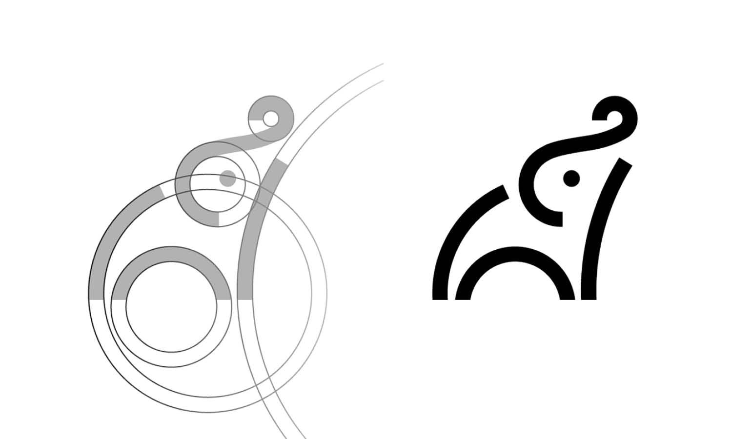
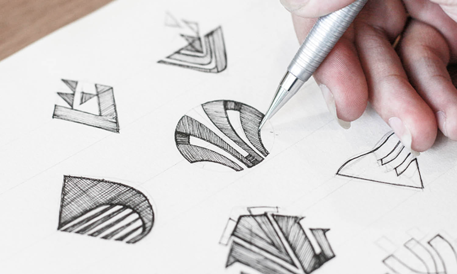
Source: Pixtocraft, A Logo Mark Creative Modern Minimalist Logo Design, Dribbble, https://dribbble.com/shots/18849311-A-logo-mark-creative-modern-minimalist-logo-design
Select a Beginner-Friendly Design Tool
The best tool is not necessarily the most advanced one. It is the one that lets you control the important details without slowing down the process.
Template-Based Editors
Template-based platforms make it easy to arrange text, icons, and simple shapes. Use templates as starting points rather than finished logos. Change the type, color, spacing, and symbol so the result does not look identical to other designs.
Logo Makers
Logo makers can generate concepts from a name, industry, and preferred style. They are useful when you need direction quickly, but the first results may feel generic. Refine the strongest idea instead of accepting it unchanged.
Simple Vector Programs
Basic vector tools provide greater control over shapes, proportions, and scalable files. They take longer to learn, but they are helpful when you want to adjust details precisely or prepare a logo for large-format use.
Build the First Logo Concept
Start with a rough but focused version. The first concept does not need to be polished. It only needs to show whether the central idea works.
Start in Black and White
Working without color makes the structure easier to judge. You can see whether the symbol has a strong shape, the text is readable, and the layout feels balanced. If the logo depends on color to make sense, the concept may need simplification.
Use One Main Visual Idea
Choose one central idea. A coffee brand might use a cup, a bean, or a letterform inspired by steam, but combining all three could create clutter. One clear concept is easier to recognize and remember.
Arrange the Elements Clearly
Place the name and symbol so they feel connected. The icon should not overpower the text, and the text should not appear added at the last moment. Test alignment, spacing, and scale until the layout feels stable.
Remove Unnecessary Details
Delete shadows, textures, outlines, and decorative marks that do not improve recognition. These effects may look appealing at a large size but often become messy when the logo is reduced.
Choose Typography and Color Carefully
Typography and color can change the personality of a logo, so each choice should support the message defined earlier.
Use One or Two Typefaces
One typeface is often enough. If you use two, assign each a clear role, such as one for the name and another for a tagline. Multiple decorative fonts compete for attention and weaken consistency.
Match the Font to the Brand
Ask whether the font feels serious, casual, refined, bold, or friendly. A heavy geometric style may suit a strong modern brand, while rounded lettering may feel more approachable. Readability should remain the priority.
Build a Limited Color Palette
Choose one main color and, if needed, one supporting color. A limited palette is easier to use consistently. Test the logo in full color, black, and white to ensure the design does not lose its identity.
Check Contrast and Readability
Place the logo on light and dark backgrounds. Make sure the name remains visible and the symbol does not disappear. Strong contrast is especially important for small digital uses and printed materials viewed from a distance.

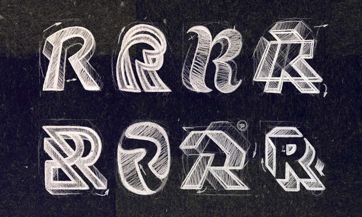
Source: Jose, K, Dribbble, https://dribbble.com/shots/19635700-K
Test the Logo in Real Situations
A logo can look convincing on a design canvas and still fail in practice. Testing helps reveal problems before the design is finalized.
Reduce the Logo to a Small Size
Shrink it to the size of a social profile image or website favicon. Check whether the symbol remains recognizable and the name stays readable. Simplify details that disappear instead of forcing them into a small space.
Place It on Different Backgrounds
Try the logo on white, black, colored, and photographic backgrounds. You may need a light version for dark surfaces and a dark version for light ones.
Preview Common Applications
Place the logo on a website header, business card, label, package, or profile image. These previews show whether the proportions suit real layouts and whether alternative arrangements are needed.
Refine the Design With Useful Feedback
Feedback is most valuable when it focuses on communication rather than personal taste. Share the logo with a small group that understands the brand or resembles its audience.
Ask Specific Questions
Instead of asking whether people like the logo, ask what it communicates, which element they notice first, and whether the name is easy to read. Specific questions lead to more useful responses.
Look for Repeated Concerns
One person may dislike a color because of personal preference. Several people struggling to read the name suggests a genuine problem. Prioritize repeated concerns rather than reacting to every comment.
Make Controlled Revisions
Change one element at a time. Adjust the font, spacing, color, or symbol separately so you can see what improves the design.
Export the Final Logo Files
Once the logo is complete, save versions that will work across common uses. Proper file preparation makes the design easier to apply consistently.
Save Vector and Raster Formats
Export a scalable SVG or PDF for printing and resizing. Save transparent PNG files for websites, presentations, and social media. JPG files can be useful for previews, but they do not support transparency.
Create Color Variations
Prepare full-color, black, and white versions. These variations provide flexibility when the primary logo lacks contrast against a background.
Keep Horizontal and Compact Layouts
Save a horizontal version for headers and a compact or stacked version for square spaces. A symbol-only version may also work for profile icons or favicons if the mark is recognizable by itself.
Conclusion
You do not need professional training to create a logo that feels clear, usable, and appropriate for your brand. A strong beginner process starts with understanding the message, selecting a simple logo type, and making restrained choices with typography, color, and shape. When you create logo design without designer help, focus less on complexity and more on making every element serve a purpose. Test the logo at different sizes, gather focused feedback, and prepare the right file variations before using it. The result will succeed not because it uses advanced effects, but because people can recognize it, read it, and connect it with the brand it represents.
Let Us Know What You Think!
Every information you read here are written and curated by Kreafolk's team, carefully pieced together with our creative community in mind. Did you enjoy our contents? Leave a comment below and share your thoughts. Cheers to more creative articles and inspirations!
Related Articles





Leave a Comment