Professional Tips & Guides For A Good Logo Sketching

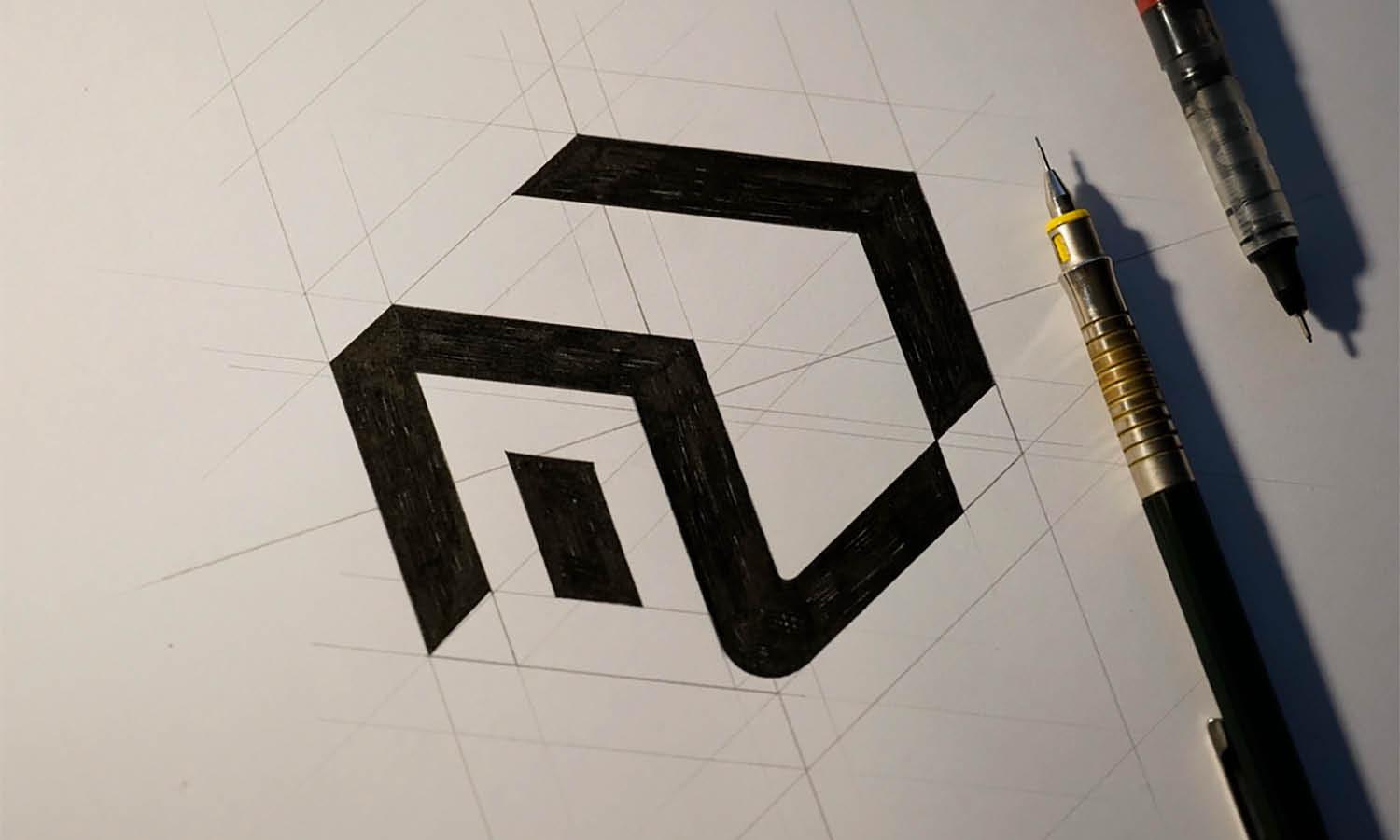
Source: Bratus, Vitrapex Logo Sketch, Dribbble, https://dribbble.com/shots/3728390-Vitrapex-Logo-Sketch
Logo sketching is an essential step in the design process, providing a foundation for a strong and memorable visual identity. Before digital tools come into play, sketching allows designers to explore multiple concepts freely, experiment with different compositions, and refine ideas without limitations. Whether you are a seasoned professional or a beginner, sketching helps in developing a logo that is both unique and effective.
A well-executed logo sketch serves as the blueprint for a final design. It enables designers to focus on form, structure, and concept without the distractions of colors and effects. By sketching first, designers can identify strong visual elements, simplify complex ideas, and ensure that the logo maintains versatility across different applications.
In addition, logo sketching fosters creativity by allowing designers to think outside the box and discover innovative solutions. This article explores professional tips and guides to enhance your logo sketching skills, helping you create visually compelling and conceptually strong logos that stand out in any industry.
Understand the Brand Identity
Before beginning the logo sketching process, it is crucial to understand the brand identity. A logo serves as a visual representation of a business, and without a clear grasp of what the brand stands for, the design may lack meaning and effectiveness. Every brand has its own personality, mission, and target audience, all of which must be reflected in the logo.
Start by gathering essential information about the brand. This includes its core values, industry, competitors, and audience demographics. Understanding what sets the brand apart allows for the creation of a logo that aligns with its unique character. A brand with a modern and innovative focus may require a sleek, minimalist design, while a company with a rich history might benefit from a more classic or vintage look.
Additionally, consider the emotions the brand wants to evoke. A playful and energetic brand may require bold, dynamic elements, while a luxury brand might call for refined, elegant details. Sketching concepts with these factors in mind ensures that the final design effectively communicates the brand’s essence.
Start With Simple Shapes
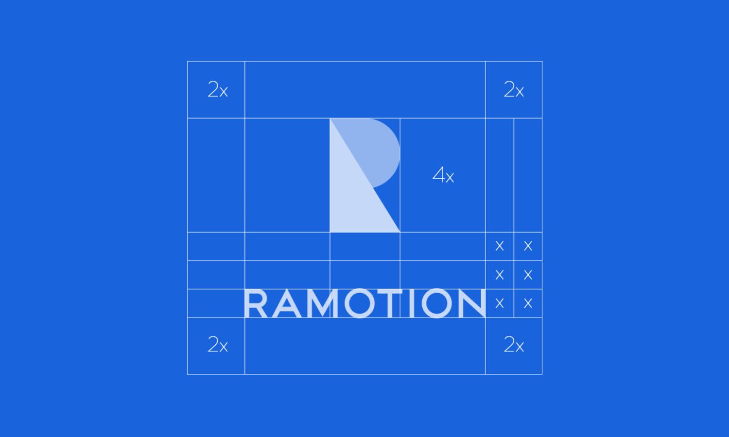
When beginning the logo sketching process, working with simple shapes is an effective way to develop strong concepts. Simple forms like circles, squares, and triangles serve as the foundation for more complex designs while ensuring the logo remains versatile and recognizable.
Basic geometric shapes allow designers to focus on structure and composition before refining details. Many successful logos, such as those of major corporations, rely on simple yet powerful shapes that create instant recognition. By sketching with basic forms first, designers can build a logo that maintains clarity even at smaller sizes.
Additionally, simple shapes help establish balance and proportion. A well-balanced logo appears professional and visually appealing across different applications, from business cards to billboards. When sketching, experiment with different combinations of shapes to create a dynamic and memorable design.
Another benefit of starting with simple shapes is that it speeds up the creative process. Instead of getting lost in intricate details, designers can quickly explore multiple variations of an idea, refining the best concepts before adding complexity. This approach makes it easier to adjust and evolve designs without compromising the core structure.
Focus on Concept Before Details
One of the most important aspects of logo sketching is prioritizing the concept before getting caught up in intricate details. A well-thought-out concept is the backbone of any successful logo, ensuring that the design is both meaningful and memorable. Without a strong foundational idea, even the most detailed logo can fail to communicate the intended message effectively.
Begin by brainstorming different directions that align with the brand identity. Think about symbolism, abstract representations, and unique ways to convey the brand’s essence. Sketching rough ideas quickly allows for the exploration of multiple concepts without fixating on perfection too early in the process. The goal is to capture the essence of the logo rather than refine minor details at this stage.
Once a few strong concepts have been established, they can be refined through further sketching and iteration. Details such as typography, line weights, and embellishments should only be introduced after the core structure of the logo is solid. Overcomplicating a sketch too soon can restrict creativity and limit the ability to explore alternative solutions.

Use a Sketchbook for Ideas
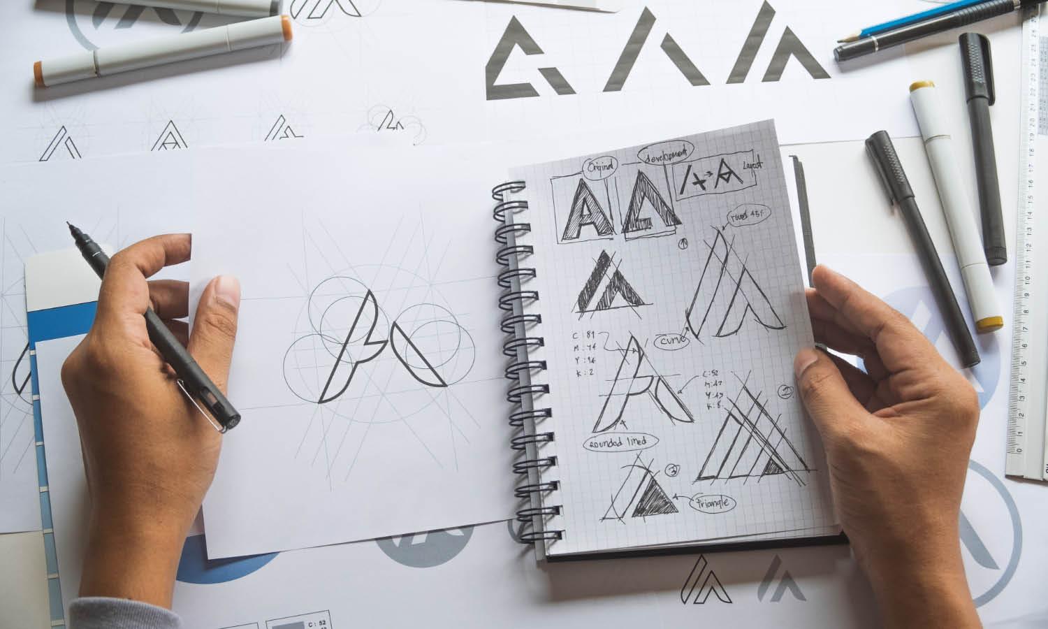
A sketchbook is an essential tool for any designer working on logo sketching. It serves as a dedicated space to explore ideas, experiment with different styles, and document creative progress. Keeping a sketchbook allows designers to refine concepts without the pressure of creating a polished final design immediately.
Sketching by hand encourages a free-flowing creative process, making it easier to develop unique and innovative ideas. Unlike digital tools, a sketchbook provides a tangible way to visualize design concepts quickly without distractions. It allows for brainstorming multiple logo variations and testing compositions before committing to a final direction.
Having a collection of sketches in one place also helps track progress over time. Old sketches may inspire new ideas or serve as a reference for future projects. Additionally, flipping through previous concepts can spark fresh perspectives, helping designers break through creative blocks.
Another advantage of using a sketchbook is that it promotes spontaneity. Ideas can come at any time, and having a sketchbook readily available ensures that no concept is lost. Even rough doodles can evolve into refined, professional logo designs with further development.
Work With Pencil First
When starting the logo sketching process, working with a pencil is highly beneficial. A pencil provides the flexibility needed for experimentation, allowing designers to refine concepts without the constraints of permanent lines. Unlike ink or digital tools, a pencil enables quick adjustments, making it easier to explore multiple ideas before committing to a final design.
Using a pencil also encourages a more fluid and organic sketching approach. Designers can freely sketch rough shapes, refine proportions, and test different layouts without worrying about mistakes. Erasing and reworking elements helps to build a strong foundation, ensuring that the logo maintains balance and structure from the beginning.
Additionally, a pencil sketch helps in visualizing depth and shading, which can be valuable when developing three-dimensional or stylized logos. Light sketching can indicate motion, texture, or direction, adding extra character to the design. Keeping strokes light and loose in the early stages ensures that refining the final sketch is seamless.
Another advantage of working with a pencil first is that it slows down the process, encouraging designers to think critically about their compositions. Rushing to digital tools too soon can limit creativity, while a pencil-based approach allows for more thoughtful, well-developed ideas.
Experiment With Different Styles
Exploring different styles is a crucial part of the logo sketching process. Every brand has a distinct personality, and experimenting with various design approaches helps identify the most effective visual representation. Instead of settling on the first idea, designers should test multiple styles to find the best fit for the brand’s identity.
Some logos work best with a minimalist and geometric approach, while others thrive with detailed, hand-drawn elements. Trying different styles—such as modern, vintage, abstract, or illustrative—ensures a broad exploration of possibilities. This experimentation phase allows designers to push creative boundaries and discover unique solutions that might not be immediately obvious.
Additionally, sketching in multiple styles helps to understand what works best in different applications. A highly detailed logo may look impressive on paper but lose clarity when scaled down for small prints or digital use. On the other hand, a simple and bold design may work well in all formats, maintaining its impact across various media.
Avoid Relying on Colors Initially
When beginning the logo sketching process, it is important to focus on structure and composition rather than color. A strong logo should work effectively in black and white before any colors are introduced. Prioritizing form ensures that the logo remains versatile, recognizable, and functional across different applications.
Sketching in grayscale allows designers to refine the logo’s shape, contrast, and balance without the distraction of color choices. Relying on colors too early in the process can mask structural weaknesses or mislead the designer into thinking the logo is more impactful than it truly is. A well-designed logo should be able to stand on its own, maintaining clarity and meaning regardless of the color palette used.
Additionally, many applications require logos to be used in monochrome formats, such as embossing, engravings, or newspaper prints. A logo that maintains its integrity in black and white ensures it remains effective in any medium. Once the sketch is finalized and its structure is strong, color can be thoughtfully introduced to enhance the design.

Source: Yoga Perdana, Swan Logo Sketch, Dribbble, https://dribbble.com/shots/21419607-Swan-Logo-Sketch
Incorporate Negative Space
Negative space is a powerful design technique that enhances logo sketching by creating visual interest and hidden meanings. Skillfully using empty spaces within a logo can make the design more memorable, clever, and impactful.
Negative space is particularly effective in minimalist logos, where simplicity enhances recognition. By thoughtfully shaping the space around and within elements, designers can create secondary images or symbols that add depth to the design. Iconic logos such as the FedEx logo, with its hidden arrow, demonstrate how negative space can reinforce brand messaging in a subtle yet powerful way.
When sketching a logo, designers should look for opportunities to incorporate negative space naturally. This could involve shaping letters creatively, aligning elements strategically, or using contrast to highlight essential features. A well-balanced use of negative space prevents clutter and keeps the design visually appealing.
Another advantage of negative space is its ability to improve scalability. Logos with clean, well-defined spaces remain legible and effective in both large and small formats. A well-executed negative space concept ensures clarity whether the logo is printed on a billboard or displayed on a business card.
Sketch Multiple Variations
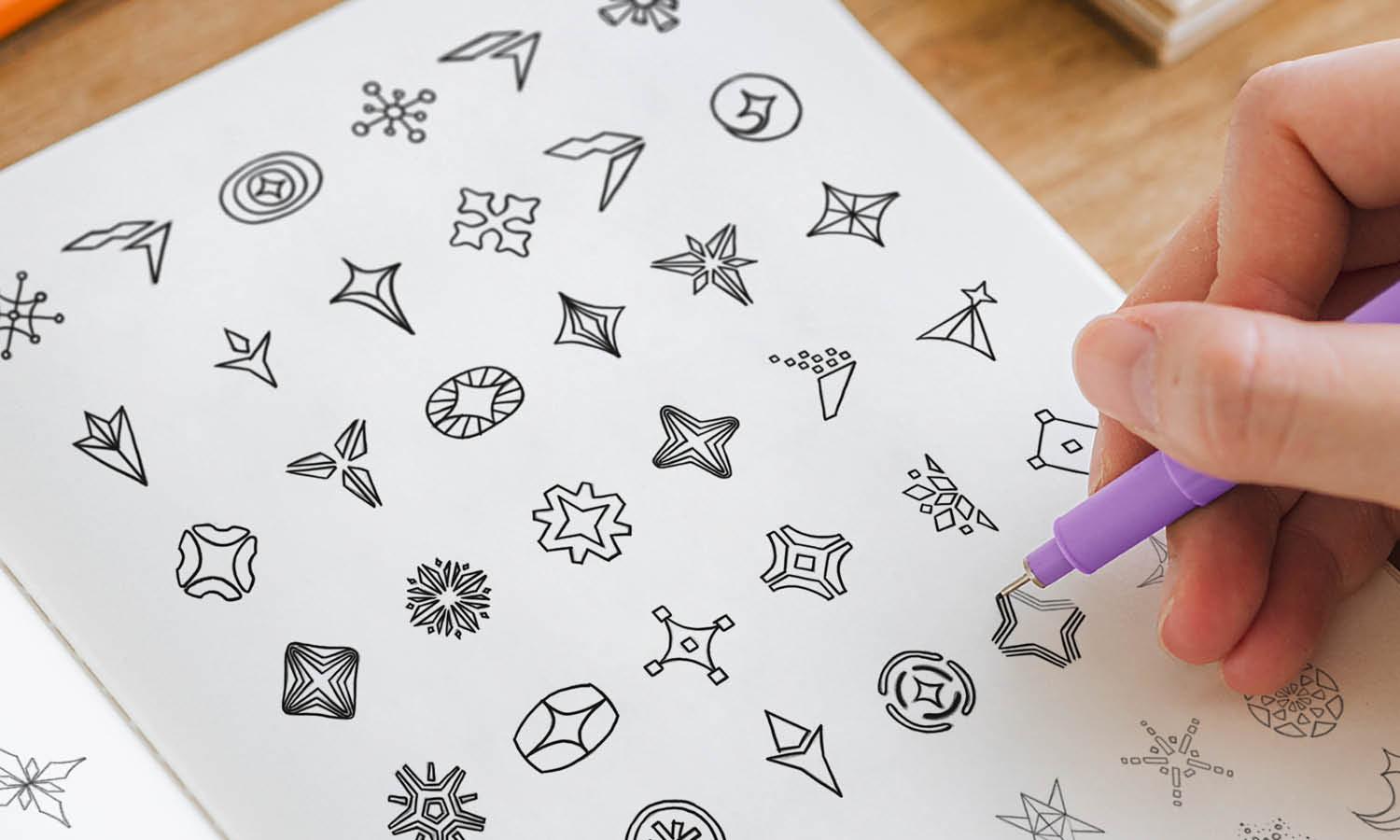
Sketching multiple variations is a crucial step in the logo sketching process, allowing designers to explore different possibilities before settling on the best concept. A single idea may evolve in various directions, and experimenting with multiple sketches helps refine the design and ensure a stronger final outcome.
By creating different variations, designers can assess how subtle changes impact the overall feel of the logo. Small tweaks in shape, proportion, line weight, or typography can make a significant difference in clarity and visual appeal. Some variations may include alternative layouts, abstract representations, or different alignments to see which works best for the brand.
Having multiple sketches also helps in presenting options to clients. Providing a range of possibilities allows for better discussions and collaborative decision-making. It ensures that the final choice is well-thought-out and tailored to the brand’s identity.
Additionally, sketching variations enables designers to test adaptability. A logo needs to work across different platforms, from digital screens to print materials. Experimenting with various forms early on ensures the logo remains versatile and effective in all formats.
Use Reference Materials
Using reference materials is an essential part of the logo sketching process. Studying existing designs, typography, and visual elements can spark creativity and provide inspiration for unique logo concepts. While originality is key, analyzing references helps designers understand industry trends, visual structures, and effective design techniques.
Reference materials can include previous logo designs, branding guides, nature-inspired patterns, architecture, and even hand-drawn illustrations. Observing how successful logos utilize composition, symmetry, and balance can guide designers in making informed decisions during the sketching phase.
However, using references does not mean copying. The goal is to analyze and interpret design elements to create something new and original. Sketching ideas based on inspiration from multiple sources allows for creative combinations that result in fresh and unique logos.
Additionally, reference materials help in understanding cultural and industry-specific design trends. A logo for a tech company may require a sleek, modern look, while a handmade artisan brand might benefit from organic, hand-drawn elements. Studying what works within specific industries ensures that the logo communicates the right message.
Conclusion
Logo sketching is an essential step in crafting a strong, effective design. By focusing on brand identity, experimenting with different styles, and refining concepts before adding details, designers can develop logos that are both visually compelling and meaningful. Working with simple shapes, incorporating negative space, and sketching multiple variations ensure adaptability and clarity across different applications. Utilizing reference materials and sketching by hand fosters creativity and allows for unique ideas to emerge. A well-executed sketch serves as the foundation for a timeless logo, making the design process more efficient and ensuring a logo that stands out with purpose and impact.
Let Us Know What You Think!
Every information you read here are written and curated by Kreafolk's team, carefully pieced together with our creative community in mind. Did you enjoy our contents? Leave a comment below and share your thoughts. Cheers to more creative articles and inspirations!





Leave a Comment