How To Turn Client’s Brief Into A Successful Logo Design

Transforming a client's brief into a successful logo design is a pivotal task for any designer. The brief serves as a roadmap, guiding the creative process and ensuring that the final design resonates with the target audience while reflecting the client's brand identity. Understanding and interpreting a client's brief accurately is the first step in creating a logo that not only meets but also exceeds expectations. This involves a deep dive into the client's business, understanding their market, and grasping the nuances of their branding needs.
A well-executed logo acts as a powerful brand ambassador, instantly communicating a company's core values and distinguishing it in a competitive marketplace. In this article, we explore comprehensive strategies to effectively convert a client's brief into a logo design that is not just visually appealing but also strategically sound and market-ready. These guidelines will help designers create compelling logos that are true to the client's vision and purpose, ensuring the logo becomes a cornerstone of the client's branding strategy.
Understand the Client's Vision
Understanding the client's vision is fundamental in transforming their brief into a successful logo design. As a designer, your first step should be to immerse yourself in the client's world. Initiate discussions to clarify the brief and ask probing questions that reveal deeper insights about their expectations and the essence of their brand. It's crucial to comprehend not just what the client says, but also what they imply or may not express directly. This understanding will dictate the direction of your design process. Focus on the emotions the client wants to evoke with their logo, and consider the overarching message they intend to communicate to their audience.
This thorough understanding sets the foundation for a design that truly represents the client's business and resonates with their target market. By aligning your creative vision with the client’s objectives, you create a pathway to a logo that not only stands out visually but also upholds the brand’s core values and mission.
Identify Key Elements
Identifying key elements from the client’s brief is crucial for developing a logo that effectively communicates the brand’s message. Start by pinpointing the target audience, as this will influence the logo’s design style, colors, and complexity. Understanding who the logo needs to appeal to guides the aesthetic decisions to ensure it resonates well with the intended demographic. Next, extract the brand values that need to be highlighted through the logo. These values are the core of the brand’s identity and should be reflected clearly in the logo to establish a strong brand connection.
Additionally, discern any specific design preferences or styles mentioned in the brief. Whether the client favors a minimalist approach or a more intricate design can drastically shape the creative direction. This step is about synthesizing the client’s requirements and preferences into a coherent set of design elements that will inform the conceptualization and execution of the logo, ensuring it not only meets but exceeds the client’s expectations.
Conduct Research
Conducting thorough research is a pivotal step in translating a client's brief into a successful logo design. This research should encompass several areas: industry-specific trends, the client's competitors, and the target audience's preferences. Start by exploring the latest trends within the client's industry to ensure the logo feels current and relevant. However, it's important to differentiate between trends that enhance the logo's timelessness and those that may make it quickly outdated. Next, analyze the logos of competitors. This not only helps in understanding what symbols, colors, and fonts are common and therefore to be avoided for uniqueness but also highlights opportunities where your client’s logo can stand out.
Understanding the target audience is equally crucial. Delve into the demographics, psychographics, and preferences of the people the brand intends to attract. What designs appeal to them? What colors evoke the right emotions? This knowledge ensures the final logo not only appeals to the client but also captivates the intended market. By integrating insights from these research facets, you can craft a logo that truly reflects the client's vision and resonates with the market, enhancing the brand’s presence and appeal.

Brainstorm Concepts
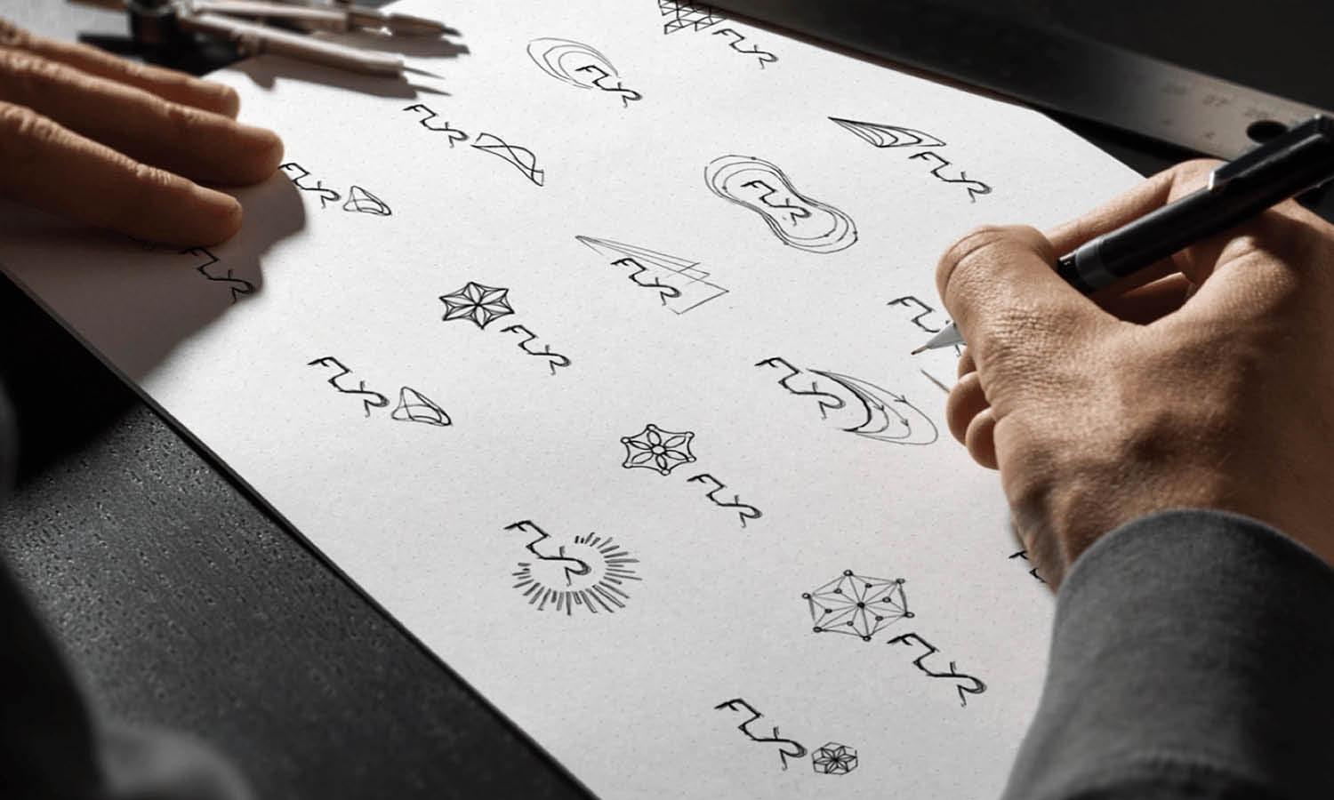
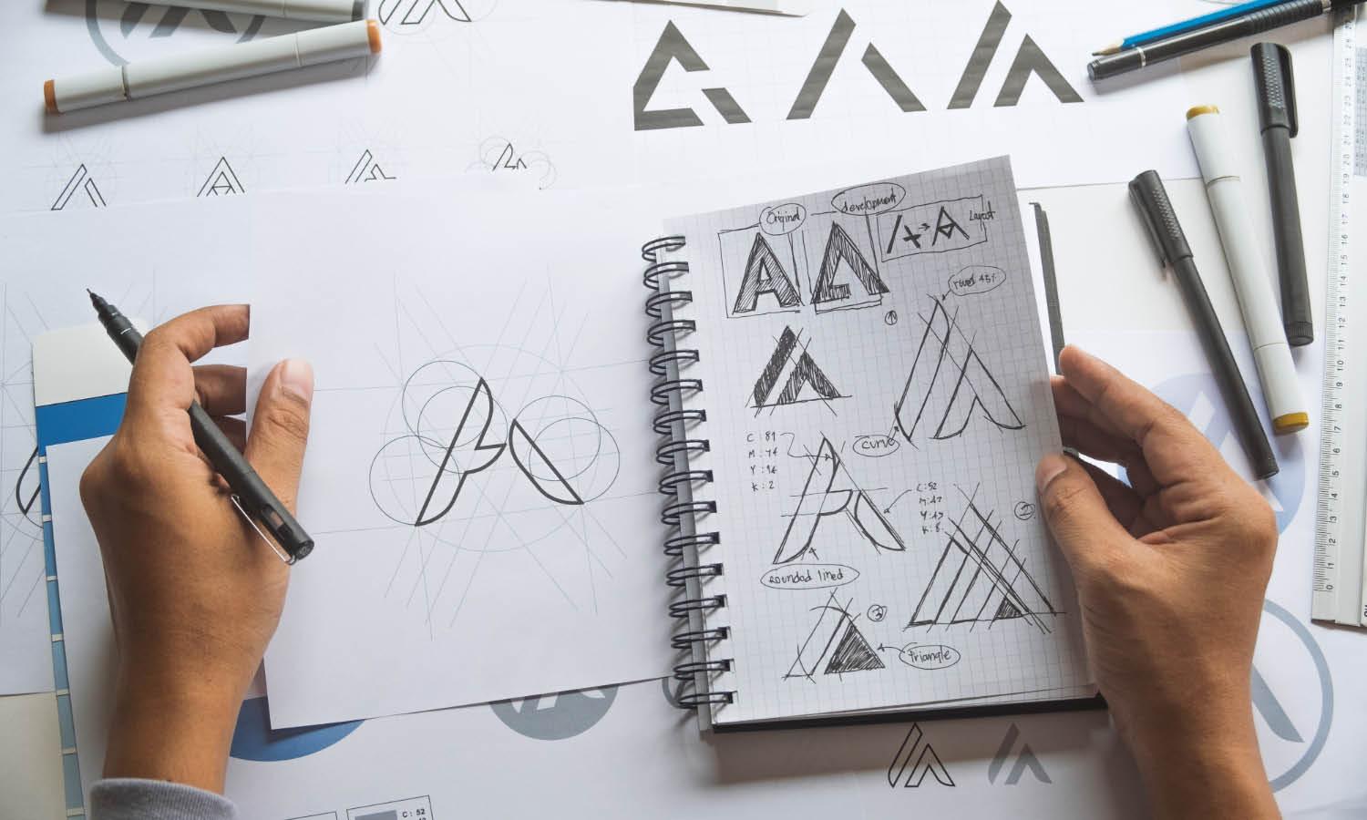
Brainstorming concepts is an essential phase in the logo design process, where creativity meets the groundwork laid by the client’s brief and your research. Begin this stage by generating a wide range of ideas, sketching out quick thumbnails to explore various visual interpretations of the key elements identified earlier. This freeform phase encourages creative thinking and helps designers break out of conventional patterns. Use brainstorming techniques such as mind mapping or word association to explore different angles and perspectives on the brief. Focus on creating diverse concepts that each tell a different story or highlight a different aspect of the client’s brand personality.
It’s crucial during this phase not to limit yourself—consider unconventional ideas and push the boundaries of typical design norms. Once a substantial variety of concepts is developed, start refining them based on the most promising and innovative ideas. This involves critically assessing each concept for its ability to communicate the client’s message, its visual impact, and its uniqueness. The goal of this process is to narrow down to a few strong concepts that can be developed further, ensuring they align well with the client’s vision and meet the objectives outlined in the brief.
Choose Appropriate Colors
Choosing the appropriate colors is a critical step in logo design, as colors play a pivotal role in conveying a brand's identity and evoking specific emotions. When translating a client's brief into a logo design, consider the psychological implications of colors. For instance, blue can evoke trust and dependability, making it ideal for financial institutions, while green is often associated with health and sustainability, suitable for organic brands. Begin by identifying the emotions the client wishes to elicit from their target audience. This understanding will guide your color choices to ensure they align with the brand's values and message. Additionally, consider the cultural context of the target audience, as color perceptions can vary widely between different cultures and demographics.
It’s also vital to test colors in various applications to ensure consistency across different media such as digital, print, and merchandise. Using a limited color palette can enhance brand recognition and ensure the logo's versatility. Opt for colors that stand out in the competitive landscape, supporting the brand to make a strong and memorable impression. By carefully selecting colors that align with the client’s objectives and resonate with the audience, you can create a logo that effectively communicates the brand’s core message and identity.
Select Suitable Typography
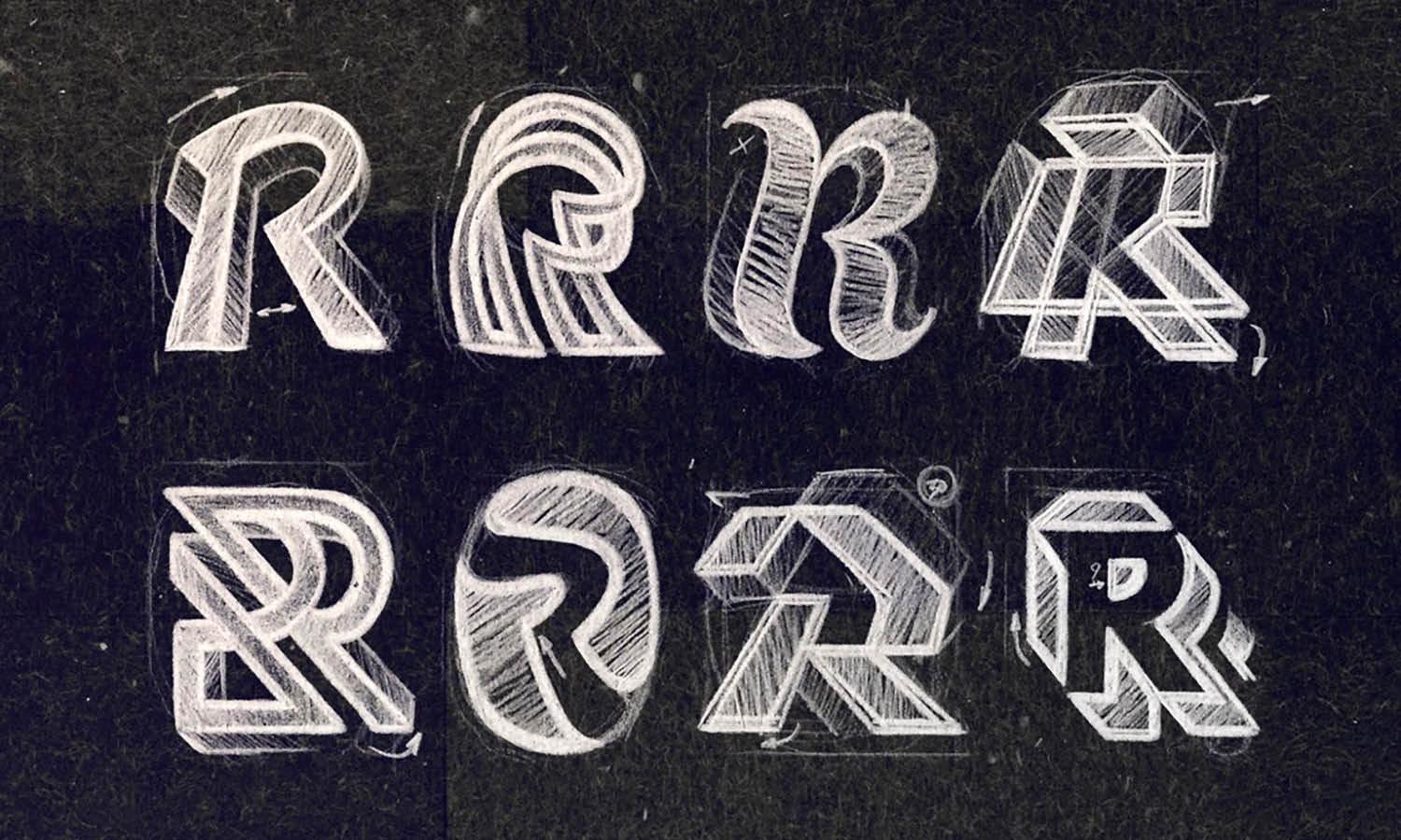
Selecting suitable typography is essential in logo design, impacting readability, brand perception, and overall effectiveness. Typography should complement the logo's style and communicate the client's brand personality. Start by considering the nature of the business and the message the brand intends to convey. For example, a modern sans-serif font may be suitable for a tech company aiming for a clean, minimalistic look, whereas a traditional serif font could be better for a law firm that wants to project trustworthiness and professionalism. It’s important to ensure that the chosen typeface is legible in various sizes and across different mediums. Avoid overly decorative fonts that might compromise readability, especially in smaller scales. Also, consider custom typography.
Tailoring a unique font for the logo can enhance brand uniqueness and set it apart from competitors. When selecting typography, keep in mind the balance and proportion in relation to other elements in the logo. The right typography should integrate seamlessly with the design, enhancing the overall cohesion and aesthetic appeal. Evaluate several typefaces and consult with the client, providing them with visual examples and rationales for each choice. This collaborative approach ensures the final selection not only meets the design requirements but also resonates with the client and their audience, reinforcing the brand's identity and values.
Consider Symbolism
Incorporating symbolism into a logo design can significantly enhance its meaning and impact. When translating a client's brief into a logo, consider elements that can symbolize the brand's values, mission, or industry. Effective symbolism will create a deeper connection with the target audience and enhance brand recall. Start by identifying symbols that are universally recognized and relevant to the brand's field. For example, a tree might represent growth and sustainability, suitable for environmental organizations, while a shield could signify security, ideal for a security firm. It’s crucial to choose symbols that are not only aesthetically pleasing but also culturally appropriate and sensitive to the target market.
Symbolism should be subtle yet powerful, adding a layer of meaning without overwhelming the design. Additionally, consider the scalability of the symbol; it should be distinct and recognizable even when scaled down for smaller applications like business cards or mobile apps. By thoughtfully integrating symbolism into the logo design, you provide an immediate sense of what the brand stands for, making the logo not just a visual mark but a narrative element in its own right.

Source: Artur Sagitov, INNOPOLIS, Behance, https://www.behance.net/gallery/50725449/INNOPOLIS
Create a Flexible Design
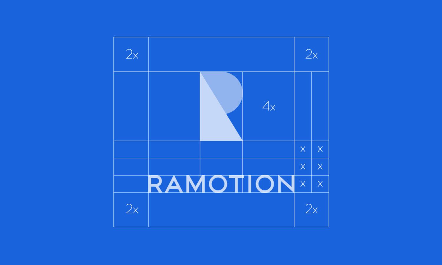
Creating a flexible design is crucial in logo development, ensuring that the logo remains effective and functional across various media and applications. A flexible logo adapts well to different sizes, from large billboards to tiny mobile icons, and works in both full color and monochrome. Begin the design process by considering all the potential environments where the logo might appear. This includes digital media, print materials, merchandise, and corporate communications. Use a simple, clean design that maintains its integrity when altered for different formats. Avoid using too many details that might get lost in smaller sizes.
Test the logo in various contexts to ensure that it is recognizable and visually appealing in both horizontal and vertical formats. Consider creating variations of the logo that include a symbol-only version, a text-only version, and combined versions, which provides versatility without sacrificing brand consistency. Utilize vector graphics to ensure that the logo can be scaled without losing quality. By prioritizing flexibility in the design process, you ensure that the logo serves its purpose effectively, no matter the setting, enhancing the brand's ability to communicate its message universally and consistently.
Ensure Simplicity
Ensuring simplicity in logo design is crucial for creating a memorable and effective visual identity. A simple logo design does not only make the logo more recognizable but also more versatile and adaptable to various uses. When translating a client's brief into a logo, focus on the core elements that represent the brand, and avoid cluttering the design with unnecessary details. Simplicity in logo design means using clean lines, limited colors, and clear typography, which helps in making the logo easy to recognize at a glance. This approach also ensures that the logo remains effective across different mediums, whether digital, print, or physical merchandise. Consider the logos of iconic brands; they often use straightforward designs that convey their brand identity efficiently and elegantly.
To achieve simplicity, refine your concepts by stripping down to the most essential elements, focusing on what is absolutely necessary to communicate the brand's message. This might mean choosing a single design element or symbol that can stand alone or integrating the brand name in a unique yet minimal way. By prioritizing simplicity, you help ensure that the logo will not only be timeless but will also foster strong brand recognition and loyalty.
Check for Trademark Conflicts
Checking for trademark conflicts is an essential step in the logo design process to ensure that the new logo does not infringe on existing trademarks. This not only prevents legal issues but also ensures that the logo is unique and distinct within its market. Begin by conducting a comprehensive search of existing trademarks in relevant categories and geographies using online trademark databases such as the United States Patent and Trademark Office or the World Intellectual Property Organization. It’s advisable to also search business registries, domain names, and internet searches to ensure broader coverage of any potential conflicts. If similarities are found, it may be necessary to modify the design to avoid disputes and to create a more distinctive logo.
In some cases, consulting with a trademark attorney might be beneficial to navigate complex cases and to get professional advice on trademark law. This step is crucial not only to avoid legal complications but also to build a strong brand identity that is uniquely associated with your client’s business. By ensuring that the logo is free from trademark conflicts, you enhance its integrity and protect the client's investment in their brand.
Conclusion
Successfully translating a client's brief into a logo design requires a blend of creativity, strategic thinking, and attention to detail. Each step, from understanding the client's vision to checking for trademark conflicts, plays a crucial role in crafting a logo that effectively communicates the brand’s identity. A well-designed logo not only captures the essence of the brand but also makes a lasting impression on the target audience. By adhering to these principles, designers can ensure that their logos are not just visually appealing but also strategically aligned with the client’s goals and market demands. This meticulous approach results in a logo that truly represents the brand and enhances its market presence.
Let Us Know What You Think!
Every information you read here are written and curated by Kreafolk's team, carefully pieced together with our creative community in mind. Did you enjoy our contents? Leave a comment below and share your thoughts. Cheers to more creative articles and inspirations!


Leave a Comment