10 Logo Design Basics You Should Learn As A Beginner

Source: Badal Patel, Stage Kitchen, Behance, https://www.behance.net/gallery/115017855/Stage-Kitchen
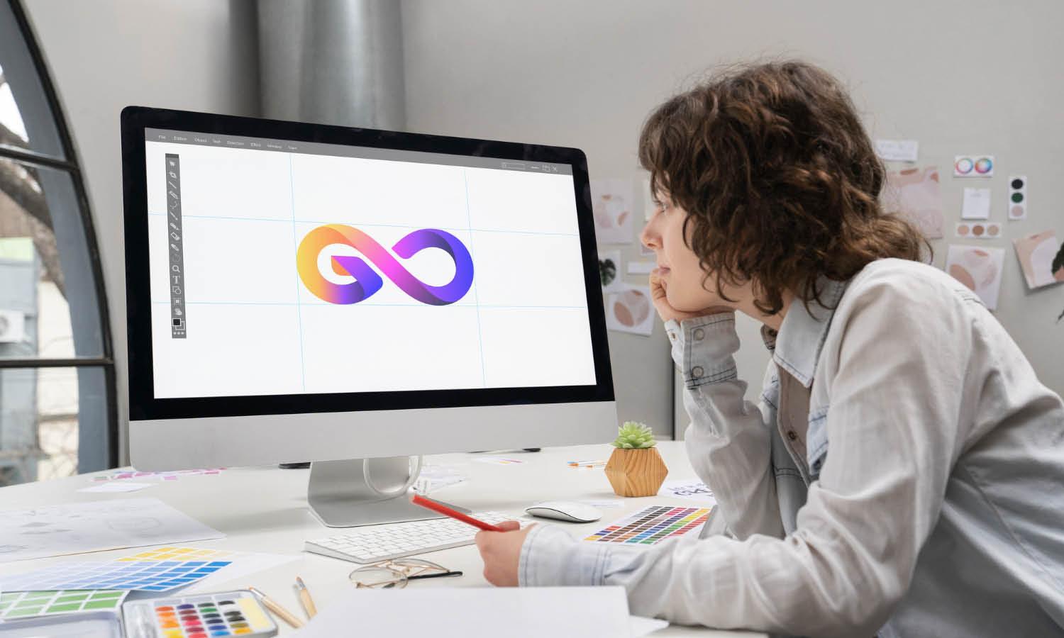
Creating a logo is more than just combining shapes and colors; it's an essential process that sets the visual cornerstone of a brand's identity. Understanding the fundamentals of logo design is crucial for both new designers and business owners looking to craft a symbol that effectively communicates their brand's values and appeals to their target audience. In this guide to logo design basics, we will explore the critical elements that make a logo not only visually appealing but also functional and enduring.
Whether you are starting a new venture or looking to refresh your current brand image, grasping these basics can significantly impact how your brand is perceived and recognized in the market. This introduction aims to lay the groundwork for creating a logo that is both memorable and effective, ensuring it resonates well with the intended audience while standing out in a competitive landscape.
Understand the Brand
At the core of logo design basics lies the imperative to deeply understand the brand for which the logo is being designed. This foundational step is crucial as it informs the direction of all design choices that follow. A well-crafted logo communicates the brand’s personality, values, and unique selling propositions succinctly and effectively. To achieve this, designers must immerse themselves in the brand’s world, understanding its history, target audience, industry specifics, and competitive landscape. This involves engaging with the client to extract as much information as possible, which can include the brand's vision, mission, and objectives.
Additionally, understanding the brand’s audience is paramount; a logo must resonate with them, invoking both recognition and trust. This connection can often dictate the choice of colors, shapes, and typography in the logo, each of which will carry its own psychological impact. As such, a designer’s role transcends mere artistic endeavor, venturing into market research and consumer psychology to ensure that the logo truly represents its brand.
Simplicity Is Key
A fundamental principle in logo design basics is the importance of simplicity in logo design. A simple logo is not just a trend but a timeless strategy that ensures your design remains effective and versatile across various applications. Simplicity in logo design means minimal use of colors, shapes, and fonts, which helps in creating a clear and concise brand identity. A straightforward design makes a logo easy to recognize, remember, and reproduce, which is particularly important in today’s fast-paced market where quick brand recognition is critical. Moreover, a simple logo adapts more effectively across different mediums, from digital screens to print, and even when scaled down to smaller sizes.
It avoids the visual noise often associated with overly complex designs, ensuring that the logo does not lose its integrity when viewed under different circumstances or from various distances. To achieve simplicity, focus on the essential elements of the brand’s identity and strip away any unnecessary components that do not contribute to its overall message. This approach not only enhances the logo's longevity but also strengthens its ability to communicate the brand’s essence succinctly and powerfully.
Relevance to the Industry
A pivotal aspect of logo design basics is ensuring the relevance of the logo to the industry it represents. A logo should be a visual ambassador, instantly communicating the field or sector of the business to its audience. This alignment with the industry helps to set the correct expectations and build the appropriate image in the customer's mind. For instance, tech companies often opt for sleek, modern designs that reflect innovation and efficiency, while a luxury brand might choose a design that embodies elegance and exclusivity with minimalistic but powerful imagery. Understanding industry standards and expectations can guide the design process significantly. It involves researching competitors and industry leaders to identify common themes and elements that are well-received by the target audience.
However, while it’s important to stay relevant, the goal should also be to differentiate the brand from its competitors. The logo should strike a balance between fitting in and standing out, ensuring it is both recognizable within its industry and distinct enough to avoid blending in. This strategic approach in design not only enhances brand recall but also strengthens the brand's position within its market.

Source: Liteshop2, Koffein, Behance, https://www.behance.net/gallery/135432551/Koffein
Versatility Matters
In the realm of logo design basics, versatility is a key attribute that significantly enhances the utility and longevity of a logo. A versatile logo performs effectively across various mediums and formats, from large billboards to small mobile screens, and is equally impactful in full color or black and white. This adaptability ensures that the logo maintains its integrity and effectiveness in different contexts, which is crucial in today's multi-platform marketing environments.
To achieve versatility, a logo should be simple yet significant, avoiding overly complex elements that may not translate well across all sizes. Designers should consider how the logo will look on different backgrounds, in different sizes, and how it adapts to both digital and physical formats. Testing the logo in various applications during the design process can provide valuable insights into its functionality and impact.
Furthermore, a versatile logo should be timeless, capable of enduring market changes without appearing outdated. This means opting for a design that avoids trendy elements that may feel dated after a few years.
Color Psychology
Understanding color psychology is crucial in logo design basics as, colors play a significant role in how a brand is perceived by its audience. Each color has specific psychological effects and can evoke different emotions. For example, blue often represents professionalism, trust, and serenity, making it a popular choice in corporate and healthcare industries. Red, known for its vibrancy and energy, is commonly used in brands that want to appear bold and exciting. Choosing the right colors for a logo involves more than personal preference; it requires a strategic understanding of what each color communicates. It's essential to consider the brand’s core values and the message it intends to convey through its visual identity. The chosen colors should reinforce and complement these aspects.
Additionally, it's important to consider cultural differences in color perception, as colors may have varying meanings in different cultures. For instance, while white is often associated with purity in many Western cultures, it can represent mourning in some Eastern cultures. Effective use of color psychology can enhance brand recognition and influence consumer behavior, making it a powerful tool in the logo design process.
Font Selection
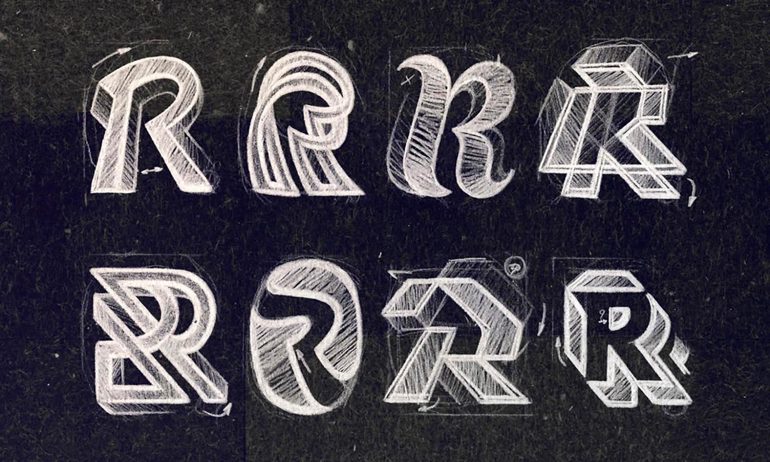
Font selection is another critical component covered in logo design basics. The choice of typography can significantly influence the overall impact of a logo. Fonts convey different personalities and can affect the readability and recognition of a logo. Serif fonts, characterized by small lines at the end of strokes, often convey a look of reliability and tradition, making them suitable for law firms, financial institutions, and academic establishments. On the other hand, sans-serif fonts, which lack these lines, appear more modern and clean, ideal for technology companies and startups.
When selecting a font, it’s crucial to ensure it aligns with the brand’s personality and is legible across various uses and sizes. This helps maintain consistency and clarity in all brand communications. Moreover, custom typefaces can offer uniqueness and exclusivity, setting a brand apart from its competitors. However, designers must also consider practical aspects such as licensing rights and versatility of the font. Ultimately, the selected font should not only look appealing but also function well across different mediums, ensuring the logo remains effective and cohesive in all marketing materials.
Unique Design
Achieving a unique design is an essential aspect of logo design basics that differentiates a brand in a crowded marketplace. A logo serves as the face of a company and must be distinctive enough to stand out among competitors. This does not necessarily mean being overly elaborate; rather, it involves creating a design that is both innovative and reflective of the brand’s identity. To develop a unique logo, designers should delve into the brand's story, values, and unique selling points. Incorporating these elements into the design can make the logo not only unique but also meaningful.
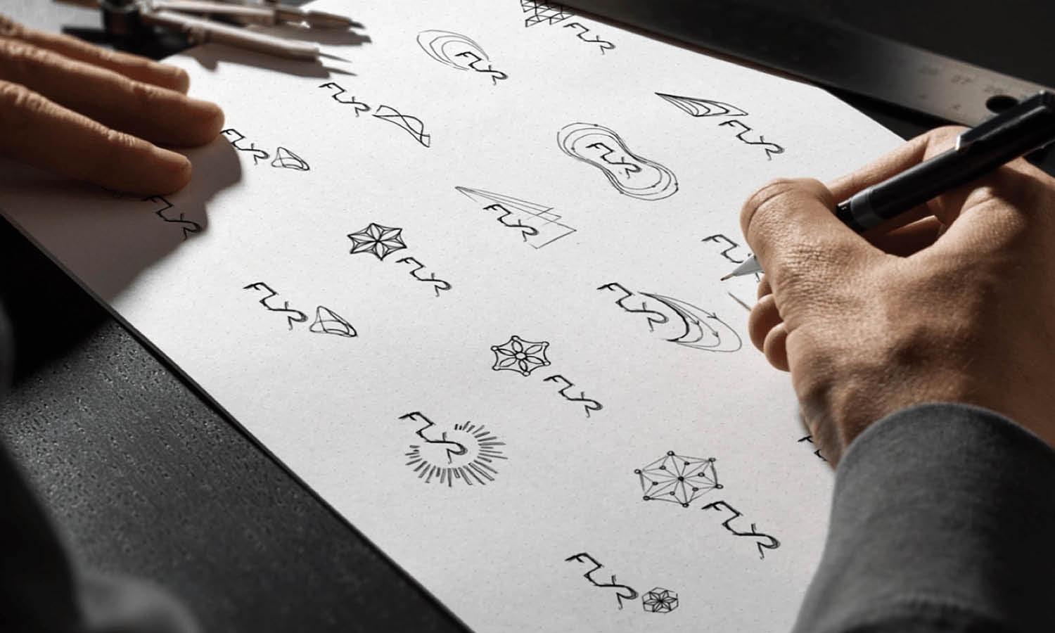
Another approach is to experiment with different design techniques, such as combining symbols in new ways or creating custom typography that is specific to the brand. The aim is to avoid generic and overused logos, instead crafting something that captures the essence of the brand in a novel way. This process might involve several iterations and refinements to distill the essence of the brand into a simple yet compelling visual form. Ultimately, a unique logo enhances brand recall, encourages brand loyalty, and establishes a strong visual identity in the consumer's mind.

Source: Think Bold Studio, Graham's Late Bottle Vintage, Behance, https://www.behance.net/gallery/137565535/Grahams-Late-Bottle-Vintage
Avoid Trends
While staying current with design trends can provide inspiration, relying too heavily on them in "Logo Design Basics" can result in a logo that quickly becomes dated. The goal of a great logo is timelessness; it should look as effective today as it will in decades. To achieve this, focus on the brand's enduring qualities rather than fleeting design fads. Trends can inform a designer about current preferences, but they should not dictate the logo's design. Instead, designers should concentrate on creating something that represents the brand authentically and consistently over time.
By avoiding trends, the logo avoids the risk of needing a redesign as trends evolve, ensuring the brand maintains a steady and reliable presence. This approach not only saves time and resources but also builds a stronger brand identity. A logo should be designed for longevity, embodying the brand’s values and mission in a way that resonates universally with its audience, irrespective of the changing design landscape.
Balance and Proportion
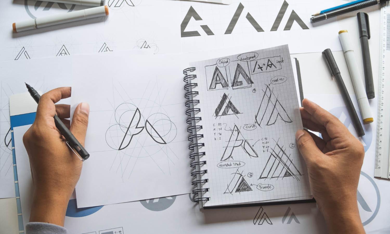
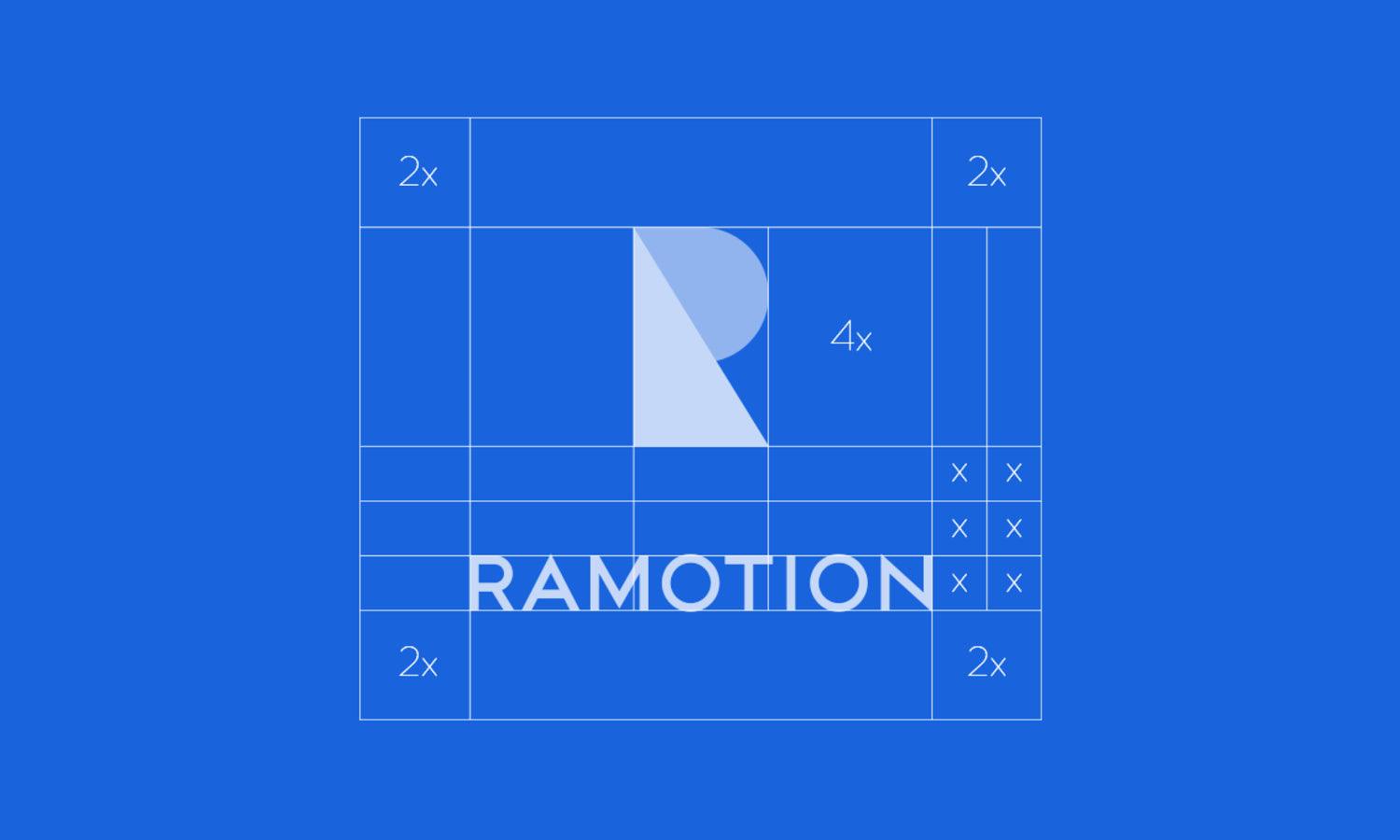
In logo design basics, achieving balance and proportion is key to creating a logo that is both aesthetically pleasing and effective. Balance refers to the distribution of visual weight in a design, ensuring that no single part of the logo overwhelms the others. This equilibrium can be symmetrical, where elements are mirrored on either side of a central axis, or asymmetrical, where different elements are balanced according to their visual weight, leading to a more dynamic composition. Proportion, on the other hand, deals with the relative sizes of the logo’s elements. Proper proportion ensures that each part of the logo is harmonious with the whole, contributing to a cohesive look that is easy on the eyes.
Achieving this requires a keen eye for detail and an understanding of how various shapes and components interact within a confined space. Designers often use grids and ratios, like the Golden Ratio, to plan and execute designs that naturally appeal to the human eye. This technical precision helps in creating logos that are not only visually balanced but also versatile across various applications. A well-balanced and proportioned logo instills a sense of stability and professionalism, key qualities for any brand aiming to make a strong impression.
Legal Check
A critical step outlined in logo design basics is conducting a legal check to ensure that the logo design does not infringe on existing trademarks. This due diligence is crucial to avoid potential legal conflicts that can result in costly litigations and necessitate a redesign of the logo. Before finalizing a logo, it’s important to search through trademark databases, often available online through national intellectual property offices, to ensure that the logo, or elements of it, are not already registered or in use by another entity. This search should include not only identical marks but also similar ones that could be confused with the logo in question, as trademark law covers not only identical conflicts but also logos that are deceptively similar.
Consulting with a legal expert specializing in intellectual property can provide additional security, ensuring that all legal aspects of the logo are covered. Furthermore, if the logo passes these checks, considering registering the logo as a trademark can offer legal protection against misuse and copying, securing the unique identity of the brand. This legal groundwork might seem tedious but is essential for safeguarding the brand’s visual identity and its long-term market presence.
Conclusion
Mastering logo design basics is crucial for any designer aiming to create impactful and enduring logos. From understanding the brand’s core values to ensuring legal compliance, each step in the design process plays a pivotal role in crafting a logo that effectively communicates the brand’s identity. Emphasizing simplicity, versatility, and timeless design principles will help in developing logos that not only resonate with the target audience but also withstand the test of time. By adhering to these foundational guidelines, designers can ensure that their creations not only look professional but also serve as a powerful symbol of the brand they represent.
Let Us Know What You Think!
Every information you read here are written and curated by Kreafolk's team, carefully pieced together with our creative community in mind. Did you enjoy our contents? Leave a comment below and share your thoughts. Cheers to more creative articles and inspirations!






Leave a Comment