10 Tips to Create a Good Dessert Shop Logo Design

Created by Alexandra Erkaeva | https://dribbble.com/shots/17419630-Roundie-s-Bagels
Your logo will represent your brand. It is different from the brand itself, but it has a major role as a symbol for your products or services.
A logo often becomes the first thing in customers' minds to recognize your product. This fact has been proved by science, that humans learn more effectively through images and visual cues. It explains why a good logo sticks in our minds.
In addition to that, it is an opportunity to tell people about the products you offer. A good logo design delivers certain messages, telling people what makes your product different from others, and piques their interest.
A well-designed logo will also enhance the packaging of your product. Thus, it looks nicer and more attractive. Furthermore, a good logo design is capable of impressing people and bringing more customers to your business. In other words, it plays a role in marketing.

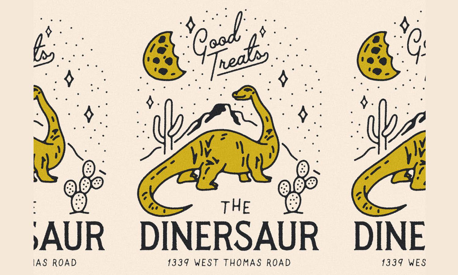
Created by Mark Johnston | https://dribbble.com/shots/16330275-The-Dinersaur-Shop-Shirt
For that purpose, your dessert shop logo design will need to be attractive, nice looking, and unique. But at the same time, it also needs to have a simple and memorable look.
There are many things to consider when you are about to design a dessert shop logo. This includes choosing the right icon, deciding on colors, combining some shapes, or modifying a certain character.
This is why creating a logo design is not easy. And logos for dessert shop is not an exception. Thus, many business owners often need an expert designer. A designer will help you to get a special logo for your dessert shop.
But if that's not an option or if you want to create your own dessert shop logo, then you can start by doing some research and learning how to design it.

Created by Casandra Ng | https://dribbble.com/shots/7910435-Strawberry-mochi
1. Develop a Brand Identity
Brand identity includes every visual element of your brand, from its colors to every other element of your logo design. These elements play a major role in distinguishing your dessert shop in the customer's mind.
Having a clear and certain brand identity will be helpful in creating a logo design that will stick in people's minds. Thus, people will recognize your dessert shop's product easily.
To develop your brand identity, firstly, you need to determine certain features that represent your dessert shop. Then, you have to decide the most important values and what will be most noticeable to the customers.

Created by brandosaur | https://dribbble.com/shots/14916791-Arty-Biscuits
Next, you will also need to find out what distinguishes your dessert shop from others. This might be a difficult step, but it's an essential one. Take your time to ponder these questions and find the answers. For example, your dessert shop focuses on ice creams that will bring joy and refresh customers' moods.
Developing your brand identity will bring you to the first step to start designing your dessert shop logo. It will not immediately bring you a complete design. But you will be able to figure out the values that your dessert shop logo design needs to project.

Created by Kristina | https://dribbble.com/shots/10128556-J-S-Chocolate
2. Look at Other Dessert Shop's Logos
Taking the first step is often the hardest part. You need an idea to start creating a design. Sometimes, you have the idea in mind but have a difficult time putting it out. It might feel like there's a vague image, like puzzles that need to be completed first.
Meanwhile, having too many ideas might end up getting you stuck because you are too busy analyzing these ideas over and over. As a result, you waste time while nothing comes out of your design.
Doing some research by observing many great logos out there might help to develop an idea or to put what you have in mind into a certain illustration. Looking at other dessert shop designs will help you to know how it generally looks.
Besides, you can also learn how they impress people and what makes them outstanding and memorable. You can also figure out some distinguishing features for each dessert shop logo.
Furthermore, by observing other shops' logos, you'll be learning the language of logos. You will notice that they deliver certain messages through the design elements. They usually refer to a good association between the shop, products, and customers.

Created by Gold Lunchbox | https://dribbble.com/shots/5796731-Thinsters
3. Choose Your Colour Identity
One of the essential elements in design is color, as it plays a major role as visual stimuli. Studies have suggested that color can affect people's moods, thus affecting their decision to buy a product.
Your dessert shop logo design will be the face of your business. It will be put on the package, on the shop's social media and website. Moreover, it often becomes the one thing that sticks in the mind of your customers.
Thus, color selection plays a critical role in the success of your dessert shop logo. Hence you need to decide wisely. Firstly, it will be helpful to learn about the psychological effects of some colors.

Created by Ashley Trommler | https://dribbble.com/shots/5649709-Crumble
For example, brown is associated with natural ingredients, orange radiates warmth, yellow might invoke happiness, and pink symbolizes kindness and love. Meanwhile, stand-out red looks passionate, and the shades of black, white, and grey can invoke calmness.
You can choose to make it monochromatic or multicolored. Logos with a single color will look more simple and easier to remember. Meanwhile, using multiple colors might result in a more attractive appearance.
If you choose to use multiple colors, then be mindful of the combination. It is a good idea to limit the number of colors you use.

Created by Katrin Emery | https://dribbble.com/shots/16042735-The-Merry-Dairy
4. Create A Symbol
A certain symbol is often used for a specific industry, for example, plus a sign for medical services, cake, or ice cream for dessert. Using the symbol will allow people to immediately know what kind of product you offer.
After all, it will be used as a symbol to identify your brand. Hence, it usually uses certain illustrations that are typical for certain businesses. But, using the exact same symbol will never make your logo stand out. As a result, your customers will find it difficult to distinguish your shop from similar shops.
That is why it is recommended to create an icon for your design. You can make it by modifying the typical symbol so that people will be able to recognize the product of your shops immediately.
To create a peculiar icon, many logos combined some illustrations and made and modified a certain figure or character. Then, complete it by adding some colors.
For example, you choose to use a cupcake illustration. To make it unique, you can modify it into a smiling character that gives a friendly vibe. Next, add something peculiar, like a nice hat for the topping. Lastly, use some nice colors, so it looks more interesting.

Created by Jay Master | https://dribbble.com/shots/7968742-Charlies-Bagels
5. Select a Fun-Looking Font
There's no rule about adding text to your logo design. In fact, some businesses use no text, while others only use text for the logo design. By using only one of them, you will have a simple-looking logo, making it easier for people to remember.
Most businesses tend to use the combination of symbol and text because text includes the brand's identity. However, you need to remember that adding too many texts might make it look complicated.
If you want to add some text to your dessert shop logo design, then you will need to select a font. Every font has its own character and brings a different impression. You can use more than one font, but make sure to be consistent.
Since different fonts say different things about your brand, make sure to select them wisely. There are many things to consider while choosing the font, such as line thickness, contrast, and style.
Select a font that fits best for your dessert shop, and consider whether it has a classic or modern style. The thinner font that is written on a diagonal axis gives out casual and inviting vibes. You can choose a more playful font if your dessert shop aims for young people.

Created by Krestovskaya Anna | https://dribbble.com/shots/16821502-Kelly-s-Cookies-Logo
6. Keep it Simple
A simple logo design is easier to memorize and will stick in your customer's mind for a long time. Thus, no matter how many ideas come for your dessert shop logo, it is important to keep it as simple as possible.
Simple logo design doesn't mean it is less creative or attractive. In fact, many great logos look simple but powerful. This allows them to be able to permeate the business world and reach more people.

Created by Nikola Vicentijevic | https://dribbble.com/shots/6031294-Gelato-and-Bar
You can choose an icon to represent our dessert shop. Then, modify it to create a peculiar feature that will distinguish your brand. A good example is a missing bite on the Apple logo that turns a simple apple silhouette into an iconic character.
It doesn't have to be something extravagant. You just need a tiny change and a little modification that is able to pique people's interest and curiosity. For example, rather than using ordinary ice cream as an icon, you can make the ice cream melt on one side, dripping some liquid that looks refreshing.
A little bit of creative modification will turn your dessert shop logo design into a distinguishable one. At the same time, it maintains simplicity to make it easier to memorize.

Created by Sergey Shapiro | https://dribbble.com/shots/14182300-Emanday
7. Test Your Logo On Several Medias
One of the most crucial things in shop logo design is visibility. You have to make sure that your logo will always be visible. So, people will be able to see and notice it even from some distance.
Selecting a contrasting background is a way to make sure your shop logo design has good visibility. If it has a colorful theme, then using white for the background will be a good idea.
Do not forget to be mindful of your text readability as well. It is preferable to consider the contrast of background and font color as well. If your font is white-colored, then using a black background will be effective in guaranteeing visibility.
You can also choose other colors for the background if using typical white or black doesn't suit your dessert shop logo well. One thing you need to remember is to give some contrast to make sure your logo has good visibility.
The easiest trick to solve it is by choosing a contrasting color combination. For example, if your dessert shop logo uses pink as its dominant color, then do not use pink color, whether the same tone or not, as the background. Choose something more contrasting, like navy blue or dark brown.

Created by David Prasetya | https://dribbble.com/shots/18405368-Maynard-s-Ice-Cream-Cafe
8. Balance Your Logo's Elements
When every element of your design is ready, you have to start to align them. It is crucial that all of these elements are well-balanced to form the design as a whole. Quoted from WIX Blog, paying attention to alignment, symmetry, and negative space are the key components of logo psychology.
Although there's no rule for the element's alignment, it is not a good idea to spread it around. Aligning them in one direction will guide people's attention to that point. Thus, it is recommended to determine which one you prefer.
Most logo designs choose to align their elements at the center because it tends to make it easier to catch people's attention. But a logo doesn't always have to use center alignment. You can align all your elements in the same direction, whether left or right side.
Then, if you have decided on the alignment for your dessert shop logo design's elements, it is preferable that you include your peculiar element there as well.
For example, you are creating an illustration of some cakes piled on the left side, and the one on the top has a topping that resembles a crown. Put the crown slightly tilted to the left side and add a diamond illustration on it.

Created by Zvucifantasticno | https://dribbble.com/shots/9169019-Cookie-s-Fresno
9. Aims for A Memorable Design
Design trends tend to change in a short time. That's why, although it's tempting to follow the current trend, it might not be a wise choice. When the trend changes in the near future, it will be a pitfall for your dessert shop logo design.
Thus, creating a logo design with a more classic look is preferable. Compared to trends in season, classics are timeless. It is fine to take more time to figure out shop logo design in a more classic style. After all, it will be the one that represents your shop for a long time ahead.

Created by Corey Reifinger | https://dribbble.com/shots/4462058-Marathon
In addition to being timeless, classic designs tend to be simple. Thus, it is easier for people to memorize. It will allow your customers to not only notice the logo design but also remember it for a long time.
Thinking about some logos that are memorable to you might help you to create one. First, try to figure out what makes them stick in your mind. Generally, memorable logos represent the brand in a direct manner. Take a look at MacDonald's, for example.
For that reason, make sure to stay true to your brand identity and the values you want to project in your logo.

Created by Naila Medjidova | https://dribbble.com/shots/5356392-Madonna-Mia-Branding
10. Ask For Some Feedback
Designing is a creative process that involves trial and error. You might need to redesign, to change the colors or font. Sometimes you might even need to change the basic elements. It is not an easy process, but try to not be discouraged if things get difficult.
After many trials and errors, you might begin to feel more at a loss than before that it's impossible to tell which is better or worse for your brand. When you reach this stage, then it is a good idea to get some feedback. Try to ask anyone near you to give their opinion about your rough version designs.
Asking more people will bring you more opinions. Their impression of your logo design might be different from one person to another. Thus, asking many people is better, so that you can know a general opinion.
If it's possible, try to ask them for specific opinions, like how they perceive your shop from the logo or what is the first thing that comes to mind when seeing your logo design. It will be more helpful rather than being told whether your logo design is good or bad. Feedback might help to perfect your logo.

Created by greg davis | https://dribbble.com/shots/14564847-Mascot-illustration-for-Boxwood-Biscuits
Final Words
Those are several tips for creating a good dessert shop logo design. Hopefully, they can be helpful for your creative process.
Creating a good logo for a dessert shop needs many considerations. Besides, the process might not always be smooth sailing. You will need to take many steps, deciding your design elements one by one, then start making some rough versions of your logo design.
You also need to go through many trials and errors, such as re-modify your icon, changing your color combination, or struggling to find the perfect font. Many challenges in the tough process can be stressful.

Created by cmpt_rules | https://dribbble.com/shots/16324218-THE-BAGEL-CAFE-MASCOT
Besides, you might get some disheartening statements when asking for feedback. People might not get the impression you want. Sometimes, your rough version of the logo design might be unable to communicate the values you want to project.
If these things happen, please do not let them discourage you. Remember that people have different opinions, but the majority voice doesn't always mean true. Try to see it from a different perspective. Perhaps, a tiny bit of modification on your logo design could fix people's opinions about it.
Remember once more about the vital role of the logo for your dessert shop. Then, you will find no reason to give up halfway.


Leave a Comment