30 Best Hygiene Logo Design Ideas You Should Check

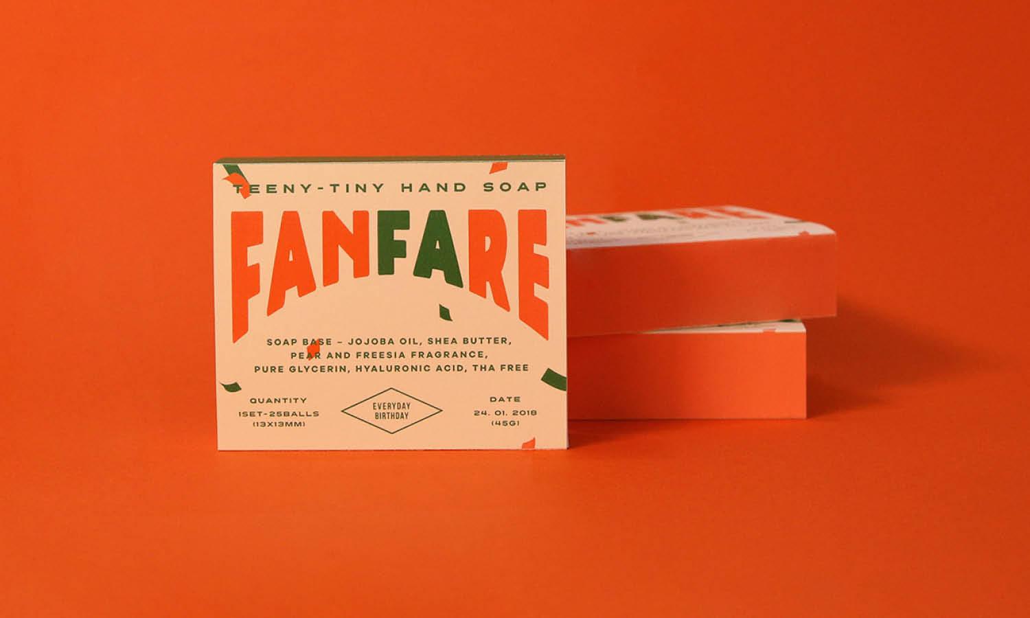
Source: U sun Hwang, Fanfare, Behance, https://www.behance.net/gallery/63388015/Fanfare-hand-soap
A great Hygiene Logo Design instantly tells customers that cleanliness, care, and freshness are at the heart of your brand. In a world where hygiene is now a top priority, a well-crafted logo does more than just look good—it builds trust and sends the message that your services or products are clean, safe, and reliable. From sparkling water droplets to crisp geometric icons, the right visuals can transform a simple mark into a powerful representation of health and purity.
This article dives into some of the most creative Hygiene Logo Design ideas you’ll want to check out. You’ll find fresh concepts inspired by nature, sleek modern styles that radiate professionalism, and playful motifs that add a touch of friendliness without sacrificing clarity. Whether you’re launching a cleaning service, personal care line, or eco-friendly sanitizer brand, the designs here show how color, shape, and symbolism work together to express your values.
By exploring these ideas, you’ll get inspired to create a memorable and effective Hygiene Logo Design that stands out in a competitive market. Let’s get started with this collection of imaginative approaches that can make your brand shine with a clean, confident identity.
Hygiene Logo Design Ideas

Source: Veronika Kulish, Boon, Behance, https://www.behance.net/gallery/144466879/BOON-hair-care-collection

Source: QingYou Studio, Dreamore, Behance, https://www.behance.net/gallery/121879613/Dreamore-SHAMPOO-LOGO-VI-PACKAGE-DESIGN

Source: Peltan-Brosz Studio, Conserva Collective, Behance, https://www.behance.net/gallery/89752191/Conserva-Collective

Source: Victor Rutka, Ana Flora, Behance, https://www.behance.net/gallery/169557415/Ana-Flora

Source: Rafael Duarte, Sevla natural, Behance, https://www.behance.net/gallery/145439487/SEVLA-natural

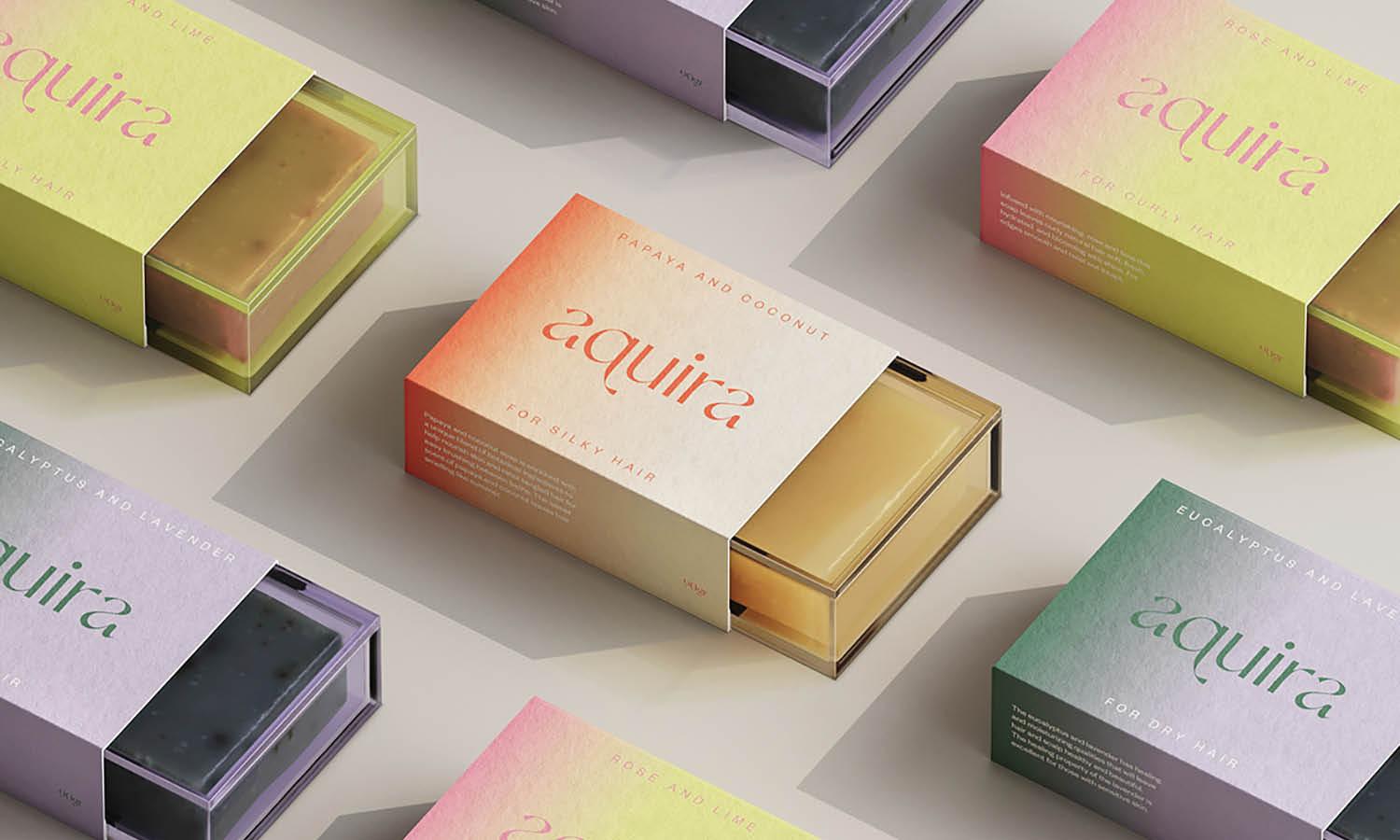
Source: Rosana Sousa, Aquira, Behance, https://www.behance.net/gallery/137663435/Aquira-Solid-Shampoo-Packaging

Source: Diego Leyva, Manisante, Behance, https://www.behance.net/gallery/132013447/MANISANTE

Source: Zoe Designs, The Soap Co., Behance, https://www.behance.net/gallery/138156965/The-Soap-Co-Artisan-Soap-Branding

Source: Godbout Isabel, Savons Milca, Behance, https://www.behance.net/gallery/134371645/Savons-Milca-Collection-Visage

Source: Maria Famenka, Olivier Logo, Behance, https://www.behance.net/gallery/182541355/Olivier-logobrand-identity-for-soap

Source: Mariah Phillips, Calia, Behance, https://www.behance.net/gallery/101334285/Calia

Source: Larissa Graboski, Shower No'ah, Behance, https://www.behance.net/gallery/119744169/Shower-Noah-Sua-beleza-em-harmonia-com-a-natureza

Source: Grzegorz Podgórski, Herper Hygienics, Behance, https://www.behance.net/gallery/157800523/Herper-Hygienics-identyfikacja-wizualna

Source: Openmint Studio, Pooops!, Behance, https://www.behance.net/gallery/126210895/POOOPS

Source: Eddie Zarate, Wild Grove, Behance, https://www.behance.net/gallery/220339991/Wild-Grove-Logo-Visual-Identity

Source: Becca Hand, Solid Olive, Dribbble, https://dribbble.com/shots/26387083-Solid-Olive-Logo

Source: Marina Zakharova, Dheo, Dribbble, https://dribbble.com/shots/25044103-Dheo-Cosmetic-brand-logo

Source: Валентина Садчикова, Bianchi, Behance, https://www.behance.net/gallery/187199003/logotipLogosoapBianchi

Source: Earlybirds Design, SinceToday, Behance, https://www.behance.net/gallery/139575821/SinceToday-PuruPuru-facial-mask

Source: Glasfurd and Walker, Eluo, Behance, https://www.behance.net/gallery/72356501/Eluo-Facial-Masks-Polishes

Source: Lyon & Lyon, Mighty Green, Behance, https://www.behance.net/gallery/84174765/MIGHTY-GREEN

Source: Alisa Peti, Florene, Behance, https://www.behance.net/gallery/130358913/Florene

Source: Ju+ Design, Natur, Behance, https://www.behance.net/gallery/128187819/Natur-Visual-Identity-Design

Source: Zakaria Falel, Laura Soap, Behance, https://www.behance.net/gallery/142353445/laura-soap-brand-design

Source: Kirill Borisov, Elizabeth Bath & Hygge, Behance, https://www.behance.net/gallery/122611707/HOMEMADE-SOAP-BRAND

Source: Dan Swift, Sope, Behance, https://www.behance.net/gallery/100270165/Sope

Source: PassionSwirls Creative, Syli, Behance, https://www.behance.net/gallery/140053009/SYLI-Soap-Emporium

Source: Archive Design Studio, Lushloop, Behance, https://www.behance.net/gallery/218469057/LUSHLOOP-BRAND-IDENTITY-Bottled-Body-Soap

Source: Vadim Carazan, CleanBee, Dribbble, https://dribbble.com/shots/25132601-CleanBee-logo-design

Source: U sun Hwang, Fanfare, Behance, https://www.behance.net/gallery/63388015/Fanfare-hand-soap
Which Fonts Work Best For Hygiene Logo Design?
Choosing the right font for a Hygiene Logo Design can be as refreshing as stepping into a room filled with crisp, clean air. Fonts are not just letters; they are personalities that set the tone for your brand’s identity. When it comes to hygiene-focused businesses, the typography should convey freshness, trustworthiness, and clarity while still standing out in a crowded market. Below are five fun and unique points to guide your choice of fonts for a Hygiene Logo Design.
Clean And Sans-Serif Fonts Create A Modern Vibe
Sans-serif fonts are a go-to option for any Hygiene Logo Design because they instantly give off a fresh, uncluttered feeling. Think of fonts like Helvetica, Lato, or Open Sans, which are smooth and easy to read. They mirror the simplicity and neatness that customers expect from hygiene-related products or services.
Rounded Fonts Add A Friendly And Gentle Touch
If you want your Hygiene Logo Design to feel approachable and warm, rounded fonts work like magic. Fonts such as Nunito or Quicksand create a soft, inviting appearance that’s perfect for personal care brands or family-oriented hygiene products. They show cleanliness without feeling cold or clinical.
Elegant Serif Fonts Suggest Premium Quality
For businesses looking to project a high-end or luxurious image, classic serif fonts can be an excellent choice. Fonts like Playfair Display or Cormorant Garamond bring a sense of sophistication to your Hygiene Logo Design while still maintaining readability. They suggest quality and attention to detail, ideal for upscale hygiene services or specialty goods.
Geometric Fonts Convey Structure And Reliability
Geometric fonts are built from simple shapes, which makes them look precise and trustworthy. Fonts like Futura or Avenir project professionalism and order—perfect traits for a Hygiene Logo Design in the medical or industrial cleaning sector. Their balanced shapes echo a sense of reliability and high standards.
Custom Or Handwritten Fonts Add Unique Personality
Sometimes, a custom font or subtle handwritten style can make your Hygiene Logo Design truly memorable. A carefully drawn script or lightly brushed lettering can express creativity and individuality while still keeping the design neat. This approach is especially appealing for boutique hygiene brands or eco-friendly products that want to stand out from mass-market competitors.
In short, fonts have the power to transform your Hygiene Logo Design from ordinary to extraordinary. Whether you choose a clean sans-serif, a soft rounded style, an elegant serif, a bold geometric look, or a custom script, your typography should echo the freshness, trust, and clarity that define the essence of hygiene. By blending style with meaning, your font choice becomes more than just text—it becomes a signature of your brand’s clean and confident identity.
Which Symbols Represent Cleanliness in Logos?
Diving into the world of hygiene logo design, the symbols you choose become the visual vocabulary you communicate with. These icons aren’t just pretty pictures; they’re potent signals that instantly convey cleanliness and hygiene. Here’s a rundown of the top five symbols that are practically sparkling with cleanliness, perfect for making your hygiene logo design shine.
The Water Drop: Purity in Every Pixel
The water drop is a classic symbol of cleanliness and purity. It’s straightforward yet powerful, often used to represent freshness, cleanliness, and natural purity. Whether it’s indicating moisture in hand sanitizers or representing the aqueous solutions of cleaning products, the water drop is like the universal solvent of hygiene symbols—clean, clear, and essential.
The Sparkle: Twinkle, Twinkle, Clean Little Star
Nothing says "spotless" like a sparkle or a starburst symbol. These little icons are often used to denote something shiny, new, or freshly cleaned. They’re the visual equivalent of the sparkle in your eye when you see a perfectly clean surface. Adding a sparkle to your hygiene logo can give it an energetic, effervescent character that promises top-notch cleanliness and brilliance.
The Leaf: Green Means Clean
Incorporating a leaf into your hygiene logo can suggest eco-friendliness and natural ingredients, which are increasingly important in today's market. Leaves symbolize growth, nature, and health—qualities that align well with eco-conscious cleaning products and organic hygiene solutions. They tell your customers that your brand respects the planet while tackling grime. Think of it as the badge of honor for green, clean living.
The Shield: Guarding Against Germs
A shield symbol conveys protection and safety, making it a fitting choice for hygiene logos, especially in sectors like healthcare and public sanitation. It reassures the viewer that they are shielded from germs, bacteria, and viruses. Using a shield can position your brand as a defender of health, a frontline warrior in the battle against dirt.
The Bubbles: Effervescent Clean
Bubbles are synonymous with cleanliness. They are playful, light, and most importantly, they signify scrubbing action. From dish soaps to bathroom cleaners, bubbles indicate a deep clean. Including bubbles in your hygiene logo can make it appear more dynamic and visually interesting, adding a sense of thorough cleansing power that’s both fun and effective.
By choosing the right symbols for your hygiene logo design, you're not just creating an image; you’re crafting a narrative about your brand's dedication to cleanliness and health. Whether it’s the purity of water, the brilliance of a sparkle, the natural touch of a leaf, the protective embrace of a shield, or the bubbly cheer of soap suds, each symbol packs a visual punch. Let your logo tell a clean story, one symbol at a time!
What Colors Are Best for Hygiene Logo Designs?
Color is a powerful communicator, especially when it comes to the crisp, clean aesthetic required for a hygiene logo design. Choosing the right colors can make or break how consumers perceive your brand’s commitment to cleanliness. Here are the top five colors that shine the brightest in hygiene-focused branding, each bringing its own unique flavor of freshness to the table.
Brilliant Blue: A Trusty Tide of Cleanliness
Blue is the champion of hygiene colors, often associated with cleanliness, water, and tranquility. This color can range from the deep, confident navy to the soft, serene sky blue. Blue is a universal favorite in healthcare and cleaning product logos because it evokes a feeling of calm and reliability. It's like that trusty pair of rubber gloves under the sink—always there, always dependable.
Pristine White: The Quintessential Clean
White is purity personified. It’s the color of fresh snow, crisp linens, and, of course, the doctor’s lab coat. In hygiene logo design, white stands for simplicity and sterility, offering a visual cue of unblemished purity. Utilizing white in your logo can create a sense of space and clarity, making it a perfect canvas for your cleanliness message to shine.
Green: The Fresh Face of Clean
Green brings a fresh and eco-friendly vibe to hygiene logo designs. It’s the color of nature, health, and renewal—qualities that are perfect for brands focusing on organic or natural cleaning products. From minty hues to deep forest greens, this color communicates a commitment to environmentally safe practices and products. Think of it as the color of the reusable cleaning cloth, both eco-conscious and effective.
Silver and Gray: The Sleek Side of Sanitation
Silver and gray often stand in for the metallic, the technological, and the modern in logo design. These colors are synonymous with stainless steel—a material prevalent in medical and professional kitchens, where cleanliness is paramount. Using these colors in your hygiene logo can convey a sense of cutting-edge cleanliness technology and high efficiency. It’s the high-tech air purifier of colors, silently and effectively doing its job.
Soft Pastels: Gentle, Soothing, and Clean
Soft pastels, like pale pinks, lavenders, and light yellows, offer a gentle, comforting approach to hygiene. These colors are often used in products targeting sensitive areas, such as baby or skincare items, where harsh chemicals are a no-go. Pastels communicate care and gentleness, appealing to consumers looking for a tender touch in their cleanliness. They’re the soft, hypoallergenic wipes in the world of hygiene colors—safe, soothing, and sensitive.
Integrating these colors into your hygiene logo design can help you tap into the visual psychology of your target audience, encouraging them to see your brand as a beacon of cleanliness and trust. Choose wisely, and let your colors broadcast your brand’s commitment to hygiene in the loudest hues!
What Are Some of the Best Imagery for Hygiene Logo Design?
Creating a hygiene logo design that not only resonates with cleanliness but also captivates the audience requires a clever blend of imagery. In the sparkling world of clean brands, the images you choose are not just visual elements; they're ambassadors of trust and purity. Here’s a look at five types of imagery that can turn your hygiene logo into a beacon of cleanliness and professionalism.
The Pristine Hands: A Symbol of Personal Care
Hands are a universal symbol of personal hygiene. Featuring imagery of hands in a logo, whether they're washing, holding a product, or presented in a clean, unblemished state, speaks volumes about personal care and cleanliness. This imagery is particularly effective for brands that focus on hand sanitizers, soaps, or other personal hygiene products. It's like giving your customers a virtual handshake, one that promises cleanliness and care with every interaction.
Sparkling Surfaces: Reflecting Cleanliness
A shining surface, whether it's a gleaming floor, a spotless countertop, or even a radiant window, can be powerful imagery for hygiene logos. This type of image conveys effectiveness and thoroughness, ideal for businesses specializing in cleaning services or products that promise a spotless finish. These visuals are akin to the satisfying reveal in a cleaning advertisement, where the product leaves everything looking new and untouched.
Water Elements: The Essence of Purity
Water, in any form—be it a drop, a wave, or even steam—can significantly enhance the clean feel of a hygiene logo. Water imagery is versatile and can be used to suggest freshness, purity, and natural cleansing properties. It’s particularly effective for brands promoting products like water filters, shower supplies, or aquatic spa services. The sight of water in a logo can be as refreshing as the product itself, making it a perennial favorite in hygiene design.
Botanical Elements: Nature’s Clean Agents
Incorporating leaves, flowers, or even herbal motifs can suggest an eco-friendly approach and natural purity. This imagery works well for brands that pride themselves on using organic or natural ingredients. Botanical elements in a hygiene logo can communicate safety and gentleness, appealing to consumers who prefer products without harsh chemicals. It's a way to show that your brand cleans with the power of nature, not against it.
Protective Shields: Guarding Health and Cleanliness
Using a shield or barrier in hygiene logos symbolizes protection and safety—key aspects when it comes to cleanliness. This type of imagery is ideal for products or services that focus on protecting the user from germs, bacteria, and viruses. It reassures customers that they are shielded from contaminants and that health is a priority. Think of it as the visual equivalent of saying, "We've got you covered against germs.”
The right imagery in your hygiene logo design can do more than just make it look good—it can communicate your brand’s values and promises. From the reassuring touch of clean hands and the gleam of spotless surfaces to the freshness of water, the natural appeal of botanicals, and the sturdy protection of shields, each image is a piece of the story your brand wants to tell. Choose wisely, and let your logo speak in clean, clear visuals!
What Are The Best Shapes For A Friendly Hygiene Logo Design?
Shapes are like secret storytellers in any Hygiene Logo Design—they speak volumes before a single word is read. When you want your hygiene-focused brand to feel welcoming, approachable, and trustworthy, the shapes you choose are just as important as the colors or fonts. The right forms can instantly send signals of care, safety, and freshness, turning an ordinary logo into something that feels warm and relatable. Below are five fun and unique shape ideas to consider for a friendly Hygiene Logo Design.
Soft Circles And Ovals Symbolize Care And Inclusivity
Circles and ovals are naturally friendly shapes. They’re smooth, continuous, and comforting to the eye. In a Hygiene Logo Design, they can represent protection, wholeness, and care—perfect for brands offering personal hygiene products, cleaning services, or wellness solutions. A circle enclosing your symbol or text creates a cozy, safe feeling that customers subconsciously appreciate.
Gentle Waves Suggest Freshness And Flow
Wave-like shapes bring a sense of motion, water, and cleanliness. Incorporating soft curves or flowing lines into a Hygiene Logo Design signals freshness, purity, and renewal. This approach works wonderfully for handwash brands, cleaning products, or even eco-friendly hygiene services, where the idea of gentle yet effective care is key.
Rounded Rectangles Offer Stability Without Harshness
While sharp-edged rectangles feel rigid, their rounded-corner counterparts strike a balance between stability and friendliness. Using rounded rectangles in a Hygiene Logo Design can frame your text or icon neatly while keeping the tone approachable. They’re ideal for brands that want to communicate professionalism but avoid feeling too clinical.
Leafy Or Natural Silhouettes Highlight Gentle Care
Organic shapes like leaves, petals, or subtle plant-inspired icons bring a nurturing and eco-conscious feel to a Hygiene Logo Design. These soft, asymmetrical forms hint at natural ingredients, sustainability, and gentle effectiveness, which resonates strongly with today’s hygiene-conscious consumers who also care about the environment.
Bubbles And Droplets Convey Cleanliness And Playfulness
Nothing says “fresh and clean” quite like bubbles or water droplets. Incorporating these shapes into a Hygiene Logo Design creates an instant connection to washing, purity, and sparkling results. Their rounded, airy look adds a playful edge that works for both family-friendly hygiene products and fun service brands.
By weaving these shape ideas into your Hygiene Logo Design, you can craft a logo that feels welcoming and fresh while still signaling trust and care. Whether you use circles, waves, rounded rectangles, natural silhouettes, or bubbles, each choice helps define your brand’s personality. The right shape transforms your logo into more than just a graphic—it becomes a friendly handshake from your business to your customers, promising cleanliness and confidence in every interaction.
Conclusion
A thoughtful approach to shape, color, and typography can make a big difference when developing a Hygiene Logo Design. By using circles, waves, rounded rectangles, natural motifs, or bubbles, you can convey a sense of freshness, care, and reliability. Each element you choose speaks directly to your audience and shapes how they perceive your brand. A well-planned Hygiene Logo Design does more than look attractive—it builds trust and communicates your values at a glance. Whether you’re creating a new identity or refining an existing one, focusing on these details helps ensure your logo feels both inviting and memorable.
Let Us Know What You Think!
Every information you read here are written and curated by Kreafolk's team, carefully pieced together with our creative community in mind. Did you enjoy our contents? Leave a comment below and share your thoughts. Cheers to more creative articles and inspirations!





Leave a Comment