30 Best Dentist Logo Design ideas You Should Check

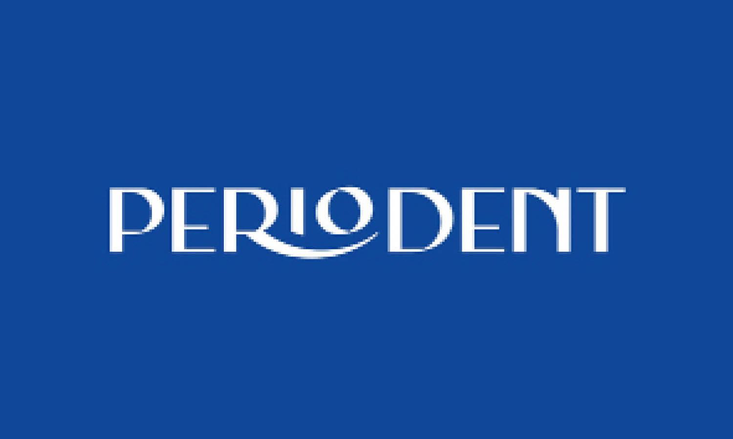
Source: Roche Studio, Periodent, Behance, https://www.behance.net/gallery/146001705/Periodent-branding
A great smile deserves a great first impression, and nothing captures that better than a thoughtfully crafted dentist logo design. This article dives into some of the best ideas you can check to make your dental practice’s branding truly shine. From crisp and clean aesthetics to playful and approachable visuals, dentist logo design has evolved into an exciting field full of creativity and meaning.
Whether you’re opening a modern dental studio, a family-friendly clinic, or a specialized orthodontic practice, the right logo can immediately communicate trust, care, and professionalism. Imagine a simple tooth outline transformed into a bold geometric icon, or a subtle smile hidden within the lettering to evoke friendliness. Color choices, shapes, and typography all work together to set the tone, letting patients know they’re in good hands before they even walk in the door.
This introduction sets the stage for exploring dentist logo design ideas that stand out, appeal to different audiences, and help define a practice’s identity. By blending creative elements with a sense of warmth and expertise, these designs show how branding can make even a routine check-up feel a little more inviting and memorable.
Coffee Product Logo Design Ideas

Source: Dous Studio, Doctor Otero, Behance, https://www.behance.net/gallery/115473893/Doctor-Otero

Source: Junior Russo, PFAU Odontologia, Behance, https://www.behance.net/gallery/144651655/Pfau-Odontologia

Source: Agu Wu, Toothtopia, Behance, https://www.behance.net/gallery/74384995/Toothopia-Kids-Dentist

Source: Ahmed Essam, Behance, https://www.behance.net/gallery/179914371/Roots-clinic-logo-design-and-branding

Source: Fernando Magri, Leonardo Balancin, Behance, https://www.behance.net/gallery/112116891/Leonardo-Balancin

Source: Anant Sonawane, Dentique, Behance, https://www.behance.net/gallery/79700547/Dentique

Source: Felice Della Gatta, The Dentists of Sunbury, Dribbble, https://dribbble.com/shots/24997589-The-Dentists-of-Sunbury-Brand-Identity

Source: 光 Matt Arey, Sonrisse, Behance, https://www.behance.net/gallery/230860627/Sonrisse-Brand-Identity

Source: Pedro Bernardes, Carol Lopes, Behance, https://www.behance.net/gallery/144493363/Carol-Lopes-Odontologia-Integrada

Source: Palma Studio, Dent, Behance, https://www.behance.net/gallery/131960665/Dent

Source: Tap Content, Dentall, Behance, https://www.behance.net/gallery/195806365/DentAll

Source: Vini Almeida, DOM, Behance, https://www.behance.net/gallery/144890347/DOM-Odontologia-Especializada

Source: Riley Carroll, East Nashville Dental, Dribbble, https://dribbble.com/shots/4222778-East-Nashville-Dental-Co

Source: Studioborn.Co, Orthodontist, Instagram, https://www.instagram.com/p/BRn4XWPD42L/

Source: _Studiowam, Instagram, https://www.instagram.com/p/CQQYEq2tZp3/

Source: Candaceljoseph, Shelby Dental, Instagram, https://www.instagram.com/p/BuX8tK3gQCA/

Source: Lawren4kinship, Shine Dental, Instagram, https://www.instagram.com/p/ByYGRFmleEz/

Source: Meghan Stewart, Joy in a Smile, Dribbble, https://dribbble.com/shots/2266847-Joy-in-a-Smile

Source: Marcio Nascimento, Allison Rebello, Behance, https://www.behance.net/gallery/124272005/Allisson-Rebello-Cirurgiao-Dentista

Source: Arif Mahabub, Dentalhesia, Dribbble, https://dribbble.com/shots/20767405-Dentalhesia-Logo-and-brand-identity-design

Source: Balsamstudio, Scandinavian Clinic, Behance, https://www.behance.net/gallery/60505585/Scandinavian-Clinic

Source: Awp — As We Proceed, Maison Dentaire, Behance, https://www.behance.net/gallery/106880249/MAISON-DENTAIRE-No32

Source: Baianat, Mohamed Elashmawy, Behance, https://www.behance.net/gallery/121282409/Dr-Mohamed-Elashmawy-dental-care-clinics-brand-design

Source: Dan Feldman, Tend, Behance, https://www.behance.net/gallery/93146323/Tend-Brand-Identity

Source: Hasanakcaydesign, Rooted Dental, Instagram, https://www.instagram.com/p/CR610G-DOJn/

Source: Avincer Studio, Marilene Sales, Behance, https://www.behance.net/gallery/94945647/Marilene-Sales-Odontologist-Visual-Brand

Source: Ciano Design, Orthowise, Behance, https://www.behance.net/gallery/120982511/Orthowise

Source: Dudu Blanco, Clinica Dental, Behance, https://www.behance.net/gallery/63276669/Clinica-Dental-Restyling

Source: Logorilla, Sail Smile Dentistry, Dribbble, https://dribbble.com/shots/25934079-sail-smile-dentistry

Source: Roche Studio, Periodent, Behance, https://www.behance.net/gallery/146001705/Periodent-branding
What Shapes Work Best In A Friendly Dentist Logo Design?
Creating a warm and welcoming impression is essential for any dental practice, and one of the easiest ways to achieve that is through the shapes used in its branding. In dentist logo design, shapes are more than just decorative elements—they subtly influence how patients feel about your practice before they even step inside. Here are five shape ideas that can instantly add a friendly and approachable vibe to your logo while still keeping it professional and memorable.
Soft Rounded Shapes
Curved lines and gentle edges instantly evoke feelings of comfort and care. In dentist logo design, circles, ovals, and rounded corners on icons or frames can soften the clinical feel often associated with dentistry. These shapes suggest approachability and empathy, making them perfect for family-oriented or pediatric dental practices.
Smile-Inspired Arcs
Nothing says “friendly” like a smile! Incorporating subtle arcs or curved lines reminiscent of a grin can immediately communicate positivity and warmth. Whether tucked beneath a tooth icon or built into the lettering itself, smile-inspired shapes in dentist logo design help patients feel at ease and reinforce your focus on healthy, happy smiles.
Tooth Outlines With Playful Twists
A tooth outline is a classic choice, but giving it a playful twist—like soft waves, stylized hearts, or rounded corners—transforms it into something more approachable. In dentist logo design, these variations signal professionalism while also showing that your practice is friendly, modern, and fun.
Interlocking Or Overlapping Shapes
Using interlocking circles, gentle overlaps, or linked icons creates a sense of connection and trust. These shapes work wonderfully for group practices or dental offices emphasizing teamwork and patient relationships. In dentist logo design, they convey unity and collaboration, making your practice feel like part of the community rather than just another clinic.
Nature-Inspired Silhouettes
Shapes inspired by nature—like leaves, waves, or sunbursts—bring freshness and vitality to your branding. In dentist logo design, these organic forms communicate health, renewal, and a holistic approach to care. They’re especially effective for practices offering eco-friendly or wellness-based dental services, adding a warm and earthy touch to your look.
By thoughtfully selecting shapes, you can transform a simple design into a powerful symbol of friendliness and care. From soft curves to smile arcs and nature-inspired icons, the right shapes in dentist logo design help your practice stand out while making patients feel welcome and relaxed.
What Colors Are Best for a Dentist Logo Design?
Choosing the right colors for a dentist logo design is crucial in setting the tone and communicating the values of the dental practice. Colors not only enhance the aesthetic appeal but also trigger psychological responses that can make your brand more memorable and trustworthy. Here are five colors that work wonders for dentist logos, each bringing its own unique vibe to your brand identity:
Soothing Blue
Blue is a no-brainer when it comes to dentist logo design. Renowned for its calming effects, blue can help soothe anxiety, a common emotion in dental patients. It’s also associated with cleanliness, health, and professionalism—key attributes for any dental practice. Lighter shades of blue can evoke a sense of safety and serenity, while darker shades convey reliability and trust. Integrating blue into your logo can make your dental office appear more welcoming and trustworthy.
Clean White
White is another popular choice, often used to symbolize purity, cleanliness, and simplicity. It’s a fantastic background color for any dental logo as it suggests a sterile and hygienic environment—exactly what you want from a dental practice. White can also be used to create negative space within the design, adding a modern twist to traditional symbols like teeth or dental tools.
Healthy Green
Green is a refreshing choice for a dentist logo, particularly if you want to emphasize wellness and natural care. It’s associated with health, tranquility, and renewal. Light greens can be calming and soothing, while deeper greens are often associated with prestige and wealth. For practices that specialize in eco-friendly or holistic dental services, green is a perfect color to underline these unique selling points.
Friendly Orange
If you're aiming to project a more approachable, friendly, and youthful image, orange is a great option. It’s vibrant and energetic, which can make your logo more inviting and less intimidating. Orange combines the energy of red and the happiness of yellow, often associated with creativity and affordability. It’s an excellent choice for family dentistry or pediatric practices that want to appear fun and welcoming to children and young families.
Professional Grey
Grey is the go-to color if you want to strike a balance between professional sophistication and modern minimalism. It’s perfect for creating a sleek, high-end look that appeals to an adult clientele. Grey can also be used as a complementary color to soften the impact of more vibrant colors or to add a touch of elegance and formality to your logo design.
When designing your dentist logo, consider how these colors can be combined to reflect the personality and specialization of your practice. The right color palette not only enhances visual appeal but also reinforces the emotional and psychological comfort your patients seek in dental care.
What Fonts Work Best for a Dentist Logo Design?
Selecting the right font for your dentist logo design is as crucial as choosing the perfect color palette or symbol. The font sets the tone and communicates your practice's personality, whether it's modern and sleek or warm and welcoming. When it comes to dentist logo designs, certain fonts have proven to be particularly effective in ensuring the logo is not only visually appealing but also conveys trust and professionalism. Here are five types of fonts that work wonders in dentist logos:
Sans-Serif Fonts: The Modern Choice
Sans-serif fonts are a popular choice for dentist logos due to their clean and contemporary look. These fonts are characterized by their lack of decorative strokes (serifs) at the ends of letters, making them appear more streamlined and modern. Fonts like Helvetica, Arial, and Futura are excellent examples that offer readability and simplicity, which help in creating a professional and approachable look.
Serif Fonts: Classic and Trustworthy
If you want your dental practice to exude a sense of tradition and reliability, serif fonts are the way to go. With their decorative strokes, serif fonts such as Times New Roman, Garamond, and Georgia suggest a classic and established practice. These fonts are often associated with professionalism and can help in making the logo appear more dignified and trustworthy.
Script Fonts: Personal and Friendly
Script fonts, which mimic cursive handwriting, can add a personal touch to your dentist logo design. They are ideal for practices that want to project a friendly and inviting image. Fonts like Brush Script or Lucida Handwriting can convey warmth and care, making patients feel more at ease. However, it’s important to ensure that the script is legible, especially when scaled down to smaller sizes, to maintain clarity in all forms of communication.
Display Fonts: Bold and Memorable
Display fonts are designed to make a strong impression. They are usually more decorative and can be tailored to fit your brand's unique personality. Whether it's a bold, blocky typeface or something more whimsical and playful, display fonts can make your logo stand out. These are particularly effective for pediatric dental practices or those aiming to make a more creative or bold statement.
Geometric Fonts: Sleek and Stylish
Geometric fonts are defined by their clean lines and clear shapes, which can give a logo a modern and minimalist feel. Fonts like Futura or Avant Garde are based on geometric shapes like circles and squares, making them highly stylized yet simple. These fonts work well for dental practices that emphasize innovation and modern dental technologies.
When choosing the font for your dentist logo design, it's essential to consider the overall message you want to communicate. The right font will not only be aesthetically pleasing but will also resonate with your target audience, enhancing your practice's branding efforts. The goal is to choose a font that complements your logo’s other elements, ensuring a cohesive and professional look that instills confidence and comfort in your patients.
What Creative Layouts Work For Dentist Logo Design?
A logo’s layout determines how all its visual elements—icons, text, colors, and shapes—come together to create a memorable impression. In dentist logo design, a creative layout can instantly elevate your practice’s identity and make it feel approachable, professional, and fresh. Whether you’re launching a new clinic or refreshing an existing brand, exploring inventive layouts helps your logo feel as dynamic and welcoming as the smiles you create. Below are five creative layout ideas that work beautifully for dentist logo design.
Vertical Stack Layout
Arranging icons above text creates a clean, balanced look that’s perfect for signage, business cards, and social media. In dentist logo design, placing a tooth or smile icon on top of your clinic’s name gives the design a clear hierarchy and makes it easy to recognize at a glance. This layout feels modern and uncluttered, ideal for practices that want a sleek and straightforward image.
Circular Badge Layout
Circular layouts bring unity and friendliness to a logo. In dentist logo design, enclosing your icon and text within a round badge or seal can create a polished and trustworthy appearance. This approach works especially well for family or community-focused clinics, where the circle symbolizes wholeness, care, and continuity.
Split Icon And Text Layout
Breaking the logo into two distinct halves—one for the icon, one for the text—offers a flexible and contemporary feel. In dentist logo design, you might place a stylized tooth on the left with your clinic name on the right, separated by a clean line or color block. This layout is versatile for digital and print, making your brand instantly adaptable across platforms.
Emblem With Hidden Smile Layout
An emblem-style layout that cleverly integrates a hidden smile or dental instrument into the overall shape creates a memorable and playful identity. In dentist logo design, these subtle surprises delight viewers and reinforce your focus on happy, healthy smiles. It’s a creative way to show personality without sacrificing professionalism.
Overlapping Layers Layout
Using overlapping shapes, gradients, or icons can add depth and movement to your logo. In dentist logo design, layering a translucent tooth shape over a soft color field or combining multiple icons signals innovation and energy. This layout style is perfect for practices that want to showcase a modern, forward-thinking approach to dental care.
By experimenting with these layouts, you can craft a dentist logo design that’s not only visually striking but also resonates with patients. From vertical stacks to hidden emblems, each creative arrangement offers a different way to communicate care, trust, and personality, turning your logo into a powerful symbol of your practice’s values.
What Textures Bring Depth To A Dentist Logo Design?
Adding texture to a logo is like giving it a personality boost—it turns a flat design into something that feels tactile, memorable, and full of character. In dentist logo design, textures can evoke cleanliness, care, innovation, or warmth, depending on how they’re applied. They not only make your branding visually engaging but also help communicate your practice’s unique vibe. Below are five texture ideas that bring depth and interest to a dentist logo design while keeping it professional and approachable.
Subtle Glossy Shine Texture
A soft, glossy finish can make your logo feel fresh and polished, much like a perfectly cleaned tooth. In dentist logo design, this texture works especially well for icons shaped like teeth or smiles. The glossy effect suggests hygiene, expertise, and attention to detail, giving your logo a sleek, modern edge without overwhelming it.
Gentle Gradient Texture
Gradients add dimension and flow, making flat colors come alive. In dentist logo design, a gentle gradient—such as a shift from aqua to soft white—can symbolize freshness and clarity. This texture feels airy and welcoming, perfect for clinics that want to highlight a calming and patient-focused environment.
Soft Brushed Or Watercolor Texture
Using a brushed or watercolor effect introduces a human, artistic touch. In dentist logo design, this texture can soften sharp edges and make your branding feel more personable. It’s especially appealing for pediatric or family practices, where warmth and approachability are key.
Minimal Linework Or Hatch Texture
Incorporating fine linework or subtle hatching adds structure and sophistication to a logo. In dentist logo design, these textures can outline tooth shapes, dental tools, or even typography to create a distinctive look. This approach signals precision and expertise, making it ideal for specialized or high-tech dental services.
Organic Patterns Inspired By Nature
Nature-inspired textures—like soft leaf veins, rippling water, or gentle waves—add freshness and vitality. In dentist logo design, these organic patterns can suggest holistic care, eco-conscious practices, or renewal. They bring a sense of calm and healthfulness, making patients feel relaxed and confident in your services.
When used thoughtfully, texture transforms a simple dentist logo design into something that’s not just seen but felt. Whether you choose glossy highlights, gradients, artistic brushes, precise linework, or organic patterns, the right texture can elevate your branding and set the tone for a welcoming, trustworthy practice. Each option gives your logo a unique depth that resonates with patients and makes your clinic stand out.
Conclusion
A well-designed logo is more than just a visual—it’s the first handshake between your practice and your patients. In dentist logo design, every choice of shape, texture, and layout plays a role in communicating professionalism, care, and trust. By combining friendly forms, thoughtful color palettes, and creative details, your branding can instantly make patients feel at ease while showcasing your expertise. A strong dentist logo design not only strengthens recognition but also builds confidence in your services. Investing time in refining these elements ensures your practice stands out as welcoming, reliable, and memorable in the minds of your community.
Let Us Know What You Think!
Every information you read here are written and curated by Kreafolk's team, carefully pieced together with our creative community in mind. Did you enjoy our contents? Leave a comment below and share your thoughts. Cheers to more creative articles and inspirations!


Leave a Comment