30 Best Medicine Logo Design Ideas You Should Check

Source: Elina Kobylianska, Stantors, Behance, https://www.behance.net/gallery/113730887/STNTRS-Brand-identity-Packaging-design-system
When it comes to Medicine Logo Design, creativity meets trust, and innovation pairs with clarity. This article is set to highlight some of the most inspiring and effective ideas that bring the world of healthcare branding to life. In today’s competitive landscape, a well-crafted logo does more than identify a clinic, pharmacy, or wellness brand—it communicates professionalism, compassion, and reliability at first glance.
From sleek modern symbols to timeless emblems inspired by classic medical imagery, Medicine Logo Design ideas now go far beyond stethoscopes and caduceus symbols. Think calming color palettes, minimalistic cross motifs, abstract human figures, and clever typography that reflects care and expertise. Each design trend offers a unique way to connect with patients, stand out from competitors, and build long-term trust.
In this article, you’ll discover how thoughtful composition, innovative shapes, and strategic color choices can elevate your healthcare branding. Whether you’re a designer seeking fresh inspiration or a medical professional aiming to refresh your identity, these Medicine Logo Design ideas will spark creativity and guide you toward a logo that feels both modern and meaningful. Get ready to explore options that balance style with substance and truly resonate with your audience.
Medicine Logo Design Ideas

Source: Youne Comunicação, Mais Brasil, Behance, https://www.behance.net/gallery/163428003/Rebranding-Mais-Brasil

Source: Rodrigo Balbino, Endosclínica, Behance, https://www.behance.net/gallery/140823939/Endosclinica

Source: Jessica Kuhn, Medclin, Behance, https://www.behance.net/gallery/111115327/Medclin-Logo

Source: Fable & Co., Medow, Behance, https://www.behance.net/gallery/124677567/Medow

Source: TechUp Solutions, Healmetry, Behance, https://www.behance.net/gallery/235567515/Healmetry-Modern-Logo-For-Healthcare

Source: Abd Rahman Najjar, Hiliago Tan, Behance, https://www.behance.net/gallery/158136293/Hiliago-Tan-Branding-Packaging

Source: Ande Studio, Sotille, Behance, https://www.behance.net/gallery/156128173/Sotille

Source: Maxim Kadashov, Metode, Behance, https://www.behance.net/gallery/81328853/Metode-CGI

Source: Elian Vásquez, Complex Laboratory, Behance, https://www.behance.net/gallery/161172629/Complex-Laboratory

Source: A.W. Maria, Swiss Association for Functional Medicine, Behance, https://www.behance.net/gallery/153579383/Swiss-Association-for-Functional-Medicine

Source: Filipe Venezia, CallMed, Behance, https://www.behance.net/gallery/161160411/CallMed

Source: Alexandra Design Studio, Ortofizija, Behance, https://www.behance.net/gallery/166465495/Ortofizija-brand-identity

Source: Elif Kameşoğlu, LogicMed, Dribbble, https://dribbble.com/shots/21653693-LogicMed

Source: K9 Design, Chinese Medicine Ointment, Behance, https://www.behance.net/gallery/126817109/Chinese-Medicine-Ointment

Source: Cássio Podgaietsky, Laboratório Vidas, Behance, https://www.behance.net/gallery/125496857/Laboratorio-Vidas

Source: Rowen® Brand Agency, Anesfe, Behance, https://www.behance.net/gallery/154247913/Anesfe

Source: Sanja Toshikj, Sintera, Dribbble, https://dribbble.com/shots/26367983-Sintera

Source: Rakib, Pharma, Behance, https://www.behance.net/gallery/161666441/Pharma-brand-identity

Source: Daniel Ross Luft, Meds, Dribbble, https://dribbble.com/shots/24431629-Business-Card-for-Meds

Source: Yegor Orliuk, EcoPlex, Behance, https://www.behance.net/gallery/216592769/EcoPlex

Source: Hatypo Studio, Haigeia, Behance, https://www.behance.net/gallery/202735491/Haigeia-HealthcareMedical-Brand-Identity

Source: ShihabBrands, Dribbble, https://dribbble.com/shots/26673459-Healthcare-Medicine-Heart-Telemedicine-Hospital-Logo-Design

Source: Felipe Samir, Lauro Cesar, Behance, https://www.behance.net/gallery/164258549/Lauro-Cesar

Source: Agata Klama, Skinimal, Behance, https://www.behance.net/gallery/157076799/Skinimal-Brand-identity

Source: Mluz Clavel, Peter Garred's Laboratory, Behance, https://www.behance.net/gallery/129361501/Peter-Garreds-Laboratory

Source: Hassan Pervez, Medhome, Behance, https://www.behance.net/gallery/159037393/Medhome-Logo-Design

Source: MW Branding Agency, Ceremone, Behance, https://www.behance.net/gallery/160987445/Ceremone

Source: Dzuy Ngo, Vien Ngoc, Behance, https://www.behance.net/gallery/91006485/Vien-Ngoc-Oriental-Medicine-Clinic-Branding

Source: Vlad Pavlenko, Mashtaler, Behance, https://www.behance.net/gallery/148321177/MASHTALER-Identity

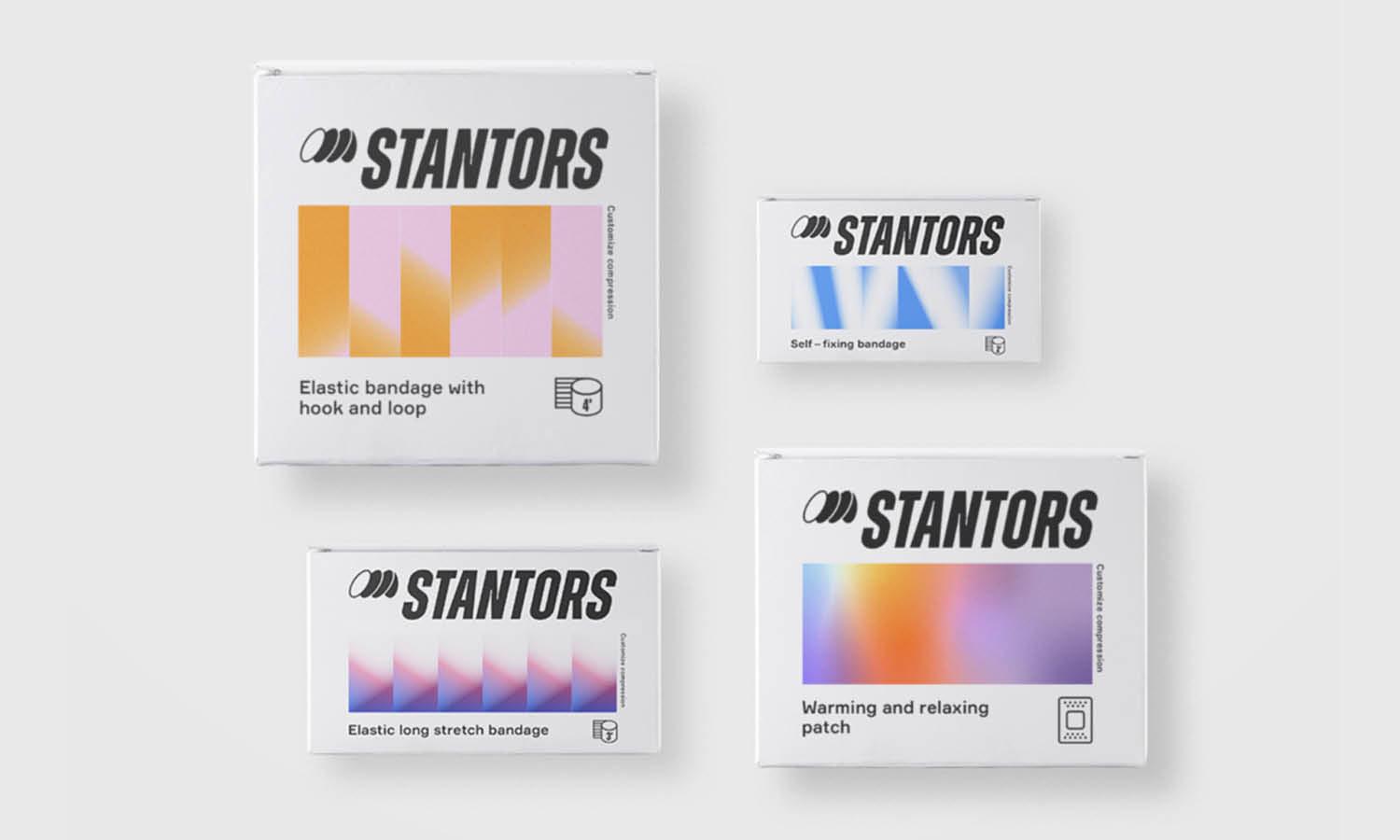
Source: Elina Kobylianska, Stantors, Behance, https://www.behance.net/gallery/113730887/STNTRS-Brand-identity-Packaging-design-system
What Symbols Represent Trust In Medicine Logo Design
When thinking about Medicine Logo Design, symbols are more than decorative—they carry meaning that reassures patients and builds confidence. Trust is one of the most valuable qualities in healthcare branding, and the right visual elements can express safety, care, and professionalism instantly. Below are five powerful types of symbols you can use to represent trust in Medicine Logo Design.
Crosses And Shields
The cross remains one of the most recognizable signs in the medical field, while shields evoke protection. Combining these two can create a powerful emblem of safety, care, and defense against harm. Whether styled as a bold geometric cross or a soft-edged shield, these shapes instantly communicate reliability and established expertise.
Hands And Caring Gestures
Hands symbolize compassion, human connection, and support—perfect for building emotional trust. A stylized hand cradling a heart, holding a leaf, or offering care can give a Medicine Logo Design a warm, approachable feel. This works especially well for clinics, wellness centers, and services that emphasize personalized care.
Natural Elements And Growth Motifs
Leaves, trees, and subtle plant patterns evoke healing and renewal. Incorporating natural elements gives your Medicine Logo Design a sense of harmony and holistic care, which can resonate with audiences looking for sustainable or integrative treatments. These motifs balance science with nature, suggesting a trustworthy and balanced approach.
Abstract Human Figures And Community Icons
Stylized silhouettes or figures reaching upward reflect vitality, health, and inclusivity. These abstract shapes can also represent teamwork and a supportive community. Using human-centric symbols in a Medicine Logo Design reassures patients that they are the heart of your mission. It’s a subtle but effective way to build trust.
Modern Medical Tools And Technology Icons
While traditional symbols like stethoscopes or heartbeats are familiar, sleek, modern versions of these icons can show that a brand is both innovative and dependable. Clean-line graphics of diagnostic tools or digital health symbols in a Medicine Logo Design communicate up-to-date knowledge without overwhelming the viewer, balancing innovation with professionalism.
Incorporating these five categories of symbols not only strengthens your Medicine Logo Design but also helps your brand communicate credibility and care at first glance. By thoughtfully selecting shapes that resonate with your audience, you can create a visual identity that feels inviting, professional, and above all, trustworthy.
What Graphic Styles Suit Medicine Logo Design
When it comes to Medicine Logo Design, the graphic style you choose can shape how people perceive your brand. In a field where trust, innovation, and care are essential, the style of your logo communicates just as much as the symbols or colors you pick. Below are five exciting graphic styles that suit Medicine Logo Design and make your branding feel both memorable and meaningful.
Minimalist And Clean Lines
A minimalist approach with crisp lines and uncluttered layouts helps communicate professionalism and reliability. This style suits hospitals, clinics, and pharmaceutical brands that want to appear clear, direct, and transparent. By stripping away excess detail, a minimalist Medicine Logo Design feels modern, trustworthy, and easy to recognize at any size.
Soft And Organic Illustrations
Gentle, rounded illustrations evoke compassion, warmth, and personal care. Think smooth shapes, hand-drawn curves, or watercolor textures that soften a brand’s appearance. This style is perfect for wellness centers, holistic medicine practices, or pediatric clinics, as it creates a nurturing and approachable look for your Medicine Logo Design.
Geometric And Structured Forms
Geometric styles use precise shapes—like hexagons, circles, or triangles—to represent structure, science, and order. This graphic approach conveys a sense of innovation and expertise, making it ideal for labs, biotech companies, or high-tech healthcare services. A geometric Medicine Logo Design balances technical credibility with visual clarity.
Icon-Based And Symbol-Heavy Designs
An icon-based style leans on bold, memorable symbols like medical crosses, hearts, or stylized stethoscopes. Using strong icons ensures quick recognition, especially in crowded markets. This approach works well when your Medicine Logo Design needs to be versatile across packaging, apps, signage, or uniforms while staying impactful and simple.
Futuristic And Tech-Inspired Looks
For brands focusing on cutting-edge treatments, telemedicine, or digital health, a futuristic style can work wonders. Sleek gradients, dynamic lines, and abstract patterns give a sense of forward-thinking care. This style makes your Medicine Logo Design stand out as innovative, modern, and attuned to the future of healthcare.
Each of these graphic styles has its own strengths, and the key is to align your choice with your brand’s personality and mission. Whether you opt for the simplicity of minimalism, the warmth of soft illustrations, the precision of geometric forms, the instant impact of icon-based designs, or the edge of futuristic looks, your Medicine Logo Design will communicate much more than just your name—it will tell a story of care, reliability, and progress.
What Typography Best Represents a Medical Logo Design?
Embarking on the quest to find the perfect typography for a Medicine Logo Design is like being a detective in the world of design – it's thrilling, challenging, and incredibly rewarding. In the sphere of Medicine Logo Design, the right choice of typeface is a crucial element that communicates your brand's identity and ethos. Let's explore, in a fun and unique way, the five essential typography choices that best represent a medical logo.
Sans Serif for Clarity and Modernity
Sans serif fonts are a go-to choice in Medicine Logo Design for their clean, clear, and modern appearance. These fonts, free from the decorative 'serifs' at the ends of strokes, offer unparalleled legibility and simplicity. They convey a sense of modernity and progressiveness, essential in the ever-evolving field of medicine. Fonts like Helvetica, Arial, or Futura could be your allies in creating a contemporary and professional look.
Serif Fonts for Tradition and Trust
If your brand aims to emphasize tradition, reliability, and trustworthiness, serif fonts are your best bet. These fonts, with their classic decorative strokes, evoke a sense of established credibility and enduring legacy. Times New Roman or Georgia, for instance, can lend an air of respected authority to your medical logo.
Humanist Fonts for Approachability
Humanist fonts strike a balance between the impersonal nature of sans serif and the formality of serif fonts. They are designed with an emphasis on readability and comfort, making them an excellent choice for pediatric or family medicine logos. Fonts like Gill Sans or Frutiger can help create a friendly and accessible brand image.
Geometric Fonts for Precision and Efficiency
Geometric fonts, characterized by their clean lines and perfect circles, convey a sense of precision and efficiency. They are ideal for specialties that pride themselves on technological advancement and precision, such as surgical centers or medical research facilities. Consider fonts like Futura or Avant Garde for a sleek, cutting-edge look.
Script Fonts for Personalization and Elegance
While not a common choice in Medicine Logo Design, script fonts can add a touch of elegance and personalization. They work well for boutique clinics, holistic medicine practices, or specialty medical services. Script fonts like Lucida Handwriting or Brush Script can give your logo a unique and personalized touch, but remember to prioritize readability.
The right typography for a Medicine Logo Design is a careful blend of clarity, tradition, approachability, precision, and personalization. It's not just about picking a font but about narrating your brand's story and ethos. With these insights, you're well on your way to creating a medical logo that's not just a visual symbol but a beacon of trust, care, and professionalism in the healthcare world.
What Are Some Symbols That Can Enhance Medicine Logo Design?
Symbols play a crucial role in crafting a memorable and meaningful medicine logo design. The right symbols can convey trust, care, and professionalism at a glance, making the logo resonate with patients and stakeholders alike. But not all symbols are created equal! Here are five impactful symbols that can take your medicine logo design to the next level:
The Cross
The cross is a universal symbol of healthcare and emergency medical services. Its simplicity and immediate recognition make it a go-to element in medicine logo design. Whether it's a red cross for emergency aid or a green cross often associated with pharmacies, this symbol has a timeless appeal. The cross can be styled in countless ways—modern, minimalistic, or even abstract—while still communicating its connection to healthcare.
The Rod of Asclepius
The Rod of Asclepius, featuring a single serpent entwined around a staff, is a classic medical symbol rooted in Greek mythology. Representing healing and medicine, this symbol adds an air of tradition and authority to a logo. It's especially effective for hospitals, medical associations, and educational institutions in the healthcare field. Bonus: it looks sleek and professional when incorporated into modern logo designs.
The Heart
Nothing says "care and compassion" quite like a heart. This symbol is perfect for medicine logo designs related to cardiology, general wellness, or patient-centered care. A heart can be creatively stylized—outlined, abstract, or paired with other elements like a heartbeat line—to make it more dynamic and unique. It's a versatile symbol that instantly connects with audiences on an emotional level.
DNA Strands
For medical fields like biotechnology, genetics, or research, DNA strands are a fantastic choice. They symbolize innovation, science, and the essence of life itself. Their intricate design can add a touch of sophistication to any medicine logo. When combined with clean typography or modern color schemes, DNA strands can create a futuristic and trustworthy impression.
Leaves and Natural Elements
Incorporating leaves or other natural elements can be a great way to highlight a connection to holistic health, herbal medicine, or sustainability in healthcare. Leaves often symbolize growth, healing, and natural well-being, making them a popular choice for alternative medicine practices, wellness brands, and environmentally conscious medical organizations. A single leaf, a branch, or even a tree can add a refreshing and calming touch to your logo.
Symbols are the visual anchors of a medicine logo design. They make your logo instantly recognizable, meaningful, and memorable. So, whether you choose a cross, a heart, or a DNA strand, remember to align the symbol with your brand’s core values and mission to make the biggest impact.
Which Colors Work Best for Medicine Logo Design?
Choosing the right colors for a medicine logo design is like selecting the perfect prescription—it needs to be tailored, effective, and impactful. Colors do more than just make a logo look attractive; they evoke emotions, build trust, and communicate the brand’s values in a glance. Let’s dive into the hues that work best for medicine logo designs and why they’re the top choices.
Blue: The Color of Trust and Professionalism
Blue is the reigning champion in medicine logo design. Why? Because it screams trust, reliability, and calmness—all qualities that patients look for in healthcare providers. Blue also has a soothing effect, making it a popular choice for hospitals, clinics, and pharmaceutical brands. From light sky blue to deep navy, this color helps establish a professional and approachable image. Plus, it’s versatile enough to pair beautifully with other colors.
Green: Symbolizing Healing and Wellness
Green is all about health, growth, and natural healing, making it a fantastic choice for medical practices with a focus on holistic or environmentally friendly care. Whether it’s a leafy icon or a vibrant green text, this color communicates renewal and vitality. It’s especially effective for practices in alternative medicine, wellness centers, and organic pharmaceutical companies. The psychological link to nature and recovery makes green a calming and reassuring choice.
White: Purity and Cleanliness at Its Best
White is often used as a complementary color in medicine logo designs, representing purity, cleanliness, and sterility. These qualities are vital in the healthcare field, where hygiene and precision are paramount. A white background or white accents in a logo can create a minimalist, clean, and modern aesthetic. It’s the perfect canvas for other colors to pop while reinforcing a sense of trust and professionalism.
Red: Energy and Urgency
Red isn’t shy—it’s bold, attention-grabbing, and powerful. In medicine logo design, red is often used to indicate urgency and action, which is why it’s common in emergency services logos. However, it must be used thoughtfully. Too much red can feel overwhelming or alarming, but when balanced with neutral or cooler tones, it can signify strength, passion, and care. For logos in urgent care or emergency medicine, red gets the message across with intensity and purpose.
Teal and Turquoise: Balance and Innovation
Teal and turquoise strike a perfect balance between the calmness of blue and the healing vibes of green. These shades bring a modern and innovative touch to medicine logo designs, often appealing to tech-forward healthcare brands, telemedicine companies, or research-based practices. Teal evokes clarity and sophistication, making it a fantastic choice for logos aiming to stand out while maintaining trustworthiness.
Colors in medicine logo design are more than just a visual treat—they’re a language that communicates trust, care, and competence. Whether it’s the calming reliability of blue, the natural healing of green, or the bold urgency of red, each color has its place in crafting a logo that resonates with patients and partners alike. So, pick your palette wisely—your logo is about to make a healthy impression!
Conclusion
A well-thought-out Medicine Logo Design does more than identify a healthcare brand; it builds a visual bridge of trust, care, and professionalism. By choosing the right graphic styles, colors, and symbols, you can create a logo that speaks clearly to patients and partners alike. Whether you prefer minimalist layouts, soft illustrations, geometric precision, bold icons, or futuristic elements, each approach can highlight your values and expertise. A purposeful Medicine Logo Design ensures your identity stands out while reflecting compassion and innovation, making your brand instantly recognizable and reassuring to those who rely on your medical services or products.
Let Us Know What You Think!
Every information you read here are written and curated by Kreafolk's team, carefully pieced together with our creative community in mind. Did you enjoy our contents? Leave a comment below and share your thoughts. Cheers to more creative articles and inspirations!






Leave a Comment