30 Best Medical Logo Design Ideas You Should Check

Source: Sergio Joseph, Beepr, Dribbble, https://dribbble.com/shots/15938250-Beepr-3
Medical logo design is not just about creating a simple cross or a stethoscope icon; it’s about crafting a visual identity that radiates trust, care, and professionalism while standing out from the crowd. In today’s fast-paced world, patients and clients are drawn to visuals that feel both familiar and fresh, making a well-designed logo an essential part of any medical brand. Whether it’s a hospital, clinic, pharmacy, or wellness center, a memorable medical logo design can help establish a lasting impression and build confidence in the services offered.
This article is going to showcase some of the best medical logo design ideas that merge creativity with clarity. Expect to see bold color combinations, modern shapes, and unique elements that still honor the industry’s sense of reliability and compassion. From minimalist symbols that echo cutting-edge healthcare to playful yet professional designs that appeal to family practices, these ideas will inspire you to rethink how medical branding can look and feel. With the right mix of aesthetics and meaning, these medical logo design examples show that healthcare visuals can be both functional and inspiring, capturing hearts while communicating expertise at first glance.
Medical Logo Design Ideas

Source: Wesley Marc Bancroft, Salient, Dribbble, https://dribbble.com/shots/16642926-Salient-2-Brand

Source: Josh Warren, ArchForm, Dribbble, https://dribbble.com/shots/17177136-Archform-aligners

Source: Oluwatobiloba Otun, Muna, Behance, https://www.behance.net/gallery/184403709/Muna-Medical-Brand-Identity

Source: Sudipta Bhuinya, Atcare, Dribbble, https://dribbble.com/shots/17649902-Medical-Logo

Source: MD: Abu Musa, Medisense, Behance, https://www.behance.net/gallery/217431895/Medisense-Logo-Branding

Source: MD Rahan, Behance, https://www.behance.net/gallery/229620917/Logo-Design-Medical-logo-Technology-logo-modern-logo

Source: Rafij Rahman Rohan, Mediwon, Dribbble, https://dribbble.com/shots/16946144-MediWon-Logo-Design-Letter-M-Letter-W-Medical-Cross

Source: Bradu Branding, Clínica Médica Haddad, Behance, https://www.behance.net/gallery/177744853/BRANDING-CLINICA-MEDICA-HADDAD

Source: Liliya Chabanenko, KCM, Behance, https://www.behance.net/gallery/218971917/KCM-family-medicine-clinic-logo

Source: Plau Design, Unimed, Behance, https://www.behance.net/gallery/165137541/Unimed-Redesign

Source: Maryanne Stanislavska, Behance, https://www.behance.net/gallery/152562139/Hospital-brand-identity

Source: Omar Faruk, Docttrow, Dribbble, https://dribbble.com/shots/17007792-doctrrow-Logo-Design-Concept

Source: Elif Kameşoğlu, RepReach, Dribbble, https://dribbble.com/shots/15872261-RepReach-Logo-Design

Source: Joanna Kay, Curva Scoliosis & Spinal Fusion, Behance, https://www.behance.net/gallery/209480007/Curva-Scoliosis-Spinal-Fusion-Logo-Design

Source: Dmytro Kosilov, Behance, https://www.behance.net/gallery/235191941/Web-Service-Design-of-Medical-Online-Platform

Source: Line Collective, Prime Medical Care, Behance, https://www.behance.net/gallery/227731039/Prime-Medical-Care-Brand-Identity

Source: Mahmoud El Dallash, SODIC Westown Medical Centre, Behance, https://www.behance.net/gallery/44234737/SODIC-Westown-Medical-Centre

Source: Md Hasanat, HealthSphere, Behance, https://www.behance.net/gallery/233854701/HealthSphere-Modern-Medical-Healthcare-Logo-Design

Source: Rafij Rahman Rohan, CityPharma, Dribbble, https://dribbble.com/shots/15793581-CityPharma-Logo-Design-City-Medical-Cross-Symbol-Capsule

Source: Pixeliota, Nxden Scrubs, Dribbble, https://dribbble.com/shots/18324329-Nexden-Scrubs-Logo-And-Branding-Design

Source: Sharif Hossain, Stellar, Behance, https://www.behance.net/gallery/229212421/Stellar-Hospital-Logo-Brand-identity

Source: DesignerHunt Studio, Behance, https://www.behance.net/gallery/236026341/Medical-Health-Brand-Identity

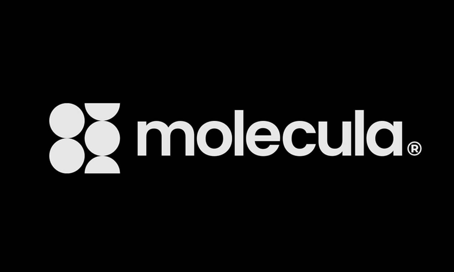
Source: Gennady Savinov, Molecula, Dribbble, https://dribbble.com/shots/16519600-Molecula-Logo

Source: Mahdy Hasan Hridoy, True Friend, Dribbble, https://dribbble.com/shots/16513018-TrueFriend-Mental-Disorders-Health-Medical-Logo-Branding

Source: MW Branding Agency, Evernate Branding, Behance, https://www.behance.net/gallery/231666711/Evernate-Branding-Packaging-3D

Source: Shihab, Medicus, Dribbble, https://dribbble.com/shots/14969469-Medicus-logo-mark-M-heart-letter-mark-logo-design-symbol

Source: Ahmed Rumon, Mediware, Dribbble, https://dribbble.com/shots/17305025-health-logo-awareness-ribbon-medical-logo-mediware

Source: Felipe Bruno, Equipe Médica de Saúde, Behance, https://www.behance.net/gallery/215858061/Equipe-Mdica-de-Saude

Source: Gennady Savinov, Kollabex, Dribbble, https://dribbble.com/shots/15585815-Kollabex-Logo

Source: Sergio Joseph, Beepr, Dribbble, https://dribbble.com/shots/15938250-Beepr-3
What Shapes Convey Care In Medical Logo Design?
When it comes to medical logo design, shapes can do a lot more than just look pretty—they can instantly communicate compassion, trust, and expertise. The right shape can make a medical brand feel approachable while still maintaining professionalism. Whether you’re creating a logo for a hospital, wellness clinic, or pharmacy, thinking carefully about shape can set the tone for how patients perceive the brand. Below are five shape styles that convey care in medical logo design while keeping your visual identity fresh and memorable.
Soft Rounded Circles
Circles are timeless symbols of unity, harmony, and community. In medical logo design, a circle can create a sense of continuity and wholeness, which naturally suggests healing and holistic care. When paired with soothing colors like blue or green, circles can make even the most clinical services feel approachable and patient-centered.
Gentle Curved Lines
Curved lines—whether in swooshes, waves, or subtle arcs—soften the overall look of a medical logo design. These shapes imply motion, adaptability, and care, making them perfect for brands that want to emphasize patient support, innovation, or progressive treatment. Curves feel welcoming and break away from rigid, sterile designs.
Heart-Inspired Motifs
Nothing says care quite like a heart shape. While it may seem obvious, a cleverly integrated heart can feel modern and distinctive. In medical logo design, the heart can be abstracted into geometric forms, combined with a cross, or stylized as part of a lettermark to represent compassion and human connection without being overly literal.
Cross Variations With Soft Edges
The cross is a classic in medical logo design, but harsh angles can sometimes feel too clinical. By rounding the edges, layering multiple crosses, or weaving them into circular frames, you can create a symbol that still reads as “medical” but feels more nurturing and less intimidating. This tweak preserves tradition while adding warmth.
Leafy And Organic Shapes
Organic shapes, such as leaves, sprouts, or flowing natural patterns, are increasingly popular in medical logo design. They signal growth, healing, and a holistic approach to wellness. These shapes also appeal to audiences interested in preventive care or alternative medicine, offering a softer, nature-aligned impression that balances science with empathy.
Incorporating these five shape styles into your medical logo design helps create an identity that is both professional and personable. By thinking beyond rigid geometric forms and embracing softer, more organic silhouettes, you can design a logo that not only signals medical expertise but also radiates care and trust—qualities every patient appreciates at first glance.
What Symbols Represent Trust In Medical Logo Design?
In the world of medical logo design, symbols aren’t just decorations—they’re powerful signals that shape how people feel about a brand. A well-chosen symbol can instantly communicate reliability, compassion, and credibility, which are crucial for any healthcare provider. By picking icons that naturally evoke trust, your logo can stand out while making patients feel confident and cared for. Below are five symbolic directions that bring trust to the forefront in medical logo design.
The Classic Cross With A Twist
The cross has long been associated with healthcare and emergency aid, making it one of the most recognized trust symbols in medical logo design. Giving it a creative update—like softening its edges, layering it with gradients, or integrating it into another shape—keeps the meaning clear while showing your brand’s unique personality.
Shield Or Emblem Shapes
Shields naturally convey protection and safety, making them ideal for medical logo design aimed at trust. When combined with gentle colors or additional elements like hands or leaves, a shield-based logo can suggest a modern “guardian of health” feel without looking too rigid or old-fashioned.
Hands And Helping Gestures
Few symbols express care as directly as a pair of hands. Whether cradling a heart, holding a cross, or abstractly shaping a circle, hand motifs evoke human touch and empathy. This makes them perfect for clinics, family practices, or wellness centers that want to project warmth and reassurance in their medical logo design.
Heartbeats And Lifelines
A stylized heartbeat line or lifeline curve can inject energy into a logo while still symbolizing trust and vitality. It suggests responsiveness, attention, and the constant care of professionals. Used subtly—perhaps as an underline or as part of a larger icon—this motif adds dynamism without overwhelming the design.
Nature-Inspired Elements
Leaves, trees, and other organic symbols signal growth, healing, and balance. Including them in medical logo design can make a brand feel more holistic and trustworthy, especially for practices emphasizing preventive care or wellness. Combined with a cross or shield, these symbols create a bridge between science and nature, reassuring patients that their health is in balanced hands.
Each of these five symbols has the power to communicate trust at first glance. By blending traditional healthcare icons with fresh design ideas, medical logo design can be both recognizable and distinctive. This thoughtful approach not only makes your logo memorable but also sets the tone for the trustworthy, compassionate care that every patient hopes to find.
What Are Creative Approaches To Medical Logo Design?
Medical logo design doesn’t have to feel cold or formulaic. In fact, some of the most memorable health-care brands break away from traditional looks to create a warm, human connection. A clever blend of symbols, colors, and composition can help your logo stand out while still communicating professionalism and trust. Below are five creative approaches to medical logo design that balance originality with clarity—each offering a fresh way to express care, innovation, and expertise.
Mix Classic Icons With Modern Geometry
One creative route is to take familiar medical symbols—like the cross, caduceus, or stethoscope—and simplify them into bold, geometric shapes. This transforms a traditional emblem into a clean, contemporary mark. For example, a cross made of overlapping triangles or hexagons can suggest cutting-edge technology and precision while still being recognizable.
Use Unexpected Color Palettes
Blue and green are the usual suspects in medical logo design, but breaking out of that box can create instant differentiation. Consider soft coral, muted lavender, or a gradient of teal and gold to signal innovation and warmth. Pairing unexpected hues with clear typography can make your logo memorable without sacrificing trustworthiness.
Integrate People-Centered Imagery
Human silhouettes, hands, or abstract figures create an emotional connection and immediately convey compassion. For a creative twist, you can weave these figures into other shapes—a person forming the stem of a leaf, or two hands shaping a heart outline. This approach is perfect for brands that focus on patient experience and holistic care.
Play With Negative Space
Negative space adds a subtle “aha” moment that can delight viewers and show design sophistication. For example, a hospital logo might use the gap between two curved lines to form a hidden cross, or a pharmacy logo might reveal a pill capsule shape inside a letterform. These hidden elements make medical logo design more engaging and memorable.
Blend Nature With Technology Motifs
Healthcare today often combines science and wellness, so fusing organic and tech-inspired elements can feel fresh. A leaf with a digital circuit pattern, or a heartbeat line transforming into a tree branch, tells a story of innovation and care. This hybrid style is especially effective for wellness centers, biotech firms, or progressive clinics.
Each of these creative approaches turns a standard medical logo design into something distinctive, human, and forward-thinking. By experimenting with icons, colors, shapes, and hidden meanings, you can craft a visual identity that resonates with patients while signaling professionalism and trust. The result is a logo that not only stands out but also speaks directly to the values of health, healing, and hope.
What Are the Best Color Schemes for Medical Logo Designs?
When it comes to medical logo design, the color scheme isn't just about aesthetics—it’s about conveying the right message. Colors have the power to evoke emotions, communicate information, and influence decisions. That's why choosing the perfect palette for your medical logo is crucial in making the right impression. Let’s explore five fantastic color schemes that can elevate your medical logo from ordinary to extraordinary, ensuring it looks professional, approachable, and aligned with healthcare values.
Classic Blue and White
Blue is the champion of medical logo colors, known for its soothing and calm qualities. It represents knowledge, stability, and trust—vital characteristics for any medical institution. Paired with white, which conveys cleanliness and simplicity, this color scheme is a powerhouse in healthcare branding. This traditional duo is popular among hospitals, dental clinics, and insurance companies, promising professionalism and peace of mind.
Green and White
Green is another excellent choice for medical logo designs, symbolizing growth, health, and renewal. It’s a refreshing alternative to blue, offering a sense of serenity and natural balance. When combined with white, green takes on a clean and crisp appearance, ideal for clinics and wellness centers focusing on holistic and natural medicines. This color scheme helps patients feel relaxed and reassured about their care environment.
Soft Pastels
For a more gentle and nurturing look, pastel colors like soft pinks, baby blues, and pale greens can be perfect. These colors are often associated with care and comfort, making them a great choice for pediatric and women’s health clinics. Pastels are less traditional but can differentiate your practice by giving it a warm and inviting feel, which is especially appealing in fields that deal with sensitive or personal health issues.
Bold Contrasts with Red or Orange
If you want your medical logo to stand out, incorporating a bold color like red or orange can make a big impact. Red stands for strength and passion and is often used to grab attention quickly. However, it must be used sparingly in the medical field to avoid associations with danger or emergencies. Orange, on the other hand, is less intense and evokes feelings of warmth and friendliness. Using these colors as accents against a neutral background (like grey or black) can create a dynamic and modern look.
Professional Grays and Blues
For a more sophisticated and high-tech feel, consider a palette of grays combined with shades of blue. This color scheme is particularly effective for medical technology companies, specialty clinics, and research institutions. Gray conveys balance and neutrality, while blue adds a touch of trust and calm. This combination can suggest cutting-edge technology and innovation, appealing to a professional audience.
Choosing the right color scheme for your medical logo design is about more than just personal preference—it’s about crafting an identity that communicates trust, professionalism, and care. With these color schemes, your medical logo will not only look appealing but also resonate emotionally with your audience, ensuring it leaves a lasting, positive impression.
What Fonts Work Best for Medical Logo Design?
Choosing the right font for your medical logo design can be as crucial as selecting the color palette or the symbol. The typography in your logo not only spells out the essential information but also sets the tone for how patients perceive your brand. Should they feel reassured and safe, or is a modern and innovative approach more your style? Let's dive into five font types that harmonize beautifully with the needs of a medical logo, ensuring your practice or facility communicates effectively and stylishly.
Serif Fonts
Serif fonts are characterized by the small lines or strokes regularly attached to the end of a larger stroke in a letter or symbol. Classic and trustworthy, these fonts, like Times New Roman and Georgia, exude professionalism and credibility. They are often used in traditional medical practices, such as family medicine clinics and legal documents, where trust and authority are paramount. A serif font in your medical logo can reassure your patients that they are in the hands of experienced professionals.
Sans Serif Fonts
Clean, modern, and straightforward, sans serif fonts like Helvetica, Arial, and Futura offer excellent readability and a contemporary feel. These fonts lack the small projecting features at the ends of strokes, giving them a sleek and minimalist look. Ideal for cutting-edge medical technology firms, cosmetic clinics, and youth-focused health services, sans serif fonts suggest a no-nonsense approach to healthcare, emphasizing clarity and efficiency.
Script Fonts
For a more personalized touch, script fonts mimic cursive handwriting. They range from elegant and formal to casual and laid-back. In a medical logo, a well-chosen script font can convey warmth and approachability, making it a fantastic choice for pediatric clinics, family therapy services, or wellness spas. However, caution is advised with script fonts as their legibility can decrease at smaller sizes, which is essential to consider for mobile devices and smaller print materials.
Modern Fonts
Modern fonts, characterized by strong structures, clear lines, and often a futuristic feel, can give your medical logo a cutting-edge look. Fonts like Century Gothic or Avant Garde are perfect for medical research institutions, high-tech medical devices companies, and innovative health app developers. They reflect innovation and forward-thinking, appealing to a demographic that values contemporary solutions in healthcare.
Handwritten Fonts
If you're aiming for an approachable, friendly, and caring vibe, handwritten fonts are a great choice. These fonts are as close as you can get to human touch in typography, which can be particularly effective for counseling services, children’s health clinics, or any service where a gentle human touch is crucial. Handwritten fonts can make your logo feel more individualized and less corporate, fostering a connection with your audience.
Each font type brings its own flavor and message, so consider what you want your medical logo design to communicate about your healthcare brand. The right font will not only make your logo visually appealing but also reinforce the reliability, care, and professionalism that should define every interaction with your medical practice.
Conclusion
A strong medical logo design does more than identify a healthcare brand; it builds confidence and communicates care at first glance. By thoughtfully combining trusted symbols, shapes, and colors, a medical logo design can express professionalism while remaining approachable and memorable. Whether you’re creating a new identity or refreshing an existing one, focusing on elements that convey trust, compassion, and innovation will help your visual identity resonate with patients and partners alike. With careful planning, your medical logo design becomes a lasting emblem of reliability and excellence in the ever-evolving world of healthcare.
Let Us Know What You Think!
Every information you read here are written and curated by Kreafolk's team, carefully pieced together with our creative community in mind. Did you enjoy our contents? Leave a comment below and share your thoughts. Cheers to more creative articles and inspirations!
LINK
Are you on the lookout for fresh and inspiring medical logo design ideas? Whether you're launching a new healthcare startup or refreshing an established medical brand, the right logo can make all the difference. In today’s digital age, a logo is not just a symbol but the face of your brand—it communicates your values, services, and professionalism at a glance. That’s why we've curated a collection of top-notch medical logo design ideas that combine creativity with clarity, ensuring your brand stands out in the bustling healthcare sector.





Leave a Comment