30 Best Boutique Logo Design Ideas You Should Check

Source: Brand Brothers, Losanje, Behance, https://www.behance.net/gallery/142567285/Losanje-Brand-identity
When it comes to fashion and style, first impressions matter, and nothing speaks louder than a chic and memorable logo. A well-crafted boutique logo design can instantly capture the spirit of a brand—whether it’s minimal and modern, glamorous and elegant, or quirky and playful. This is where creativity and strategy meet, blending typography, symbols, and colors into a design that feels just as unique as the boutique itself.
Boutique logo design ideas often play with elegant fonts, delicate icons, and stylish layouts that reflect exclusivity and personality. From cursive scripts that feel timeless to geometric shapes that convey sophistication, each design element tells a story about the brand’s identity. A boutique is not just about selling products—it’s about offering an experience, and the logo sets the tone for that journey.
In this article, we’ll showcase some of the best boutique logo design inspirations worth checking out. Whether you’re running a high-end fashion store, a cozy vintage shop, or a trendy lifestyle brand, these ideas can spark fresh concepts and elevate your brand image. Get ready to see how thoughtful design can transform a simple logo into an unforgettable style statement.
Boutique Logo Design Ideas

Source: Cansu Merdamert, Thousand The Boutique, Behance, https://www.behance.net/gallery/74971985/Thousand-The-Boutique

Source: Md. Mobinul Hoque, BK Fashion, Dribbble, https://dribbble.com/shots/26205451-BK-Fashion-Logo-Designs

Source: Caro Reyes, Omini Concept Boutique, Behance, https://www.behance.net/gallery/92052383/Omini-Concept-Boutique

Source: Dimitrije Mikovic, Roveria Boutique, Dribbble, https://dribbble.com/shots/25068249-Roveria-Boutique-Winery

Source: Tatiana Dronova, Rubberstamp, Behance, https://www.behance.net/gallery/206311113/Brand-Identity-for-Stationery-Boutique-RUBBERSTAMP

Source: Rupanjana Paul, Anika Boutique, Behance, https://www.behance.net/gallery/215176643/Anika-Boutique-Brand-Identity-Design

Source: Saif Zain, Komode, Behance, https://www.behance.net/gallery/121515575/Komode

Source: Torey Needham, Hayloft Studios, Dribbble, https://dribbble.com/shots/25085072-Hayloft-Studios-Pt-1

Source: Studio Eclectis, La Flora, Behance, https://www.behance.net/gallery/138955853/LA-FLORA-Floral-Boutique-Visual-Brand-Identity-Design

Source: Bruno Jara, Dear Candles, Behance, https://www.behance.net/gallery/138947193/Dear-Candles-Identity

Source: Minh Y Nguyen, Mimi & Bon Fleuriste, Behance, https://www.behance.net/gallery/90426617/Mimi-Bon-Fleuriste

Source: Ruhul Amin Rubel, Miss Boutique House, Dribbble, https://dribbble.com/shots/22063167-Miss-Boutique-House-Logo

Source: Cristie Stevens, Aprés Whitefish, Dribbble, https://dribbble.com/shots/14740858-Apr-s-Whitefish-I-Boutique-Hotel-Logo

Source: Jamie Prendergast, Koye, Behance, https://www.behance.net/gallery/135127381/Kove

Source: Olga Stokolos, Behance, https://www.behance.net/gallery/174839635/logotip-dlja-multibrendovogo-butiku-%28koncept%29

Source: Ania Pavlowa, Miko, Behance, https://www.behance.net/gallery/139502113/MIKO-womens-clothing-brand

Source: Ahmed, Viman, Dribbble, https://dribbble.com/shots/24854936-Viman-Logo-Design

Source: Mohamed Alaa, La Souge, Behance, https://www.behance.net/gallery/95092489/LA-SOUGE-BRANDING

Source: MD Helal Akbar, Dribbble, https://dribbble.com/shots/26156740-Clothing-brand-logo-streetwear-logo-clothing-logo-branding

Source: Leandra Rexhepi, Ragine, Behance, https://www.behance.net/gallery/88100385/Ragine-Visual-Identity

Source: Baianat, Nory, Behance, https://www.behance.net/gallery/134418357/Nory-brand-design

Source: Airin, Dribbble, https://dribbble.com/shots/26068917-Luxury-Boutique-Logo-Elegant-Minimal-For-Sale

Source: Prizma Studio, Do I Do, Behance, https://www.behance.net/gallery/129588457/Do-I-Do-womenswear

Source: Othila, Materia, Behance, https://www.behance.net/gallery/140768529/Materia

Source: Omnium, Karma, Dribbble, https://dribbble.com/shots/14080764-Karma-tags

Source: Ekaterina Markova, Art De Fleur, Behance, https://www.behance.net/gallery/142301413/-ART-DE-FLEUR-FLOWER-BOUTIQUE

Source: Eliza Braun, Darco, Behance, https://www.behance.net/gallery/123158477/DARCO-clothing-brand

Source: Motora Design, Bertie Barrott, Behance, https://www.behance.net/gallery/208959595/Bertie-Barrott

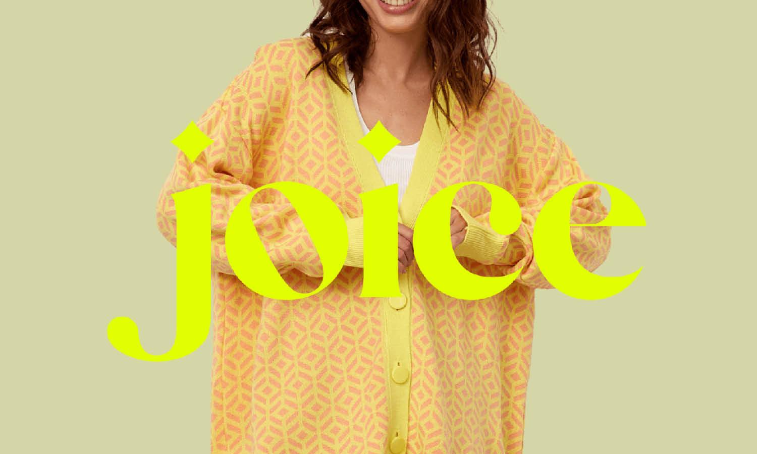
Source: Zero Design, Joice, Behance, https://www.behance.net/gallery/139576619/Joice-Fashion-Branding

Source: Brand Brothers, Losanje, Behance, https://www.behance.net/gallery/142567285/Losanje-Brand-identity
What Are The Key Elements Of A Modern Boutique Logo Design?
A boutique logo design is more than just a visual stamp—it’s the very essence of a brand’s style, charm, and personality. When done right, it feels effortlessly chic, timeless, and fresh all at once. But what exactly makes a boutique logo look modern while still carrying that signature elegance? Let’s break down the five key elements that truly define a contemporary boutique logo design.
Stylish Typography With Character
Typography is the heartbeat of boutique logo design. Modern logos often rely on fonts that feel sleek yet personal—think elegant serifs, playful scripts, or bold minimal sans-serifs. Each typeface sets a mood: a handwritten script might evoke warmth and charm, while a thin serif communicates sophistication. The trick is finding a font with personality that reflects the boutique’s vibe without being overly trendy.
Minimalist Yet Memorable Symbols
In boutique logo design, less is more. Modern boutiques lean toward simple, clean icons—like a delicate flower outline, a geometric shape, or even a subtle abstract mark. These symbols keep the design recognizable while avoiding clutter. The focus is on minimal shapes that leave a lasting impression, much like a stylish outfit that doesn’t need too many accessories.
Refined Color Palettes
Color is where a boutique logo design gets its flair. Contemporary boutiques often use muted pastels, chic monochromes, or warm earthy tones. Sometimes, a bold pop of gold or blush pink is added for a touch of luxury. A refined palette ensures the logo feels timeless and adaptable, whether it’s on a storefront, tag, or Instagram feed.
Balance Of Simplicity And Personality
A modern boutique logo design shines when it feels both simple and unique. It avoids being generic by adding small twists—like a quirky letter shape, unexpected spacing, or a subtle design flourish. The goal is to strike harmony: minimal enough to look polished, yet full of personality to stand out in a stylish market.
Versatility Across Platforms
Boutique logos don’t just live on a shop sign anymore—they need to shine on websites, clothing labels, business cards, and social media icons. A modern boutique logo design is crafted with versatility in mind. It should work equally well in full color or black and white, and remain legible whether it’s tiny on a tag or bold on a billboard.
In short, the key elements of a modern boutique logo design come down to chic typography, clean symbols, thoughtful colors, balanced personality, and adaptability. Together, they create a look that feels fashionable, timeless, and unmistakably boutique.
What Are Some Icon Ideas for Boutique Logo Design?
In the bustling world of boutiques, standing out is not just an option—it's a necessity! Your boutique's logo is the sparkly jewel that can catch the eye of passersby and engrain your brand in the minds of shoppers. When considering icon ideas for your boutique logo design, you want something that resonates with your brand's personality and makes your audience stop and stare. Here are five captivating icon ideas that could elevate your boutique's visual identity and make it truly iconic.
Floral Motifs
Flowers aren't just for vases; they are also perfect for adding a touch of natural elegance to your boutique logo. Floral motifs can be adapted to fit any boutique style—from the sophisticated, delicate linework for a high-end fashion store to bold, abstract flowers for a modern pop-up boutique. Whether you choose a rose to symbolize passion and luxury or a simple daisy for its cheerful and inviting vibe, incorporating a floral element can attract a wide audience who appreciates beauty and detail.
Vintage Elements
If your boutique has a flare for the past, why not reflect this in your logo? Vintage icons such as antique keys, classic cars, or even a silhouette of a Victorian dress can immediately convey a sense of nostalgia and class. These elements work particularly well for boutiques specializing in vintage clothing, accessories, or home décor. They tell a story of timelessness and charm that can be very appealing to customers who revel in history and uniqueness.
Animal Symbols
Incorporating an animal icon into your boutique logo design can give it a lively and memorable twist. Choose an animal that reflects the characteristics you want to associate with your brand. For instance, a peacock could symbolize luxury and beauty, while a cat might represent independence and sophistication. Animal icons can be stylized to fit any boutique atmosphere, from playful and cute to sleek and elegant.
Fashion Accessories
When people think of boutiques, they often think of fashion. Using an icon of a high-heeled shoe, a handbag, or a stylish hat can immediately communicate what your boutique specializes in. These icons are straightforward, recognizable, and can be styled in countless ways to match the aesthetic of your brand—be it chic and simple or bold and glamorous.
Geometric Shapes
If you prefer a more abstract approach, geometric shapes can be a powerful way to make your boutique logo stand out. A triangle might symbolize stability and strength, a circle could denote unity and perfection, and a square could represent balance and reliability. Combining multiple shapes or playing with their arrangements can create a visually intriguing logo that is both modern and impactful.
Using these icon ideas in your boutique logo design not only makes your branding visually attractive but also helps tell your brand's story in a compact and engaging way. Each icon choice carries its own set of connotations and style, so pick the one that aligns best with what your boutique stands for. With the right icon, your logo will not just be seen—it will be remembered!
Which Fonts Work Best For Boutique Logo Design?
When it comes to boutique logo design, fonts play a starring role. The right typography can instantly communicate elegance, charm, or bold personality, making it one of the most defining elements of a boutique’s identity. Choosing the perfect font isn’t just about aesthetics—it’s about creating a feeling that matches the boutique’s unique vibe. Let’s look at five font styles that truly shine in boutique logo design and why they work so well.
Elegant Serif Fonts
Serif fonts are a timeless choice for boutique logo design. They add a touch of class, refinement, and luxury. Thin serifs with high contrast, like Didot or Bodoni, can make a boutique feel upscale and sophisticated. These fonts work especially well for high-end fashion or luxury lifestyle shops, where a sense of prestige is essential. The tiny flourishes at the ends of each letter give a logo the perfect blend of tradition and modernity.
Playful Script Fonts
Script fonts bring charm and personality, making them perfect for boutique logo design that wants to feel approachable yet stylish. A handwritten script can convey creativity and warmth, while a flowing calligraphic style radiates elegance. Think of scripts that mimic brush strokes or handwriting—they add a personal, artisanal vibe that’s perfect for boutiques selling handmade, vintage, or whimsical products.
Clean Sans-Serif Fonts
If simplicity and modern chic are what you’re after, sans-serif fonts are the way to go. In boutique logo design, a clean sans-serif font communicates minimalism, freshness, and contemporary appeal. Fonts like Helvetica Neue or Futura have crisp edges and a modern tone that feels polished without being fussy. These are perfect for boutiques that want to emphasize simplicity and let their products do the talking.
Quirky Display Fonts
For boutiques that thrive on individuality and boldness, display fonts can be a game-changer. These fonts are all about standing out and making a statement. Whether it’s a bold geometric style, funky lettering, or an unusual artistic twist, display fonts add personality in spades. Used thoughtfully, they can make a boutique logo design instantly recognizable and memorable—just like that one-of-a-kind statement piece in a wardrobe.
Refined Minimalist Fonts
Minimalist fonts focus on clean lines, thin weights, and simple shapes, which work beautifully for boutiques that embrace modern aesthetics. These fonts are subtle but sophisticated, creating a sleek boutique logo design that feels trendy without being overwhelming. Minimalist typography pairs well with neutral colors and simple icons, allowing the overall design to feel airy, balanced, and effortlessly stylish.
In the end, the best fonts for boutique logo design depend on the mood and message you want to convey. Elegant serifs whisper luxury, scripts add charm, sans-serifs embody modern chic, display fonts shout individuality, and minimalist fonts strike a balance of subtle sophistication. Together, these options offer endless possibilities for creating a logo that feels just as fashionable as the boutique itself.
What Colors Work Best In Boutique Logo Design?
Color is one of the most powerful tools in boutique logo design. It doesn’t just decorate—it sets the mood, tells a story, and instantly conveys the personality of a brand. The right color palette can make a boutique feel luxurious, playful, minimal, or welcoming. Choosing the best colors isn’t just about what looks nice; it’s about aligning with the boutique’s style and message. Let’s look at five colors and combinations that work beautifully in boutique logo design.
Soft Pastels For Elegance
Pastels like blush pink, lavender, mint, and powder blue are forever favorites in boutique logo design. They create a soft, elegant, and approachable vibe. These shades feel feminine, modern, and effortlessly stylish, making them perfect for boutiques that focus on fashion, lifestyle, or delicate accessories. Pastels balance sophistication with warmth, giving logos a fresh yet timeless feel.
Black And White For Timeless Sophistication
Nothing says chic like a black and white boutique logo design. This classic pairing is simple yet powerful, instantly communicating elegance and confidence. Black adds depth and formality, while white brings balance and clarity. Together, they create a high-contrast look that works across all mediums—whether it’s a storefront sign, shopping bag, or Instagram profile. This combo is perfect for boutiques that want a sleek and versatile image.
Metallic Accents For Luxury
Gold, silver, and rose gold accents bring a sense of luxury and exclusivity to boutique logo design. Metallic tones add sparkle and sophistication, often used in combination with neutrals like black or cream. They give the impression of refinement and high value, perfect for boutiques that want to highlight their premium status. A hint of metallic detail can elevate even the simplest logo into something eye-catching and glamorous.
Earthy Neutrals For Natural Charm
Warm browns, beiges, taupes, and olive greens are wonderful for boutiques with a rustic, organic, or artisanal edge. In boutique logo design, earthy tones give off a grounded, authentic feel. They’re especially fitting for boutiques that focus on handmade goods, eco-friendly fashion, or cozy interiors. Neutrals are versatile and soothing, providing a down-to-earth elegance that stands apart from flashier palettes.
Bold Jewel Tones For Drama
Emerald green, sapphire blue, ruby red, and amethyst purple bring energy and richness to boutique logo design. Jewel tones make a bold statement while still feeling elegant. They’re ideal for boutiques that want to exude confidence, creativity, and individuality. These colors stand out beautifully on packaging and signage, creating logos that are vibrant, memorable, and full of character.
In boutique logo design, colors do more than fill space—they define identity. From soft pastels that whisper elegance to jewel tones that shout boldness, each palette tells a unique story. By choosing colors that align with the boutique’s personality, the logo becomes more than a symbol—it transforms into a stylish invitation to step into the brand’s world.
What Are Examples Of Timeless Boutique Logo Design Ideas?
A boutique logo design should feel like a little black dress—stylish, versatile, and forever in fashion. While trends shift every season, certain design ideas remain timeless because they balance elegance with personality. These classic approaches make sure your boutique’s identity never feels outdated and always keeps its charm. Let’s dive into five timeless boutique logo design ideas that continue to inspire.
Monogram Logos
Monograms are a boutique logo design favorite because they exude sophistication with minimal effort. Using the boutique’s initials in a stylish font creates a logo that feels polished and exclusive. Think of elegant serif letters intertwined or sleek sans-serifs arranged in a modern style. Monogram logos are versatile, looking equally stunning on shop signs, shopping bags, and clothing tags. They’re a true classic that never goes out of style.
Handwritten Signatures
Handwritten logos feel personal, warm, and chic, making them a timeless idea for boutique logo design. A flowing script or signature-style font gives the impression of care and individuality. It’s as if the boutique owner signed the brand with love, adding a touch of authenticity. These designs work beautifully for boutiques that want to emphasize artisanal charm and a one-of-a-kind shopping experience.
Minimal Icon Pairings
Pairing a boutique’s name with a simple icon is another timeless boutique logo design idea. Icons like delicate leaves, subtle geometric shapes, or even a minimalist hanger can communicate style without overwhelming the eye. The beauty lies in simplicity—an understated design that’s memorable yet versatile. These logos are perfect for brands that want to keep things chic and modern while leaving a lasting impression.
Crest And Emblem Designs
Crests and emblems give boutique logos a sense of tradition and heritage. Inspired by classic seals and coats of arms, they make a boutique feel established and trustworthy. These designs often include ornamental flourishes or circular frames that encase the boutique’s name or initials. In boutique logo design, crests are ideal for shops that want to communicate timeless elegance and a refined shopping experience.
Black And White Elegance
Sometimes, color isn’t even necessary to create a timeless design. A black and white boutique logo design is effortlessly chic and adaptable. The high contrast ensures visibility and legibility across every medium, from storefronts to business cards. This monochrome style works for boutiques of all types, from luxury fashion to vintage charm, proving that simplicity can indeed make the loudest statement.
At its core, timeless boutique logo design is about blending elegance, simplicity, and a touch of personality. Monograms, handwritten scripts, minimal icons, emblems, and black-and-white styles all deliver logos that feel as fashionable today as they will years from now. These ideas prove that when it comes to boutique branding, true style never fades.
Conclusion
A well-thought-out boutique logo design is more than a pretty picture—it’s a visual language that communicates style, personality, and brand values. The best designs bring together elegant typography, thoughtful motifs, and harmonious colors to create something that feels timeless yet unique. Whether it leans on soft pastels, bold jewel tones, or classic black and white, each choice helps define how a boutique is remembered. By focusing on the right elements, a boutique logo design becomes a lasting symbol of identity, ensuring that customers connect not only with the products but also with the story behind the brand.
Let Us Know What You Think!
Every information you read here are written and curated by Kreafolk's team, carefully pieced together with our creative community in mind. Did you enjoy our contents? Leave a comment below and share your thoughts. Cheers to more creative articles and inspirations!


Leave a Comment