
10 Tips To Create A Good Modern Logo Design

Source: Cilas Souza, Behance, https://www.behance.net/gallery/142606663/GOLDMAC-VISUAL-IDENTITY
A successful modern logo design does much more than look attractive. It helps people instantly recognize a brand, understand its personality, and remember it long after their first interaction. Modern logos have evolved alongside changing consumer preferences, digital platforms, and branding strategies. Today, businesses often favor clean, adaptable, and highly functional designs that work across websites, social media profiles, mobile apps, packaging, and printed materials. The challenge is creating a logo that feels current without becoming dependent on short-lived trends. A strong modern logo design balances simplicity, originality, scalability, and brand relevance. It communicates clearly while remaining flexible enough to perform in many different situations. Whether you are creating a logo for a startup, redesigning an existing identity, or refining a personal brand, the following tips can help you develop a logo that feels modern while remaining effective for years to come.
Understand The Brand Before Designing Anything
One of the biggest mistakes in logo creation is jumping directly into sketches and visual ideas before understanding the brand itself. Every successful modern logo design begins with strategy. Before selecting shapes, fonts, or colors, you need a clear understanding of the business and its audience. Start by identifying the brand's personality. Is it innovative, professional, playful, luxurious, or approachable? Different personalities require different visual approaches. A technology company may benefit from clean geometric elements, while a creative studio might require a more expressive solution. It is equally important to understand the target audience. The preferences of corporate decision-makers differ significantly from those of younger consumers. The logo should reflect the expectations and interests of the people the brand wants to reach. By establishing these foundations first, every design decision becomes more intentional. Instead of creating something that simply looks modern, you create a logo that genuinely represents the brand.
Keep The Design Simple And Focused
Simplicity remains one of the defining characteristics of effective modern branding. A modern logo design should communicate clearly without overwhelming viewers with excessive details, decorative elements, or complicated visuals. Simple logos are easier to recognize and remember. They can be understood quickly, even when viewed for only a few seconds. In today's fast-moving digital environment, instant recognition is often more valuable than intricate artwork. Reducing visual clutter does not mean making a logo boring. Instead, it means focusing on the most important elements and removing anything that does not contribute to the overall message. Every shape, line, and design feature should serve a purpose. Many of the world's most recognizable logos rely on this principle. Their strength comes from clarity rather than complexity. When evaluating your design, ask yourself whether any element can be simplified without losing meaning. In many cases, a cleaner solution creates a stronger result.
Prioritize Strong Scalability
Design For Large And Small Applications
A logo must function in many different environments. It may appear on a large billboard one day and a social media profile image the next. A strong modern logo design maintains its clarity regardless of size. When designing, regularly test how the logo appears across multiple formats. Examine it on websites, mobile screens, packaging, signage, business cards, and promotional materials. If important details disappear when the logo becomes smaller, revisions may be necessary.
Avoid Tiny Details
Fine lines, intricate textures, and highly detailed illustrations often create problems when scaled down. Elements that look impressive on a large screen can become unrecognizable in smaller applications. Modern logos often succeed because they prioritize clean forms and clear visual structures. Eliminating unnecessary detail improves versatility and ensures the logo remains effective in every context.

Source: Mateus Seifert, Behance, https://www.behance.net/gallery/141810023/Avisto
Choose Clean And Contemporary Typography
Typography plays a major role in modern logo design. Even when a logo includes a symbol, the chosen typeface contributes significantly to how people perceive the brand. Modern logos frequently feature clean, well-balanced typography that prioritizes readability. Sans-serif fonts remain popular because they often feel contemporary and perform well across digital platforms. However, modern design is not limited to one style. The most important consideration is whether the typography aligns with the brand's identity. Avoid choosing fonts simply because they are currently fashionable. Trend-driven typefaces can quickly feel outdated. Instead, look for options with strong readability, balanced proportions, and distinctive characteristics that support the overall concept. Customizing typography can also help create uniqueness. Small adjustments to letterforms often make a logo more recognizable while maintaining a clean and professional appearance.
Use Color With Purpose
Limit The Number Of Colors
Color can strongly influence how people perceive a brand, but using too many colors often weakens a logo's visual impact. Many successful modern logos rely on limited color palettes that create a cleaner and more refined appearance. Restrained color usage also improves consistency across different applications. Simpler palettes are easier to reproduce accurately on digital and printed materials.
Support Brand Personality
Every color communicates something different. Blue often suggests trust and reliability, while green may represent growth or sustainability. Black can convey sophistication, while bright colors may create energy and excitement. When selecting colors, focus on the message you want the brand to communicate. The goal is not to follow color trends but to strengthen the brand's personality. A thoughtful color strategy makes a modern logo design more memorable and meaningful.
Create A Distinctive Visual Element
One challenge in modern logo design is avoiding generic solutions. Many industries become crowded with similar symbols, making it difficult for brands to stand apart. A distinctive visual element can solve this problem. This may be a unique symbol, a custom letterform, an unexpected shape, or a clever combination of design elements. The goal is to create something that people associate specifically with the brand. Originality does not require complexity. In fact, some of the most memorable logos rely on a single defining feature. The key is finding a visual concept that feels both unique and relevant. Before finalizing a design, compare it with competitors. If the logo looks interchangeable with others in the same industry, consider refining the concept further. Distinctiveness helps strengthen recognition and supports long-term brand growth.
Design With Digital Platforms In Mind
Modern brands operate primarily in digital environments, making digital performance an essential consideration during the design process. A modern logo design should remain clear and recognizable on websites, social media platforms, mobile applications, email signatures, and digital advertisements. These environments often present space limitations that influence how logos are displayed. Consider how the logo appears as a profile image, favicon, or app icon. Complex compositions may lose impact when compressed into small digital spaces. Strong modern logos often use clean shapes and balanced layouts that adapt easily to digital formats. Testing across different devices can reveal potential issues before launch. A logo that performs consistently on desktops, tablets, and smartphones is better prepared for today's digital-first marketplace.

Source: Leyning Ferraz, Behance, https://www.behance.net/gallery/135401971/Letron
Use Negative Space Strategically
Negative space refers to the empty areas surrounding and within design elements. When used thoughtfully, it can add depth, meaning, and memorability to a logo without increasing complexity. Some designers use negative space to create hidden symbols or visual connections that reveal themselves after closer inspection. These subtle discoveries can make a logo more engaging and memorable. However, restraint is important. The purpose of negative space is to enhance communication, not create confusion. If the concept becomes too complicated, viewers may miss the intended message entirely. In modern logo design, negative space works best when it supports simplicity rather than competing with it. A clever visual relationship can strengthen a logo, but clarity should always remain the top priority.
Avoid Following Short-Term Design Trends
Many designers feel pressure to follow current visual trends, but trend-focused logos often age quickly. What feels modern today may look outdated within a few years. A strong modern logo design focuses on timeless principles rather than temporary aesthetics. Simplicity, clarity, balance, and relevance remain effective regardless of changing design fashions. This does not mean ignoring contemporary influences altogether. Awareness of current design preferences can be valuable. The goal is to use those influences selectively while building a logo that remains effective over time. When evaluating design choices, ask whether they genuinely support the brand or simply reflect a passing trend. Logos built on strong fundamentals typically deliver better long-term results than those created solely to appear fashionable.
Test The Logo In Real-World Situations
Review Practical Applications
Before finalizing a logo, test it in realistic scenarios. Place it on business cards, websites, social media profiles, packaging, presentations, and promotional materials. These applications reveal strengths and weaknesses that may not be obvious during the design phase.
Gather Objective Feedback
Feedback can provide valuable insight into how others perceive the logo. Ask viewers whether the design feels clear, memorable, and appropriate for the brand. Observe whether they recognize key elements quickly and understand the intended message. Testing helps identify issues before launch and provides opportunities for improvement. A logo that performs well in practical situations is more likely to succeed once it becomes part of a brand's identity.
Frequently Asked Questions About Modern Logo Design
How Often Should a Modern Logo Be Updated?
A logo does not need frequent redesigns if it still represents the brand clearly and performs well across current platforms. Consider an update when the business changes direction, the design becomes difficult to use, or its visual style feels noticeably dated. Small refinements may be more appropriate than a complete replacement.
Which File Formats Should a Modern Logo Include?
A complete logo package should include vector formats such as SVG, EPS, or AI for unlimited scaling, along with PNG and JPG files for everyday digital use. It is also helpful to prepare full-color, monochrome, transparent-background, horizontal, and compact versions for different platforms and production requirements.
Should a Modern Logo Have Multiple Layout Variations?
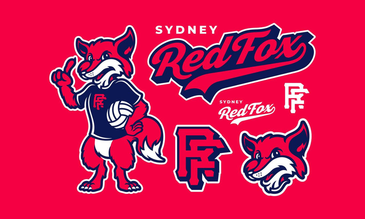
Yes, a flexible logo system often performs better than relying on one fixed arrangement. A primary logo can support horizontal, stacked, symbol-only, and simplified variations. Each version should share the same visual identity, allowing the brand to remain recognizable across narrow website headers, social profiles, packaging, and large-format displays.
How Can Designers Make a Logo More Accessible?
Accessible logo design begins with strong contrast, readable typography, and shapes that remain clear without depending entirely on color. Designers should test the logo against light and dark backgrounds and consider how it appears to people with color vision deficiencies. Clear forms improve recognition for a wider audience.
What Legal Checks Should Be Completed Before Launching a Logo?
Before launch, search for similar logos and registered trademarks within the brand’s industry and target markets. Confirm that fonts, icons, and other design assets include appropriate commercial licenses. For important business identities, consulting a trademark professional can help reduce conflicts and protect the logo as the brand grows.
Conclusion
Creating an effective modern logo design involves much more than following current visual trends. The strongest logos are built on a foundation of strategy, simplicity, functionality, and brand relevance. By understanding the brand, simplifying visual elements, choosing thoughtful typography and colors, creating distinctive features, and testing thoroughly, designers can develop logos that perform consistently across many applications. A modern logo should feel current without depending on temporary design fashions. When clarity, scalability, and purpose guide the creative process, the result is a logo that remains recognizable and effective long after trends have changed. Focus on solving branding challenges rather than chasing visual trends, and your logo will be better positioned for long-term success.
Let Us Know What You Think!
Every information you read here are written and curated by Kreafolk's team, carefully pieced together with our creative community in mind. Did you enjoy our contents? Leave a comment below and share your thoughts. Cheers to more creative articles and inspirations!
Related Articles










Leave a Comment