10 Tips To Create A Good Numerical Logo Design

Source: Guga Bigvava, Behance, https://www.behance.net/gallery/85862175/Logo-Design-Numbers
A strong logo is one of the most important elements of a brand’s visual identity. Among the many styles available today, numerical logo design stands out as a unique and memorable approach. Instead of relying solely on symbols or letters, this style uses numbers as the central visual element. Many brands choose numbers because they can represent meaningful concepts such as founding years, lucky numbers, model names, or brand milestones.
A well-crafted numerical logo design can communicate simplicity, clarity, and strong brand recognition. Numbers are universal symbols that people quickly recognize, which makes them powerful tools in visual communication. When designed thoughtfully, a numerical logo can be modern, creative, and instantly memorable.
However, creating an effective numerical logo design requires more than simply placing a number in a design. Designers must consider typography, balance, color choices, and overall composition to ensure the number looks visually appealing and meaningful. The goal is to transform a simple number into a distinctive visual mark that represents the personality of a brand.
In this article, we will explore practical tips that can help designers and business owners create a good numerical logo design. From choosing the right number style to ensuring visual balance, these tips will guide you in developing a logo that is both attractive and memorable.
Understanding The Concept Of Numerical Logo Design
Before creating a strong brand mark, it is important to understand the concept behind numerical logo design. This style focuses on using numbers as the main visual element of a logo. Unlike traditional logos that rely on symbols or letters, a numerical logo design highlights digits to communicate identity, meaning, or brand values.
Numbers can carry powerful messages. They may represent a founding year, a lucky number, a product model, or even a symbolic meaning connected to a company’s story. Because numbers are universally recognized, they can quickly capture attention and make a logo easier to remember.
A successful numerical logo design is not simply about placing a number in a layout. Designers need to carefully consider how the number interacts with other design elements such as typography, spacing, shapes, and color. The goal is to transform a simple digit into a visual mark that feels distinctive and balanced.
For example, many fashion brands, sports teams, and technology companies use numbers as part of their identity. When designed creatively, numbers can appear modern, bold, elegant, or even playful depending on the brand personality.
Understanding the purpose of the number is the first step in the design process. Designers should ask why the number matters to the brand and how it reflects the brand message. With a clear concept, a numerical logo design becomes more meaningful and visually appealing.
By focusing on clarity, symbolism, and strong visual structure, designers can turn simple numbers into memorable brand identities that stand out in a crowded market.
Choosing The Right Numbers For Your Brand Identity
Selecting the right numbers is a crucial step when creating a numerical logo design. The number used in the logo should have a clear connection to the brand’s identity, story, or message. When the number has meaning, the design becomes more memorable and authentic.
Many brands choose numbers that represent important milestones or values. For example, a company might use its founding year, a lucky number, or a number that symbolizes quality or performance. In sports, numbers often represent strength and achievement, while in fashion they can express exclusivity or heritage.
When developing a numerical logo design, designers should think about how the number reflects the personality of the brand. A single digit can feel simple and bold, while multiple digits may communicate history or depth. The visual balance of the number also plays an important role in how the logo is perceived.
Another important factor is readability. The chosen number should be easy to recognize at different sizes and across various applications. Whether the logo appears on packaging, websites, or merchandise, the number must remain clear and visually appealing.
Designers can also experiment with creative arrangements. Numbers can be stacked, combined with letters, or integrated with shapes to create a more dynamic composition. However, the number should always remain the central focus of the numerical logo design.
By carefully selecting numbers that align with the brand story and visual identity, designers can create a numerical logo design that feels meaningful, distinctive, and easy to remember.
Keeping The Numerical Logo Design Simple And Clear
Simplicity is one of the most important principles in logo creation, and it plays a major role in an effective numerical logo design. Because numbers are already strong visual elements, a clean and simple approach helps the design remain easy to recognize and memorable. Overcomplicated details can distract from the main focus and make the number harder to read.
When designing a numerical logo design, the number should be the star of the composition. Avoid adding too many decorative elements that compete with the digit itself. Simple lines, balanced spacing, and clear shapes will help the number stand out and communicate the brand identity more effectively.
A simple numerical logo design is also more versatile. Logos appear in many places, including websites, mobile screens, product packaging, business cards, and signage. If the design is too complex, important details may disappear when the logo is scaled down. A clean design ensures the number remains clear at both small and large sizes.
Designers can achieve simplicity by focusing on strong structure and thoughtful composition. Using limited colors, clear typography, and balanced proportions can create a refined and professional appearance. Negative space can also be used creatively to add subtle visual interest without overwhelming the design.
Another benefit of simplicity is memorability. A numerical logo design that is clean and well-structured is easier for people to remember and recognize. When viewers can quickly identify the number and associate it with a brand, the logo becomes more powerful.
By prioritizing clarity and simplicity, designers can create a numerical logo design that feels modern, professional, and timeless.

Source: Helvetiphant™, Dribbble, https://dribbble.com/shots/5976664-888-vers-A
Selecting Typography That Enhances Numerical Forms
Typography plays a significant role in shaping the appearance of a numerical logo design. Even though the focus is on numbers, the style of the digits can strongly influence how the logo communicates the brand’s personality. Choosing the right type style helps transform simple numbers into a distinctive visual identity.
Different typography styles can create different impressions. A bold and geometric typeface can make a numerical logo design look modern and powerful. On the other hand, a more elegant or curved style can communicate sophistication and creativity. The chosen typography should reflect the tone and values of the brand.
One important consideration is legibility. The numbers in a numerical logo design should always be easy to read, even at smaller sizes. Avoid overly decorative fonts that make the digits confusing or difficult to recognize. Clear shapes and balanced proportions help maintain strong readability across various applications.
Designers can also customize the typography to make the logo more unique. Small adjustments to the curves, angles, or spacing of the numbers can add personality without sacrificing clarity. Customizing the digits helps ensure that the numerical logo design feels original rather than generic.
Another useful approach is pairing numbers with subtle supporting text. In some logos, a brand name or tagline may appear alongside the number. In this case, the typography should complement the numerical form instead of competing with it.
By selecting and refining typography carefully, designers can create a numerical logo design that feels balanced, expressive, and visually distinctive.
Using Creative Shapes To Support Numerical Elements
Creative shapes can greatly enhance a numerical logo design by adding visual interest while still keeping the number as the main focus. Shapes help frame the number, guide the viewer’s attention, and strengthen the overall composition. When used thoughtfully, they can turn a simple digit into a more engaging and professional logo.
One common approach in numerical logo design is to combine numbers with geometric shapes such as circles, squares, or triangles. These shapes provide structure and balance, making the logo feel more stable and organized. For example, placing a number inside a circle can create a badge-style logo that feels strong and recognizable.
Shapes can also be used to emphasize the meaning behind the number. A dynamic shape with sharp angles might communicate energy and movement, while softer curves can express elegance or creativity. The shape should support the brand’s personality without overpowering the number itself.
Another useful technique is integrating shapes directly into the number. Designers can merge lines, curves, or patterns with the digit to create a more unique visual mark. This approach helps make the numerical logo design look custom and distinctive.
However, it is important to keep the composition balanced. Too many shapes or decorative elements can make the logo appear cluttered. The number should always remain the most prominent part of the design.
By carefully selecting and arranging shapes, designers can enhance a numerical logo design while maintaining clarity, creativity, and visual harmony.
Choosing Colors That Strengthen Numerical Logo Design
Color plays a powerful role in shaping the mood and impact of a numerical logo design. The right color choices can make the numbers more noticeable, memorable, and aligned with the brand’s identity. A thoughtful color palette helps bring the design to life while supporting the overall message of the logo.
When developing a numerical logo design, designers should start by considering the brand’s personality. Bright and bold colors often communicate energy and excitement, while softer tones may suggest elegance or trust. The selected colors should reflect the emotions and values the brand wants to express.
Contrast is another important factor in color selection. Strong contrast helps the number stand out clearly against its background. This is especially important in a numerical logo design because the digit must remain easy to recognize in different contexts and sizes.
Using a limited color palette can also improve the effectiveness of the design. Too many colors may distract from the number and make the logo feel busy. Many successful logos rely on two or three colors to create a clean and focused appearance.
Designers should also consider how the logo looks in different formats. A numerical logo design should remain effective in full color, black and white, and grayscale. Testing these variations ensures the design remains clear and recognizable across various applications.
By choosing colors carefully, designers can enhance the visibility and personality of a numerical logo design while maintaining a strong and cohesive visual identity.
Balancing Numbers With Other Design Elements
Creating balance is an important step in developing a strong numerical logo design. While the number should remain the main visual element, supporting components such as shapes, typography, or symbols can help complete the composition. The key is ensuring that these elements complement the number instead of overpowering it.
A balanced numerical logo design carefully considers spacing, alignment, and visual weight. If additional elements are placed around the number, they should be arranged in a way that feels harmonious and easy to read. Proper spacing allows the number to breathe visually and keeps the logo from appearing crowded.
Designers often combine numbers with subtle graphic elements to strengthen the overall look. For example, a small symbol, line, or geometric frame can support the number and make the logo more structured. However, these elements should always play a secondary role, allowing the number to remain the focal point.
Another aspect of balance is proportion. The size of the number should relate well to any surrounding elements such as brand names or decorative details. If the number is too small, it may lose impact. If it is too large, it might overwhelm the entire composition.
Testing different layouts can help designers discover the most effective arrangement. By adjusting spacing, alignment, and element placement, it becomes easier to achieve a visually pleasing result.
A well-balanced numerical logo design not only looks more professional but also improves readability and brand recognition. When all elements work together harmoniously, the logo becomes clearer, stronger, and more visually appealing.
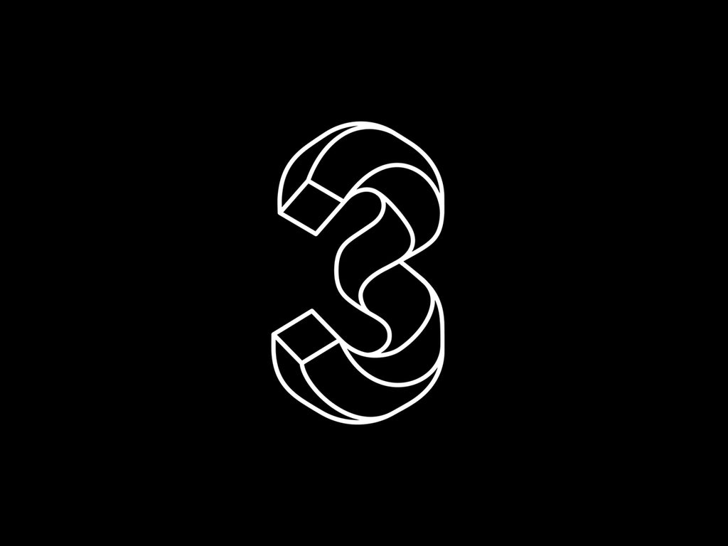
Source: Tamari Chabukiani, Dribbble, https://dribbble.com/shots/5608426-3-Georgian-letter-V
Making Your Numerical Logo Design Memorable
A memorable logo is essential for building strong brand recognition, and this is especially true for a numerical logo design. Because numbers are simple visual elements, designers must use creativity and thoughtful design techniques to make the logo stand out and remain easy to remember.
One effective way to create a memorable numerical logo design is by giving the number a distinctive style. This could include customizing the shape of the digits, adding unique curves or angles, or designing the numbers in a way that reflects the brand’s personality. Small design details can make a big difference in how people remember the logo.
Consistency also plays an important role. A numerical logo design should visually connect with other brand elements such as colors, typography, and overall design style. When the logo feels consistent with the brand identity, it becomes easier for audiences to recognize and recall.
Another approach is to use subtle visual storytelling. The number in the logo might represent an important year, a meaningful milestone, or a symbolic value connected to the brand. When viewers understand the meaning behind the number, the design becomes more engaging and memorable.
Designers should also focus on clarity. A clean and well-structured numerical logo design allows viewers to recognize the number instantly. If people can quickly understand what they see, the logo is more likely to stay in their memory.
By combining creativity, clarity, and thoughtful design choices, designers can create a numerical logo design that leaves a lasting impression and helps the brand stand out.
Ensuring Scalability Across Different Media
One important factor in creating a successful numerical logo design is ensuring that the logo works well across different media and sizes. A logo rarely appears in just one place. It may be used on websites, mobile applications, packaging, business cards, social media, signage, and promotional materials. Because of this, scalability becomes a critical part of the design process.
A strong numerical logo design should remain clear and recognizable whether it is displayed on a large billboard or a small mobile screen. If the numbers become difficult to read when the logo is reduced in size, the design may lose its effectiveness. Designers should therefore prioritize clarity and simplicity when shaping the digits and surrounding elements.
Testing the logo at different sizes is a practical way to ensure scalability. Designers can shrink the logo to very small dimensions and check if the numbers remain legible. If important details disappear, the design may need adjustments such as thicker lines, simplified shapes, or better spacing.
Another helpful approach is designing the logo in vector format. Vector graphics allow the numerical logo design to scale smoothly without losing quality. This ensures that the logo stays sharp and professional across digital and print platforms.
Designers should also test the logo on various backgrounds and materials. A logo that works well on a website should also look strong on merchandise or packaging.
By focusing on scalability, designers can create a numerical logo design that remains effective and visually appealing across many different applications.
Testing Your Numerical Logo Design For Versatility
Versatility is another key characteristic of a well-designed numerical logo design. A logo should be flexible enough to work in many different environments while maintaining its identity and visual impact. Testing the logo in various situations helps designers confirm that the design is practical and reliable.
One of the first steps in evaluating versatility is reviewing how the numerical logo design looks in different color formats. The logo should perform well in full color, black and white, and grayscale versions. This flexibility is important because logos are often printed or displayed in situations where color options are limited.
Designers should also test the logo on different backgrounds. For example, the logo might appear on light backgrounds, dark surfaces, textured materials, or photographs. A versatile numerical logo design should remain visible and clear in all of these scenarios.
Another useful test involves applying the logo to different brand materials. Designers can place the numerical logo design on mockups such as websites, business cards, product packaging, and social media graphics. This process reveals how the logo behaves in real-world applications.
Consistency is also important. Even when used across various platforms, the logo should maintain its recognizable structure and style. If the design requires major changes for different uses, it may not be versatile enough.
By carefully testing different situations, designers can refine their numerical logo design and ensure that it remains strong, adaptable, and effective wherever the brand appears.
Conclusion
A well-crafted numerical logo design can transform simple numbers into a powerful brand symbol. By focusing on clarity, balance, typography, color, and thoughtful composition, designers can create logos that feel distinctive and memorable. Numbers have universal recognition, which makes them effective visual elements when used creatively. A strong numerical logo design should also remain scalable and versatile across different platforms and materials. By applying the tips discussed in this guide, designers and business owners can develop a numerical logo design that not only looks visually appealing but also strengthens brand identity and leaves a lasting impression.
Let Us Know What You Think!
Every information you read here are written and curated by Kreafolk's team, carefully pieced together with our creative community in mind. Did you enjoy our contents? Leave a comment below and share your thoughts. Cheers to more creative articles and inspirations!




Leave a Comment