How Big Should A Logo Design Be On A T-Shirt?

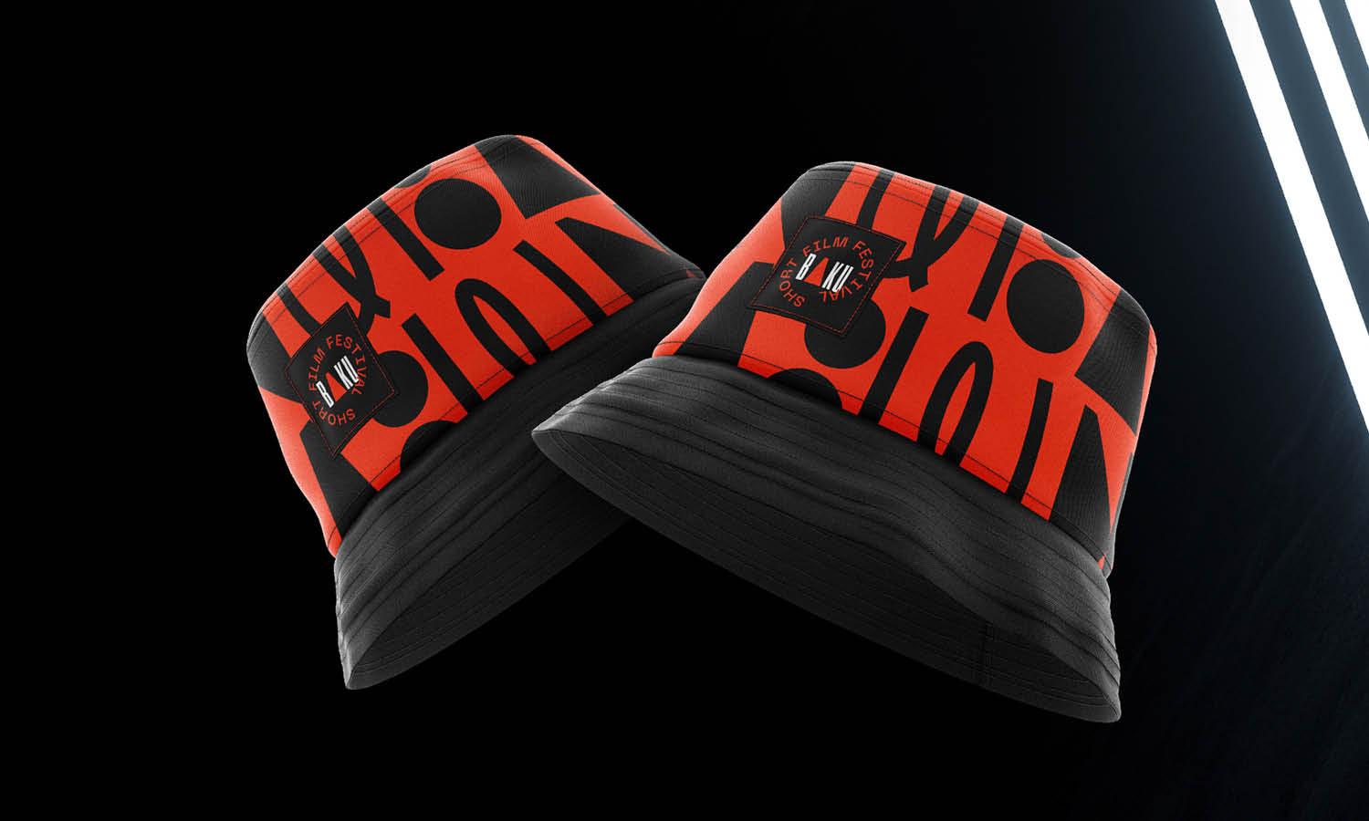
Source: Ali Salama, CAPE, Behance, https://www.behance.net/gallery/158561751/CAPE
Choosing the right size for a logo on a t-shirt is more than a matter of aesthetics; it's a strategic decision that influences brand perception and wearer comfort. When designing or selecting a logo for a t-shirt, several factors must be considered to ensure the final product looks appealing and aligns with the brand's identity. The size of the logo can affect how it is perceived from a distance, its impact on the overall design of the shirt, and even the cost of production. Whether for corporate use, team uniforms, or promotional clothing, the logo's dimensions should be tailored to suit the shirt’s purpose and the target audience's preferences.
This guide will explore essential considerations to help designers and marketers decide on the optimal logo size for various types of t-shirts, enhancing both visibility and engagement. By understanding these key aspects, you can ensure that your logo serves its purpose effectively, whether it is to promote a brand, convey a message, or simply add a stylish element to casual wear.
Consider the Purpose of the T-Shirt
The purpose of a t-shirt greatly influences the appropriate size and positioning of a logo design. For promotional t-shirts intended to catch the eye at events or in large crowds, a larger logo can be crucial for visibility and brand recognition. These logos are often placed prominently across the chest or back to ensure they are readable from a distance, effectively turning wearers into walking billboards for the brand. Conversely, t-shirts designed for corporate environments or team uniforms may benefit from smaller, more discreet logos. These typically sit on the chest or sleeve, subtly incorporating the company’s brand while maintaining a professional appearance.
For casual wear brands, the logo size should reflect the brand's identity—whether that's bold and outgoing, or minimalist and understated. Understanding the t-shirt's intended use not only helps in determining the optimal size of the logo but also ensures that it resonates well with the target audience, enhancing the garment's overall appeal and effectiveness as a marketing tool.
Standard Size Recommendations
When deciding on the size of a logo for a t-shirt, there are standard dimensions that can guide the design process. Typically, logos on the left chest area of a t-shirt should measure approximately 3 to 4 inches in width, which ensures visibility without dominating the garment's overall appearance. For full front or back designs, a width of 9 to 11 inches is standard, allowing the logo to be clearly visible even from a distance. These sizes serve as a general guideline; however, the specific dimensions may vary based on the logo’s complexity and the style of the t-shirt.
For example, more detailed logos might need slight enlargements to maintain legibility. Designers must also consider the scale in relation to the t-shirt size, ensuring that the logo appears proportionate across varying sizes from small to extra-large. By adhering to these standard size recommendations, designers can create aesthetically pleasing and functionally effective t-shirt designs that meet both the client’s needs and the expectations of the end user.
Visibility From a Distance
Ensuring that a logo is visible from a distance is crucial, especially for t-shirts used in promotional events, sports, or other public settings where brand visibility plays a key role. A well-sized logo maximizes the impact of the message and enhances brand recognition. For t-shirts intended to be seen from afar, consider scaling up the logo. A larger design, around 6 to 12 inches wide, positioned on the front or back, can be easily recognized from a distance. This size adjustment makes the logo a focal point of the t-shirt, capturing attention quickly and effectively. Additionally, the choice of contrasting colors can further increase visibility, ensuring that the logo stands out against the background of the shirt.
When designing for distance visibility, it's also important to simplify the logo. Reduce intricate details which might blur from afar and focus on bold, clear designs that convey the essence of the brand with minimal visual noise. This approach not only improves recognition but also aids in creating a strong visual association with the brand, which is vital in crowded or fast-paced environments.

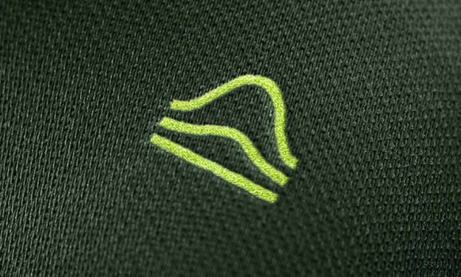
Source: Rafa Molbo, Costa Sur by Sizexcellent - 2022 Summer Collection, Behance, https://www.behance.net/gallery/150390965/Costa-Sur-by-Sizexcellent-2022-Summer-Collection
Balance With T-Shirt Design
Maintaining balance between the logo and the overall t-shirt design is essential to creating an appealing and effective product. The logo should not overpower the shirt's design but rather complement it. Consider the placement and size of the logo in relation to other design elements like patterns, text, or additional graphics on the t-shirt. A well-proportioned logo enhances the shirt’s aesthetics without causing visual clutter. For instance, a smaller logo on the front with a larger, more detailed graphic on the back can maintain design harmony. Additionally, the logo’s color scheme should harmonize with the shirt's colors to create a cohesive look.
Designers should also take into account the style and purpose of the t-shirt; for example, a minimalist logo can add sophistication to a business casual shirt, while a more vibrant and larger logo might be suitable for a casual or artistic design. By considering these aspects, designers can ensure that the logo effectively communicates the brand’s message while also enhancing the overall design quality and appeal of the t-shirt.
Location on the T-Shirt
The location of a logo on a t-shirt is a critical factor that affects both the design's impact and its visibility. Common placements include the left or right chest, which is ideal for corporate logos or small designs that signify brand identity without overpowering the shirt’s overall look. This position is traditionally used for its subtlety and professional appeal, making it suitable for business or team apparel. For a more casual and noticeable impact, centering the logo on the chest or enlarging it across the entire front provides greater visibility, often used in promotional or event-specific wear.
The back of the t-shirt is another popular location, especially for additional information or secondary logos that complement the front design. Logos placed on the sleeve are an emerging trend, offering a modern twist on branding that is both stylish and understated. When deciding on the location, consider the logo's role in the overall design and how it interacts with other elements like seams, pockets, or graphic prints. Each position offers a different visual experience and serves various branding purposes, from discreet representation to bold promotion.
Audience Preferences
Understanding the preferences of your target audience is essential in determining the appropriate logo size and placement on a t-shirt. Different demographics have varied tastes that can influence design decisions. Younger audiences might gravitate towards larger, more vibrant logos that make a bold fashion statement, while older demographics might prefer smaller, more conservative designs that reflect subtlety and sophistication. Additionally, consider the cultural significance of the logo and its alignment with audience values and expectations. For sports teams or music bands, fans often appreciate larger logos that express their support and affiliation loudly.
In contrast, luxury brands might opt for minimalistic logos that emphasize exclusivity and elegance. Conducting market research, such as surveys or focus groups, can provide valuable insights into what your audience desires. By aligning the logo design with audience preferences, the t-shirt can achieve greater emotional resonance, enhancing brand loyalty and satisfaction.
Printing Techniques
The choice of printing technique is pivotal in determining how well a logo is executed on a t-shirt. Screen printing remains the most popular method due to its cost-effectiveness and high-quality results for larger runs. This technique allows for vibrant, consistent colors and is suitable for logos that do not require intricate detail. Digital printing, on the other hand, is ideal for designs that involve detailed images or a wide range of colors, including gradients. Digital printing offers a softer touch and is more adaptable to small quantities or one-off designs. Another technique, heat transfer, involves printing a logo on special paper and transferring it onto the t-shirt using heat.
While versatile for complex color applications, it can result in a less durable design that may crack over time. Embroidery, although not a printing technique per se, offers a premium feel with its raised texture, making it a great choice for corporate apparel where durability and a classy appearance are desired. Each of these techniques has its own set of advantages and limitations, and the choice will largely depend on the logo’s complexity, the quantity of the order, and the expected durability of the design on the fabric.

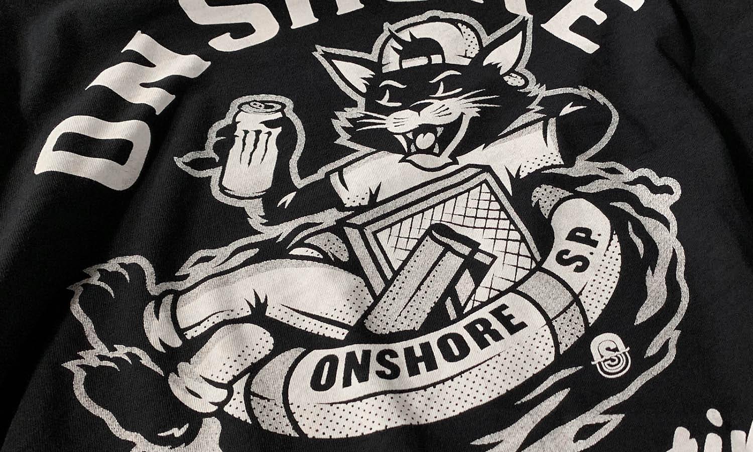
Source: Goldenpressstudio, Instagram, https://www.instagram.com/p/Ch4sZCXrrnt/
Material Considerations
The material of the t-shirt is a crucial factor in determining both the comfort and the effectiveness of the printed logo. Cotton is a popular choice due to its breathability and softness, making it ideal for casual wear. However, logos on cotton shirts may fade or lose sharpness over time due to the fabric's texture. Polyester, a more durable option, offers vibrant color retention for logos and is preferred for athletic or performance wear due to its moisture-wicking properties. Blends of cotton and polyester combine the best of both worlds, providing both comfort and resilience, which can enhance the logo’s appearance and longevity.
For more sustainable options, organic cotton and recycled materials are increasingly favored, which also appeal to eco-conscious consumers. When selecting the t-shirt material, consider how the fabric’s characteristics will affect the printing process and the final appearance of the logo. Some materials may require specific types of ink or printing techniques to ensure the logo is durable and visually appealing.
Wearability and Comfort
Wearability and comfort are paramount when incorporating a logo into a t-shirt design. The size and placement of the logo can significantly influence the overall comfort of the garment. Larger logos, especially those printed with thicker inks like plastisol, can make the fabric less flexible and breathable, potentially leading to discomfort in warmer conditions. It's crucial to consider the weight and texture of the logo's material in relation to the fabric of the t-shirt. Water-based inks, for example, are softer to the touch and can enhance the comfort level of the t-shirt by allowing more breathability.
Additionally, the location of the logo should be thoughtfully chosen to avoid irritation; for instance, a logo positioned too low on the back can be uncomfortable when the wearer sits down. The feel of the logo itself, whether it is raised and textured or smoothly integrated into the fabric, also affects how the t-shirt feels when worn. Designers should strive to balance aesthetic appeal with practical wearability, ensuring that the t-shirt remains comfortable and functional while still showcasing the logo effectively.
Mock-ups Are Essential
Creating mock-ups is an essential step in the t-shirt design process, especially when integrating logos. Mock-ups allow designers and clients to visualize how the logo will appear on different styles and colors of t-shirts before production begins. This visualization can help in making adjustments to the logo’s size, color, and placement, ensuring that the final product meets the desired specifications and aesthetic standards. Digital mock-ups offer a quick and cost-effective way to experiment with various designs, while physical samples provide a real-world view of how the materials and inks interact with the fabric.
Mock-ups are also invaluable for obtaining feedback from stakeholders and making iterative changes, which can prevent costly errors in the printing process. Additionally, they help in determining how the logo behaves on different body types and t-shirt sizes, which is critical for ensuring consistency across a range of products. Investing time in creating detailed mock-ups can greatly enhance the success of the final t-shirt design, leading to a more satisfactory product for both the client and the end consumer.
Conclusion
The success of a t-shirt logo design hinges on careful consideration of various factors such as size, placement, material, and printing techniques. Each element plays a pivotal role in ensuring that the logo not only looks appealing but also resonates with the target audience and maintains comfort and durability. By meticulously planning and testing these aspects through mock-ups and understanding the specific needs of the project, designers can create effective and impactful t-shirt logos that enhance brand visibility and wearer satisfaction. Remember, a well-designed logo on a t-shirt is not just an emblem; it's a statement.
Let Us Know What You Think!
Every information you read here are written and curated by Kreafolk's team, carefully pieced together with our creative community in mind. Did you enjoy our contents? Leave a comment below and share your thoughts. Cheers to more creative articles and inspirations!







Leave a Comment