How To Create Versatility In Logo Design

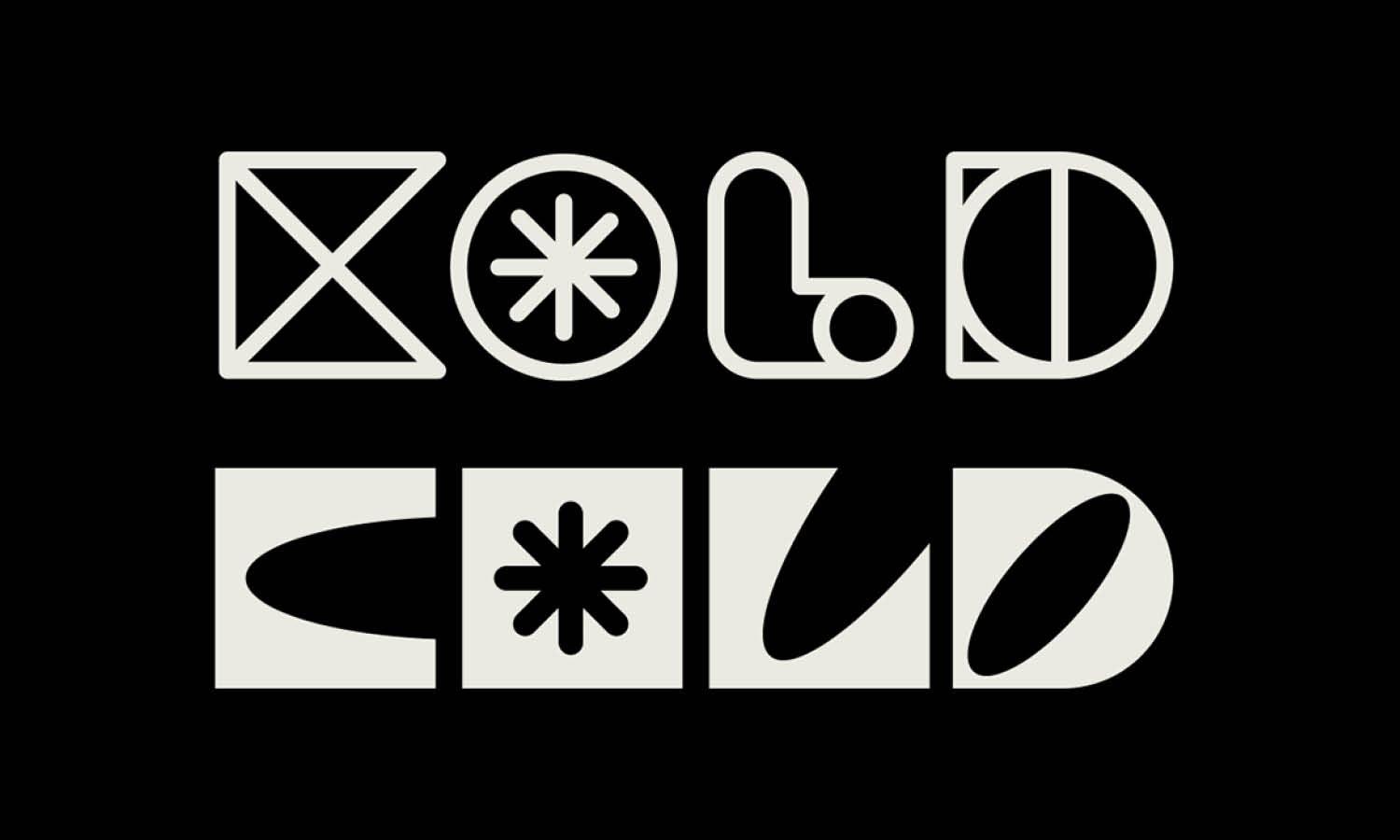
Source: Obrazur Brands, Jorixent, Behance, https://www.behance.net/gallery/178639127/Jorixent
The versatility of a logo design is crucial for ensuring a brand's adaptability across various media and consumer touchpoints. A versatile logo serves as the cornerstone of a brand's visual identity, supporting its visibility and recognition regardless of the platform. The challenge lies in creating a logo that is not only visually appealing but also flexible enough to maintain its effectiveness in diverse applications—from digital displays to physical merchandise.
Achieving versatility in logo design requires a strategic blend of simplicity, adaptability, and timeless elements. Designers must consider multiple factors, such as scalability, color schemes, and cultural relevance, to ensure that a logo can evolve with the brand while staying true to its core values. This introduction to versatility in logo design will explore key strategies and considerations that can help designers create logos that stand the test of time and change, empowering brands to seamlessly integrate their identity in both traditional and innovative marketing platforms.
Keep It Simple
In the realm of logo design, simplicity is the key to versatility. A simple logo design allows for more flexibility across various media, making it easier to recognize and remember. By focusing on essential elements and avoiding overly complex features, designers can ensure that the logo remains effective and adaptable. Simplicity in logo design often involves using clean lines, minimalistic shapes, and limited colors, which helps maintain clarity even when the logo is scaled down for smaller applications such as mobile apps or social media icons. This approach not only enhances the logo's usability across different platforms but also ensures that it can withstand changes in design trends over time.
For instance, iconic brands like Apple and Nike have mastered the art of simplicity, creating logos that are instantly recognizable worldwide. Their success demonstrates how a straightforward and concise design can communicate a brand’s essence more effectively than a complicated one. Thus, keeping it simple is not merely a design choice but a strategic decision that can significantly influence a logo’s longevity and versatility.
Use a Flexible Color Palette
A flexible color palette is vital for creating a versatile logo design. This strategy involves selecting colors that can adapt seamlessly to different backgrounds and contexts, enhancing the logo's functionality across various branding materials. When choosing colors for a logo, it is essential to consider their psychological impact and cultural associations, ensuring that they resonate with the target audience while maintaining consistency in brand identity. A versatile color palette typically includes neutral tones that blend well with other colors, supplemented by one or two distinct hues that can stand out when needed.
For example, Google’s logo uses a primary color palette that looks appealing on both light and dark backgrounds and can be easily adjusted for different marketing materials without losing its visual impact. Additionally, it is wise to design logos in a monochrome version to ensure that they maintain their integrity in black and white settings or when color printing is not feasible. By incorporating a flexible color palette, designers can create a logo that is not only striking and coherent but also highly adaptable, meeting the diverse needs of modern branding with ease.
Create a Responsive Design
In the era of digital media, creating a responsive logo design is imperative for maintaining versatility in logo design. A responsive logo can adjust to different sizes and platforms without losing its essence or functionality. This adaptability ensures that the logo remains effective and legible whether it is displayed on a giant billboard or as a tiny icon on a smartphone screen. Designing a responsive logo often involves developing a set of variations that can be used in different contexts. For instance, a complex logo may have a detailed version for large formats and a simplified icon that maintains key elements for smaller, digital uses.
This approach allows the logo to remain recognizable and consistent across all brand touchpoints. Moreover, incorporating flexibility in the logo’s layout and components can help maintain its visibility and impact on various devices and mediums. For example, adaptable logos may include elements that can be rearranged or omitted in certain contexts without compromising the brand identity. By prioritizing responsiveness in logo design, brands can ensure their identity thrives in the fast-paced, multi-platform business environment of today.

Source: Guilherme Vissotto, Organizze, Behance, https://www.behance.net/gallery/170082105/Organizze
Incorporate Timeless Elements
Timelessness is a crucial aspect of creating a versatile logo design. A logo that incorporates timeless elements is likely to remain relevant and effective across different eras without necessitating frequent redesigns. To achieve timelessness, designers should focus on simplicity and avoid overly trendy elements that may become dated quickly. Instead, incorporating classic typography, simple geometric shapes, and balanced compositions can help ensure the logo’s longevity. Timeless logos often use minimal color schemes and clear, uncluttered lines that convey the brand’s message without depending on current design trends. For example, logos like those of Coca-Cola and IBM have stood the test of time due to their straightforward yet distinctive designs that do not rely heavily on the whims of fashion.
These logos maintain their appeal and functionality over decades, demonstrating how timeless elements can contribute to a logo’s adaptability and enduring success. By embedding timelessness into the design, logos can serve as a constant symbol of the brand, reinforcing its identity regardless of changing market conditions or visual trends.
Test Scalability
Testing scalability is a fundamental step in ensuring the versatility of a logo design. A scalable logo maintains its clarity and impact whether it is enlarged for a billboard or reduced for a business card. To test scalability, designers should frequently scale their designs up and down during the development process. This includes viewing the logo at various sizes to assess its legibility and aesthetic appeal across different mediums. An effective scalable logo will retain its details and distinctiveness without becoming cluttered or losing essential elements when minimized. One practical method is to use vector graphics, which allow infinite scaling without loss of resolution.
Additionally, it's important to consider the logo's use on digital platforms where it might be seen on screens of varying resolutions. By ensuring the logo performs well at both very small and very large sizes, designers can confirm its suitability for diverse applications, from mobile apps to large outdoor advertising, thereby enhancing the brand's visibility and recognition across all platforms.
Design with Negative Space
Utilizing negative space effectively can greatly enhance the versatility and memorability of a logo design. Negative space involves the use of the background color to form an integral part of the logo’s design, creating a visual puzzle that can captivate the audience’s imagination. This technique not only adds a layer of sophistication but also ensures that the logo remains effective in various contexts and adaptations. For instance, the FedEx logo famously incorporates an arrow within the negative space between the letters 'E' and 'X', which suggests precision and forward direction, aligning with the brand’s identity in logistics. By designing with negative space, logos can become more adaptable and interesting, often revealing dual meanings or visual surprises that engage viewers.
Moreover, this approach encourages simplicity and can improve the logo’s visibility and effectiveness across different applications. Whether displayed in full color, monochrome, or different textures, a logo that cleverly uses negative space can maintain its integrity and continue to communicate the brand’s message effectively.
Use Adaptable Typography
Choosing adaptable typography is crucial for enhancing the versatility of a logo design. The right typeface should not only align with the brand’s personality but also remain legible and impactful across different media and scales. When selecting typography for a versatile logo, consider fonts that are clear and simple yet distinctive enough to stand out. Sans-serif fonts, for example, are often favored for their readability on digital screens as well as their modern appearance. It's also beneficial to choose a typeface that can be easily adjusted for weight and spacing, which allows the logo to maintain its effectiveness in both large displays and compact formats.
Testing the typography under various conditions, such as on different backgrounds and at different sizes, is essential to ensure it performs consistently well. Additionally, consider the future use of the typeface in other branding materials such as corporate communications and advertising. A versatile typography choice will enable the logo to serve as a seamless part of a cohesive brand strategy, ensuring that the logo and brand identity resonate clearly with the audience, regardless of where they see it.

Source: Habibur Rahman, MOVIO - Logo Design | Furniture & Interiors Branding, Behance, https://www.behance.net/gallery/178000641/MOVIO-Logo-Design-I-Furniture-Interiors-Branding
Plan for Different Brand Touchpoints
Planning for different brand touchpoints is essential in creating a versatile logo design. A logo must be able to adapt to various environments where the brand interacts with its audience, including online platforms, print materials, merchandise, and large-scale advertising. Designers should envision how the logo will appear on websites, social media, product packaging, and even physical locations like storefronts or corporate offices. This foresight allows for adjustments in the logo’s design to ensure it is effective in each specific context. For instance, a logo might need a variant that is optimized for the header of a website, another that fits well on social media avatars, and yet another that is visible and recognizable on billboards.
This adaptability ensures that the brand maintains a consistent and professional image across all points of customer interaction. Additionally, designers should consider the technical requirements for each touchpoint, such as color variations suitable for digital versus print media, and the scalability necessary for various physical sizes. By planning for these diverse applications from the beginning, designers can create a logo that not only strengthens brand identity but also enhances its reach and impact across all touchpoints.
Avoid Overly Trendy Designs
In the pursuit of a versatile logo design, it is essential to steer clear of overly trendy elements that might quickly become outdated. While trends can provide inspiration and contemporary appeal, relying heavily on them can result in a logo that feels dated once those trends pass. Instead, focus on creating a design that combines modern aesthetics with classic principles of design. This approach ensures that the logo remains relevant and effective over many years. Designers should aim for a balance between uniqueness and timelessness, which often involves embracing simplicity and focusing on the fundamental aspects of the brand's identity rather than fleeting stylistic preferences.
For example, the use of bold and simple shapes, balanced color palettes, and classic typography can help achieve a look that is both current and enduring. By avoiding the temptation to include every new design fad, your logo will serve the brand consistently, supporting a long-term branding strategy. Ultimately, a logo should not only resonate with today's audience but also adapt to future market changes without losing its core identity.
Consider the Logo’s Background
When designing a versatile logo, considering its background is crucial for ensuring it performs well in any setting. A logo must be effective on various backgrounds, from the bright colors of digital displays to the subdued tones of print materials. This requires careful selection of colors and design elements that maintain contrast and visibility against different backdrops. One effective strategy is to create a logo that works well in both full color and monochrome. This ensures that the logo remains impactful when color options are limited, such as in newspaper advertisements or on certain merchandise. Additionally, designers can prepare variants of the logo with different color schemes specifically tailored for light, dark, or colorful backgrounds.
Testing the logo against diverse backgrounds during the design process helps identify potential issues with visibility or legibility. This consideration not only enhances the logo's adaptability but also ensures that the brand's identity is consistently communicated, regardless of where and how the logo is used. Ensuring that the logo stands out without clashing with varying environments will bolster the brand's professional image across all platforms.
Conclusion
Creating a versatile logo design is essential for brands aiming to maintain relevance across multiple platforms and environments. By focusing on simplicity, adaptability, and timelessness, designers can craft logos that not only stand the test of time but also enhance brand identity in any context. A truly versatile logo seamlessly adapts to varying backgrounds, remains effective in different media formats, and resists the fleeting allure of trends. As brands continue to navigate the complexities of modern markets, investing in a versatile logo design ensures consistent recognition and reinforces a cohesive brand message, establishing a solid foundation for lasting brand success.
Let Us Know What You Think!
Every information you read here are written and curated by Kreafolk's team, carefully pieced together with our creative community in mind. Did you enjoy our contents? Leave a comment below and share your thoughts. Cheers to more creative articles and inspirations!


Leave a Comment