The Color Psychology For Logo Design

Understanding the psychology behind color choices in logo design is crucial for creating an impactful brand identity. Color does more than just enhance the aesthetic appeal of a logo; it plays a pivotal role in conveying the emotional and psychological values of a brand. Each color has the potential to trigger specific feelings and actions among consumers, making it a powerful tool in branding strategy.
When designers choose a color scheme for a logo, they are not just selecting hues that look visually pleasing together. They are also considering the psychological connotations associated with those colors to align with the brand’s message, target audience, and overall branding objectives. The strategic use of color can improve brand recognition, influence customer behavior, and even drive purchasing decisions.
In this article, we will explore how different colors can be employed effectively in logo design to communicate key brand attributes and connect emotionally with different audiences. By understanding the principles of color psychology, designers can craft logos that not only stand out visually but also resonate deeply with consumers.
Red: Energy and Urgency
Red is one of the most emotionally intense colors in logo design, often associated with energy, passion, and action. This vibrant color can increase heart rate and create a sense of urgency, which is why it's frequently used in logos for companies that want to evoke excitement or attract attention quickly. In the realm of color psychology for logo design, red can also signify courage and power, making it a popular choice for brands in the automotive, sports, and food industries.
The use of red in a logo can make a brand stand out in the marketplace, commanding attention from consumers. It's particularly effective for prompting impulse buys, making it a strategic choice for clearance sales or fast-food restaurants. However, it's important for designers to use red judiciously as its high energy can also evoke feelings of aggression or strain if overused. Balancing red with neutral colors can help mitigate its intensity while maintaining its dynamic impact.
This bold color can be tailored to fit any brand personality, from youthful and fun to bold and luxurious, depending on the shades and accompanying colors used. By understanding how red affects consumer perception, designers can harness its power to create logos that not only grab attention but also resonate deeply with the target audience.
Blue: Trust and Dependability
Blue is a cornerstone in the palette of logo design, favored for its association with trust, dependability, and professionalism. This color evokes a sense of security and reliability, making it a top choice for financial institutions, healthcare companies, and technology firms. The psychological impact of blue stems from its calming effects, which can lower blood pressure and reduce feelings of anxiety.
In logo design, different shades of blue can convey various aspects of trust and authority. Lighter blues are often seen as refreshing and friendly, ideal for social networks, while darker blues represent strength and reliability, suitable for corporate entities. This versatility makes blue one of the most widely used colors in logos aimed at establishing customer loyalty and trust.
Blue also has universal appeal, rarely invoking strong negative emotions, which contributes to its widespread use in branding. It can be paired with contrasting colors like orange or yellow to enhance creativity and energy, or used alongside neutral grays and whites to maintain a more conservative and professional look. Incorporating blue into a logo design not only helps establish an immediate connection with consumers but also reinforces the brand’s commitment to reliability and professionalism over time.
Yellow: Optimism and Attention-Grabbing
Yellow, the color of sunshine, is used in logo design to evoke feelings of happiness, optimism, and energy. It's an attention-grabbing color that can make a logo stand out in a crowded marketplace. In the context of color psychology for logo design, yellow is effective in evoking a sense of warmth and welcoming, which can appeal to a broad audience.
The brightness of yellow is often used to attract the eye, making it a common choice for point-of-sale displays and promotions. It's especially popular in the retail and food industries, where companies aim to evoke a cheerful, friendly atmosphere. Yellow can also stimulate mental processes and encourage communication, making it a good choice for brands that want to promote an open, accessible image.
However, the use of yellow must be balanced well, as its vibrancy can be overwhelming if used in excess. It works best when used as an accent color to draw attention rather than as the dominant color in a logo. Designers often pair yellow with darker colors like blue, gray, or black to enhance readability and visual impact.
Green: Growth and Health
Green is a versatile color in logo design, commonly associated with growth, renewal, and health. It resonates deeply with audiences concerned about environmental issues and wellness, making it a popular choice for brands in the organic, sustainable, and healthcare sectors. The psychological impact of green is largely positive, evoking feelings of peace, safety, and tranquility.
In color psychology, green also symbolizes stability and endurance, suggesting a reliable and enduring brand. It’s used by companies to communicate their commitment to environmental stewardship and their ethical responsibility. The calming effect of green is beneficial for brands that aim to reduce anxiety, such as financial services, where it helps convey a sense of security and prosperity.
Different shades of green can communicate various aspects of a brand’s identity. Darker greens are often used by corporations to project wealth, stability, and growth, while lighter greens are more associated with innovation and freshness, perfect for startups and tech companies.
Pairing green with complementary colors like brown or beige can enhance its connection to nature, while metallic tones like silver can give it a more sophisticated and luxurious feel. Understanding the nuances of green’s psychological effects allows designers to create logos that effectively communicate the core values of the brand, aligning with consumer expectations and building trust.
Orange: Friendly and Inviting
Orange is a vibrant and energetic color that combines the intensity of red with the cheerfulness of yellow, making it a popular choice in logo design for brands looking to project a friendly and inviting image. This color is often associated with creativity, enthusiasm, and a youthful energy, which can help attract a wide demographic, particularly younger audiences.
In the context of color psychology for logo design, orange stands out for its ability to stimulate activity, encourage social interaction, and invoke feelings of excitement and adventure. It's a less aggressive color than red but still packs a lot of punch, which makes it ideal for call-to-action buttons, promotional materials, and lifestyle brands.
Despite its vibrancy, orange is versatile enough to be used in various industries, from food and beverage to sports and entertainment. It works particularly well for brands that want to appear accessible and approachable, without the intensity that red may convey.
When using orange in logo design, it’s important to consider its cultural meanings as well, since it can represent different things in different contexts. Pairing orange with neutral colors like white, black, or gray can balance its vibrancy, making it more sophisticated and ensuring that it appeals to a broader audience.
Purple: Luxury and Creativity
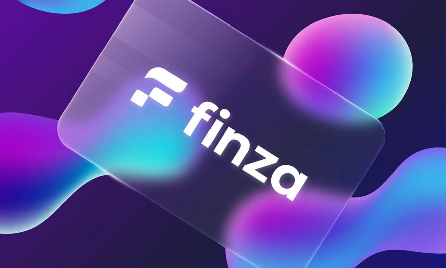
Purple is a rich, dramatic color that embodies luxury, creativity, and sophistication. Historically associated with royalty, nobility, and prestige, purple is effective in logo design for brands aiming to convey a sense of luxury and exclusivity. This color stimulates the problem-solving areas of the brain, encouraging creativity, and imagination, which makes it a favorite among brands in the arts, technology, and high-end service industries.
The psychological impact of purple is linked to its ability to uplift, calm nerves, and inspire. It is less commonly used in branding than colors like blue or red, which can help a logo stand out in a sea of more traditional designs. Brands use purple to suggest wealth and luxury while also hinting at their forward-thinking and visionary qualities.
Different shades of purple can communicate various messages: lighter purples are often seen as romantic and nostalgic, ideal for beauty or floral brands, while darker shades are more aligned with luxury, mystery, and the sophistication required by premium brands.
Pairing purple with gold or silver can enhance its luxurious feel, whereas combining it with green or orange can highlight its creative side. Careful consideration of color combinations and usage can help maintain the balance between being striking and soothing.
Black: Sophistication and Elegance
Black is a powerful and versatile color in the palette of logo design, epitomizing sophistication, elegance, and modernity. It's a popular choice for luxury brands, fashion labels, and high-end corporate businesses that aim to project authority, stability, and strength. In terms of color psychology for logo design, black conveys a sense of exclusivity and serious intent, making it ideal for creating a strong, impactful brand identity.
The use of black in logos can create a striking contrast, especially when paired with brighter colors, which enhances the visual impact and memorability of the brand. It works exceptionally well for minimalist designs, where the focus is on the text or a simple icon, emphasizing the clarity and precision of the brand’s vision.
Black is also associated with precision, professionalism, and cleanliness, which appeals to a wide range of industries from technology to automotive. It can make other colors pop when used as a background, providing a dramatic effect that attracts the viewer's eye.
Designers often choose black for its timeless quality; it doesn't go out of style and works well across various media, from print to digital. However, it's important to use black wisely, as it can be overwhelming if not balanced properly with other design elements.
White: Simplicity and Purity
White is fundamental in logo design, often used to convey simplicity, cleanliness, and purity. It's a color that reflects light, creating a sense of openness and space, which can make a logo feel more approachable and easy to understand. In the realm of color psychology for logo design, white is seen as a blank slate, symbolizing a fresh beginning or unblemished purity, making it a popular choice for health care, child care, and luxury spa brands.
Using white in logo design can provide a sense of clarity and precision, often used effectively in minimalist designs where less is more. It helps other elements of the logo to stand out, such as colorful symbols or detailed typography, ensuring that the focal point of the design catches the viewer’s attention.
White is also versatile; it can adapt to any surrounding color, enhancing other hues without overwhelming them. This adaptability makes it excellent for brands that want to project an image of neutrality and fairness. It’s particularly effective on signage and online, where a white logo can appear crisp and distinct against darker backgrounds.
Moreover, white spaces in a logo can improve readability and recognition, making the brand more memorable. It's essential for designers to balance white with other colors to avoid it appearing too stark or sparse.
Pink: Fun and Feminine
Pink is a versatile color in logo design, commonly associated with femininity, warmth, and playfulness. It can range from soft pastel shades to vibrant hot pinks, each conveying different messages. Lighter pinks are often used to evoke an air of sweetness and innocence, perfect for brands related to babies, women, or confectionery. In contrast, brighter pinks can signify boldness and energy, appealing to a younger, trendier audience.
In the realm of color psychology for logo design, pink can have a calming effect and is used to communicate care and compassion. It’s particularly effective in health and beauty sectors, where it reassures and welcomes users. Pink is also a color of nurturing, making it a good choice for brands that want to convey a sense of security and softness.
Despite its traditional association with feminine traits, modern brands are increasingly adopting pink to break stereotypes and appeal to a broader audience. When used strategically, pink can help a logo stand out in a competitive market by offering a fresh, contemporary look that challenges conventional color choices.
Combining Colors
Combining colors effectively in logo design is essential for conveying a brand's identity and emotional appeal. The right color combinations can enhance brand recognition, create visual balance, and highlight important features of the logo. Understanding color psychology and relationships can help designers create compelling and aesthetically pleasing logos.
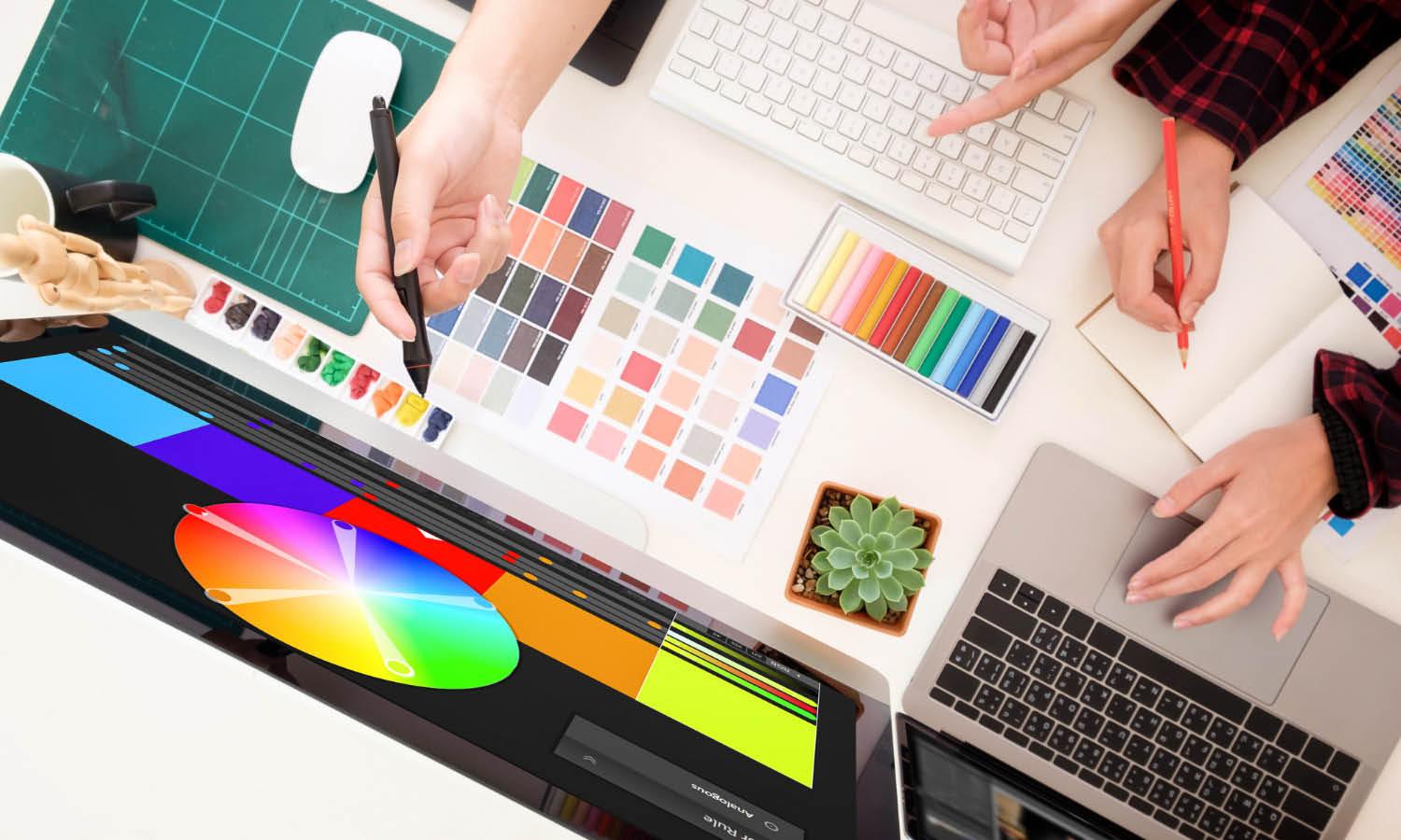
Complementary colors, which are opposite each other on the color wheel, such as blue and orange or red and green, create a vibrant look that stands out due to the high contrast. This approach is often used to draw attention and add excitement to a design. Analogous color schemes, using colors next to each other on the color wheel, offer a more harmonious and cohesive look, suitable for brands aiming for a subtle and unified appearance.
Triadic color schemes, involving three colors evenly spaced around the color wheel, provide a balanced and dynamic effect. This scheme is great for creating a colorful and energetic logo without overwhelming the design. Monochromatic schemes, using different shades, tints, and tones of a single color, can achieve sophistication and depth, emphasizing a cohesive brand identity.
Designers must also consider cultural connotations and industry standards when selecting colors, as these can influence how a logo is perceived by its target audience. The psychology of color combinations is critical in ensuring that the logo not only looks good but also communicates the right message and evokes the desired emotional response.
Conclusion
Understanding the nuances of color psychology in logo design is essential for creating a brand identity that resonates with its intended audience. Each color carries its own psychological weight, influencing perceptions and behaviors. A well-thought-out color scheme can enhance brand recognition, convey key brand messages, and evoke the desired emotional responses. As designers, our challenge is to blend the science of color psychology with aesthetic creativity to craft logos that are not only visually captivating but also strategically effective. Remember, the right color choice can be a key differentiator in a crowded marketplace, making your brand memorable and impactful.
Let Us Know What You Think!
Every information you read here are written and curated by Kreafolk's team, carefully pieced together with our creative community in mind. Did you enjoy our contents? Leave a comment below and share your thoughts. Cheers to more creative articles and inspirations!





Leave a Comment