Discovering The Benefits of Slab Serif Fonts For Logo Designs

Source: Andy Boice, LBA Monogram, Dribble, https://dribbble.com/shots/16029592-LBA-Monogram
In the dynamic world of graphic design, the choice of typeface plays a pivotal role in branding and visual identity. Slab serif fonts, characterized by their bold and impactful serifs, have become a cornerstone in the creation of distinctive and effective logo designs. These fonts are celebrated not only for their aesthetic appeal but also for their versatility across various media and industries. Whether for a startup aiming to make a strong first impression or an established brand looking to reinforce its presence, slab serif fonts offer a blend of tradition and modernity that can communicate reliability and professionalism.
This article delves into the multiple benefits of slab serif fonts in logo design, exploring how they enhance readability, attract attention, and support brand personality. As businesses continue to compete in increasingly crowded markets, understanding the strategic use of slab serif fonts in logos is essential for designers looking to create compelling and memorable brand identities.
Strong Presence
Slab serif fonts are renowned for their ability to make a bold statement in logo designs, providing a strong presence that demands attention. These fonts feature thick, block-like serifs which contribute to a sturdy and robust look, ideal for brands aiming to project strength and stability. The assertive nature of slab serif fonts makes them particularly effective for industries where trust and authority are paramount, such as finance, law, and education. Additionally, their pronounced features enhance the overall visibility of a logo, ensuring that it stands out even in cluttered visual environments.
This visual impact is not only beneficial for physical signage but also translates effectively across digital platforms where distinctiveness and immediate recognition are crucial. By incorporating slab serif fonts into their logos, companies can leverage this typographic style to convey confidence and command respect, key attributes that attract and retain consumer trust.
Personality
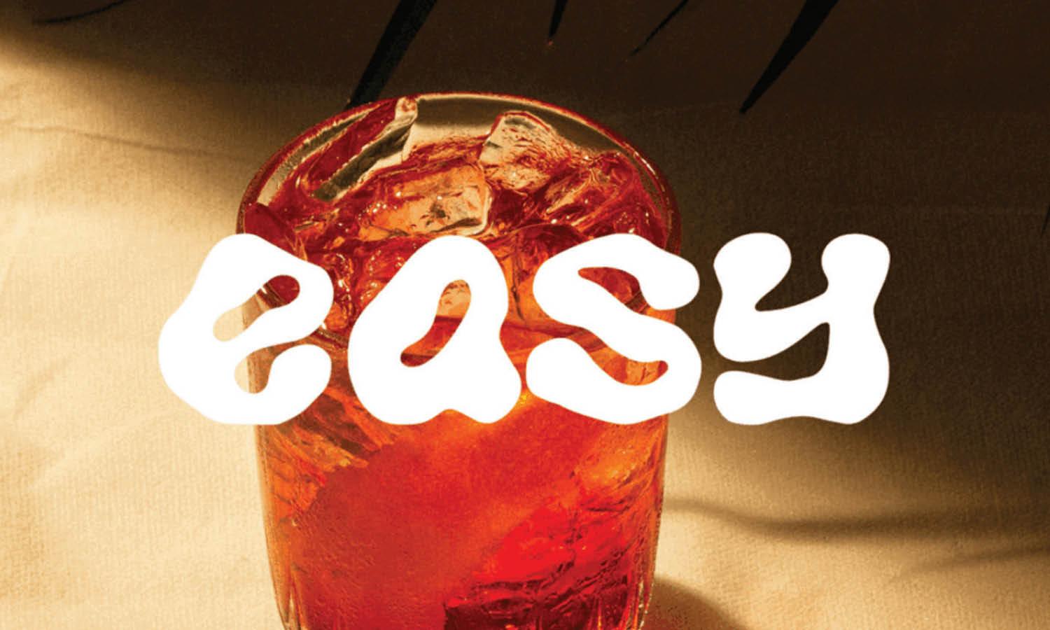
Slab serif fonts are imbued with a distinct personality that can significantly influence a brand's identity and audience perception. Each slab serif variant exudes its own unique traits—from vintage charm to modern sophistication—allowing designers to tailor logos that resonate with the desired brand image. These fonts are versatile enough to express a range of emotions and characteristics, such as friendliness, reliability, or innovation, depending on the specific style chosen. For instance, a rounded slab serif might be used to convey approachability and warmth, ideal for consumer-facing brands like cafes or retail stores, while a more angular slab serif could suggest precision and efficiency, suitable for tech companies or engineering firms.
By carefully selecting the right slab serif font, designers can craft logos that not only stand out visually but also align closely with the brand’s values and the emotions they wish to evoke. This alignment helps in forging a deeper connection with the target audience, enhancing brand loyalty and recognition.
Contemporary Appeal
Slab serif fonts, while steeped in typographic history, have evolved to become a favorite among modern designers for their blend of classic and contemporary styles. This type of font adapts well to current design trends, offering a fresh take on the traditional serif that appeals to a wide range of audiences. The updated versions of slab serif fonts often feature cleaner lines and simplified forms, making them highly suitable for modern brands that aim for a minimalist yet strong visual identity. These contemporary adaptations are perfect for technology companies, lifestyle brands, and digital media, where a balance of readability and stylishness is crucial.
Moreover, the adaptability of slab serif fonts allows them to be effectively used in various contexts, from digital displays to print media, ensuring that a brand's logo remains impactful and cohesive across all platforms. By incorporating slab serif fonts into their logos, designers can achieve a timeless look that resonates with both traditional and modern aesthetics, enhancing the brand’s relevance in today’s competitive market.

Source: LAT | A Creative Company, Naansense, Behance, https://www.behance.net/gallery/172076359/Naansense
Emotional Impact
The choice of typeface in a logo can profoundly influence the emotional response of the target audience, and slab serif fonts are particularly effective in evoking a sense of solidity and trustworthiness. These fonts, with their substantial and weighty serifs, communicate strength and reliability, qualities that are essential for brands looking to establish a strong rapport with their customers. For instance, financial institutions and legal firms often utilize slab serif fonts in their logos to reflect stability and professionalism. The emotional impact of slab serif fonts extends beyond corporate applications; they can also convey warmth and approachability when used in the right context.
A softer slab serif with rounded edges can make a brand seem more friendly and welcoming, ideal for businesses in the hospitality or service industries. This emotional versatility makes slab serif fonts a powerful tool in building a brand's identity and influencing how it is perceived by consumers. By carefully selecting a slab serif font that aligns with the desired emotional impact, designers can significantly enhance the effectiveness of a logo in communicating the brand’s message and values.
Versatility
One of the standout characteristics of slab serif fonts in logo design is their remarkable versatility. These fonts have the unique ability to fit seamlessly into a wide array of industries, from rugged outdoor brands to sleek technology firms. The structural diversity within the slab serif family allows designers to select fonts that align closely with a brand's ethos, whether that’s through a rustic, handcrafted feel or a clean, modern aesthetic. For example, a meaty, robust slab serif can be the perfect choice for a craft brewery wanting to emphasize tradition and craftsmanship, while a streamlined, geometric slab serif might be better suited for a tech startup emphasizing innovation and efficiency.
Additionally, slab serif fonts are not only adaptable across different sectors but also perform well across various media. Whether displayed on a giant billboard or a mobile app icon, these fonts maintain their legibility and impact, making them a practical choice for brands that require a cohesive identity in both digital and print formats. This adaptability extends to marketing materials, corporate communications, and user interfaces, demonstrating that slab serif fonts are not just for logos but can be integral to an entire brand’s visual strategy.
Readability
Readability is a critical aspect of effective logo design, and slab serif fonts excel in this regard. Their distinct structure, characterized by thick, block-like serifs, ensures clarity and ease of reading at various sizes and from distances. This feature is especially beneficial in environments where quick recognition is essential, such as on storefronts, vehicle wraps, and digital ads. The serifs in these fonts help to anchor each letter, creating a cohesive and unified appearance that guides the viewer’s eye along the text. This makes slab serif fonts an excellent choice for logos that need to be instantly recognizable and readable under diverse conditions, including on small screens or when viewed from a moving vehicle.
Furthermore, the inherent boldness of slab serif fonts enhances their visibility, which is crucial for brands looking to make a lasting impression in a saturated market. Their strong presence on the page or screen makes slab serif fonts a reliable choice for businesses aiming to communicate their message clearly and effectively, thereby improving brand recall and customer engagement.
Compatibility
Slab serif fonts stand out for their exceptional compatibility with other typographic styles, making them a favored choice among designers for creating dynamic and harmonious logo designs. These fonts pair remarkably well with a wide range of other typefaces, from the clean lines of sans serif fonts to the elegant flows of script fonts. This versatility allows designers to craft complex typographic hierarchies that can communicate a brand’s message more effectively. For instance, combining a bold slab serif with a delicate script can convey a sense of tradition coupled with modernity, ideal for brands looking to project both heritage and contemporary appeal. Similarly, slab serif fonts can be effectively matched with sans serif fonts to balance seriousness with minimalism, useful for corporate identities that need to project accessibility without sacrificing professionalism.
The substantial structure of slab serif fonts also supports various color treatments and graphic elements, making them highly adaptable to different visual themes and design contexts. Whether used in a standalone setting or as part of a more intricate design, slab serif fonts enhance the visual coherence of a logo, ensuring that it not only attracts attention but also maintains stylistic integrity across various applications and touchpoints.

Source: João Pedro Prux, Vaivolta | Moda Consciente, Behance, https://www.behance.net/gallery/171981537/Vaivolta-Moda-Consciente
Visibility
Visibility is paramount in logo design, and slab serif fonts excel in making logos distinctly noticeable and easy to recognize. Their bold, block-like serifs and uniform thickness provide a clear advantage in setting a logo apart from its surroundings, ensuring it catches the eye of potential customers. This is particularly crucial in competitive business environments where a logo must be immediately identifiable from a distance or at a glance. Slab serif fonts offer high legibility, which is essential when logos appear in varied sizes and on different media, from tiny mobile screens to large billboards. The strong and stable appearance of slab serif fonts also contributes to their effectiveness in both print and digital media, enhancing the logo’s presence irrespective of the background or texture upon which it is placed.
Additionally, the defined shapes of slab serif fonts help to outline and frame the text within a logo, boosting its visual impact and making it more memorable. These characteristics not only improve the visual accessibility of a brand but also strengthen brand recognition, a critical factor in building trust and loyalty among consumers. In essence, slab serif fonts provide a practical solution for businesses aiming to achieve both standout appeal and consistent visibility in their logo designs.
Professionalism
Slab serif fonts are synonymous with professionalism in logo designs, providing a solid foundation for brands to express reliability and authority. These fonts, with their substantial and sturdy serifs, convey a sense of permanence and seriousness that is crucial for industries such as finance, law, and academia. The structured appearance of slab serif fonts lends an air of formality and confidence, making logos appear more credible and trustworthy. This is particularly beneficial for businesses that need to establish a strong professional image to foster client trust and business growth. The inherent boldness of slab serif fonts also underscores the message of strength and stability, attributes that are essential in corporate communications.
Furthermore, the clear and readable nature of slab serif fonts ensures that this professionalism is communicated effectively across various platforms and scales, from business cards to corporate websites. By incorporating slab serif fonts into their logo designs, companies can project a refined and authoritative image, which helps in building a reputable brand identity that resonates with both existing and potential clients.
Brand Consistency
Utilizing slab serif fonts in logo designs significantly contributes to brand consistency, a key element in building a recognizable and coherent brand identity. These fonts offer a classic yet versatile look that can be seamlessly integrated into various branding elements beyond logos, including marketing materials, website design, and corporate communications. The uniform and distinct appearance of slab serif fonts ensures that they maintain their integrity and impact across different media and applications, reinforcing the brand’s visual theme at every touchpoint. This consistency helps in strengthening brand recall among consumers, as the repeated exposure to similar typographic elements fosters familiarity and trust.
Moreover, slab serif fonts are durable in style, resisting trends that come and go, which allows a brand to maintain a consistent visual identity over time without appearing outdated. The adaptability of slab serif fonts to different design aesthetics also means they can evolve with the brand while preserving its core visual elements. This enduring consistency is crucial for brands aiming to establish a long-term presence in the market and achieve lasting customer loyalty.
Conclusion
Slab serif fonts offer a unique blend of form and function, making them an excellent choice for logo designs across various industries. Their bold structure enhances visibility and impact, while their versatility and readability ensure that they adapt well to multiple branding needs. Whether aiming to project professionalism, consistency, or a strong emotional connection, slab serif fonts provide designers with a reliable typographic tool to craft compelling brand identities. Embracing these fonts in logo designs not only elevates a brand’s aesthetic but also reinforces its message, making it resonate more profoundly with its target audience.
Let Us Know What You Think!
Every information you read here are written and curated by Kreafolk's team, carefully pieced together with our creative community in mind. Did you enjoy our contents? Leave a comment below and share your thoughts. Cheers to more creative articles and inspirations!


Leave a Comment