Main Reasons Why You Should Only Use Letters For Logo Design

Source: Loren Klein, Shine Bright Lettering, Dribble, https://dribbble.com/shots/17134714-Shine-Bright-Lettering
When creating a strong brand identity, logo design plays a crucial role in how a business is recognized and remembered. While many logos rely on symbols, icons, or complex graphics, some of the most effective and timeless brands focus primarily on letters. Using letters in logo design allows businesses to present their brand name clearly while maintaining a clean and professional appearance. This approach is widely used by successful companies because it keeps the message simple and direct.
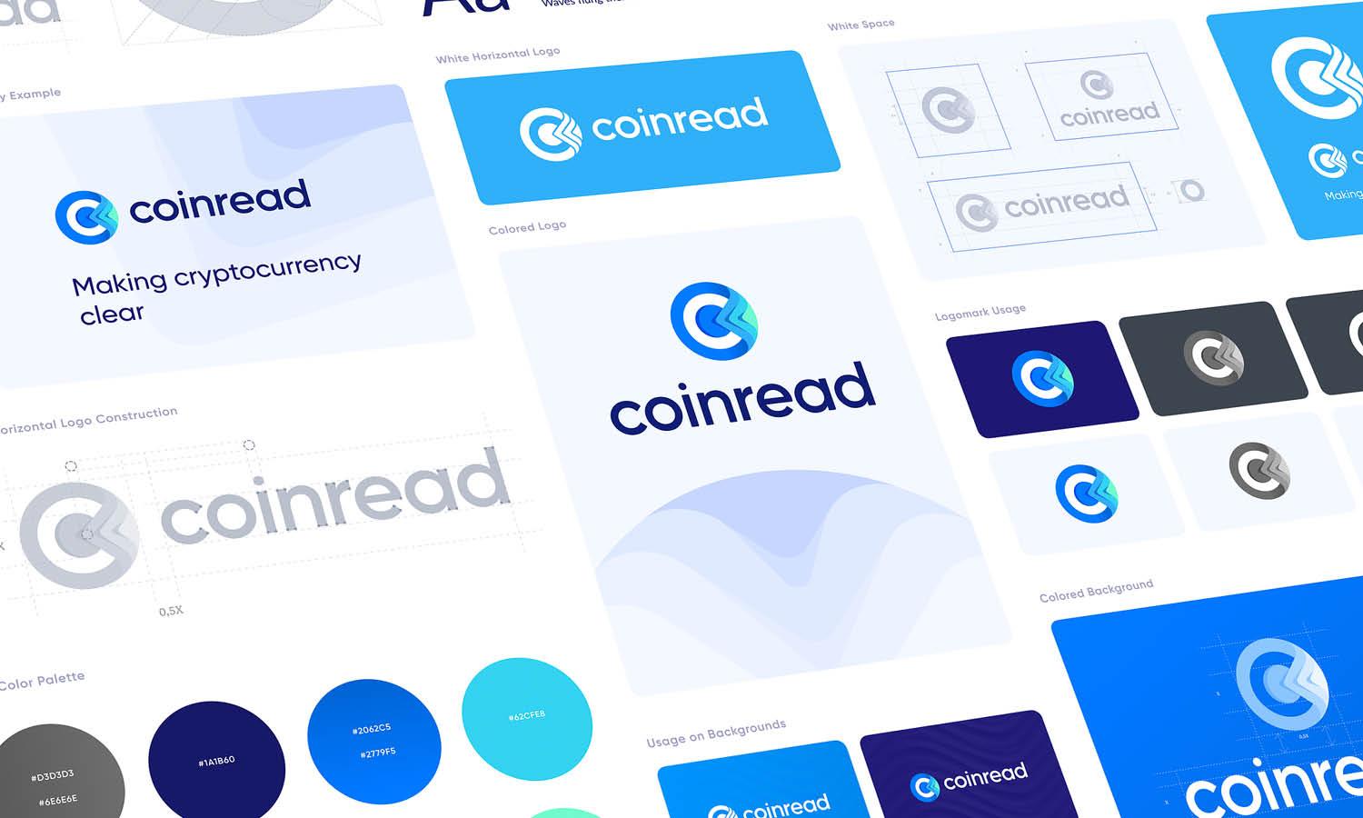
Letters in logo design can communicate a brand’s identity without unnecessary visual distractions. Whether it is a full wordmark or a monogram, letter-based logos help audiences immediately connect the brand name with the visual identity. This clarity makes it easier for customers to remember the brand and recognize it across different platforms, from websites and packaging to social media and advertisements.
Another advantage of using letters in logo design is flexibility. Letter-based logos can easily adapt to various sizes and formats while maintaining readability and visual balance. Designers can experiment with typography, spacing, and style to create a unique look without making the logo overly complicated. In this article, we will explore the main reasons why using letters can be a powerful strategy in logo design and how it can strengthen a brand’s visual identity.
Simplicity Makes Logo Design More Memorable
One of the strongest reasons to use letters in logo design is simplicity. A simple logo is often easier for audiences to recognize, remember, and recall. When a logo design focuses on letters rather than complex illustrations or symbols, the visual message becomes clearer and more direct. This clarity allows viewers to immediately associate the design with the brand name.
Letters remove unnecessary visual elements that might distract the audience. Instead of interpreting an icon or graphic, people can quickly read and understand the brand identity through typography. In many successful logo design examples, companies rely on letters to communicate their brand in a clean and professional way. Well-designed lettering can instantly create a recognizable identity without overwhelming the viewer.
Simplicity also improves consistency across different marketing materials. Whether the logo appears on a website header, business card, packaging, or social media profile, a letter-based logo design remains clear and easy to reproduce. Letters maintain their structure and legibility even when the logo is scaled down or printed in small sizes.
Designers can still create visual personality through typography choices, spacing, and styling. Even without symbols, letters can express creativity and brand character. Because of this balance between simplicity and flexibility, many designers prefer using letters as the core element in logo design.
Ultimately, a simple logo design built around letters helps brands stay memorable, recognizable, and visually clean. This approach keeps the focus on the brand name while maintaining a professional and timeless appearance.
Letters Create Strong Brand Recognition
Another important advantage of using letters in logo design is the ability to build strong brand recognition. When the brand name itself becomes the visual identity, audiences can easily remember and associate the company with its logo. Letters help reinforce the connection between the brand name and the overall visual appearance.
In many cases, people recognize brands not just by their symbols but by the distinctive way their names are displayed. A thoughtful logo design that uses letters allows designers to shape typography in a unique way. Elements such as letter spacing, custom fonts, and stylistic details can transform ordinary text into a distinctive visual mark.
Letters also help eliminate confusion that sometimes occurs with symbolic logos. Icons may require interpretation, but letters immediately communicate the brand name. This direct approach strengthens familiarity because customers repeatedly see and read the name every time they encounter the logo design.
Consistency is another factor that supports brand recognition. A letter-based logo design can be used across many platforms while maintaining the same visual identity. Whether it appears on advertisements, packaging, websites, or merchandise, the letters remain the central element that people remember.
Over time, this repeated exposure builds trust and familiarity. Customers begin to recognize the shape and style of the letters even before fully reading the name. Because of this, using letters in logo design can become a powerful tool for building long-term brand recognition and identity.
Letter-Based Logo Design Works Across All Sizes
Scalability is an essential factor in effective logo design, and letters perform exceptionally well when a logo needs to appear in different sizes. A logo design that relies on letters can maintain clarity and legibility whether it is displayed on a large billboard or a small mobile screen. Because letters are naturally structured and recognizable, they adapt easily to various visual environments.
When a logo design includes detailed illustrations or complex symbols, those elements can sometimes lose clarity when scaled down. Small sizes may blur intricate shapes, making the design difficult to recognize. In contrast, letters provide a clean and structured visual form that remains readable even at very small dimensions.
This advantage becomes especially important in today’s digital landscape. Brands must ensure their logo design works well on websites, social media icons, mobile applications, and profile thumbnails. Letters simplify this challenge because typography can be optimized for both large and small displays without sacrificing recognition.
Letter-based logos also work effectively across different printing materials. From product packaging and stationery to signage and promotional merchandise, letters keep the logo design consistent and readable. Designers can adjust weight, spacing, or layout to maintain balance while preserving the core identity.
Because of their adaptability, letters help ensure that a logo design remains functional and recognizable across every platform. This scalability makes letter-focused logo design a reliable and practical choice for brands that want a flexible and dependable visual identity.

Source: SAMPLE, Lang Beer Co, Dribble, https://dribbble.com/shots/17022301-Lang-Beer-Co
Letters Provide Clear Brand Communication
Clear communication is one of the most important goals of effective logo design. When letters are used as the main element, the logo immediately communicates the brand name without requiring interpretation. This direct approach helps audiences quickly understand who the brand is and what name they should remember.
Some logo designs rely heavily on abstract symbols or icons that may require explanation before customers understand their meaning. While symbols can be visually appealing, they sometimes create confusion if the connection to the brand is not obvious. Letters remove this uncertainty by placing the brand name at the center of the visual identity.
In letter-focused logo design, typography becomes the primary tool for expressing personality and style. Designers can adjust letter shapes, spacing, and proportions to reflect the brand’s character. A modern brand might use sleek and minimal letters, while a more traditional company may choose classic or elegant typography.
This flexibility allows letters to communicate both information and personality at the same time. The audience not only reads the brand name but also experiences the visual tone that the typography conveys. As a result, the logo design becomes both informative and expressive.
By using letters, businesses ensure their message remains simple, direct, and easy to recognize. This clarity strengthens brand identity and helps audiences instantly associate the logo design with the company behind it.
Letter Logos Offer Greater Design Versatility
Another important reason to rely on letters in logo design is the level of versatility they provide. Letters can easily adapt to different styles, layouts, and branding needs while still maintaining a consistent identity. Designers have the freedom to experiment with typography, spacing, alignment, and structure to create a unique and recognizable mark. Because letters form the foundation of written language, they can be reshaped and stylized without losing their basic meaning.
In many cases, a letter-based logo design can work in multiple formats. Designers can create a full wordmark for official branding while also developing a shorter monogram using the same letters for smaller applications. This flexibility allows the logo design to remain consistent across different marketing materials, from websites and packaging to social media profiles and promotional products.
Letters also make it easier to adjust the design when needed. Typography can be modified by changing thickness, spacing, or proportions while keeping the core structure intact. This means designers can refresh or modernize a logo design over time without completely changing the brand identity.
Another advantage is that letters can blend well with other design elements if necessary. While the main focus remains on typography, subtle shapes, lines, or color treatments can enhance the visual impact without overpowering the letters themselves.
Because of this flexibility, letters allow designers to build logo design systems that remain adaptable across many platforms. This versatility ensures that the brand identity stays recognizable while still offering creative freedom for different visual contexts.
Letter-Based Logo Design Supports Timeless Branding
Timelessness is one of the most valuable qualities in successful logo design. Trends in graphics and visual styles constantly change, but letters tend to remain stable and recognizable over time. When a logo design is built primarily around letters, it becomes less dependent on design trends that may quickly go out of style.
Many famous brands have maintained letter-based logos for decades because typography ages more gracefully than complex illustrations or trendy visual effects. Letters allow designers to focus on balance, proportion, and readability rather than temporary stylistic elements. This approach helps the logo design stay relevant even as design preferences evolve.
Typography itself offers a wide range of possibilities, from classic serif styles to modern sans-serif lettering. By choosing the right type style, designers can create a logo design that reflects the brand’s personality while maintaining a timeless appearance. Letters can also be slightly refined over the years without drastically changing the overall identity.
Another reason letters support long-term branding is that they strengthen the connection between the logo and the brand name. As customers repeatedly see the letters associated with the company, the visual identity becomes deeply embedded in their memory. This familiarity helps maintain brand recognition even as the market changes.
Because of their stability and clarity, letters make logo design more durable over time. A well-crafted typographic logo can continue to represent a brand effectively for many years without requiring major redesigns.
Letters Help Maintain Visual Consistency
Visual consistency is a key factor in building a strong and recognizable brand identity. Using letters as the main element in logo design helps maintain a consistent appearance across various platforms and marketing materials. Because letters follow a structured form, they allow designers to keep the visual identity stable while applying the logo to different environments.
When a logo design relies on letters, the typography becomes the central visual feature. This makes it easier to create a unified style across brand assets such as websites, packaging, advertisements, and social media graphics. The same letterforms, spacing, and proportions can be repeated throughout the brand’s visual system, reinforcing recognition each time the audience encounters the design.
Letters also simplify the process of maintaining design guidelines. Designers can define clear rules for how the letters should appear, including font usage, alignment, spacing, and color variations. These guidelines help ensure that the logo design remains visually consistent even when different teams or designers work with the brand materials.
Consistency is especially important in modern branding where companies appear across many digital and physical platforms. A letter-based logo design ensures that the brand identity remains stable whether it appears on mobile screens, printed documents, signage, or product packaging.
By focusing on letters, designers create a reliable visual structure that supports long-term brand consistency. This approach strengthens recognition and helps audiences easily connect the logo design with the brand’s overall identity.

Source: Logo Collection, Ilham Herry, Dribble, https://dribbble.com/shots/17431673-Logo-Collection
Letter Logos Are Easier For Audiences To Remember
Memorability is one of the main goals of effective logo design, and letters play an important role in helping audiences remember a brand. When a logo design uses letters, viewers are not only seeing a visual symbol but also reading the brand name at the same time. This combination strengthens the connection between the visual identity and the brand itself.
Human memory often responds well to familiar shapes and recognizable characters. Letters are part of everyday reading, which makes them naturally easier for people to process and recall. When designers build a logo design around letters, the brand name becomes the focal point of the visual experience.
Typography can also enhance memorability through unique styling. Designers may adjust the shape, spacing, or alignment of letters to create a distinctive appearance. Even subtle modifications can transform ordinary text into a recognizable logo design that stands out among competitors.
Another advantage is repetition. Every time customers see the logo, they also see the brand name displayed through the letters. This repeated exposure reinforces memory and helps audiences quickly recognize the brand in different situations, whether on advertisements, packaging, or digital platforms.
Because letters directly communicate the brand name while forming a visual identity, they make logo design easier to remember. Over time, audiences may recognize the style of the letters instantly, strengthening the brand’s presence and familiarity in the market.
Letter-Based Logo Design Reduces Visual Complexity
One of the biggest challenges in logo design is avoiding unnecessary visual complexity. When too many shapes, icons, or decorative elements are included, the logo can become difficult to understand and remember. Using letters as the main element helps simplify the overall structure of a logo design while still communicating the brand identity clearly.
Letters provide a natural structure that designers can rely on when building a visual identity. Because letters already carry meaning through language, they eliminate the need for additional explanatory graphics. A well-crafted typographic logo design can communicate the brand name directly, allowing the audience to instantly recognize the business without interpreting extra symbols.
Reducing complexity also improves readability. A logo design that focuses on letters remains clear even when viewed quickly or from a distance. This is especially important in modern branding environments where people encounter logos on mobile screens, social media feeds, and fast-moving advertisements.
Designers can still add personality through subtle typographic adjustments. Changes in letter spacing, stroke weight, or custom letterforms can make the logo design distinctive while keeping the overall composition simple. This balance allows the logo to remain visually interesting without becoming cluttered.
By focusing on letters, designers create logo design solutions that are clean, structured, and easy to understand. This reduction in visual complexity helps audiences quickly identify the brand and remember it long after the first interaction.
Letters Strengthen Professional Brand Identity
Another strong reason to use letters in logo design is their ability to create a professional and confident brand identity. Letters naturally represent the brand name, making the logo feel direct, trustworthy, and authentic. When the company name becomes the central design element, the brand message is communicated clearly and confidently.
Typography plays a major role in shaping how a brand is perceived. In letter-based logo design, designers carefully select or customize type styles that reflect the brand’s personality. Clean and modern letters can communicate innovation and efficiency, while more traditional typography can express reliability and heritage.
Letters also allow brands to appear more refined and organized. Because typography follows clear proportions and structure, it creates a balanced and professional visual impression. This structured appearance helps audiences feel that the brand is credible and well established.
Another benefit is that letter-focused logo design often looks polished across many different mediums. Whether used on corporate documents, product packaging, signage, or digital platforms, the letters maintain a consistent and professional presence. This reliability strengthens the brand image over time.
By using letters as the foundation of logo design, companies highlight their brand name while presenting a clean and professional identity. This approach helps build trust with audiences and supports a strong, recognizable brand presence in competitive markets.
Conclusion
Using letters in logo design offers many advantages for brands that want clarity, consistency, and long-term recognition. Letter-based logos simplify visual communication by placing the brand name at the center of the identity. This approach makes the logo design easier to remember, scalable across different platforms, and adaptable to various branding materials. Through thoughtful typography and balanced composition, letters can express personality while maintaining a clean and professional appearance. For many businesses, focusing on letters in logo design provides a reliable way to build a recognizable brand identity that remains effective and relevant over time.
Let Us Know What You Think!
Every information you read here are written and curated by Kreafolk's team, carefully pieced together with our creative community in mind. Did you enjoy our contents? Leave a comment below and share your thoughts. Cheers to more creative articles and inspirations!


Leave a Comment