How To Create Simplicity In Logo Design

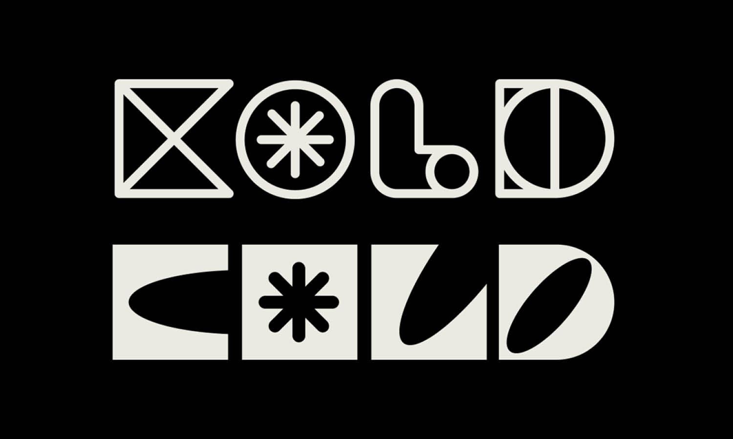
Source: Elif Kamesoglu, Revolva Brand Identity, Behance, https://www.behance.net/gallery/175219653/Revolva-Brand-Identity
In the world of branding, the power of simplicity in logo design cannot be overstated. A simple logo not only fosters instant recognition but also ensures effective communication of the brand’s essence to the target audience. The challenge, however, lies in distilling a brand's identity into a design that is both minimalist and impactful. This article explores essential strategies for achieving simplicity in logo design, offering designers at every level the insights needed to create visually compelling and memorable logos. By prioritizing clarity, minimalism, and functionality, designers can craft logos that stand out in today’s crowded marketplace.
The goal is to combine creativity with restraint, ensuring that each design element is both necessary and purposeful. As we delve into practical tips and methodologies, we aim to equip you with the tools to simplify complex concepts into clean, scalable, and versatile logos. Embracing simplicity allows a logo to resonate deeply and lastingly with its intended audience, ensuring a lasting impact on the brand's visual identity.
Understand the Brand Essence
Achieving simplicity in logo design starts with a profound understanding of the brand essence. This foundational step involves diving deep into the brand's mission, values, and target audience to ensure that the logo communicates these elements effectively and succinctly. A simple logo does not just represent the brand visually; it encapsulates its entire ethos in a single, memorable image. Designers must distill complex ideas into a clear, concise symbol that speaks to the audience at a glance. By focusing on the core aspects of the brand, designers can eliminate unnecessary elements that clutter the message, thereby enhancing the logo's impact.
The process includes identifying key themes and messages that are vital to the brand and translating these into visual elements that are easy to understand and remember. This approach not only ensures a cleaner, more straightforward design but also helps the logo remain versatile across various media. Ultimately, understanding the brand essence is about finding the soul of the brand and giving it a visual form that is both elegant and expressive, perfectly balancing aesthetic appeal with functional simplicity.
Use Minimalist Shapes
Incorporating minimalist shapes is a key strategy in creating simplicity in logo design. Simple geometric forms like circles, squares, and triangles can convey messages powerfully and succinctly. These basic shapes are easily recognizable, making them ideal for logos that need to be understood and remembered quickly. By using minimalist shapes, designers can create strong visual impacts with less, ensuring the logo remains effective even when viewed from a distance or at a small size. This approach also aids in versatility, as simple shapes are more likely to be adaptable across different platforms and scales.
Designers can experiment with these shapes to encapsulate the brand’s identity in a straightforward yet striking manner. For instance, a circle can suggest unity and inclusion, squares can convey stability and balance, and triangles might represent direction or growth. Selecting the right shape to represent a brand's essence is crucial, as it forms the foundation of the logo's visual impact. Embracing minimalist shapes not only contributes to the aesthetic of simplicity but also ensures that the logo remains timelessly relevant in various applications.
Limit Color Palettes
Limiting the color palette is a fundamental step in creating simplicity in logo design. Choosing a minimal number of colors—often no more than two—can significantly enhance the logo’s visual impact and ensure it remains memorable. A restricted color palette simplifies the design and reinforces brand recognition, as consistent colors become strongly associated with the brand. When selecting colors, it is crucial to understand the psychology behind them, as each color can evoke different emotions and meanings. For instance, blue often represents trust and dependability, while red can evoke energy and passion. By selecting the most appropriate colors that align with the brand’s values and message, designers can create a strong emotional connection with the audience.
Additionally, using fewer colors can also reduce printing costs and make the logo more versatile across various media. The challenge lies in choosing a palette that not only looks great but also works effectively in black and white or grayscale for times when color printing is not feasible. This approach not only contributes to the logo’s simplicity but also ensures its functionality across different applications and contexts.

Source: Mateus Ritter, Place Coworking, Behance, https://www.behance.net/gallery/172617847/Place-Coworking
Focus on Scalability
Scalability is crucial in maintaining simplicity in logo design. A well-designed logo must be effective and recognizable at any size, from a giant billboard to a tiny social media icon. This requires a focus on simple, clean lines and avoiding overly intricate details that might blur or become lost when the logo is scaled down. The key is to create a logo that is as legible on a small piece of merchandise as it is on a large advertisement. Designers should regularly test the logo’s scalability by viewing it at various sizes and on different mediums to ensure it maintains its integrity and impact.
This might involve simplifying elements that do not scale well or adjusting proportions to ensure clarity at smaller sizes. Effective scalability not only enhances the logo’s versatility across different platforms but also contributes to its overall simplicity. This simplification process helps in creating a timeless logo that can adapt to evolving brand needs and media formats without losing its essence or effectiveness.
Avoid Unnecessary Text
In the pursuit of simplicity in logo design, one effective strategy is to minimize or entirely avoid unnecessary text. Text can clutter a logo, detract from its visual impact, and complicate its message. Instead, focus on using the brand's name or initials in a clean, readable font. This approach not only enhances the logo’s simplicity but also increases its recognizability. When text is deemed necessary, choose typography that complements the logo’s overall design without overpowering the visual elements. Fonts should be simple yet appropriate for the brand’s personality, ensuring that they are legible across various sizes and mediums.
This might mean opting for sans-serif fonts, which are often more readable and scale better than their serif counterparts. Additionally, consider the spacing between letters and words carefully; proper kerning and leading can significantly impact the logo's readability and aesthetic appeal. By reducing text to the essentials, designers can create a more streamlined and impactful logo that communicates effectively with its intended audience.
Opt for a Single Focal Point
Creating simplicity in logo design often involves opting for a single focal point. This design principle helps in directing the viewer’s attention immediately to the most important element of the logo, making the brand’s identity clear and memorable. A singular focal point can be a graphic, a letter, or a symbol that encapsulates the essence of the brand succinctly. This approach avoids the visual chaos that can occur with multiple competing elements, allowing for a cleaner and more impactful design. When choosing the focal point, consider what aspect of the brand should be highlighted and how it can be visually represented in the simplest form.
The focal point should stand out due to its placement, size, color, or unique design, yet it should seamlessly integrate with the rest of the logo to create a cohesive look. This strategy not only enhances the logo’s visual appeal but also ensures that it remains effective and versatile across various applications, from digital media to print. A well-defined focal point in a logo design simplifies the message and strengthens brand recognition, making it a powerful tool in achieving simplicity.
Prioritize Readability Over Complexity
In the realm of logo design, prioritizing readability over complexity is crucial for creating a simple and effective logo. This approach ensures that the logo remains understandable and impactful, regardless of where it is displayed. Designers should focus on making each element of the logo clear and distinguishable, avoiding intricate graphics that could become indecipherable at smaller sizes. This is particularly important in today’s digital age, where logos must perform well on various platforms and devices. A readable logo helps in establishing strong brand recognition and recall, as it is easily identifiable by the audience. To achieve this, choose fonts and elements that are simple and bold, ensuring they can be seen from a distance or when scaled down.
Additionally, consider the contrast between the logo and its background, as high contrast can significantly enhance readability. By simplifying design elements and focusing on legibility, designers can create logos that not only convey the brand’s identity but also ensure its longevity in the marketplace.

Source: Nikola Matosevic, Asterrio - Logo 1, Dribble, https://dribbble.com/shots/21982656-Asterrio-Logo-1
Refine Line Work
Refining line work is a key aspect of creating simplicity in logo design. Clean, well-defined lines contribute to a sharp and professional appearance, making the logo more recognizable and aesthetically pleasing. When designing, it's important to consider the thickness and consistency of lines. Uniform line weight throughout the design can help maintain a cohesive look. Avoid overly complicated line patterns that can clutter the logo and detract from its simplicity. Instead, strive for streamlined, straightforward lines that convey the brand’s message without unnecessary adornment. This refinement of line work not only enhances the design’s overall clarity but also its adaptability across different media.
A logo with well-executed lines will be more versatile, appearing crisp and clear whether it’s on a large billboard or a small business card. By focusing on clean lines and avoiding fussiness, designers can ensure that the logo remains effective and enduring, embodying the essence of simplicity in every curve and stroke.
Use Symmetry and Alignment
Symmetry and alignment are essential elements in achieving simplicity in logo design. They create a sense of balance and harmony that is pleasing to the eye, making the logo more aesthetically appealing and easier to recognize. Symmetrical designs are inherently attractive because they mirror elements evenly, which can enhance the logo’s memorability. When designing a logo, consider using symmetrical or nearly symmetrical layouts as they often convey stability and professionalism. Alignment, on the other hand, refers to the orderly arrangement of elements within the design, ensuring that each component is in its proper place. Proper alignment not only improves the structure and cohesion of the logo but also reinforces its readability. It helps in creating a clean, organized look that communicates the brand’s message more effectively.
When elements in a logo are well-aligned, they create a seamless visual flow that guides the viewer’s eye across the design. This technique reduces visual clutter and focuses the viewer’s attention on the most important aspects of the logo. Using symmetry and alignment can significantly simplify the design process, leading to a logo that is both beautiful and functional.
Stay Trend-Aware but Timeless
In logo design, balancing current trends with timeless appeal is crucial for creating a simple yet effective logo. Staying informed about the latest design trends can provide inspiration and keep your work fresh and relevant. However, it's important to filter these trends through the lens of simplicity and longevity. The goal is to adopt elements that enhance the logo’s clarity and recognition without making it overly trendy or ephemeral. A timeless logo avoids fleeting design gimmicks and focuses on basic principles of good design, such as clarity, readability, and simplicity. To achieve this, choose styles and elements that have stood the test of time—such as clean lines and simple forms—and integrate them in a way that feels both contemporary and enduring.
This approach ensures that the logo will continue to be effective and appealing, even as design trends evolve. Additionally, maintaining a minimalist aesthetic can prevent the logo from becoming dated too quickly. By being trend-aware yet aiming for timelessness, designers can create logos that not only capture the essence of the brand today but also adapt smoothly to future changes, ensuring lasting relevance in the market.
Conclusion
Mastering simplicity in logo design is about more than just aesthetic appeal—it's about creating a clear, memorable identity that resonates with audiences. By focusing on core design principles such as minimalism, readability, and timeless elements, designers can craft logos that not only stand out but also endure. Employing strategies like limiting color palettes, focusing on a single focal point, and maintaining scalability ensures that logos remain effective across various platforms and uses. Ultimately, a simple logo design is a powerful tool for communicating a brand's essence succinctly and strikingly, making it a fundamental aspect of successful branding.
Let Us Know What You Think!
Every information you read here are written and curated by Kreafolk's team, carefully pieced together with our creative community in mind. Did you enjoy our contents? Leave a comment below and share your thoughts. Cheers to more creative articles and inspirations!


Leave a Comment