10 Common Shapes of Logo Design

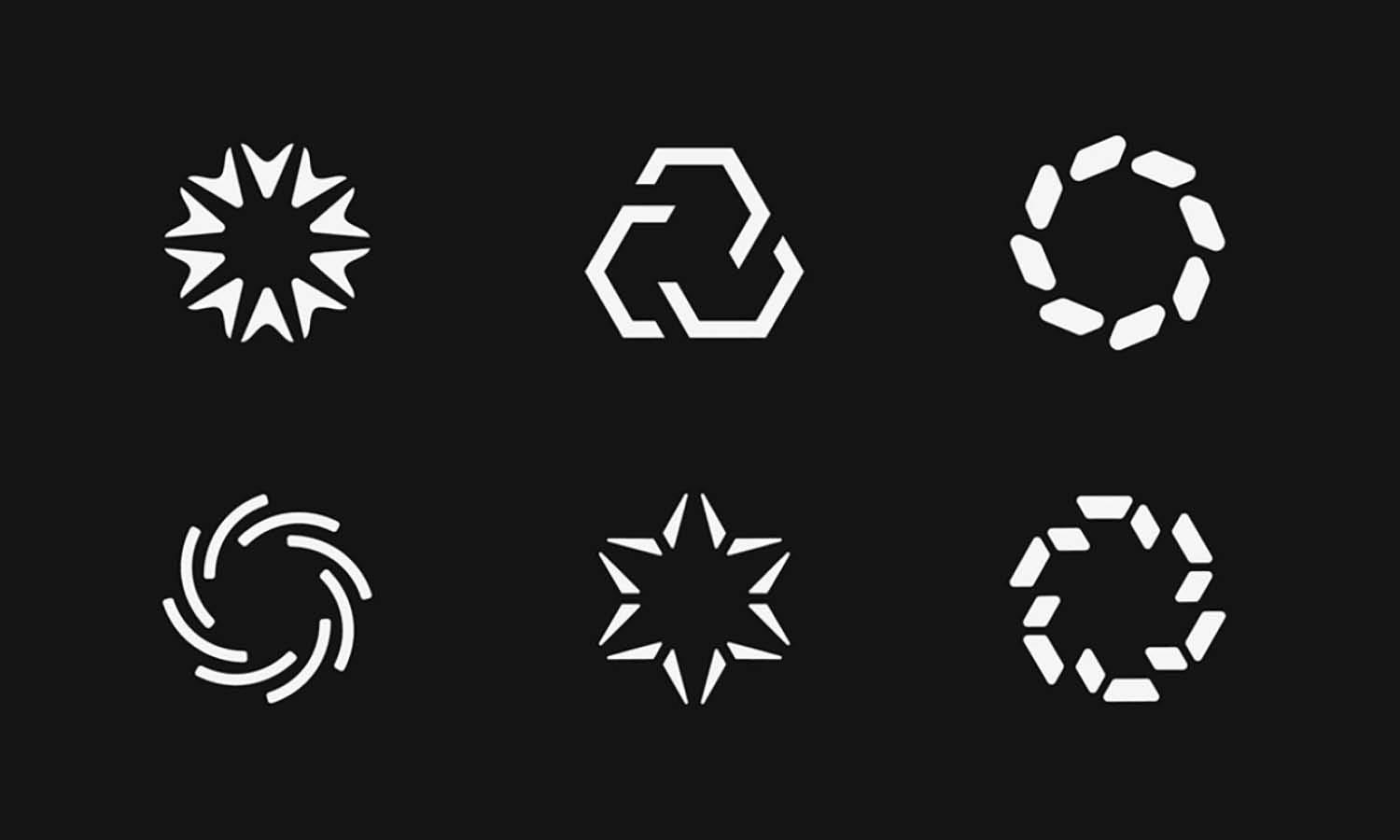
Source: Abstract Circle Logo Set 4, Connor Fowler, Dribble, https://dribbble.com/shots/9736335-WW030-Circle-Logo-4
Understanding the various shapes used in logo design is crucial for creating visually appealing and meaningful brand identities. Each shape incorporated into a logo carries deep symbolic significance and can convey a brand's message without words. From the reassuring roundness of circles that promote unity and inclusion to the sharp edges of squares and triangles that denote stability and dynamic action, every design choice matters. In the digital age, where first impressions are often visual, selecting the right shape can dramatically enhance brand recognition and customer recall.
This article explores ten common shapes in logo design, providing insights into how each can be strategically used to enhance a brand's perception. Whether you're a new designer or a seasoned professional, understanding these fundamental elements will equip you to craft logos that resonate with audiences and stand the test of time. By the end of this guide, you’ll have a solid foundation in the principles that guide effective logo design using the most common shapes.
Circles: Encouraging Unity
Circles in logo design are profoundly effective in promoting a sense of unity and wholeness. This shape, free from any beginning or end, symbolizes eternity and commitment, making it a popular choice among brands that want to emphasize community, partnership, and stability. Circles are often seen in logos where emotional engagement is critical, such as in healthcare, community services, and education sectors. The round form helps soften a brand's image, inviting an inclusive and welcoming vibe that appeals universally. Moreover, the circular shape can also represent movement, such as spinning wheels or rotating objects, suggesting innovation and continuous progress.
The psychological impact of circles extends to protection and safety, enveloping the viewer in a sense of security and trust. By incorporating circles into a logo, designers can subtly influence consumer perceptions, fostering a bond that resonates on a subconscious level. Such logos are not only memorable but also foster a strong brand allegiance due to their harmonious and balanced visual appeal.
Squares and Rectangles: Symbolizing Stability
Squares and rectangles are the pillars of strength and reliability in logo design. Their straight lines and right angles project order and predictability, which is essential for brands that aspire to convey professionalism and stability. This shape preference is dominant in industries like banking, law, and technology, where trust and dependability are paramount. The use of squares and rectangles can also suggest a foundational structure, highlighting the enduring qualities of a brand. These shapes are versatile; horizontal rectangles can suggest calm and stability, while vertical rectangles might appear more assertive and bold.
The geometric clarity of these shapes makes them excellent for stacking, which is ideal for web and print layouts, ensuring that the logos are scalable and functional across various media. By choosing squares and rectangles, designers can effectively communicate a brand's reliability and solidity, appealing to a target audience that values strength and professionalism. These shapes not only build a robust visual identity but also reinforce a brand’s presence in a competitive market.
Triangles: Indicating Action
Triangles are dynamic elements in logo design, known for conveying action, direction, and progress. Their sharp angles and pointed tips create a sense of movement and urgency, making them an excellent choice for brands that want to appear innovative and forward-thinking. The orientation of a triangle can also significantly affect its impact; an upward-pointing triangle suggests growth and ascent, ideal for companies in finance or technology. In contrast, a downward-pointing triangle might represent stability and grounding, suitable for construction and real estate businesses.
The three sides of a triangle are sometimes used to symbolize strength and resilience, reflecting a company’s foundational values. Triangles can also imply conflict or tension, which can be harnessed creatively to highlight a brand’s disruptive presence in the market. Additionally, the use of triangles can tap into psychological symbolism associated with various mythologies and religions, adding a layer of depth to the brand's narrative. For brands looking to evoke excitement and energy, integrating triangles into their logo design can effectively capture the essence of motion and innovation.

Source: LivaArt Visual Identity, Milos Bojkovic, Dribble, https://dribbble.com/shots/17851178-LivaArt-visual-identity
Horizontal Lines: Conveying Calmness
Horizontal lines in logo design are emblematic of tranquility and stability. These lines suggest a landscape of calmness and balance, evoking a serene and dependable image. Brands that wish to project an image of trust and tranquility often utilize horizontal lines to emphasize their grounded nature. This design element is particularly prevalent in healthcare, wellness, and financial services, where calmness and stability are key attributes that attract customers. The elongated width of horizontal lines can also create a perception of breadth and space, which helps in making the logo more visually appealing and easily recognizable.
Moreover, horizontal lines can suggest a journey or pathway, subtly indicating progress and continuity in a calm, measured manner. This can be especially effective for brands that want to highlight their journey-oriented approach, such as consulting firms and educational institutions. By incorporating horizontal lines, logo designers can communicate a brand’s calm, steady reliability, reassuring customers of their consistent and professional approach.
Vertical Lines: Expressing Strength
Vertical lines in logo design are powerful tools for conveying strength and professionalism. These lines are oriented upwards, suggesting growth, ambition, and authority. Often utilized by corporations that wish to project an image of solidity and uprightness, vertical lines can make a logo appear more robust and impactful. This effect is especially appealing in sectors like construction, legal, and corporate businesses where strength and reliability are crucial. Vertical lines can also create a feeling of height and grandeur, which enhances the perceived stature and prestige of a brand.
The psychological impact of vertical lines is significant; they can stimulate feelings of respect and might, influencing customer perceptions positively. By incorporating vertical lines into a logo, designers can effectively communicate a brand’s authoritative and serious nature. This design choice not only strengthens the visual impact of a logo but also aligns with the brand’s core values of growth and stability, making it a staple in the arsenal of corporate identity design.
Curves: Denoting Movement and Happiness
Curves are essential elements in logo design, often used to denote movement, energy, and happiness. Their smooth, flowing lines can convey flexibility and friendliness, making a brand appear more approachable and dynamic. Curves are particularly effective for brands in the creative, health, and wellness sectors, where a sense of human touch and personal care is important. The use of curves can soften a logo’s appearance, contrasting sharply with the harsh lines of more geometric shapes and thus appealing to a broader audience.
Moreover, curves can mimic natural forms, resonating with companies that prioritize sustainability and nature. They also have the unique ability to guide the viewer’s eye around and through the logo, creating a pleasant visual journey that enhances brand recall. By integrating curves into their designs, logo designers can craft logos that not only attract but also connect emotionally with their audience, fostering a sense of well-being and positivity.
Spirals: Reflecting Growth and Evolution
Spirals in logo design are captivating symbols that reflect growth, evolution, and natural progress. This shape, with its continuous curves, suggests a journey of development and transformation, making it an excellent choice for businesses in education, personal development, and innovation sectors. Spirals can also symbolize the idea of life cycles and rebirth, resonating deeply with companies that focus on sustainability and environmental consciousness. The visual movement of a spiral draws the eye inward, creating a dynamic interaction that engages viewers and invites them to contemplate the brand's story.
Additionally, spirals can be perceived as creative and artistic, ideal for industries related to art, design, and creativity. By incorporating a spiral into a logo, designers can convey a sense of motion and continuity, suggesting that the brand is forward-thinking and adaptable. This shape not only enhances the aesthetic appeal of the logo but also embeds a deeper meaning into the brand identity, emphasizing ongoing growth and continuous improvement.

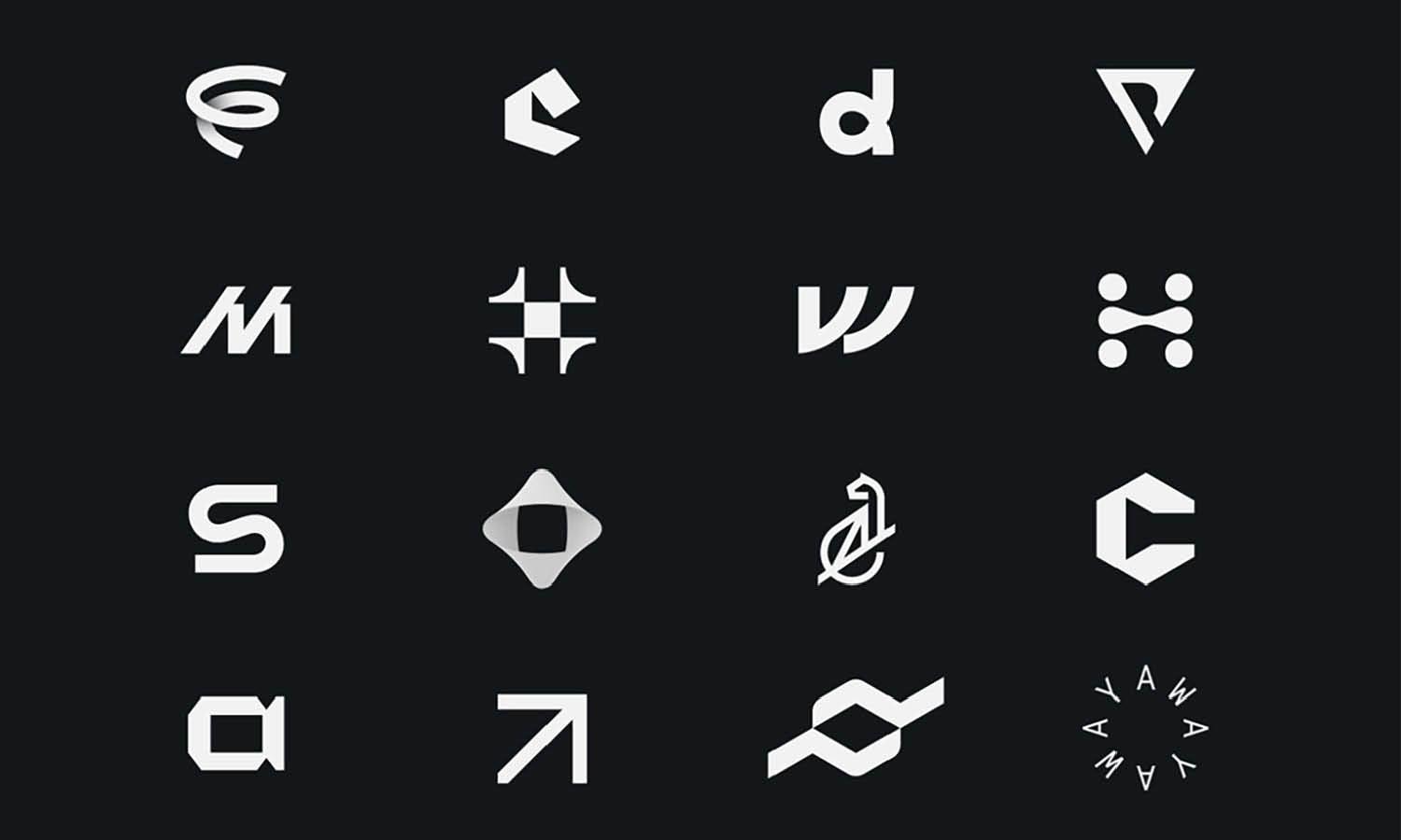
Source: C Lettermark, MisterShot, Dribble, https://dribbble.com/shots/14832169-C-lettermark
Stars: Implying Prestige
Stars are powerful symbols in logo design, often used to imply prestige, excellence, and high standards. This shape is particularly popular among luxury brands, award organizations, and entities that wish to convey a sense of achievement and superiority. Stars can create a striking impact, instantly drawing attention with their bright and aspirational connotations. They are versatile in design, capable of being stylized in numerous ways to fit the specific image of a brand, whether it’s classic elegance or modern sophistication.
Stars are commonly associated with dreams and magic, making them suitable for businesses in the entertainment or children’s sectors. The use of a star in a logo can also symbolize guidance, like a north star leading the way, which is appealing for educational and advisory services. By utilizing stars in their designs, logo creators can effectively communicate a brand’s commitment to excellence and its role as a leader in its field, resonating with consumers who value quality and aspiration.
Diamonds: Illustrating Luxury
Diamonds in logo design are synonymous with luxury, exclusivity, and high-quality craftsmanship. This geometric shape, with its sharp angles and brilliant facets, captures the essence of sophistication and elegance. It is often used by premium brands in the jewelry, fashion, and luxury goods sectors to symbolize superior quality and an elite status. The diamond shape also conveys durability and timelessness, traits that are highly prized in high-end markets. Its association with precious stones adds an inherent value to the brand’s identity, suggesting that the products or services offered are not just purchases but investments.
Designers utilize diamonds to attract a discerning clientele who appreciates the finer things in life. Additionally, the diamond’s structure allows for creative interpretations in logo design, enabling brands to craft unique and memorable identities that stand out in competitive luxury markets. By integrating a diamond shape into their logos, companies can effectively communicate their commitment to excellence and their focus on delivering unparalleled experiences.
Organic Shapes: Emphasizing Naturalness
Organic shapes in logo design are used to emphasize naturalness and approachability. These shapes, often irregular and asymmetrical, mirror elements found in nature, such as leaves, flowers, and water droplets. They are particularly favored by brands that align themselves with health, wellness, and environmental consciousness. The use of organic shapes can convey a sense of comfort and ease, making a brand appear more accessible and friendly. This is crucial for companies that want to create a strong emotional connection with their audience, as these shapes evoke feelings of warmth and genuineness.
Organic shapes are also versatile, enabling designers to create fluid and unique logos that help brands stand out from those using more traditional geometric forms. They lend themselves well to industries that prioritize eco-friendliness and sustainability, helping to communicate a company’s commitment to these values visually. By incorporating organic shapes into their logos, businesses can effectively signal their dedication to natural products and services, appealing to consumers who value authenticity and ecological responsibility.
Conclusion
In the realm of logo design, the power of shape cannot be underestimated. Each form, from the precision of geometric figures to the fluidity of organic shapes, carries its own set of meanings and influences. Designers must carefully select shapes that align with a brand's identity and values to craft logos that not only attract attention but also resonate deeply with the target audience. Whether seeking to convey strength with bold lines or evoke elegance with curves, understanding the psychological impact of common shapes in logo design is essential for creating compelling and effective brand symbols.
Let Us Know What You Think!
Every information you read here are written and curated by Kreafolk's team, carefully pieced together with our creative community in mind. Did you enjoy our contents? Leave a comment below and share your thoughts. Cheers to more creative articles and inspirations!


Leave a Comment