How to Choose the Right Shapes for Your Logo Design

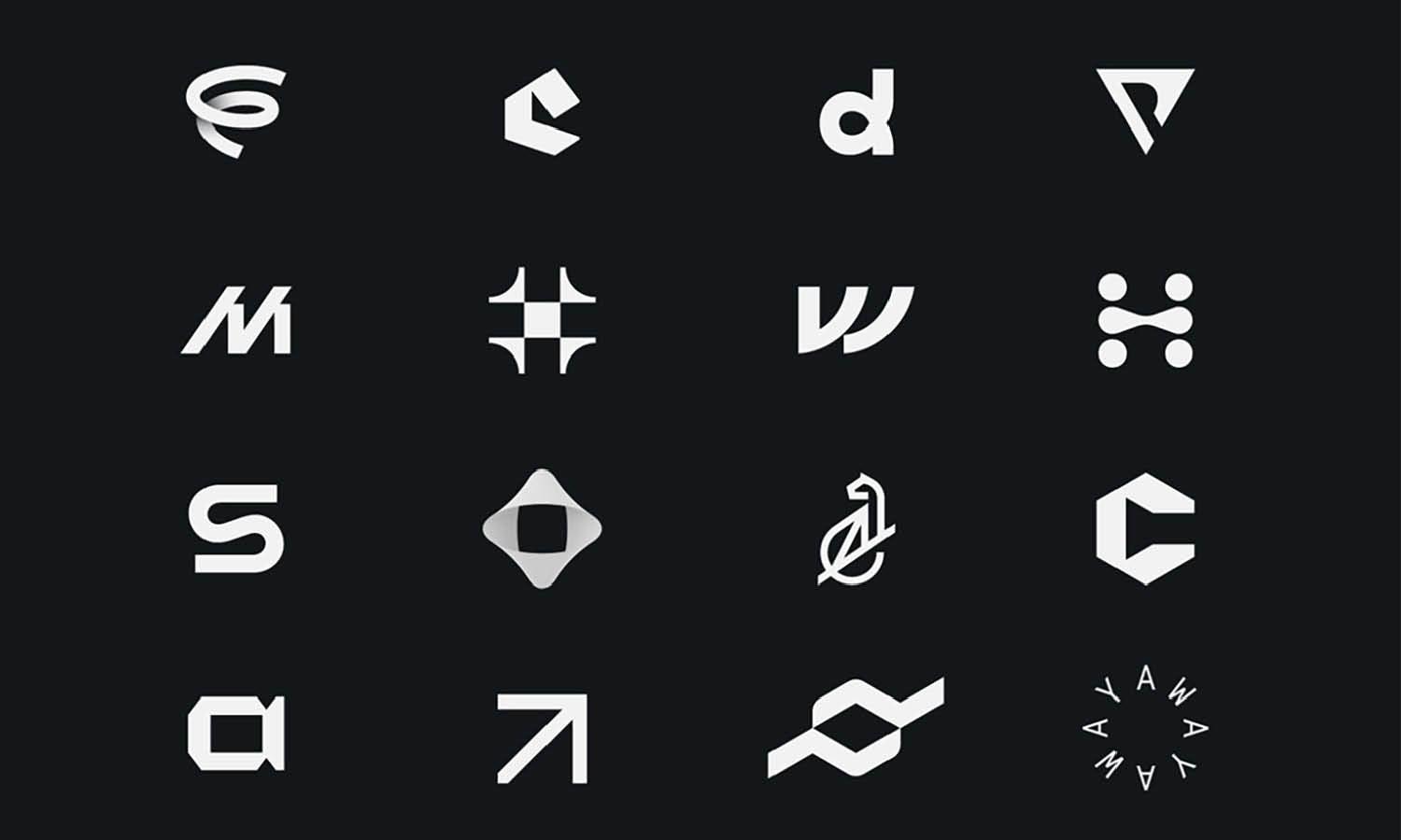
Source: Alex Aperios, Experimental Type & Logos, Dribble, https://dribbble.com/shots/14437434-Experimental-Type-logos
Selecting the appropriate shapes for your logo design is more than just an aesthetic decision; it's a strategic choice that can significantly influence your brand's perception and recall. Shapes are powerful symbols that convey messages and evoke emotions, making their selection pivotal to creating a logo that aligns with your brand identity. Whether you are a start-up looking to make your mark or an established company aiming to revamp your visual representation, understanding the implications of shape choices will guide you in crafting a logo that resonates with your audience.
In the realm of logo design, every curve, angle, and line is a nuanced form of communication. This article delves into the fundamentals of choosing the right shapes to embody your brand's values, message, and personality, ensuring that your logo stands out in the competitive business landscape. We will explore how different shapes can express various brand qualities, from trust and stability to energy and dynamism, providing you with the knowledge needed to make informed design decisions that captivate and engage.
Understand the Psychology of Shapes
The psychology of shapes is fundamental in logo design, as each form can evoke distinct emotions and convey specific messages. In the context of logo design, understanding these psychological impacts helps create a brand identity that resonates with the intended audience. Circles, often seen in logos, represent unity, eternity, and wholeness. Their round edges convey a sense of community, friendship, and love. Squares and rectangles suggest stability, reliability, and strength due to their familiar and straightforward structure. These shapes are predominant in industries that emphasize trust and security, such as banking and insurance. Triangles are dynamic and associated with movement, direction, and growth.
Pointing upwards, they symbolize stability and power, whereas a triangle pointing downwards can represent risk or instability. The use of vertical lines can give a sense of height and grandeur, which is ideal for companies that want to impart a feeling of ambition and innovation. Horizontal lines, on the other hand, suggest tranquility and calm. By choosing the right shapes in logo design, businesses can effectively communicate their core values and ethos without words, making a lasting impression on consumers.
Consider Your Brand’s Personality
Selecting shapes for your logo should be a reflection of your brand’s personality, aiming to tell your unique story through visual design. If your brand is about innovation and modernity, you might opt for abstract shapes that break away from traditional forms to convey creativity and forward-thinking. Conversely, if reliability and trust are central to your brand's values, more conventional shapes like squares and rectangles can project stability and professionalism. For brands with a youthful, energetic personality, using dynamic shapes like stars or bursts can evoke excitement and vibrancy.
Organic shapes, such as curves and spirals, suggest fluidity and natural movement, making them suitable for brands that want to appear accessible and friendly. The key is to align your shape choices with the characteristics you want your brand to embody. This alignment ensures that the logo communicates the desired brand personality effectively. Through strategic shape selection, you can forge a visual identity that not only stands out in the marketplace but also builds a deeper connection with your target audience.
Simplicity Is Key
In the world of logo design, the maxim "less is more" often holds true, especially when it comes to the use of shapes. A simple shape in a logo is not just a matter of aesthetic preference but a strategic choice that enhances brand recognition and recall. Simple geometric forms—circles, squares, triangles—are instantly recognizable and easy for the human brain to process. These shapes can be powerful tools in creating an impactful logo that communicates the essence of a brand at just a glance. Moreover, simplicity in shape aids in versatility across various applications. A simple logo translates effectively across different media, from tiny mobile screens to large billboards, maintaining its integrity and visibility without losing detail.
This adaptability is crucial in today’s multi-platform marketing environments. Additionally, simple shapes are timeless, allowing a logo to remain effective and relevant longer, reducing the need for frequent redesigns. By focusing on simplicity, designers can create logos that are not only memorable but also enduring symbols of a brand’s identity.

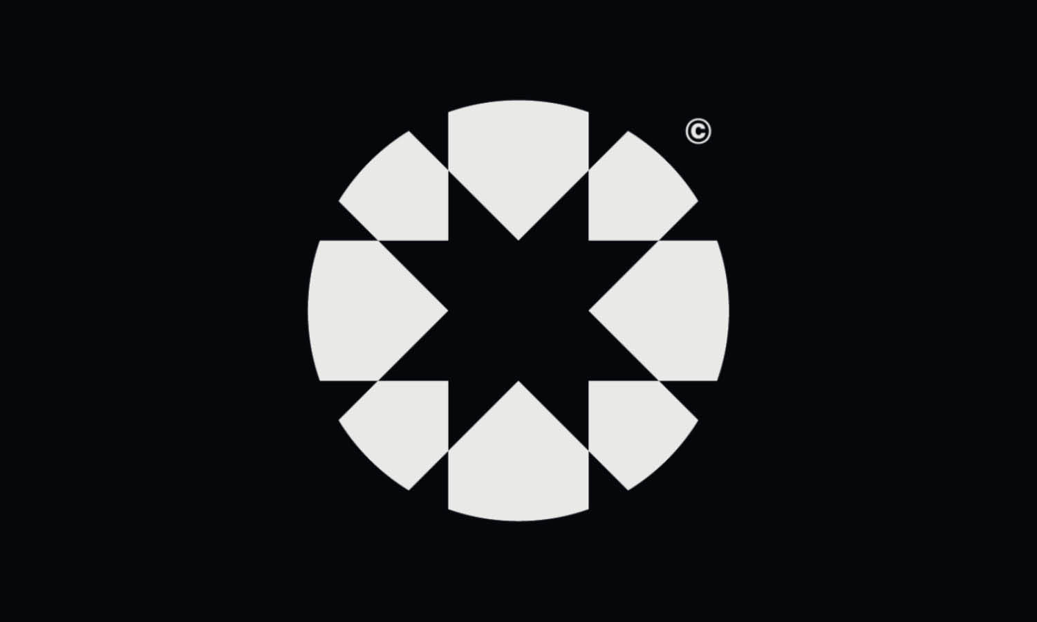
Source: Connor fowler, Abstract Square Logos 5, Dribble, https://dribbble.com/shots/9874100-WW036-Square-Abstract-Logo-5
Think About Scalability
Scalability is a critical consideration in logo design, particularly in how shapes are used to ensure the logo performs well across all sizes and mediums. A scalable logo retains its impact and legibility whether it is on a small business card or a large billboard. This is where the choice of shapes plays a vital role. Simple, clean shapes scale down without losing detail and remain effective when viewed from a distance or at a small size. For instance, a complex design with intricate details might look impressive at a large scale but can become muddled and lose its effectiveness when reduced. To achieve scalability, it's important to test your logo in various sizes during the design process.
This testing ensures that the shapes chosen do not blend together or create unintended patterns when viewed at different scales. Additionally, consider the use of negative space and how it interacts with the shapes at varying sizes. A well-designed logo with scalable shapes helps maintain brand consistency across diverse advertising platforms, enhancing brand recognition and ensuring the logo’s longevity in the market.
Use Shapes to Tell a Story
In logo design, shapes are not just visual elements but narrative tools that can encapsulate and convey the story of a brand. Each shape incorporated into a logo carries its own weight in storytelling potential. For example, circles can symbolize unity and commitment and are perfect for brands that want to emphasize community and continuity. Rectangles and squares project stability and reliability, ideal for businesses that wish to reflect strength and professionalism. Triangles, with their dynamic angles, can depict growth and progression, suitable for companies that are forward-thinking and innovation-driven. Designers can craft a visual narrative by strategically combining these shapes to reinforce the brand’s message.
For instance, overlapping circles in a Venn diagram style can represent a brand built on collaboration and connection. Similarly, a logo that combines angular forms can suggest dynamism and rapid movement, ideal for a technology startup. By thoughtfully choosing and arranging shapes, designers create a logo that does more than identify a business—it tells its story, communicates its values, and positions its brand within the broader market context, all through the power of visual storytelling.
Balance Your Design
Achieving balance in logo design is crucial for creating a visually appealing and effective brand symbol. Balance in design ensures that no single part of the logo overpowers the others, allowing the logo to be perceived as a cohesive whole. This balance can be symmetrical or asymmetrical, depending on the brand’s personality and the message it wants to convey. Symmetrical balance, where elements are mirrored on either side of a central axis, suggests harmony, professionalism, and reliability. It is often used in industries where trust is paramount, such as finance and healthcare. Asymmetrical balance, however, uses different shapes or elements of varying weights to create equilibrium.
This type of balance is dynamic and can be more engaging, making it suitable for brands that want to appear innovative and modern. The key to mastering balance in logo design is understanding how different shapes interact and counterbalance each other within the space. Designers must consider the size, color, and placement of shapes to ensure that the logo feels stable and grounded. This balance not only enhances the logo’s aesthetic but also ensures that it is effective across various applications, from digital media to print.
Experiment with Combinations
Experimenting with combinations of different shapes in logo design can lead to innovative and memorable logos that stand out in the market. By merging geometric shapes such as circles, squares, and triangles, designers can create complex visuals that captivate and engage audiences. For instance, combining a circle and a triangle can symbolize stability and innovation, ideal for businesses in technology or research fields. The juxtaposition of soft and hard edges provides a visual interest that can make a logo more dynamic and appealing. Additionally, integrating organic shapes with geometric ones can soften a logo's look while maintaining its professional feel, suitable for industries like healthcare or education.
This approach not only enhances the aesthetic appeal but also allows brands to communicate multiple facets of their identity simultaneously. Designers should consider how different shapes can complement and enhance each other, creating a balanced yet exciting visual narrative. Testing various configurations can reveal how shapes interact, helping to convey the brand's message more effectively. Through creative experimentation, designers can discover unique combinations that perfectly embody the brand's essence.
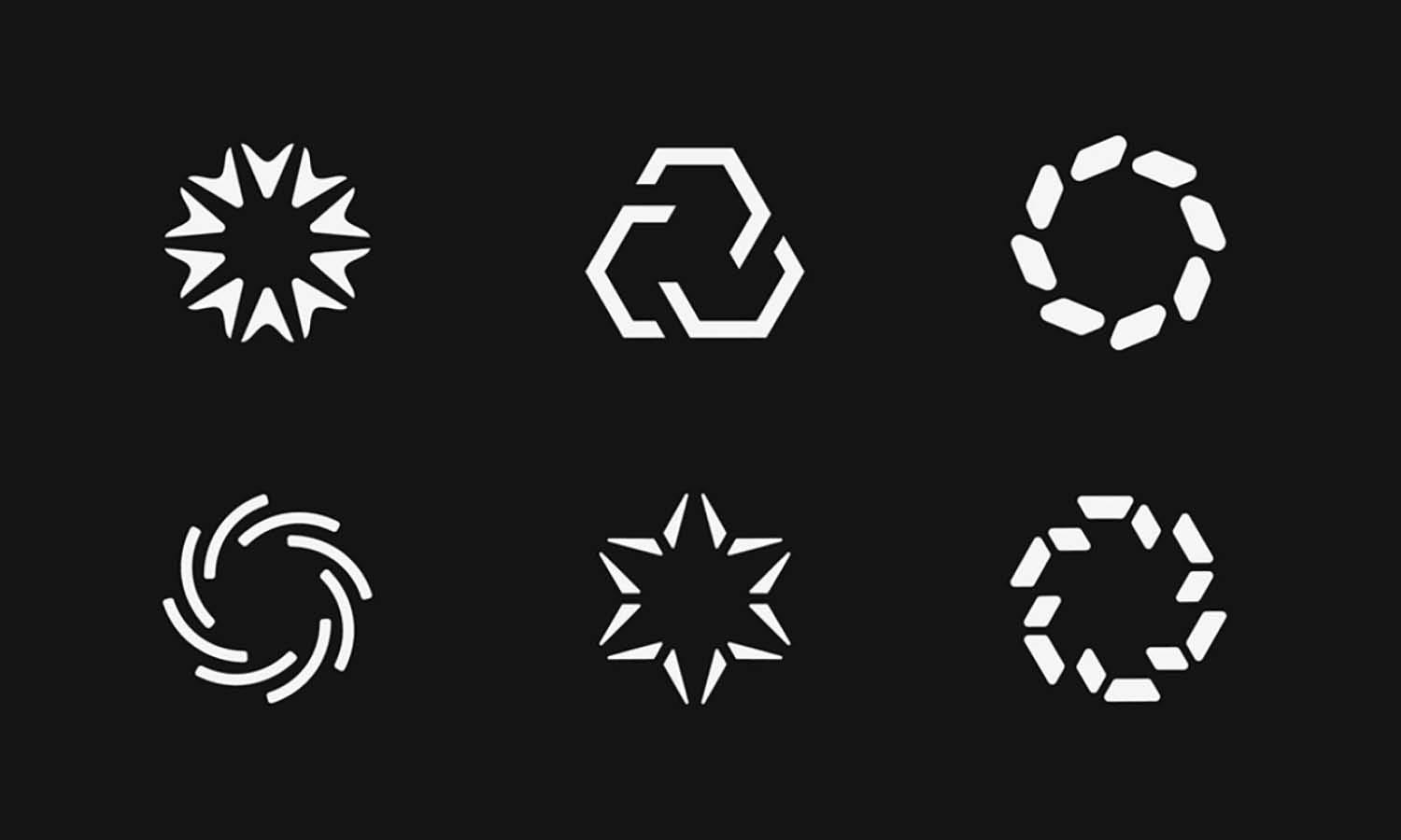
Source: VASK Studio, Seventy Studios Visual Identity, Dribble, https://dribbble.com/shots/19120399-Seventy-Studios-Visual-Identity
Use Negative Space
Utilizing negative space effectively in logo design can add a layer of sophistication and intrigue, making a logo not just seen but also studied. Negative space, or the background space around and between the subject of an image, can be used to form shapes that communicate additional messages or reinforce a brand's identity. For instance, the negative space in a logo might outline a hidden symbol or shape that aligns with the brand’s values, such as a tree hidden within a circle to represent growth and sustainability for an environmental organization. This technique not only enhances the visual appeal of the logo but also encourages engagement as viewers may take a closer look to understand the full design.
It's important for designers to plan the use of negative space as meticulously as the main shapes, ensuring that both elements work harmoniously to convey the desired message. Logos that effectively use negative space are often simpler, making them more adaptable and memorable. This approach not only makes the logo visually striking but also imbues it with a sense of cleverness and depth, enriching the viewer's interaction with the brand.
Color and Shape Interaction
The interplay between color and shape in logo design is crucial for conveying a brand's message effectively and creating an emotionally resonant image. Colors have the power to influence perception and evoke specific feelings—blue can instill a sense of trust and security, red can evoke energy and passion, and green often represents growth and sustainability. When these colors are combined with shapes, the impact of the logo can be significantly amplified. For instance, a red triangle can communicate a sense of excitement and bold action, whereas a blue circle might be used to promote calmness and stability. It’s essential for designers to consider how colors enhance or diminish the psychological implications of shapes.
The contrast between colors and shapes can also play a vital role in making a logo more legible and visually striking. Using complementary colors can make shapes stand out, while analogous colors might create a more harmonious look. Additionally, the saturation and brightness of colors can affect visibility and readability, particularly in different media formats. Designers must experiment with various color and shape combinations to determine the most effective duo for communicating a brand's identity, ensuring the logo is not only beautiful but also functional across all applications.
Test for Visibility
Testing for visibility is an indispensable step in the logo design process, ensuring that the chosen shapes perform well across various platforms and conditions. A logo must be clearly visible and recognizable whether it's displayed on a small mobile screen, a large billboard, or anything in between. This testing involves examining the logo in different sizes and on various backgrounds to guarantee it maintains its integrity without losing impact. It's important to consider different use cases, such as digital displays, print materials, and merchandise, to see how the shapes and overall design hold up.
For example, intricate designs might lose detail when scaled down for small digital icons, while simpler shapes might become too bold or dominant on large-scale prints. Designers should also evaluate the logo under different lighting conditions and against diverse color backgrounds to ensure it remains effective. This can prevent potential issues such as shapes blending into the background or colors clashing, which can diminish the logo's effectiveness. By rigorously testing the logo's visibility, designers can refine their designs to be adaptable and enduring, ensuring the logo not only catches the eye but also leaves a lasting impression.
Conclusion
The thoughtful selection and combination of shapes in logo design play a pivotal role in crafting a brand's visual identity. From understanding the psychology of shapes to testing for visibility, each aspect is crucial in ensuring that a logo not only represents the brand effectively but also connects emotionally with the audience. By balancing simplicity with creative shape combinations and considering the impact of color interactions, designers can develop logos that are both memorable and versatile across various applications. Ultimately, the power of shapes in logo design cannot be underestimated as they are fundamental to establishing a strong and lasting brand presence.
Let Us Know What You Think!
Every information you read here are written and curated by Kreafolk's team, carefully pieced together with our creative community in mind. Did you enjoy our contents? Leave a comment below and share your thoughts. Cheers to more creative articles and inspirations!





Leave a Comment