10 Tips To Create A Good Travel Logo Design
Here are some excellent tips you can easily follow to create a fantastic travel logo design!

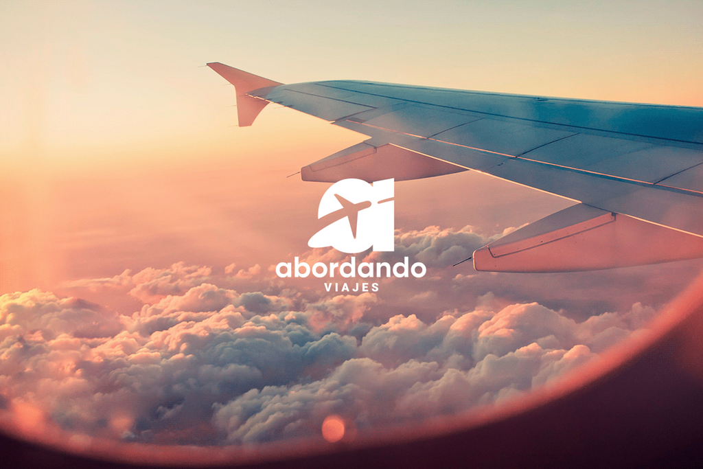
Created by Ártico Estudio | https://www.behance.net/gallery/92587245/Abordando-Viajes-Branding-Social-Media
Tour and travel industry has a long list of possible designs and styling for its logo. At the same time, the industry is also filled with cutting-throat competition. More and more companies appear to provide more exciting offers or news. In many cases, it is hard to stand unique and distinctive in it. That is why the company needs a proper travel logo design.
Logo design, in general, is packed with information about the company, services, and offers. It is best to highlight that old or new agencies need to pinpoint certain aspects to keep the logo memorable. With the memorable design, the company has the chance to gain more attractive sales even in the more challenging industry or market.

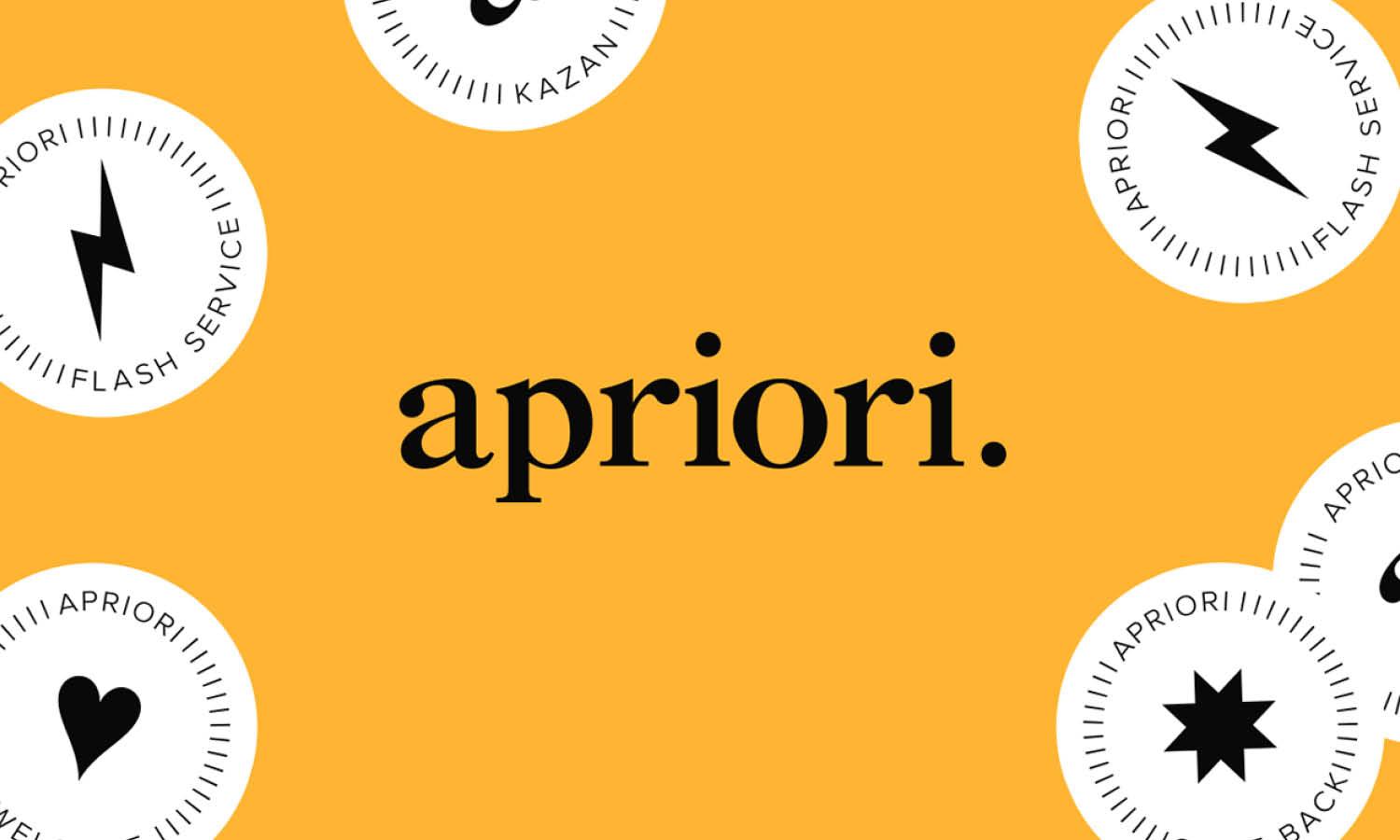
Created by Yulia Golobiani | https://www.behance.net/gallery/113070575/apriori
But travel and tour agencies demand a pretty unique aspect to pinpoint in their logo. The design needs to be attractive as well as communicative about its services. A visual identity should also hold significance, which is present in many other items such as cards, websites, and services. At the same time, it should also create a sense of motion for the audience.
What kind of consideration does the creator need to make a good journey and tour logo? The following tips highlight some tips for creating a seamless, timeless, unique, and effective design for travel agencies. Each indicates points that make the works better, which designers can consider in the creating process. Try it out.
10 Tips To Create A Good Travel Logo Design
- Find Good Inspiration
- Visualize The Brand Message
- Trying Different Styles & Methods
- Create A Sense Of Personality
- Consider The Identity
- Provide the Best Use Of Color
- Create An Impact With Font
- Simplify With Symbolism
- Make It Appealing & Easy To Recognise
- Make Sure The Logo Is Adaptable

Created by Mukhlisa Abdurakhimova | https://www.behance.net/gallery/139814627/Trip-Squad-Brand-Identity-Design
1. Find Good Inspiration
Creating unique imagery that appears stands out in the market can be a great challenge to face for every creator. To avoid an accusation of plagiarism or similar images, designers can get more inspiration by checking out the market trend and competitors. Learning about the competitor and market also helps provide a more attractive or working design.
Creators can learn what is working and not working for the travel industry from the competitors. Studying the trends also help a dodge bullet action, which means avoiding the mindless and harmful bandwagon of design trends. The point is that not every logo trend is good, which is why the creator is not only working with good imagery but also an effective one in the market.

Created by Quim Marin Studio | https://www.behance.net/gallery/103916057/Rehlat-Travel-Ag-Identity
2. Visualize The Brand Message
Along with the importance of the audience, every logo should consist of designs that convey the company's message. The message and services of every tour agency might sound similar, but they can offer different parts of the niche. Take an example of a travel company that focuses on flights or packages.
Sometimes travel can also provide a range of services, including rental, transportation, to a certain degree of products. That is why designers need to ensure the logo can transfer the meaning. The reason is to properly deliver the information through the imagery and design. At the same time, it should also avoid false advertising.

Created by Grzegorz Motławski | https://www.behance.net/gallery/96227007/Healtour-Case-Study
In this case, it is best to explore the company's information and products. The creator can get the idea and highlight certain information about the company. Take an example of a travel logo design that pinpoints a mountain and jeep imagery. It is a clear and direct message to say that the company offers tours to certain mountain attractions.
Similarly, to a travel agency that puts a plane image or food symbol in it. The imagery is the key to identifying the real services or products of the company. It is similar to the concept of making a design that is significant or correlates to the business. The key is to avoid any misleading logo image and keep the meaning in mind.

Created by Pimula Agency | https://www.behance.net/gallery/84753055/StoryTeller-Branding
3. Trying Different Styles & Methods
Travel logo design can look different and unique by implementing a distinctive style. Logo style itself appears in varying possibilities, from vintage, old, modern, fancy, or minimalism. If the creator wants to be different, trying a different design style might help get the best one on the list. It is also a great experience building.
While it is free for creators to play around with design style, one should keep attention to its clarity and relevance to the company. Style can help enhance or pinpoint the company personality, such as the country-style logo for a travel agency serving an exceptional tour in a wild west world destination.

Created by carly berry | https://www.behance.net/gallery/59165647/jetlag-brand-identity
4. Create A Sense Of Personality
One common sense in every tour logo is the impression of fun, enjoyment, and leisure. Travel, in general, is seen as a stress reliever, which means creators also need to highlight that impression on the design. No one will want to associate with the company if the logo appears gloomy, especially with how the sign is the first impression of the travel services.
The point highlights that the logo design should evoke a feeling of happiness, enjoyment, or attractivity. The creator should craft and maintain its look without losing the voyage company identity. The point is mostly about creating a clear message of how good the key attractive point is in the travel or service the company provides.

Created by Firoj Kabir | https://www.behance.net/gallery/145044129/Travley-Logo-Branding-Travel-Agency-Logo-Design
Sometimes, the creator can also be more creative by working with playful and joyful images of the destination. Take an example of a cartoon version of Mayan culture, a cute camel, or a fun trip on a beach. The idea goes along with attracting a certain audience with a fun and attractive emotion. Make people feel a bit happier and expect fun travel.
The imagery and the sense of fun or enjoyment can differ from one logo design to another. Most of the time, the tour company's brand identity, style, image, or services take part in shaping the feeling. If it is a honeymoon-related vacation, the travel logo design will appeal to more romantic, personal, and beautiful images.
Meanwhile, the more challenging tour services can use more intimidating imagery. For example, an image of hiking or mountain climbing tools. It tries to appeal as well as provide the real meaning of the company's ideal services. In other words, the logo and its design's appearance should convey the happy feeling of travel while also pinpointing the services.

Created by Sebastián Martínez | https://www.behance.net/gallery/48020447/Travelgrafia
5. Consider The Identity
At this point, the creator might already have the running sketch in their mind. Before applying the concept and ideas, one thing creators need to implement in the travel logo design is brand personality. Brand personality is elements that make the viewer or reader memorize the company in general, including looking at the color, font, or imagery.
But one thing that makes travel logos unique is the brand personality itself. Creators need to highlight that every company has a different style and approach. One emphasized high-quality professionality; the other might put on a more fun budget trip. Being professional or fun is the personality that the creator can implement in the works.
A tip in working with brand personality is to pick traits that overlap with the audience. Take an example of using purple as a color of romance. It is also a common pick to accentuate the wealthy image. Since the tone, voice, and image overlap, you can use color as one of the personality aspects of the logo design.

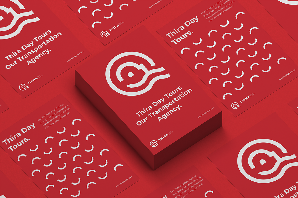
Created by Giorgos Stathopoulos | https://www.behance.net/gallery/97754029/Thira-Day-Tours
6. Provide the Best Use Of Color
If designers need to convey the real feeling and meaning of the logo design, one of the key elements to highlight is color. Colors in design play a huge role in evoking the audience's feeling, attracting the eye's attention, providing concepts, and also adding a variety of meanings to it. It is also associated with the object and a human's ability to retain memory in just a glance.
How the color works are pretty complex but can be simplified by at least categorizing it into two points, warm and cold. The traditional color under warm categories is the best option to evoke happiness, passion, and a joyful mood on the logo. Since the travel design needs to evoke such meaning, the best pick for the work is the bright hues.

Created by Baianat | https://www.behance.net/gallery/133749373/Fastra-brand-design
It goes with the fact that many tourism logos use yellow and red to create a sense of playfulness and brightness in their design. The bright hues are also known to have higher retention in catching people's eyes and attention. With that in mind, the logo can stand out in the heavy and competitive market.
But at the same time, the travel logo design should retain the company's overall branding and mood. There are chances that some companies will decide to use cold colors to signify their brand identity or personality. Take the example of Traveloka, the company that uses blue and simple flying birds to accentuate its branding. It gives a feeling of freedom, just like the bird flying in the sky.

Created by Abraham Melendres | https://www.behance.net/gallery/145086759/Minstravel
7. Create An Impact With Font
Font and typography came as the next potential important element in logo design. In every industry, other than travel, the font can display a certain image for the audience. It is similar to how color and images develop an impression on the travel company. The use of font will accentuate what kind of company is running the business.
One thing that is pretty unique in travel logos is the versatility of the industry itself. It turns the design ideas or options into vast and bigger ones to pick from. The essence of vacation and holiday likely appear more fun, relaxing, and casual. With that, the company can use cleverer typography.

Created by The Collected Works | https://www.behance.net/gallery/124612269/Vanish-Travel
In the older logo style, many agencies or companies use more conservative and bold fonts. The purpose is to add the impression of professionalism and trust. But the more modern Travel Logo Design complies with, the less formal concept. The use of script fonts, sans serif, or custom typeface creates a sense of purity, uniqueness, and joy, something the industry wants to highlight.
But the challenge of working with casual fonts is to avoid looking cheap, unserious, and slapdash. The creator needs to ensure the fonts appear professional and trusted. The key is to ensure the logo design is readable and people can read the travel information. Sometimes, it also works by implementing local culture writing and making sure people understand.
In one way or another, a logo is a fairly simple design that can go too much without proper composition. Creators have to pay attention to the use of imagery, logo style, color, and fonts. Make sure everything works well together, including when working with complex images or elements. The idea is to avoid the clustered image that makes the logo hard to read.

Created by Herman Scheer | https://www.behance.net/gallery/108994253/Elude
8. Simplify With Symbolism
Every vacation company has its specific niche and destination. If you look at the all-in-one travel company, the logo design will compose its conceptual images of services. Transportation images, tools, attractions, and the most effective one is the location's charm. Take an example of a Hawaii or Bali destination; the logo will come with its beautiful beach image.
A trip to a mountain, waterfall, certain countries, or attractions will also highlight the location. The idea is similar to providing a clear message of the services and feelings. The designer's intention in incorporating the location's beauty or icon is to ensure the design can give a hint of the destination. In many travel-based companies, the imagery varies.

Created by Lucas Barreira | https://www.behance.net/gallery/119451163/Partiu-Viajar
Thanks to the vast imagery of locations and icons, designers got many options to show in the design. It helps make the logo feel more novel or unique in the cutting-throat market. Creators should research a lot about the destinations to find certain charms or points to showcase in the tour agency's identity.
While the idea is pretty good to make a unique travel logo design, the idea is mostly limited to specific destination services. Like Indonesia, creators can incorporate some iconic panoramic images such as waves, trees, or volcanoes. But when the tour agency has a range of services, it is best to stay creative without generating a confusing message.

Created by tegusu Inc | https://www.behance.net/gallery/137288361/Nam-Thi
9. Make It Appealing & Easy To Recognise
Appealing to your audience will be the key to successful logo design. It is not only for the travel and tour industry but also for other industries and products. With the increasing demands and the more challenging market, travel agencies or companies should pay attention to the audiences and target. In other words, determining the main buyers or targets.
It explains the importance of having a clear target audience in the market. Tour services come in varying possible offers, from an affordable voyage, honeymoon, luxury, seasonal, or group products. With that information, designers can put certain aspects to specify the audience. Take an example of a luxury travel destination or service.

Created by Bravo | https://www.behance.net/gallery/128852645/Book-Cabin
The design for the logo should highlight its appeal. It can use sleek and elegant design, color, symbol, or luxurious icon. The elements will be the complete opposite if the travel logo design targets budget backpacker members. The creator should fit the imagery, style, and looks based on its target.
Knowing the target and learning about the market are the key to a successful logo. Designers can check out the services and scope of the travel company. The creator can highlight certain aspects, such as the demographic points, the type of travel, the services, the products, cost, and identity. Thus, the design will appeal to the audience without losing its identity.

Created by Simon Hüsler | https://www.behance.net/gallery/51263877/Go-Honduras-Go-Bananas
10. Make Sure The Logo Is Adaptable
As logo design appears as a traditional identity for the company, one that should be unique in the market. The logo is also the identifier that is used and appears in varying products or company-related items, such as cards, marketing, display, or website. With that varying uses, one should ensure the design is versatile enough for every function.
To make versatile images work, one of the best answers is to use a PNG image file. It is an image file that won't lose its quality upon scaling up or down. The next thing to do is to make a logo design that works with simple imagery. One should underline that travel company appears in varying media. Using an overly complex design will only lose its clarity when used in smaller media.

Created by Brobrand Agency | https://www.behance.net/gallery/140484775/Tripseed-Travel-Agency-Branding
Final Words
When creating a travel logo, the design highlights are mostly pretty simple and less complicated. But to compete with the cutting-throat market, the company should consider some aspects of its design. The effective company identity included in the logo design will compose some personal identities and service niches.
The details include creating visual imagery that appeals to the audience. It composes of varying elements, such as services and messages. The vacation imagery also needs to depict the sense of leisure, fun, and enjoyment. Some ideas can appear as a location's unique identity, symbol, character, color, and font.

Created by Maria Ermakova | https://www.behance.net/gallery/115771327/Adeola-Travel-agency
At the same time, the tour and tourism agency also needs to pinpoint its brand personality. The purpose is to make a unique identification in the market. Along with it, there is also a need to learn the market, the versatility of the logo, and the design style. In the end, a good travel logo design should comprise a sense of identity, attract an audience, and propose its message.
Working with design identity for logos can come with its particular challenge. In the case of travel and tour agencies, the sign is part of its identity. It should cover the message, services, information, and distinctive imagery. Thus, designers or creators should pay attention to the company, market, and industry's details.


Leave a Comment