10 Tips To Create A Good Kindergarten Logo Design

Created by Rachel Dangerfield | https://dribbble.com/shots/15780341-Play-Maysie-Branding
Creating a kindergarten logo means facing a range of challenges and points in creation. The idea is that kindergarten is part of the education and child care industry. It brings a notion of how important the visual identity design comes with proper elements, which both appeal to the education and the child or parents' eyes.
It creates a certain higher difficulty in drafting and developing logo design. Designers need to pay attention to the market, the industry, the audience, and the kindergarten itself. In this case, kindergarten logo design needs to pinpoint certain aspects which keep them stand out, distinctive, but also relevant. In one way or another, the visual and its identity should work together.

Created by Cristian Tituleasa | https://dribbble.com/shots/2254395-Kinderunity
Among many challenges and visual aspects, some vital elements have certain ideas that should be highlighted. The first one is the design's audience, which is a vital point considering the industry is more professional and formal. The idea of creating a fun and child-friendly design should at least comply with the education industry standard.
Along with the more complex meaning and message, the completion of working with kindergarten logos comes around with appealing to its audience. The target audience might be similar but also have certain differences. As the creator works around with the design, it also complies with other elements to highlight it, including color, symbol, and font.

Created by Alex Zhevanov | https://dribbble.com/shots/6789901-logo-for-kindergarten
There is also a certain limit to being too friendly or serious. It creates a sense of complexity in the logo creation, which should be part of the planning and idea works. As it is a young learner school, the kindergarten identity also needs to create an area of belief and trust. In the big picture, the work is a bit more complex. But when planned properly, it can be a good identity.
10 Tips To Create A Good Kindergarten Logo Design
- Create An Authentic Visual
- Designing For Kids & Parents
- Using Symbolisms To Deliver The Message
- Try Creating A Mascot
- Create Your Own Elements
- Create Identity With Colors
- Adding Extra Personality With Fonts
- Don't Overcomplicate The Design
- Be Experimental & Fun
- Avoid Bland Design

Created by Rifqi Fadhlurrahman Halim | https://dribbble.com/shots/9708861-Kids-Pointe-Religious-Kinderganten-Logo-Contest
1. Create An Authentic Visual With Positivity
In many logo creations, one of the most vital points of design elements is the personality of the company itself. In this case, designers should learn further about kindergarten. As an institution, kindergarten tends to have a certain message, personality, and upbringing. Take an example of an international preschool or institution.
It means the school will need to indicate the international facet of the services. There are also varying niches and focus on every schooling, which the creator can put as the kindergarten logo design definite elements. It might be a nursery for certain religion-based education, such as Christian schools or Islamic schools. With that point put in mind, the logo will have its personality.

Created by Shani Aisha | https://www.behance.net/gallery/129501089/Teach-Our-Children-Inc-Rebrand
In general, the personality of kindergarten is likely to be followed by a fun, happy, and entertaining emotion. But some schools want their logo design to appear more professional with a touch of children-friendly essentials in it. Those certain rudiments of personality and distinctions are what the creators need to make a distinctive identity.
The creator should invest time and research in working with the signified kindergarten. The idea is to fully capture and learn about the company or the business itself. The personality also has a strong relation with brand identity, which can amplify the imagery preference, color, details, and other elements in the kindergarten logo design.

Created by Aly Izquierdo | https://www.behance.net/gallery/92290915/Tic-tac-toe
2. Designing For Kids & Parents
As much as kindergarten has a strong connection with the education industry, the main appeal and target are the parents or the children. It makes the logo design likely to have a huge correlation with children's products' identity. Those points signify the importance of designing a logo or identity that fully appeals to kids and parents.
The idea of designing for parents relates to the decision to trust their child in kindergarten. Most of the time, the best design aspect is using a logo with a certain appeal to the mother. In the industry of child care, the mother is the primary target of the services and goods given by the institute. It is especially true with an industry revolving around children.

Created by Miguel Carballo | https://www.behance.net/gallery/100583295/Indiana-Escuela-Infantil
To fully embrace the appeal to mothers or parents, the logo design should exude a feeling of trust and belief regarding the signified brand. The designer can start by researching imagery that helps improve the meaning without losing the kindergarten personality. As the school can take parents' attention, it continues to create attractive designs for kids.
A design for kids can simply focus on capturing their attention and desirability. Many schools use varying elements that exude the vibes of fun, lightheartedness, and cuteness. At some point, the child care or kindergarten can use a logo design that both impress the parents and kids. The best instances are pictures of happy children and some small books.

Created by Marden Jump | https://www.behance.net/gallery/91331985/Escola-Tindolele
3. Using Symbolisms To Deliver The Message
When creating the kindergarten logo design, the creator needs to highlight at least three aspects in deciding the symbols. Symbols or images are one of the key elements that can attract and deliver messages. Starting with understanding the message of the kindergarten, the creator will be able to find the best design that represents the images.
The first point that creators need to fit in the symbol is the education aspect of the industry. The kindergarten will need at least one or two aspects that help maintain the essence of education and child care services. It can be an image of a book, writing tools, or graduation caps. It will provide a slight detail of the learning and teaching activities of the kindergarten.

Created by Jordana Alves | https://www.behance.net/gallery/81278249/The-Early-Intervention-Centre
The next thing the creator needs to put in mind about the symbol is the best imagery to attract both kids and parents. Most children will love images involving animals, simple geometric shapes, cartoon characters or kids, abstract shapes, or other simple influences in the works. In many cases, good imagery for the logo design is not far from the stereotypical styles.
Pointing out the message of the kindergarten is also a good value in developing or picking the best symbol. For schools that put more natural values, the design can incorporate some greens and nature in it. A preschool with a focus on art or music can also highlight the subjects. The good symbolic imagery of success, growth, or achievement will also turn into innovative imagery.
Take an example of Little Stars kindergarten by 99design. The cute name is highlighted by its meaning of being a star or a bright character in the night sky. To convey the meaning, the creator uses a fun character holding a star. The message and imagery also fit its name. With less formal text plus its dynamic positioning, the kindergarten logo design is a great design example.

Created by Natalia Ordynska | https://www.behance.net/gallery/125589663/KidsWorld-Brand-Identity
4. Try Creating A Mascot
In certain studies, some results indicate child care or children-related logo must contain animated or cartoon characters. It is best to say that the idea fits with the essence of kindergarten services. To complement the idea, creators can work around creating a mascot. A mascot, in general, is a very easy identifier for certain companies or businesses.
In the competitive education industry, every kindergarten has its personality and message. The details can help shape the best mascot to create. In many cases, the idea is pretty much related to how children love to see a fun and appealing character. So, the logo has a chance to attract kindergarten students.
The possibility of developing a character or mascot is also endless. Depending on the meaning and message, the mascot imagery can appear as a human, child, family, animal, or a unique made-up mascot. No matter the decision, the key is to keep the mascot relevant with the other design elements, including how it blends perfectly with the whole kindergarten logo.

Created by Will Yu | https://www.behance.net/gallery/131329303/Ms-Fish-Mandarin-Education
5. Create Your Own Elements
As much as the character design or mascot can help craft the kindergarten's identity, the key to making it memorable is to ensure the logo is readable or understandable. Recognizable imagery is also a vital aspect of working with kindergarten logo design. That is why only focusing on symbols or images will not do much for the school.
One study from Logodesignteam.com highlights that 65% of mothers can remember better with good logos containing symbols of text. The combination styles logo is also a very effective model for many industries, especially one with the cutting throat market. That is why the logo should have the kindergarten names on it.
Another reason why symbols and text combinations provide the best memory retention is due to their ability to provide clear information (both visually and through name). The education industry is pretty competitive, leading to many kindergartens' logos appearing similar or completely out of the loop. The said condition only faced the school with a certain chance of losing identity.

Created by Amanda Kirkman | https://www.behance.net/gallery/101925657/The-Little-Unicorn
8. Create Identity With Colors
Simple is not only for the imagery, details, or fonts. Creators also need to pick the color carefully. Since kindergarten is for kids, a vibrant, warm, and bright or anything associated with kids is the best option to pick. In this case, the most common or suitable colors for logos should be yellow, green, orange, and red. On the other hand, blue and purple can appear good but are a bit unpopular.
One thing that designers need to consider is the color psychology of the logo. Color, in general, can evoke feelings and their nature. For a logo design that is meant to attract kids or parents, pick friendly colors from the rainbow. The creator can also best not use dull colors, such as black, beige, or gray.
Vibrant bright colors are the most popular for kindergarten and child care services. Another good option also includes soft or pastel colors, such as baby pink and light blue. Most of the time, the softer color in design is meant to attract the younger audience. But in the end, the best pick should be relevant to the kindergarten logo design and brand personality.

Created by Pupila | https://www.behance.net/gallery/33549557/kipos
7. Don't Overcomplicate The Design
Even with the long options of designs, it is best to pinpoint that the final kindergarten logo design should look simple. In many cases, a simple visual identity is loved due to its memorable and recognizable point. The less detailed visuals help people focus and understand the main message of the identity.
With the simple logo, the design is also more versatile. The key and reason mostly relate to the fact that design will be used in varying media or objects. A logo design with very detailed and overused styling will only look better in larger sizes. But when used in the smaller images, the kindergarten identity will lose its clarity over the details.

Created by Abdulrahman Eleraqy | https://www.behance.net/gallery/125589309/Ojeed
6. Adding Extra Personality With Fonts
As many people understand, education is a very serious business. It is also a business that covers professional services, creating every possible identity that should signify its feature. With kindergarten being a child-friendly business, the logo will likely appear less demanding. But at the same time, the creator should not lose their hands to grasp the sense of formality.
With the less formal imagery and symbol, the only solution to bring a professional touch is through fonts. When working with typeface and typography, it does not always mean professional imagery comes with sans serif and bold font. Designers need to be bold, carefully pick the typeface, and provide professional-looking lettering, even with casual writing.

Created by 八八口 龙 | https://www.behance.net/gallery/109145547/UBI-Elephant-Kindergarten-Brand
To create that idea, the first thing to highlight is readability and flexibility. Not all casual fonts appear childish in the logo design. A visual with fitting font dynamic and proportion can turn colorful fonts into professional sight. The key is to ensure it appears proper even in front of parents' eyes.
The next thing is to make sure the kindergarten name is properly written in the font. It should be written either with color, fonts, or contrast. Using a script, sans serif, or custom font design is fine. As long as it partakes in developing a relevant personality, the message and details will be delivered.

Created by Yassine Basraoui | https://dribbble.com/shots/9830604-Momo-Kindergarten
9. Be Experimental & Fun
A unique aspect designer can consider the thematic concept. The idea of thematic refers to how the logo creates a sense of story and relevant meaning. Take an example of Islamic kindergarten that uses the As-sunnah theme for the logo design. With the thematic concept, the creator can use certain imagery to fill the meaning and the school's message.
It can include using al-Quran imagery, children with Muslim attire, or Islamic colors to signify the themes. Another thematic concept is dream jobs, games, plays, and many more. Using thematic is one of the effective ways to convey meaning and message. It also proved that the design has a higher chance of attracting mothers or parents who love to learn about kindergarten.

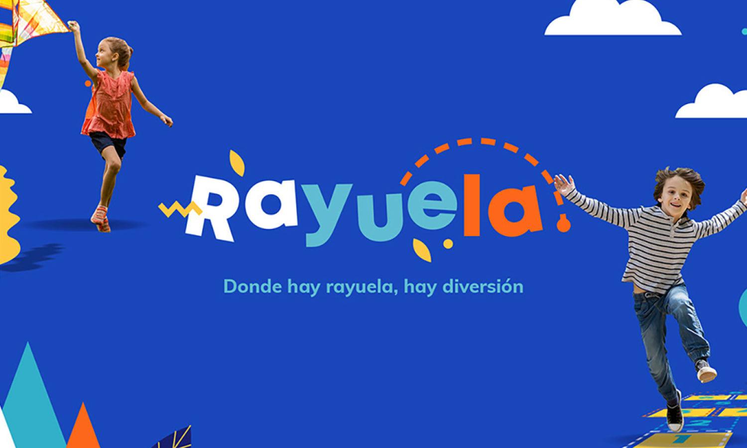
Created by Vivian Tuñón | https://www.behance.net/gallery/91277173/Rayuela-Summer-Camp
10. Avoid Bland Design
At the end of the day, the ideal works of kindergarten logo design likely go to the more cheerful and kids friendly imaginaries. The creator's biggest point is to avoid any kind of serious and sophisticated logo. If the kindergarten does offer a higher tier service or international standard, the creator can implement the idea of using internationally admitted imagery.
Stars, books, kids' images, cartoons, or any symbols come with higher chances of being accepted on an international scope. There are also various degrees of colors and fonts used that help add a more professional touch to the design. The final logo needs to appear more subtle, fun, and attractive. It should be something that befits the charm of the kindergarten and its services.

Created by Adcreators Australia | https://www.behance.net/gallery/91444319/Kids-Central-Branding
Final Words
It is not a far fetch to say that children related to company identity sound easy to make. But kindergarten as an education-related business comes with its particular challenge to face. The market of parents and kids likely depends on the logo design, which makes every element on it have a huge role as an identifier.
To conclude, designers will need to pay attention to the kindergarten's identity, personality, services, and offers. Despite its simple business, kindergarten is part of the education industry. It means the designer needs to design something that relates to the education or teaching perspective. At the same time, the logo also needs to appeal to a younger audience.

Created by Lida Feday | https://www.behance.net/gallery/98903745/Idenitity-for-kindergarten-Smartberries
The appeal comes with the audience's detail, including the parents, kids, and the market. With the proper information, the creator can indicate the details through the logo design. Other logo elements are meant to properly lead the audience and provide a message for the public. It composes the use of attractive colors, professional fonts, thematic, and mascots.
The creation of a kindergarten logo design can fall more on the signified company's personality. Kindergarten business tends to have its unique aspect, which helps attract students and people's trust. It is best to highlight that a successful design for kids-related identity should be attractive, lean, and personified.
The logo and its design creation or tips are not too different. What makes kindergarten unique is its connection with education. Designers need to proposedly a certain learning icon while also adding a young and fun synergy. The combination of styling and works are something that demands proper planning and ideation from both parties.


Leave a Comment