30 Best Kindergarten Logo Design Ideas You Should Check

Source: Cristian Tituleasa, Kinderunity, Dribbble, https://dribbble.com/shots/2254395-Kinderunity
When it comes to shaping a cheerful and welcoming identity for a school, nothing speaks louder than a thoughtful kindergarten logo design. A logo is often the very first introduction parents and children have to a school’s personality, and for kindergartens, that personality should be warm, colorful, and fun. The best logos capture the essence of early learning—playfulness, imagination, and creativity—while still being professional and memorable.
A great kindergarten logo design often incorporates vibrant colors, friendly shapes, and whimsical imagery such as books, blocks, smiling faces, or nature-inspired elements. These choices instantly communicate joy and trust, reassuring parents while exciting children about their new learning environment. Typography also plays a vital role; rounded, childlike fonts tend to feel approachable, while clear and bold lettering ensures readability.
In this article, we’re going to showcase some of the best kindergarten logo design ideas worth checking out. From modern and minimalist to lively and illustrative, these designs highlight how schools can build a strong identity that resonates with families. Whether you’re starting a new kindergarten or refreshing your brand, these inspiring ideas will help you create a logo that feels welcoming, imaginative, and full of youthful energy.
Kindergarten Logo Design Ideas

Source: Jordana Alves, The Early intervention Centre, Behance, https://www.behance.net/gallery/81278249/The-Early-Intervention-Centre

Source: Imagine Studio, Saulės Gojus, Behance, https://www.behance.net/gallery/88197619/SAULES-GOJUS-Visual-Identity

Source: Diana Galeeva, Happy May, Behance, https://www.behance.net/gallery/126155239/EKBaby-Kindergarten

Source: Nigar Musazade, Little Prince Kindergarten, Behance, https://www.behance.net/gallery/116873235/Little-Prince-Kindergarten

Source: Ran Shi, Behance, https://www.behance.net/gallery/15797311/kindergarten-VI

Source: Miguel Carballo, Indiana, Behance, https://www.behance.net/gallery/100583295/Indiana-Escuela-Infantil

Source: Shima Dehghan, MindNest Kindergarten, Behance, https://www.behance.net/gallery/215018739/MindNest-Kindergarten

Source: Gala Pérez Martín, Little Wonders Kindergarten, Behance, https://www.behance.net/gallery/220066581/Little-Wonders-Kindergarten

Source: Mari Bersteneva, Behance, https://www.behance.net/gallery/206078845/Kindergarten-identity-design

Source: Natalia Ordynska, KidsWorld, Behance, https://www.behance.net/gallery/125589663/KidsWorld-Brand-Identity

Source: Pupila, Kipos, Behance, https://www.behance.net/gallery/33549557/kipos

Source: Aly Izquierdo, Tic Tac Toe, Behance, https://www.behance.net/gallery/92290915/Tic-tac-toe

Source: Victoria Buharina, Behance, https://www.behance.net/gallery/232393007/logotip-dlja-detskogo-centra-i-brenda-odezhdy-nazvanie

Source: Marden Jump, Escola Tindolelê, Behance, https://www.behance.net/gallery/91331985/Escola-Tindolele

Source: Miguel Alpuche, Crece, Behance, https://www.behance.net/gallery/38110385/CRECE-Brand-Identity

Source: Pineapple Studio, Little Finland, Behance, https://www.behance.net/gallery/95858283/Litte-Finland-Branding

Source: Will Yu, Ms. Fish, Behance, https://www.behance.net/gallery/131329303/Ms-Fish-Mandarin-Education

Source: Lida Feday, Smart Berries, Behance, https://www.behance.net/gallery/98903745/Idenitity-for-kindergarten-Smartberries

Source: Amanda Kirkman, The Little Unicorn, Behance, https://www.behance.net/gallery/101925657/The-Little-Unicorn

Source: Alex Zhevanov, Keedo, Dribbble, https://dribbble.com/shots/6789901-logo-for-kindergarten

Source: Gennady Savinov, Kidbase, Dribbble, https://dribbble.com/shots/15555083-Kidbase-Logo

Source: Rifqi Fadhlurrahman Halim, Kids Pointe, Dribbble, https://dribbble.com/shots/9708861-Kids-Pointe-Religious-Kinderganten-Logo-Contest

Source: Yassine Basraoui, Momo, Dribbble, https://dribbble.com/shots/9830604-Momo-Kindergarten

Source: Semih Kodarlak, Mobby, Dribbble, https://dribbble.com/shots/2969683-Mobby-Kindergarten-Logo

Source: Beautique Consultancy, The Olympia Schools, Behance, https://www.behance.net/gallery/105294373/The-Olympia-Schools-Brand-System-Renewal

Source: Vivian Tuñón, Rayuela, Behance, https://www.behance.net/gallery/91277173/Rayuela-Summer-Camp

Source: Shani Aisha, Teach Our Children, Behance, https://www.behance.net/gallery/129501089/Teach-Our-Children-Inc-Rebrand

Source: Daniel Bodea, Butterfly Milk, Dribbble, https://dribbble.com/shots/15898286-ButterflyMilk

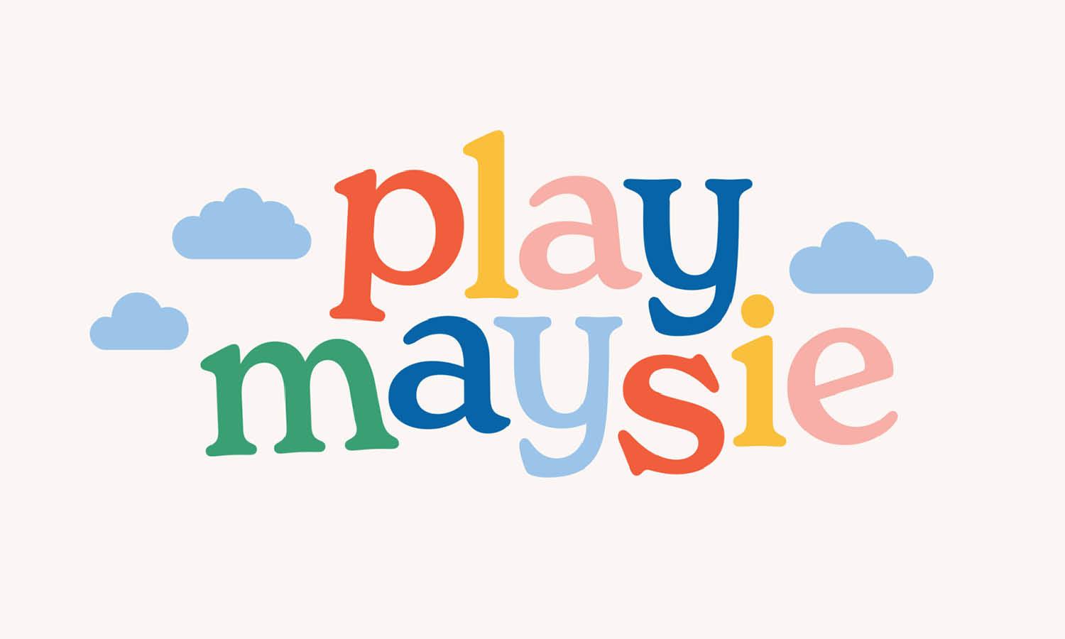
Source: Rachel Dangerfield, Play Maysie, Dribbble, https://dribbble.com/shots/15780341-Play-Maysie-Branding

Source: Cristian Tituleasa, Kinderunity, Dribbble, https://dribbble.com/shots/2254395-Kinderunity
What Symbols Are Commonly Used in Kindergarten Logo Design?
When crafting a logo for a kindergarten, the symbols chosen play a pivotal role in communicating the essence of youthful learning and fun. These symbols should resonate with both children and their parents, sparking a sense of excitement and trust. In the realm of kindergarten logo design, certain symbols have become favorites due to their universal appeal and their ability to convey the playful, nurturing environment of early childhood education. Let’s explore five of the most popular symbols that are frequently woven into the fabric of kindergarten logo designs.
Puzzles and Building Blocks
Puzzles and building blocks are quintessential symbols of early learning. They represent problem-solving and cognitive development, two core aspects of kindergarten education. Incorporating these elements into a logo can communicate a focus on intellectual growth and the joy of learning through play. Additionally, these symbols are easily recognizable by children, making the logo more memorable and appealing to its young audience.
Trees and Leaves
Nature elements like trees and leaves are often used in kindergarten logos to symbolize growth, nurturing, and natural exploration. These symbols resonate with the idea of children growing in a healthy, supportive environment. The use of green color palettes alongside these symbols can further emphasize growth and vitality, making the logo feel fresh and vibrant.
Books and Apples
Books are a universal symbol of knowledge, while apples can represent health, education, and the teacher-student relationship. These icons not only highlight the educational focus of the institution but also evoke a sense of traditional, wholesome values. When combined in a logo, they promise a commitment to nurturing well-rounded, knowledgeable young minds.
Sun and Stars
Bright and cheerful, symbols like the sun and stars often appear in kindergarten logos to denote energy, inspiration, and a bright future. The sun can signify a new beginning or a radiant environment, whereas stars might represent aspirations and high standards. These celestial symbols help create an uplifting and positive impression, perfect for a setting that aims to inspire young learners.
Smiling Faces and Handprints
Nothing speaks more directly to parents and children alike than the imagery of smiling faces and handprints. These symbols are directly associated with children and their hands-on, experiential way of learning. They convey a sense of community and individuality, showcasing the kindergarten as a place where children are happy, valued, and engaged.
Each of these symbols brings its own unique flavor to a kindergarten logo design, contributing to a visual identity that is not only eye-catching but also rich with meaning. By choosing the right combination of these elements, a kindergarten can effectively communicate its ethos and promise to both prospective students and their families.
What Are Creative Themes For Kindergarten Logo Design?
Designing a kindergarten logo design is all about capturing the magic of childhood while also presenting a trustworthy and warm identity for parents. Creative themes can bring a logo to life, making it instantly recognizable and fun. The best themes balance playfulness with clarity, ensuring the logo feels joyful while remaining professional. Here are five inspiring directions to explore:
Play And Imagination
A kindergarten is a place where play drives learning. Logos can reflect this by incorporating toys like blocks, puzzles, or balloons, paired with lively colors and whimsical typography. These playful visuals instantly convey a sense of fun, while also suggesting creativity and growth. A logo filled with imagination makes children feel excited about entering a space that celebrates their energy.
Nature And Growth
Themes inspired by nature—trees, flowers, sunshine, or leaves—are timeless in kindergarten logo design. They symbolize growth, nurturing, and a safe environment. A tree with colorful leaves, for example, can represent children blossoming in their learning journey. Bright sun rays or playful clouds add a cheerful atmosphere, signaling warmth and positivity to families.
Storybook Magic
Every child loves stories, and storybook-inspired logos create a sense of wonder. Open books with animated characters, castles, or stars help a logo look enchanting and imaginative. This theme works especially well for kindergartens that emphasize early reading or creative learning. It makes the brand feel like the start of an adventure filled with tales and discovery.
Friendship And Community
Kindergartens are often the first place where children build friendships. Logos that highlight unity—such as holding hands, circles of kids, or smiling faces—emphasize togetherness and belonging. A kindergarten logo design with this theme reassures parents that their child will be part of a caring, inclusive environment where kindness and cooperation are encouraged.
Colors Of Joy
Sometimes the theme itself is built around color. Bright, rainbow-inspired palettes can instantly signal cheerfulness and positivity. Pairing these colors with simple shapes like stars, hearts, or playful typography makes the logo memorable and uplifting. This theme is effective because it feels universal—color always connects with children and speaks the language of joy.
Creative themes in kindergarten logo design should celebrate the essence of childhood while creating a lasting impression. Whether rooted in play, nature, storytelling, community, or joyful colors, each theme offers a unique way to highlight the spirit of early education. The right theme not only communicates the values of a kindergarten but also sparks excitement in both parents and children, making it a powerful tool for connection.
What Fonts Work Best for Kindergarten Logo Design?
When it comes to kindergarten logo design, the choice of font can significantly impact the overall look and feel of the logo. The right font not only complements the design but also conveys the values and ethos of the kindergarten. Here are five types of fonts that work wonderfully in creating an engaging and appealing kindergarten logo, each bringing its own unique flavor to the design.
Handwritten Fonts
Handwritten fonts are a natural fit for kindergarten logos, as they exude a sense of warmth and friendliness. These fonts mimic human handwriting, often with irregular lines and curves, which adds a personal touch and approachability to the logo. Fonts like "Kristen ITC" and "Comic Sans" are popular choices because they appear as though they could have been written by a child, thus enhancing the playful and youthful vibe of the logo.
Bold and Chunky Fonts
Bold, chunky fonts are fantastic for making a strong and clear statement. These fonts are not only easy to read from a distance but also very impactful, making them ideal for signs, shirts, and other branding materials that need to catch the eye quickly. Fonts like "Cooper Black" or "Bubblegum Sans" have rounded, friendly shapes that are perfect for conveying a sense of fun and energy without compromising on visibility.
Colorful and Fun Fonts
Incorporating color into the font itself can add an extra layer of fun and creativity to your kindergarten logo design. Fonts that allow for multi-colored treatments can help in visually segmenting the logo or highlighting certain aspects of it. “Paprika” and “Jolly Lodger” are examples of fonts that work well with multiple colors, making the logo vibrant and more engaging for children and their parents.
Sans Serif Fonts
If you’re going for a more modern and clean look, sans serif fonts are a great choice. These fonts are known for their simple and unadorned style, which makes them extremely versatile and readable. They lend a contemporary and straightforward feel to the logo, ideal for kindergartens aiming to project a modern, efficient educational environment. Fonts like "Montserrat" and "Nunito" are excellent examples of sans serif fonts that maintain a friendly and accessible appearance.
Creative and Unique Fonts
Sometimes, a kindergarten might want to stand out with a logo that is as unique as its curriculum. Opting for creative and custom fonts can set a kindergarten apart from the crowd. These fonts are designed specifically for the logo, ensuring that no other brand shares the same typography. This customization allows for perfect integration of the font with the logo’s other design elements, offering a cohesive and unique brand identity.
In choosing the best font for a kindergarten logo design, consider how well the font communicates the kindergarten’s personality and mission. It should be legible, engaging, and appropriate for the school’s target audience—children and their parents. A well-chosen font not only adds character to the logo but also plays a crucial role in building brand recognition and emotional connection with the audience.
What Shapes Feel Friendly In Kindergarten Logo Design?
Shapes play a major role in how a logo feels, especially when it comes to creating a kindergarten logo design. The right shapes can transform a logo into something warm, approachable, and fun, instantly putting both kids and parents at ease. Friendly shapes often carry a sense of softness, joy, and comfort that align perfectly with the world of early learning. Let’s explore five shapes that bring out the most cheerful and welcoming vibes.
Circles For Warmth And Unity
Circles are among the friendliest shapes in design. Their smooth, rounded edges make them feel safe and approachable—perfect qualities for a kindergarten logo design. A circle can symbolize unity, togetherness, or even the playful image of a bouncing ball. By arranging circles in vibrant colors, designers can create logos that radiate joy and encourage a sense of community.
Stars For Wonder And Imagination
Stars bring a spark of magic into any logo. They remind us of bedtime stories, wishes, and boundless imagination. In kindergarten logo design, stars can be sprinkled around text, used as accents, or even form the main symbol. Their playful points add excitement while still feeling positive and uplifting. A star-filled logo tells children that learning is an adventure filled with possibilities.
Hearts For Care And Nurture
Hearts are universal symbols of love and compassion, making them ideal for a kindergarten setting. A kindergarten logo design that uses hearts communicates warmth, safety, and kindness. These shapes reassure parents while giving children a sense of belonging. Whether combined with smiling faces, books, or playful elements, hearts reinforce the message that the environment is built on care and encouragement.
Clouds For Playfulness And Lightness
Clouds carry a whimsical, dreamy quality that feels soft and lighthearted. In kindergarten logo design, clouds can symbolize imagination, creativity, and a carefree atmosphere. They often pair well with sun rays, rainbows, or even kites, enhancing the playful narrative. Using rounded, fluffy cloud shapes gives the logo a friendly and approachable character that children naturally connect with.
Rounded Squares For Balance And Stability
While sharp-edged squares may feel too rigid, rounded squares offer a perfect balance of structure and friendliness. They can symbolize building blocks, learning foundations, or safe spaces. In kindergarten logo design, rounded squares provide a modern yet approachable touch. When filled with bright colors, they resemble toys or puzzles, making them fun and educational at the same time.
Shapes have the power to influence how people feel about a logo. In kindergarten logo design, friendly shapes like circles, stars, hearts, clouds, and rounded squares create welcoming and joyful identities that resonate with families. These shapes not only add visual charm but also communicate the values of warmth, imagination, and community that define early education.
What Colors Work Best for Kindergarten Logo Design?
Choosing the right colors for a kindergarten logo design is as crucial as selecting its shapes and fonts. Colors not only beautify the design but also evoke emotions and convey messages that are essential in attracting young learners and their guardians. Here’s a breakdown of five vibrant and effective colors that can enhance any kindergarten logo design, ensuring it feels both welcoming and stimulating.
Bright Blue
Bright blue is universally beloved for its calming and trustworthy qualities. It represents both the sky and the sea, evoking a sense of serenity and depth. In a kindergarten logo, blue can communicate a safe and peaceful learning environment, encouraging a feeling of security and trust among parents. It’s a fantastic choice for kindergartens looking to emphasize their reliable and nurturing atmosphere.
Vibrant Red
Red is the color of energy and excitement, perfect for capturing the dynamic spirit of young children. It's stimulating and attention-grabbing, often used in logos to evoke feelings of enthusiasm and passion. In kindergarten logos, using red can suggest a fun, active, and engaging learning environment. However, because it’s so powerful, it’s best used sparingly or as an accent color to avoid overwhelming the design.
Sunny Yellow
Yellow, the color of sunshine, is inherently cheerful and uplifting. It promotes optimism and can help stimulate intellect and energy, which are desirable in educational settings. Yellow is especially effective in kindergarten logos as it attracts the attention of young eyes, encouraging feelings of happiness and warmth. When used in a logo, it can help create a friendly and inviting image that appeals to children and adults alike.
Soft Green
Green is another excellent choice for kindergarten logos due to its associations with nature and growth. It’s calming and reassuring, yet also signifies renewal and vitality. Using green can suggest a balanced, harmonious environment, promoting a sense of wellbeing and encouraging learning in a natural, supportive setting. It’s particularly appealing to kindergartens that promote outdoor activities or environmental awareness.
Playful Orange
Orange combines the energy of red and the happiness of yellow, making it a perfect color for a kindergarten logo. It’s friendly, playful, and has a welcoming vibe that can stimulate creativity and communication. Orange is an excellent choice for logos that want to express a sense of adventure and friendliness. It’s energetic without being overpowering, creating a warm and enthusiastic brand image.
When integrating these colors into kindergarten logo designs, it’s important to consider the psychological effects they have on both the children and their parents. The right color palette can make your logo not only attractive but also emotionally resonant, ensuring that it effectively communicates the joy and nurturing spirit of your educational environment. Combining these colors thoughtfully can result in a logo that’s both visually stunning and deeply meaningful, perfectly capturing the essence of your kindergarten.
Conclusion
A well-crafted kindergarten logo design goes beyond simple visuals—it becomes a symbol of trust, joy, and imagination. By choosing friendly shapes, vibrant colors, and thoughtful themes, schools can create logos that feel approachable to children while reassuring parents. Circles, stars, hearts, clouds, and rounded squares all bring unique qualities that highlight care, community, and playfulness. When combined with creative elements, these design choices capture the true spirit of early education. A kindergarten logo design should always reflect warmth and positivity, setting the stage for a welcoming environment where young learners can grow, explore, and thrive with confidence.
Let Us Know What You Think!
Every information you read here are written and curated by Kreafolk's team, carefully pieced together with our creative community in mind. Did you enjoy our contents? Leave a comment below and share your thoughts. Cheers to more creative articles and inspirations!
LINK
A brilliant kindergarten logo design does more than just look appealing; it captures the essence of youthful imagination and learning. It should be colorful, playful, and embody the spirit of fun and education that kindergartens are all about. From whimsical fonts to imaginative icons, these logo designs are crafted to evoke a sense of wonder and curiosity, key traits that any kindergarten would want to instill in its young learners. Kariong Childcare, for example, can benefit greatly from a logo that reflects its nurturing and creative environment.


Leave a Comment