30 Best School Club Logo Design Ideas You Should Check

Source: Brad Hansen, Lion Booster Club, Dribbble, https://dribbble.com/shots/18960739-Lion-Booster-Club
When it comes to school spirit, nothing speaks louder than a well-designed logo. A school club is more than just a gathering of students—it’s a community with its own identity, mission, and vibe. That’s where a strong logo design steps in. Whether it’s the debate club, drama society, robotics team, or art collective, the right design sets the tone and gives every member a sense of pride.
The beauty of school club logo design is that it doesn’t have to feel stiff or overly formal. Instead, it’s a chance to have fun, experiment with shapes, and reflect the club’s energy. Bold typography can make a sports club stand out, while playful mascots or symbolic icons can give creative groups their own charm. Colors also play a big role, bringing excitement, unity, and recognition to every poster, T-shirt, or event banner.
This article will showcase some of the best ideas for school club logo design, offering inspiration for every type of group. From simple and modern looks to vibrant and detailed illustrations, you’ll find styles that match different personalities and purposes. So, whether you’re starting a new club or refreshing an existing one, these ideas will help spark the right direction.
School Club Logo Design Ideas

Source: Stephanie White, After School Club, Dribbble, https://dribbble.com/shots/5037467-After-School-Club

Source: MissMarpl, Middlesbrough Football Club, Dribbble, https://dribbble.com/shots/16929637

Source: Brian Hurst, Loanners & Loners, Dribbble, https://dribbble.com/shots/20409307-Book-Club

Source: Veronika Žuvić, Abertillery Bowling Club, Dribbble, https://dribbble.com/shots/16654551-Abertillery-bowling-club-logo

Source: Abby Richey, Granville Cycling Club, Dribbble, https://dribbble.com/shots/17947660-Cycling-Club

Source: Cameron Maher, Philadelphia Basketball Club, Dribbble, https://dribbble.com/shots/15180549-Philadelphia-Basketball-Club-30-Days-of-Logos

Source: Alen Pavlovic, QClub Golf League, Dribbble, https://dribbble.com/shots/18024500-QClub-Golf-League

Source: Ngo Tu, HI-SCHOOL Football Club, Behance, https://www.behance.net/gallery/79273263/HI-SCHOOL-Football-Club-Project

Source: Adilson Terrivel, College Club, Behance, https://www.behance.net/gallery/23238957/college-club

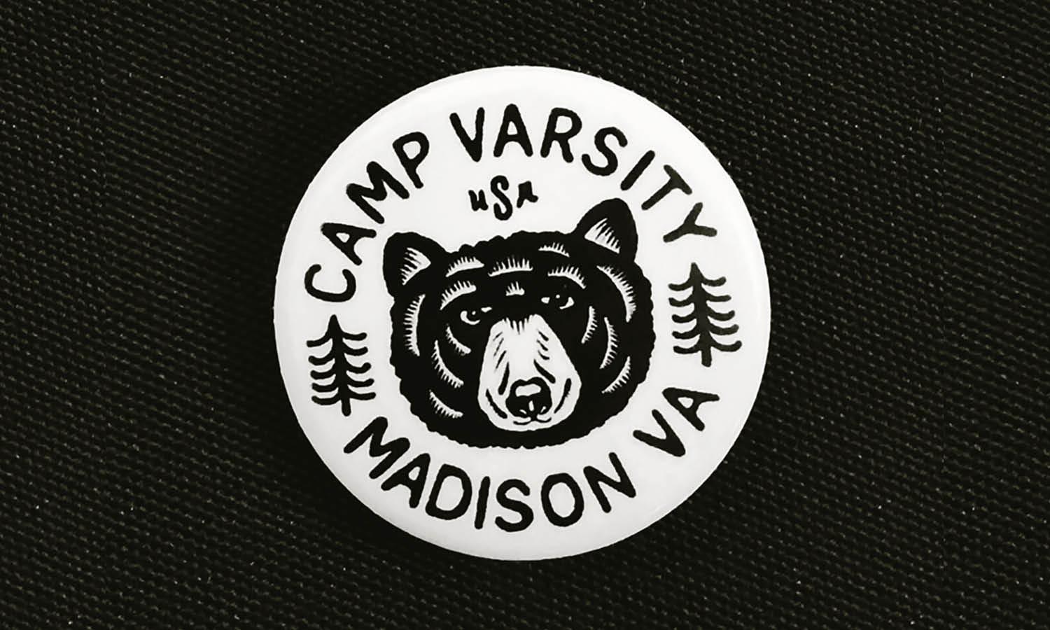
Source: Kate Libby, Camp Well, Dribbble, https://dribbble.com/shots/18397120-Camp-Well

Source: Skilline, Steel Heart Club, Dribbble, https://dribbble.com/shots/20277702-STEEL-HEART-CLUB

Source: Jessie Maisonneuve, Hooligan’s Boxing Club, Dribbble, https://dribbble.com/shots/19160262-Hooligan-s-Boxing-Club

Source: Curt R. Jensen, Brighton Journalism Club, Dribbble, https://dribbble.com/shots/20978756-Journalism-Club-Logo-Design

Source: Daniel Patrick, The Knockout Club, Dribbble, https://dribbble.com/shots/16883712-The-Knockout-Club

Source: St. Mark's, Dribbble, https://dribbble.com/shots/14675377-St-Mark-s-Logo-Design

Source: Dan Blessing, MTCS Cougars, Dribbble, https://dribbble.com/shots/18951510-MTCS-Cougars-Rebranding-02

Source: Matthew Wolff, Vermont Green FC, Dribbble, https://dribbble.com/shots/17536408-Vermont-Green-FC

Source: MissMarpl, Preston North End Football Club, Dribbble, https://dribbble.com/shots/16668877-Preston-North-End-Football-Club-emblem

Source: Michael Ralph, School Pottery Club, Behance, https://www.behance.net/gallery/222436399/School-Pottery-Club-LogoBadge-Design

Source: Jessie Maisonneuve, That Schoolin Life, Dribbble, https://dribbble.com/shots/19260671-Schoolin

Source: Jake Warrilow, Positive Thinkers Club Badge, Dribbble, https://dribbble.com/shots/16525331-Positive-Thinkers-Club-Badge

Source: Eight Hour Day, Society of Collectors, Dribbble, https://dribbble.com/shots/7115840-Club-Kiddo-Society-of-Collectors

Source: Cameron Maher, Camp Fox, Dribbble, https://dribbble.com/shots/19833328-Camp-Fox-Unused-Concept

Source: Jason McCall, SchoolHouse, Dribbble, https://dribbble.com/shots/14296884-SchoolHouse-Badge

Source: Bernie Koelsch, Argyle Tennis, Behance, https://www.behance.net/gallery/62231317/Argyle-Tennis

Source: Dan Blessing, Burlington Black Hawks Lacrosse Club, Dribbble, https://dribbble.com/shots/15213366-Burlington-Black-Hawks-Lacrosse-Club

Source: Dan Fleming, Back Bay Run Club, Dribbble, https://dribbble.com/shots/16903796-Back-Bay-Run-Club-pt-IV

Source: Pavel Fuksa, Children’s Club Logo & Icons, Behance, https://www.behance.net/gallery/99514349/CHILDRENS-CLUB-LOGO-AND-ICONS

Source: Badr, Canadian Books Club, Dribbble, https://dribbble.com/shots/19509277-canadian-books-club

Source: Brad Hansen, Lion Booster Club, Dribbble, https://dribbble.com/shots/18960739-Lion-Booster-Club
What Are Creative Ideas For School Club Logo Design?
A School Club logo design doesn’t have to feel stiff or ordinary—it’s the perfect opportunity to inject personality, flair, and creativity into something that students can proudly wear, print, and share. The goal is to craft a design that not only represents the club’s purpose but also sparks excitement among its members. Here are five creative ideas to make your School Club logo design stand out.
Play With Mascot Characters
Mascots bring instant personality to any logo. A drama club might feature a playful mask with exaggerated expressions, while a robotics club could use a quirky robot character with gears for eyes. Mascot-inspired School Club logo designs add a fun and approachable vibe, making them more relatable to students. They can be drawn in cartoonish or minimalist styles depending on the club’s mood.
Use Bold Typography As Art
Sometimes, words themselves can become the design. Creative typography—like stacking letters, curving text around a symbol, or using oversized initials—turns the club’s name into its own piece of art. A photography club might have its name shaped like a camera lens, while a music club could style its letters as notes on a staff. Playing with fonts and layouts makes the School Club logo design feel modern and original.
Mix Symbols With Unexpected Twists
Rather than using standard icons, consider giving them a playful twist. For example, an academic club could reimagine a book as a rocket ship, symbolizing knowledge that takes you far. An environmental club might feature a tree whose branches form hands to show both growth and community. Adding clever details gives your School Club logo design more depth and makes it memorable.
Add Dynamic Shapes And Motion
Logos don’t have to feel static. Using circles, arrows, waves, or swooshes can create a sense of energy and movement. A dance club might have swirls that look like flowing fabric, while a sports club could use angled lines that suggest speed and strength. Motion-inspired shapes give School Club logo design a lively look, perfect for groups that thrive on action.
Experiment With Colorful Storytelling
Colors can be used to tell the club’s story in a creative way. For example, a cultural club could feature a globe divided into vibrant sections, each representing different traditions. An art club might blend rainbow gradients into its palette to highlight creativity. Unique color blocking, gradients, and playful combinations make School Club logo design visually striking and emotionally engaging.
Creativity is the heartbeat of every School Club logo design. Whether through mascots, typography, clever symbolism, motion-driven shapes, or vibrant colors, the design should feel like an extension of the club’s personality. The best logos not only look great on posters and T-shirts but also inspire pride and excitement in every member. By leaning into these creative ideas, your school club can shine with a design that’s both fun and unforgettable.
What Symbols Work Well In School Club Logo Design?
When designing a School Club logo design, symbols are one of the most powerful tools to communicate purpose, energy, and identity. They turn abstract ideas into visuals that students can instantly connect with, making the logo memorable and meaningful. The right symbols not only tell a story but also help bring members together under a shared identity. Let’s explore five types of symbols that work especially well for School Club logo design.
Academic Icons For Knowledge-Based Clubs
For clubs focused on learning—like debate teams, science clubs, or math societies—symbols tied to education and wisdom always shine. Think open books, lightbulbs, globes, or laurel wreaths. These instantly convey intellect and achievement while keeping the design relevant to the club’s focus. A science club might use an atom or flask, while a debate team could feature a podium or speech bubble to symbolize communication.
Creative Symbols For Artistic Clubs
If the club leans toward music, theater, or art, then expressive symbols bring life to the design. A paintbrush, theater masks, or a musical note not only grab attention but also celebrate creativity. These visuals can be stylized in fun and playful ways to reflect the energy of young artists. Combining several creative icons—like a palette blending into a treble clef—can also make the logo feel one-of-a-kind.
Sports And Strength Symbols For Athletic Clubs
For sports teams or fitness clubs, bold and dynamic symbols show strength, energy, and motion. Popular choices include balls, trophies, sneakers, or even flames and lightning bolts to suggest power. Mascots such as tigers, eagles, or wolves are also popular for athletic clubs since they capture spirit and determination. These symbols work great in both detailed and minimalist styles, making them flexible for T-shirts, banners, and jerseys.
Community Symbols For Service And Social Clubs
Clubs centered around volunteering, leadership, or cultural exchange benefit from symbols that highlight unity and togetherness. Hands, hearts, circles, or puzzle pieces are strong choices to show teamwork and inclusivity. For example, an environmental club might use a tree or leaf to symbolize growth, while a cultural club could use a globe or handshake to highlight diversity and friendship.
Abstract And Modern Symbols For Versatility
Sometimes, the best School Club logo design comes from abstract shapes and modern symbols. Geometric patterns, arrows, and spirals can be used to suggest progress, innovation, and movement. These work well for clubs that want to feel fresh, future-focused, and adaptable across different platforms. Abstract logos are often versatile, allowing the design to remain timeless even as the club evolves.
Symbols bring personality and meaning into every School Club logo design. Whether it’s academic icons, creative motifs, athletic strength, community-driven imagery, or modern abstraction, the right symbol connects members and makes the club unforgettable. Choosing the right one is all about reflecting the club’s spirit, goals, and identity in a way that feels fun and inspiring.
What Fonts Best Represent School Club Logos?
When diving into the vibrant world of school club logo design, selecting the right font is like choosing the perfect outfit for a first date—it needs to make a great impression and speak volumes about who you are! A well-chosen font not only enhances the visual appeal of a logo but also plays a critical role in communicating the club’s personality and values. Here are five types of fonts that can help your school club logo stand out while effectively representing its unique flair:
Sans Serif – Clean and Modern
Sans serif fonts are the go-to choice for a sleek, modern look. They are straightforward, easy to read, and versatile, making them a popular choice for a variety of school club logos, from tech clubs to student councils. Fonts like Helvetica, Arial, and Futura offer a clean and contemporary feel that works well in both print and digital media.
Serif – Traditional and Reliable
If your club’s vibe is more traditional or academic, a serif font may be the way to go. Serif fonts are recognized by the small lines or strokes regularly attached to the end of a larger stroke in a letter or symbol. Times New Roman, Garamond, and Georgia are classic choices that convey a sense of reliability and respectability, perfect for debate teams, history clubs, or literature societies.
Script – Personal and Artistic
Script fonts are all about personality and flair, ideal for clubs related to the arts, such as drama, dance, or creative writing. These fonts mimic cursive handwriting and can range from elegant to quirky. Using a script font like Brush Script or Lucida Handwriting adds a personal touch to the logo, suggesting creativity and individuality.
Display – Bold and Attention-Grabbing
When you really want your logo to pop, display fonts are the way to go. These are designed specifically for use at large sizes, such as in headings or logos. Fonts like Impact or Bebas Neue make a bold statement and are best suited for dynamic clubs such as sports teams, music bands, or any group that wants to stand out from the crowd.
Custom Typography – Unique and Memorable
For clubs that really want to set themselves apart, custom typography is the ultimate choice. Designing a unique typeface just for your logo ensures no one else has the same look. This is particularly effective for establishing a strong and recognizable brand identity that reflects the unique ethos and spirit of your club.
Remember, the font you choose can deeply influence the perception of your club’s brand. It’s not just about the aesthetics; it’s about finding a font that aligns with the values and personality of the club. Whether you opt for something modern and sleek or traditional and dignified, the right font will help your school club logo speak louder than words.
What Are Some Creative Ideas for School Club Logo Design?
Diving into the design of a school club logo is like embarking on a creative expedition where the destination is as thrilling as the journey itself. A great logo not only captures the eye but also encapsulates the spirit of the club it represents. Whether you're designing for the chess club or the cheerleading squad, your logo should shout (or strategically whisper) the unique vibe of your group. Here are five creative ideas for school club logo design that will make your club’s brand the talk of the campus!
Mash-Up Magic
Who says a logo must be predictable? Mix elements that represent different aspects of your club to create a surprising and memorable visual mash-up. For example, if you're designing for a science and literature club, why not combine an atom and a quill? This approach not only makes your logo standout but also tells a story of what your club is about in a single glance.
Clever Negative Space
Utilize the art of negative space to add a layer of sophistication to your school club logo design. This technique involves integrating the background of the logo into the design to form an additional, relevant shape. Think of the arrow hidden in the FedEx logo. For a photography club, imagine a camera aperture that also looks like an eye, symbolizing vision and perspective.
Dynamic Typography
Let the words do more than just talk—make them come alive! Use custom typography where letters are designed or arranged to reflect the club’s activities. For a robotics club, letters could look like circuit board traces or robotic arms. This not only makes the logo visually engaging but also reinforces what the club is all about.
Cultural Icons or Local Flavors
Draw inspiration from cultural icons, local history, or school traditions. Integrating these elements can make your logo deeply resonant and reflective of its environment. For instance, if your school has a historical building or mascot, incorporate these elements into the design subtly to forge a stronger connection with the community.
Animated Ambitions
In our digital age, why stick with a static logo when you can go animated? Animated logos are perfect for digital platforms like your club’s website or social media. An animation can be as simple as the elements of the logo coming together or a character within the logo moving. This not only captures attention but can also make the interaction with the logo more enjoyable and memorable.
Crafting a logo for a school club is an opportunity to push creative boundaries and express the club's identity in a visual format. Whether you opt for simplicity or complexity, the key is to create something that is both distinctive and representative of the club's spirit. Experiment, have fun, and create a logo that makes your club proud to wear it across all their banners and badges!
What Are the Best Colors for School Club Logo Design?
Selecting the perfect palette for a school club logo design is like setting up the ultimate playlist for a road trip—every choice can elevate the experience and set the mood! Colors aren’t just shades and hues; they convey emotions, stir feelings, and can significantly influence perception. When designing a logo for your school club, picking the right colors is crucial in making sure your logo not only pops but also properly communicates your club's personality. Here are five tips to choose the best colors for your school club logo design:
Reflect Club Values
Think about what your club stands for and what emotions you want to evoke. Each color has different psychological implications which can dramatically affect how your club is perceived. For instance, blue can evoke reliability and trust and works well for debate clubs or student government associations. Green, symbolizing growth and harmony, could be a great fit for environmental clubs. Choosing colors that align with the values and essence of your club will create a stronger identity.
Stand Out From the Crowd
Look around at other logos within your school and aim to choose colors that help your club stand out. If every other club is using blue and red, maybe opt for a vibrant orange or a soothing teal. Using unique colors can make your logo more distinctive and memorable, ensuring that your club catches the eye of potential new members.
Consider Your Audience
Who are you trying to attract to your club? Younger students might be drawn to bright and vibrant colors, while older students might prefer more subdued, sophisticated shades. Understanding your audience is key to selecting colors that appeal directly to them, making the logo more effective.
Use Color to Tell a Story
Colors can be a narrative tool in your logo design. Using multiple colors can illustrate diversity and inclusivity, or you could use a gradient to symbolize transition or transformation—perfect for leadership or development clubs. Think about what story you want to tell about your club, and let colors play a role in that storytelling.
Maintain Good Contrast and Legibility
While it’s important to choose appealing colors, it’s equally crucial to ensure that your logo is legible across various uses, from digital displays to printed materials. Make sure there is good contrast between the background and foreground colors. A common mistake is using similarly toned colors together, which can lead to a logo that’s hard to read. For instance, yellow lettering on a white background might be difficult to see, reducing the impact of your logo.
Ultimately, the best colors for your school club logo will depend on the club's purpose, the emotions you wish to convey, and the practicality of the color choices in various formats. Don’t be afraid to experiment with different palettes or consult with club members to get a range of opinions. With these tips in mind, you’re ready to pick a palette that paints your club in the best light possible!
Conclusion
A well-thought-out School Club logo design is more than just a visual—it’s a unifying emblem that builds identity, pride, and recognition. From creative mascots and bold typography to clever symbols and vibrant colors, each choice adds meaning and personality. The design should capture the club’s purpose while also feeling appealing to members and audiences alike. A strong School Club logo design works across posters, apparel, digital platforms, and event banners, ensuring consistency and impact. By focusing on creativity and clarity, clubs can develop logos that not only stand out but also inspire long-lasting connection within their communities.
Let Us Know What You Think!
Every information you read here are written and curated by Kreafolk's team, carefully pieced together with our creative community in mind. Did you enjoy our contents? Leave a comment below and share your thoughts. Cheers to more creative articles and inspirations!


Leave a Comment