
30 Best Varsity Logo Design Ideas You Should Check

Source: Loren Klein, Camp Varsity Button, Dribbble, https://dribbble.com/shots/8394965-Camp-Varsity-Button
Varsity logos combine bold lettering, athletic energy, school pride, and confident shapes. Yet the style offers more variety than a block letter on a sweatshirt. Strong varsity logo design ideas can feel traditional, fierce, polished, playful, or modern depending on how typography, mascots, badges, and sports symbols are handled. If you are designing for a school, team, club, apparel label, or collegiate inspired brand, the goal is to capture competitive character without making the identity feel generic. The ideas below explore thirty distinct directions, from classic lettermarks and mascot graphics to sport specific emblems and contemporary approaches.
Varsity Logo Design Ideas

Source: Tyler Pate, Vita Coco, Dribbble, https://dribbble.com/shots/15102696-Vita-Coco-x-Varsity-assets

Source: Elliot Parker, Varsity, Dribbble, https://dribbble.com/shots/10533837-Varsity

Source: Luis Angeles, Varsity Baseball Logofolio, Behance, https://www.behance.net/gallery/152431477/Varsity-Baseball-Logofolio

Source: Jay Master, Half Court, Dribbble, https://dribbble.com/shots/18075851-Half-Court

Source: Liliana Gomez, Highschool Varsity Soccer Logo, Behance, https://www.behance.net/gallery/71588489/Highschool-Varsity-Soccer-Logo

Source: Ryan Foose, Jackson Rockabillys, Dribbble, https://dribbble.com/shots/18555543-Jackson-Rockabillys

Source: Yury Orlov, Sachs, Dribbble, https://dribbble.com/shots/18442420--S-for-SACHS

Source: Design Shark, Unquowa, Dribbble, https://dribbble.com/shots/22944844-Unquowa-School-Gators-1-2

Source: Łukasz Hajduk, Torn Shore, Dribbble, https://dribbble.com/shots/5639506-Torn-Shore

Source: Fiko Risky, Bulls Character College Sports Animal Mascot, Behance, https://www.behance.net/gallery/226761573/Bulls-character-college-sports-animal-mascot

Source: Khisnen Pauvaday, Royals, Dribbble, https://dribbble.com/shots/25102233--ROYALS

Source: Jay Master, Run It Back, Dribbble, https://dribbble.com/shots/25430165-Run-it-back

Source: Coric Design, Stona House, Dribbble, https://dribbble.com/shots/22993248-Stona-House

Source: Zilligen Design Studio, Pennsylvania Kings, Dribbble, https://dribbble.com/shots/17591081-Pennsylvania-Kings

Source: Akuma.Studio, The Patch, Dribbble, https://dribbble.com/shots/3893630-The-Patch-Badger

Source: Kalli Barrone, Lakewood Volleyball 2018, Dribbble, https://dribbble.com/shots/4950563-Lakewood-Volleyball-2018

Source: Tyler Anthony, Little Howdy Patch, Dribbble, https://dribbble.com/shots/19128838-Little-Howdy-Patch

Source: Dan Blessing, MTCS Cougars, Dribbble, https://dribbble.com/shots/18950730-MTCS-Cougars-Rebranding-01

Source: Akuma.Studio, Camp Leaders, Dribbble, https://dribbble.com/shots/24957233-Camp-Leaders-Mascot-Design

Source: Hartford Whalers, Varsity Club, Dribbble, https://dribbble.com/shots/2265725-Varsity-Club

Source: Aditya Anerao, Pune University Athletics, Behance, https://www.behance.net/gallery/224300291/Pune-University-Athletics-Logo-Identity-Design

Source: Zilligen Design Studio, Jacksonville Jaguars, Dribbble, https://dribbble.com/shots/19681653-Jacksonville-Jaguars-Concept

Source: Dckydesign_, Yokohama Hawks, Dribbble, https://dribbble.com/shots/20944435-HAWKS-LOGO

Source: Sean Morse, JV Football, Dribbble, https://dribbble.com/shots/2691058-JV-Football

Source: Matthew Doyle, Renaissance Academy Wildcats, Dribbble, https://dribbble.com/shots/14858465-Renaissance-Academy-Wildcats

Source: Jason Craig, Augustus Struts, Dribbble, https://dribbble.com/shots/20600688-AUGUSTUS-STRUTS

Source: MissMarpl, Derby County FC, Dribbble, https://dribbble.com/shots/19105949-Derby-County-FC

Source: Loren Klein, Camp Varsity, Dribbble, https://dribbble.com/shots/5388618-Camp-Varsity-Stickers

Source: MissMarpl, Peterborough United FC, Dribbble, https://dribbble.com/shots/18939069-Peterborough-United-FC

Source: Loren Klein, Camp Varsity Button, Dribbble, https://dribbble.com/shots/8394965-Camp-Varsity-Button
Classic Varsity Letter Logo Ideas
Lettering communicates identity immediately, making it a natural foundation for varsity branding. These concepts keep typography central while giving familiar collegiate forms distinctive character.
Single Block Letter Emblem
A single oversized initial creates a powerful mark with little clutter. Thick strokes, squared corners, and a contrasting outline establish classic collegiate character while keeping the symbol easy to recognize.
Interlocking Initials Logo
Two or three overlapping initials can make a varsity mark feel customized. Letters may share strokes, stack vertically, or lock together, but spacing must remain clear at smaller sizes.
Arched Varsity Wordmark
An upward arch instantly recalls traditional collegiate apparel. It works well for school names, locations, and short team names while adding movement without requiring an illustration or mascot.
Shadowed Collegiate Lettering
Offset shadows give flat lettering extra weight and a retro appearance. A simple dark shadow behind the main letters creates depth while keeping the design suitable for uniforms and merchandise.
Split Color Initial Mark
Dividing one bold initial into two color fields adds interest without complicating the structure. The treatment is especially useful when two established team colors deserve equal visual prominence.
Framed Letter Badge
Placing an initial inside a circle, diamond, shield, or geometric frame gives it more presence. Keep the surrounding shape simple so the letter remains the strongest visual element.
Mascot Driven Varsity Logo Ideas
Mascots add attitude, emotion, and personality to varsity identities. Effective designs usually exaggerate a few recognizable traits instead of rendering every realistic detail.
Fierce Eagle Mascot
An eagle head with a sharp eye, pronounced beak, and angular feathers creates an energetic athletic symbol. Simplified shapes keep the mascot recognizable on uniforms, merchandise, and digital applications.
Charging Bull Logo
A bull naturally communicates strength and determination. Forward facing horns, a lowered head, and diagonal movement can suggest a charge, while a bold silhouette preserves impact at small sizes.
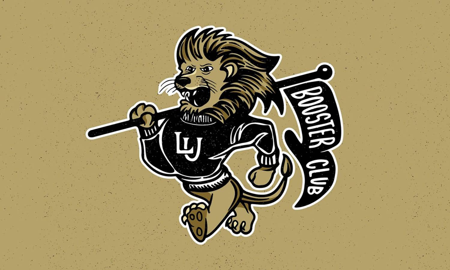
Roaring Lion Crest
A lion gives a team identity confidence and authority. Focusing on the head, mane, and open mouth often creates greater impact than showing the entire animal.
Wolf Head Emblem
A symmetrical wolf head suits varsity branding because pointed ears, focused eyes, and a narrow muzzle translate cleanly into geometric forms that feel alert, controlled, and competitive.
Bear Mascot Badge
A broad bear head creates an imposing presence for rugged team identities. Heavy outlines, a strong brow, and simplified facial shapes help the mascot stay legible when reduced.
Vintage Bulldog Character
A bulldog provides a character driven alternative to sleek mascots. A stern expression, stocky proportions, and old school illustration style pair naturally with heritage typography and traditional apparel.
Badge and Crest Varsity Logo Ideas
Badges bring typography, dates, symbols, and decorative details into one structured composition. They are especially useful when an identity needs to suggest tradition or history.
Circular Athletic Badge
A circular layout can place the team name around the outer edge while keeping an initial, mascot, or symbol in the center. The format works particularly well on patches.
Collegiate Shield Crest
A shield immediately introduces heritage. Initials, stripes, mascot details, or athletic symbols can sit inside it, but a restrained interior keeps the crest clear and easy to reproduce.
Established Year Emblem
Including a founding year can strengthen historical character. The date may sit beneath a monogram, inside a badge, or between separators when it has genuine relevance to the identity.
Laurel Varsity Crest
Laurel branches suggest victory and achievement. Simplified branches can frame a lettermark without overwhelming it, while straightforward typography keeps the composition from becoming excessively decorative.
Ribbon Banner Badge
A ribbon crossing a shield or circular emblem creates a natural space for a school or team name. Short wording keeps the banner readable and visually balanced.
Star Centered Varsity Seal
A large star provides a clear focal point for a collegiate seal. Initials, dates, or short text can surround it while preserving a balanced, athletic appearance.
Sport Inspired Varsity Logo Ideas
Sports symbols can communicate a team’s activity immediately. Strong concepts integrate equipment into the composition instead of placing unrelated objects beside the name.
Football and Initial Combination
A football silhouette can merge into a letterform, sit behind an initial, or appear through negative space. Integration keeps the sports reference connected to the identity.
Basketball Lettermark
The curved seams of a basketball offer useful opportunities for custom lettering. They can run through a circular monogram or become part of an initial’s internal strokes.
Baseball Diamond Emblem
A simplified baseball diamond naturally frames initials or a team name. Home plate can also form the base shape, creating an immediate sports connection without excessive detail.
Winged Track Logo
Wings, speed lines, and forward leaning typography can suggest acceleration without depicting a runner. This lighter approach suits track, running, and other speed focused teams.
Crossed Sports Equipment Badge
Crossed bats, sticks, or rackets can sit behind a central lettermark. The arrangement offers symmetry and immediate recognition while simplified silhouettes keep the equipment from overpowering the name.
Championship Trophy Mark
A trophy can represent achievement without identifying one sport. Pairing it with a monogram, star, or banner creates a compact mark suited to championship focused identities.
Modern Varsity Logo Design Ideas
Varsity graphics do not need to look vintage. Contemporary interpretations can preserve collegiate confidence while using cleaner shapes, sharper spacing, and fewer decorative elements.
Minimal Collegiate Monogram
A simplified monogram removes extra shadows and outlines while preserving bold athletic proportions. Small custom cuts or altered corners can give basic letters a distinctive visual signature.
Geometric Mascot Logo
Breaking a mascot into angular planes creates a structured modern appearance. Limiting the number of shapes keeps the emblem clear rather than turning it into a complicated illustration.
Negative Space Varsity Mark
Negative space can hide an initial, animal feature, or sports symbol inside a larger form. The technique adds discovery without clutter when the hidden element feels natural.
Oversized Initial Wordmark
One large initial can anchor the composition while a smaller school or team name sits nearby. This creates hierarchy and gives the identity a shorthand mark for compact applications.
Modern Shield Logo
A traditional shield can become a flat silhouette with minimal internal elements. Clean typography and measured spacing make the crest feel current without abandoning its varsity heritage.
Retro Modern Athletic Emblem
Vintage inspired letterforms can feel fresh when paired with contemporary spacing, restrained outlines, and simplified symbols. This balance works especially well for apparel and lifestyle brands influenced by collegiate culture.
Choosing the Right Direction for a Varsity Logo
The strongest varsity logo design ideas begin with the personality the identity needs to communicate. A heritage focused school club may suit a crest or established year badge, while an aggressive sports team may be better represented by a bold mascot. An apparel label borrowing collegiate aesthetics may need something cleaner and less literal. Consider where the logo will appear before deciding how much detail to include. Embroidery, caps, patches, social icons, and merchandise can expose artwork that depends on tiny lettering or intricate features. A clear silhouette and readable type usually perform better across different applications. Color also shapes the character of the design. Traditional two color combinations are easy to recognize and reproduce, but every varsity identity does not need the same palette structure. Strong contrast, deliberate hierarchy, and a distinctive central idea matter more than adding familiar conventions simply because they are expected. Testing the logo in both full color and one color can also reveal whether its shapes, spacing, and hierarchy remain strong before the identity moves into final production work.
Frequently Asked Questions About Varsity Logo Design Ideas
What Makes a Logo Look Like a Varsity Logo?
Varsity logos often use bold collegiate lettering, strong outlines, mascots, athletic symbols, shields, or badge based compositions. Their structure usually feels confident and easy to recognize from a distance. Modern versions may simplify these ingredients, but they generally retain at least one familiar collegiate cue.
Which Fonts Work Well for Varsity Logo Designs?
Block fonts, slab serifs, condensed athletic typefaces, and classic collegiate letterforms can all work well. The best choice depends on the intended personality. Customizing letters through outlines, cuts, spacing, or altered proportions can keep familiar varsity typography from feeling generic.
Can a Varsity Logo Use More Than Two Colors?
Yes. Three or more colors can work when each has a clear role, such as separating the main symbol, outline, and accents. However, a restrained palette is usually easier to reproduce consistently. Too many competing colors can weaken the direct character associated with varsity graphics.
Should a Varsity Logo Include a Mascot?
Not necessarily. A mascot is useful when a team or organization wants a character driven identity, but initials, shields, stars, wordmarks, and sports symbols can be equally distinctive. Choose the visual element that communicates the personality most clearly across the intended applications.
Conclusion
A memorable varsity logo does not come from stacking every collegiate cliché into one emblem. It comes from choosing a clear visual direction and developing it with enough character to feel specific to the school, team, club, or brand behind it. That might mean reducing an identity to one powerful initial, building personality around a mascot, or giving a familiar crest a cleaner contemporary structure. Strong varsity logo design ideas remain confident across different sizes and applications without losing their central character. When typography, symbolism, proportion, and composition support one another, the result can carry athletic tradition while still feeling original.
Let Us Know What You Think!
Every information you read here are written and curated by Kreafolk's team, carefully pieced together with our creative community in mind. Did you enjoy our contents? Leave a comment below and share your thoughts. Cheers to more creative articles and inspirations!
Related Articles








Leave a Comment