10 Tips to Create a Good Team Logo Design

Created by Zoltán Szüts | https://www.behance.net/gallery/114615589/UJPEST-FC-Rebranding
Create a Good Team Logo Design - Designing a professional-looking team logo is more than just the icons you choose. A great logo can tell the story of your team. Whether your sport is hockey, soccer, soccer, or swimming, your logo should clearly represent who you are - even at a glance.
Should your logo focus on the team name, mascot, or where you play? Does the aesthetic match the look and feel of your brand? Does the logo represent the strength behind your team? There is a lot to think about, which is why hiring a professional might be the answer. However, your logo is not only communicating the team spirit on the inside but also the image of professionalism on the outside.

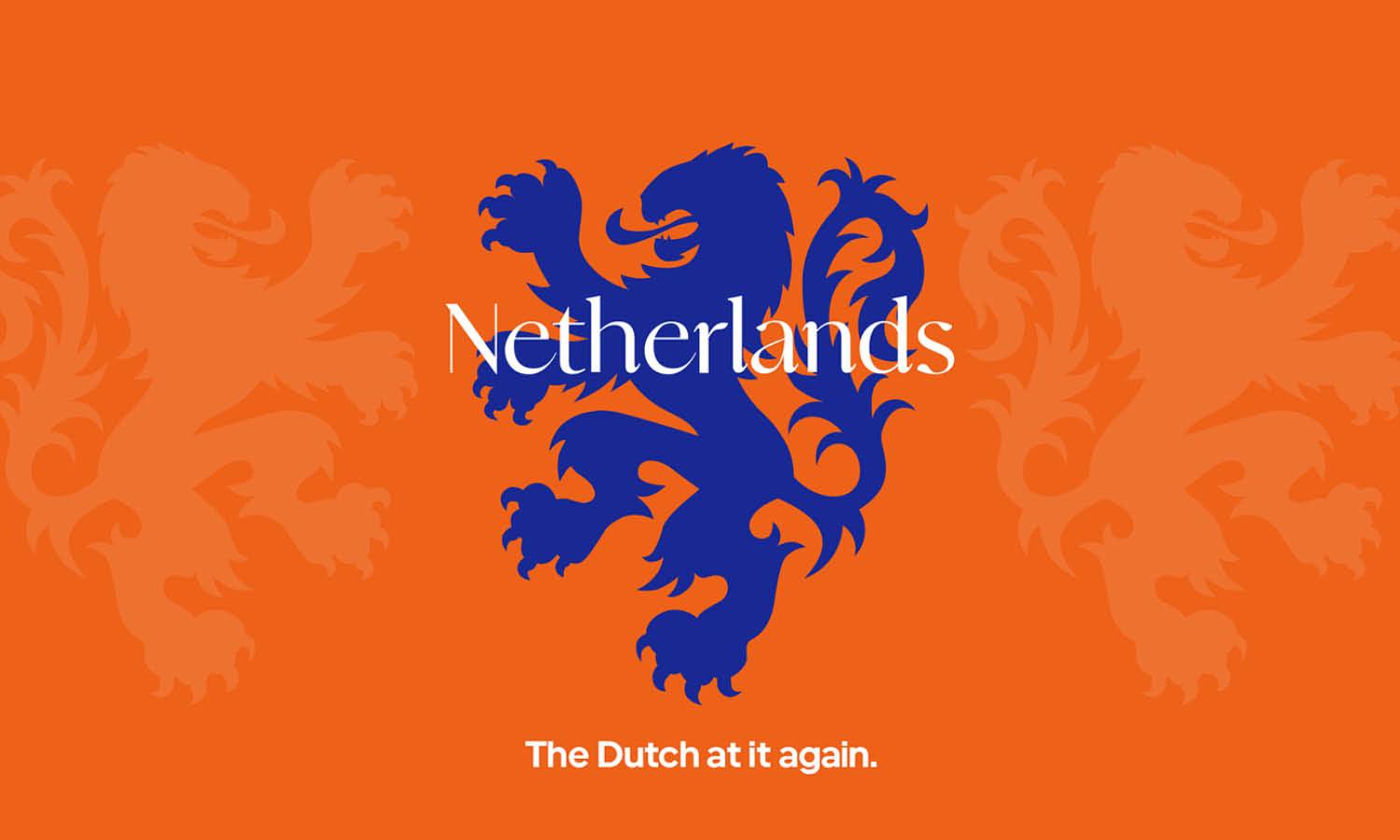
Created by Arkan Gahramy | https://www.behance.net/gallery/129723613/Netherlands-National-Football-Team-2023
A well-designed team logo shows commitment, and you take yourself seriously. After all, every professional team has one. Even if you're not really in the pro league, communication like you will make you look like a force to be reckoned with by players, opponents, and sponsors. And that can't be a bad thing. Having your own team logo will give others a point of recognition and help you stand out from the crowd.
This, in turn, will make them more likely to think of you when considering joining a club or sponsoring a team. Whether you're on a sports team, a club member, or an organization leader, you'll want to unite your group with an unforgettable team logo. A logo will not only give you recognition but also give your team members something they can afford. Here are ten tips for creating a good team logo design you need to consider:
10 Tips to Create a Good Team Logo Design
- Start Sketching As Many Options As You Can
- Get Inspiration, Not Duplication.
- Use An Iconic Symbolism
- Use Proper Design Elements
- Choose The Best Shape and Layout
- Choose Your Color Representation Wisely
- Think About Where The Logo Will Be Used
- Improve Your Idea And Be Better
- Ask Your Team For Feedback
- Try Test-Printing Your Logo

Created by NightShift Nest | https://www.behance.net/gallery/117228605/Ratchaburi-Mitr-Phol-FC-Rebranding
1. Start Sketching As Many Options As You Can
When you feel like you have a good plan, the fun part begins. It's time to put pen to paper. Don't worry if you're not super talented; it's not about creating the final product but about putting your rough idea into practice. You can write down as many ideas as you want and make as many repetitions as you want without having to censor yourself. Quantity is good at this point; you can focus on quality later.
Play a little, get creative, and see what comes out of it. Also, to create a good team logo design, you need to focus on shape rather than color. This is because, first and foremost, you will likely incorporate your team's colors into the logo, so you don't have to be very creative about it. Most importantly, a good logo should work in black and white as well as in color. After all, it should look good on a variety of media types, from large color posters to smudged monochrome faxes. So don't break the crayon just yet.

Created by Adil Kais | https://www.behance.net/gallery/100237321/Sakhalinets-Football-Club
2. Get Inspiration, Not Duplication.
It is not allowed to steal other people's work when creating a logo, just like any other creative work. It can sometimes be hard to get creative, but that doesn't mean we have to copy (change and paste) design ideas. Get inspired by others, and let it spark creativity in you. Learn from brands and designers, and incorporate learning into your logo design process.
There are guidelines but no rules that say a logo should look this way or that. A logo is a visual representation that can take any shape and anyway you want! Don't be afraid to unleash your creativity. Explore every idea that comes to you. Bend design rules if you have to; Don't be restricted by things like the traditional secure method of creating a logo. However, it is best to break the rules only after knowing the rules first. This is your design, and you have the ability to make it look the way you want it to - as long as it does the job it's supposed to. Whatever magic you create, let the logo speak for itself. And design with the core concept and brand identity intact.

Created by Salvador Escobar | https://www.behance.net/gallery/126026367/DRGN-eSports
3. Use An Iconic Symbolism
Before you start designing, you should choose the type of logo you will use: a text-based combination, an icon, or a sign. Logo designs can be broadly divided into two categories: logos that consist only of text (showing the company name or initials) and logos that contain text and symbols. Here's a breakdown of the three most popular types of logos - there are more of them, but we wanted to keep it simple!
The most classic form of a logo is word design, sometimes referred to by designers as a "logo." Word tags use only your business name - no symbols or monograms - in an existing or custom typeface. This type of logo works best if you have a short, distinctive brand name and no logo.

Created by Yu Masuda | https://www.behance.net/gallery/64592303/Meiji-University-Lacrosse-Team-Logo
A monogram is a logo containing one to three letters, usually the company's initials or first letter. A monogram can act as a symbol in a logo, with the company name below. In the case of well-known brands, wordmarks are omitted: for example, P&G for Procter and Gamble, VW for Volkswagen, or LV for Louis Vuitton. But most new companies will keep their brand name under or next to a monogram to build name recognition!
A composite logo is exactly what it sounds like: a combination of verbal signs and symbols. This type of logo makes your brand easily recognizable because it uses two design elements that represent your brand together (and can be used separately if needed). Not surprisingly, this is the most popular type of logo.

Created by BrandKing Karol Sidorowski | https://www.behance.net/gallery/68714365/TFA-United-football-academy-logo
4. Use Proper Design Elements
Now, it's time to get technical and convert your paper drawings into usable digital formats. To bring this design to life, you have several free design platforms available to recreate your graphics in a digital format.
Some platforms can help you put your graphic logo into digital format, but making your concept come alive for a business audience requires a little technical guidance. Planning is one of the most important things to do right. Make sure that all text and shapes are spaced far apart and that the logo itself is in line with its surroundings.
Your logo doesn't have to be the same, but it should align with different contexts. Chances are, you'll run into a situation where your logo faces different vertical and horizontal boundaries, and it's going to show up even in this environment, no matter how your logo is reused and where you publish it.

Created by Nurlybek Bukhpin | https://www.behance.net/gallery/123598675/Ekibastuz-football-club
5. Choose The Best Shape and Layout
Shapes play an important role in creating a good team logo design. It creates an aesthetic look for your logo because they have certain associations with the human brain. This allows brands to use the form to help convey a message or feeling to their target audience. Shapes can be used as containers and symbols in logo designs.
The container will keep your logo space limited and neatly packed for visual consumption. It is important to note that while containers add visual appeal to your logo, they can sometimes present a challenge with scalability because the logo is located in a smaller area. Make sure your team name is still readable in the container when you resize it to a different size.

Created by Richard | https://www.behance.net/gallery/92859791/Westmoor-High-School-Badminton-Team
Here are some of the values associated with some of the most popular logo shapes, as well as design considerations for each:
- Square + Rectangle: A translation of the feelings of stability and balance in the human mind. This more traditional form is useful for longer names and is popular with larger companies.
- Circle: symbolizes unity, security, and protection. It works best with short names or monograms and should be used with a strong typeface to ensure legibility when capitalized and lowered.
- Triangle: It is seen as a more aggressive form associated with strength, conflict, and speed. They can be used to represent direction and movement or as a substitute for the letters "A" and "V."
- Vertical/Horizontal Orientation: Vertical lines and shapes are associated with aggressiveness, strength, courage, and dominance, while horizontal shapes provide a calmer, calmer feel.

Created by Fabrizio Boni | https://www.behance.net/gallery/106155343/ASD-Padergnone
6. Choose Your Color Representation Wisely
Choosing colors for your logo design isn't just about choosing what works for you. Think about how your audience will see it and where it will be shown. Different colors evoke different feelings and emotions, so choose wisely. Do you see your brand represented by cool tones like blue, green, and purple or warm tones like red, orange, and yellow? Or maybe lean more towards black, white, and gray to match your brand identity. Pay attention to the colors your competitors use; you want to keep using colors that are familiar in your industry but stand out from the competition at the same time.
When you're done with your logo, you should also have a black and white copy for those times when a full-color logo isn't used (like when you put it on a photo). For this reason, you want a version of your logo that matches the black color in the design - so test that out before you finalize your logo!

Created by Marko Berovic | https://www.behance.net/gallery/100346881/Mid-City-Marlins-sport-logo
7. Think About Where The Logo Will Be Used
When you are in the process of designing a new logo or redesigning an existing one, you should always think about where to use the logo and how it will look. From business cards to poster boards to on-site items, it's important to think about how your logo will look both online and offline.
Uber recently redesigned its logo to more accurately describe its brand's "story." Since most of their customers use apps from their smartphones, the brand will likely focus primarily on how the logo looks on app icons and on small screens.
Not thinking about future uses of your logo can cause a lot of problems later on. If your logo ends up being placed on the side of a delivery truck, on a large billboard, or on a small business card, it's important to consider how the design will look across all of these platforms and side pieces. Anything that looks good on a business card may not display well when placed on a large billboard, so always think about how your logo will appear on different platforms before choosing the final design.

Created by Parvin Rustamov | https://www.behance.net/gallery/54954537/Goycha-football-club
8. Improve Your Idea And Be Better
During the above steps, the visibility of your logo should become more clear, and you should have a number of different ideas on the table. Now it's time to sort the wheat from the chaff and master your draft. To narrow the field further to a select few, take a look at your logo idea and examine the following characteristics:
- Simplicity: Is there a logo that's too complex or confusing?
- Appropriateness: Does it communicate well with what you're doing? Can people understand your sport or discipline?
- Distinctiveness: Do you imitate someone else's logo too closely? Is the logo easy to remember?
- Timelessness: will it be recognized for years to come?
- Tangibility: can the logo be understood without problems?
All of the above are the attributes of a good logo. Using it to sort out your logo concepts will help you find real gold nuggets. Also, listen to your gut feeling. It's normal to be drawn to some ideas more than others, and there is often a good reason for that. If you can, narrow it down to create a good team logo design with maximum concepts.

Created by Andrew Bryan Mondejar | https://www.behance.net/gallery/88714019/Poseidon-Sports-Logo-for-Sale
9. Ask Your Team For Feedback
Board meeting at an oval table discussing. Listen constructively to comments. Have the confidence to ignore personal preferences, like I don't like purple. However, if a particular issue or concern is raised more than once, pay attention.
When you first start working on a logo design idea, it can be hard to hear things you don't want to hear. Unfortunately, if you want your design to really work, and you don't want your clients to turn to another logo design agency for help, you'll need to listen constructively. Without completely abandoning your creative principles, you may have to admit that your personal preferences won't make it to the finish line.
Once you've created a short list that hopefully contains only a few of the best logo design ideas, try to get opinions from as many different people as possible. You can ask your friends what they think about your logo design options. Talk to other people about where you work, or reach out to industry insiders and ask for their opinion. Is your logo design easy to read, does it convey the right idea, and have people seen something similar elsewhere before? Hear the opinions of different people - not just other designers.

Created by Igor Mariev | https://www.behance.net/gallery/56153625/Tribe
10. Try Test-Printing Your Logo
It is also one of the most important elements of graphic design and can unify the entire logo design. The line you choose should represent the team or club and send the right message to the audience. Mostly, organizations choose custom font styles in their sporting logos to stand out and create broader differentiation.
So while you can experiment with different options, make sure the lettering is clear and doesn't confuse readers in print, on merchandise like T-shirts and backpacks, or on websites and social media. To design a sporty logo, it is important to choose a bold and dynamic Serif or Sans Serif font that reflects the history, origin, and purpose of the brand.

Created by Costa Skys | https://www.behance.net/gallery/71636377/Nizhny-Novgorod-Football-Club-Identity
Consider examples of the Arsenal FC, Golden State Warriors, or Roger Federer’s logo, "RF." The print instantly grabs the viewer's attention and makes a strong impression at first sight. Some teams or clubs also use cursive or scripts for greater impact and attention with typography.
The font you use will say a lot about your team's personality, so you should choose the font that best expresses your values. Your logo font should align with your team's overall identity and reinforce the message you want to communicate.

Created by Igor Mariev | https://www.behance.net/gallery/101432753/Greyhounds
Final Words
There are almost no requirements or restrictions for team crests. Specifically, they are designed to join groups together and are suggested if they have some things in common, finding a sense of unity in the logo.
Team logos are often the first thing people think of when it comes to a sports team or club. Therefore, it is one of the most important tools for creating a sense of identity and making yourself recognizable. However, for the non-designer, putting the logo together can be challenging. Fortunately, you now have a roadmap that will help you do just that.
This does not mean that you have to create a good team logo design alone or even do it. It is highly recommended to get professional help to create a great final product. However, most of the leg work can be done on your own. By making yourself an integral part of the creation process, you can ensure that the final logo truly represents your team and is an important part of your culture and identity.





Leave a Comment