30 Best Team Logo Design Ideas You Should Check

Source: Arkan Gahramy, Netherlands, Behance, https://www.behance.net/gallery/129723613/Netherlands-National-Football-Team-2023
A great team logo design is more than just a visual—it's a symbol of unity, pride, and shared purpose. Whether it’s for a sports team, corporate group, or creative collective, the right design brings everyone together under one memorable mark. A well-crafted logo doesn’t just represent your name; it embodies your values, energy, and spirit.
From bold emblems that roar confidence to sleek minimalist icons that highlight collaboration, team logos come in many creative forms. The beauty lies in how each design captures teamwork and identity in a single glance. Think of color combinations that spark motivation, fonts that express boldness, and symbols that hint at determination or victory.
In this article, we’ll explore some of the best team logo design ideas that stand out for their creativity, meaning, and visual balance. You’ll discover concepts inspired by sports, technology, community, and leadership—all crafted to inspire your next design move. Whether you’re building a logo for a local club or a professional organization, these ideas will help you design something that unites, inspires, and truly represents your team’s essence.
Team Logo Design Ideas

Source: Salvador Escobar, Drgn eSports, Behance, https://www.behance.net/gallery/126026367/DRGN-eSports

Source: Elegant Seagulls, FoxFire Crossfit, Dribbble, https://dribbble.com/shots/24499181-FoxFire-Crossfit

Source: Nathan Karinen, Detroit FC Pheasant, Dribbble, https://dribbble.com/shots/14222184-Detroit-FC-Pheasant-Logo

Source: Igor Mariev, Assumption, Behance, https://www.behance.net/gallery/101432753/Greyhounds

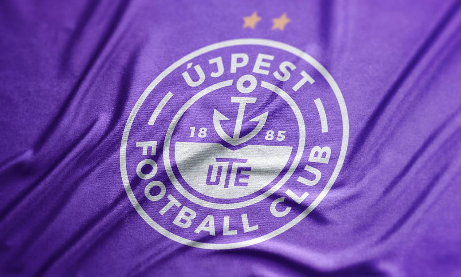
Source: Zoltán Szüts, Újpest, Behance, https://www.behance.net/gallery/114615589/UJPEST-FC-Rebranding

Source: Derrick Stratton, Panthers Sports, Dribbble, https://dribbble.com/shots/24343223-Panthers-Sports-Logo-Mascot-Logo

Source: Serhii Mudruk, Bears, Dribbble, https://dribbble.com/shots/24007016-Cyber-Sport-Team-Bears

Source: Adil Kais, Caspiy, Behance, https://www.behance.net/gallery/117329459/Caspiy-Football-Club

Source: Richard, Westmoor, Behance, https://www.behance.net/gallery/92859791/Westmoor-High-School-Badminton-Team

Source: Parvin Rustamov, Goycha, Behance, https://www.behance.net/gallery/54954537/Goycha-football-club

Source: Federico Giunco, A.C Milan, Behance, https://www.behance.net/gallery/71775065/AC-Milan-Rebranded-New-Logo-Jerseys

Source: Andrew Bryan Mondejar, Poseidon, Behance, https://www.behance.net/gallery/88714019/Poseidon-Sports-Logo-for-Sale

Source: Sam Reed, Utah Yetis Badge 01/02, Dribbble, https://dribbble.com/shots/24383492-Utah-Yetis-Badge-01-02

Source: Erikas, Rochester Red Wings, Dribbble, https://dribbble.com/shots/21294103-Rochester-Red-Wings

Source: Yu Masuda, Hokkaido University, Behance, https://www.behance.net/gallery/65122935/Hokkaido-University-Mens-Lacrosse-Team-Logo

Source: BrandKing Karol Sidorowski, TFA United, Behance, https://www.behance.net/gallery/68714365/TFA-United-football-academy-logo

Source: Igor Mariev, Tribe, Behance, https://www.behance.net/gallery/56153625/Tribe

Source: Fabrizio Boni, ASD Padergnone, Behance, https://www.behance.net/gallery/106155343/ASD-Padergnone

Source: Symbold Studio, FC Botosani, Dribbble, https://dribbble.com/shots/21279613-FC-Botosani-Rebranding

Source: NightShift Nest, Ratchaburi Mitr Phol, Behance, https://www.behance.net/gallery/117228605/Ratchaburi-Mitr-Phol-FC-Rebranding

Source: Yu Masuda, Meiji University, Behance, https://www.behance.net/gallery/64592303/Meiji-University-Lacrosse-Team-Logo

Source: Cosmin Koz, Cirrus Cloud Team, Behance, https://www.behance.net/gallery/143601685/Cirrus-Cloud-Team-Logo

Source: Zine Eddine Abdallah El Hadj, Fenecs, Behance, https://www.behance.net/gallery/126950065/FENECS-eSports-pro-team

Source: Adrián Galván, Coyotes, Behance, https://www.behance.net/gallery/110762639/Coyotes-dojo-team

Source: Andrey Novichkov, Lada, Behance, https://www.behance.net/gallery/34957689/Lada

Source: Tamara Radke, Druzhina Hockey Team, Dribbble, https://dribbble.com/shots/25089204-Druzhina

Source: Soliman Kraza, Lybotics, Behance, https://www.behance.net/gallery/110550123/LYBOTICS-Girls-Team-Logo-Design

Source: Lachlan Kiernan, Gold Coast Suns, Dribbble, https://dribbble.com/shots/25118583-Gold-Coast-SUNS-logo-redesign-concept-2

Source: Nurlybek Bukhpin, Ekibastuz, Behance, https://www.behance.net/gallery/123598675/Ekibastuz-football-club

Source: Arkan Gahramy, Netherlands, Behance, https://www.behance.net/gallery/129723613/Netherlands-National-Football-Team-2023
What Are The Best Inspirations For Team Logo Design?
Finding inspiration for a team logo design can be an exciting adventure. Every team has its own personality, purpose, and spirit—and the best logos bring those traits to life in a single image. Whether you’re designing for a sports crew, gaming squad, or corporate group, drawing inspiration from the right sources helps you create something bold, meaningful, and memorable. Here are five fun and creative inspirations to guide your next team logo design.
Draw From Your Team’s Core Values
The heart of any team logo design begins with what the group stands for. Are you about strength, innovation, unity, or creativity? Translating those core values into visuals makes your logo instantly authentic. For example, a team that values determination could use sharp lines and angular shapes, while one that values friendship might go for softer edges and connected elements. When your design reflects your values, it becomes more than a logo—it becomes a symbol of identity.
Take Inspiration From Nature
Nature has endless design ideas that can make your team logo design come alive. Think of fierce animals like wolves, lions, or eagles for power and leadership. Or use natural elements such as mountains for resilience, waves for adaptability, or fire for passion. These symbols are timeless and can be stylized to fit any design aesthetic—from sleek and modern to rugged and wild. Nature-inspired themes also bring emotional depth, making the logo feel alive and energetic.
Explore Historical And Cultural Symbols
Looking into history or cultural motifs can give your team logo design a deeper meaning. Ancient symbols like shields, swords, or laurel wreaths evoke strength and victory, while cultural patterns can express unity and heritage. For example, tribal lines or geometric shapes can add artistic flair and storytelling power. This approach works beautifully for teams that want their logo to feel rooted in tradition yet reimagined through modern design.
Find Energy In Modern Minimalism
Sometimes less really is more. Modern minimalist designs can make your team logo design look sleek, confident, and instantly recognizable. Clean lines, clever use of negative space, and balanced compositions create a strong visual impact. Minimalism is especially effective for digital-first teams like esports or startups—it communicates focus, precision, and clarity. It’s also easy to scale across platforms while staying effortlessly cool and timeless.
Get Inspired By Movement And Energy
A great team logo design should feel alive, and nothing conveys that better than motion-inspired visuals. Think of shapes that flow, lines that curve, or icons that tilt forward—these subtle cues express speed, teamwork, and progress. Adding dynamic angles or layered effects gives the logo a sense of action, perfect for sports, racing, or fitness teams. When a logo looks like it’s moving, it naturally captures attention and enthusiasm.
Inspiration can come from anywhere—values, nature, culture, simplicity, or motion. The key is to blend meaning with creativity so your team logo design feels original and unforgettable. When your logo reflects who your team truly is, it doesn’t just represent you—it inspires everyone who sees it.
What Are Some Creative Ideas For Team Logo Design?
A team logo design isn’t just a graphic—it’s the heartbeat of your group’s identity. It captures spirit, energy, and connection in one powerful visual. Whether it’s for a sports team, a gaming clan, or a corporate crew, creativity is what turns a logo from ordinary to unforgettable. Let’s explore five creative ideas that can help you craft a team logo design that truly stands out and represents unity, purpose, and pride.
Use Symbolic Imagery That Reflects Team Spirit
Start with a symbol that captures your team’s essence. It could be a fierce animal like a lion or eagle to represent strength, or something abstract like a lightning bolt for energy and speed. The best team logo design tells a story without words—each symbol should reflect a shared goal or value. You can even combine multiple elements, such as a shield for protection and a flame for passion, to communicate deeper meaning.
Play With Dynamic Typography
Typography can be more than text—it can become the art itself. Try experimenting with custom lettering that intertwines or overlaps, representing connection and teamwork. Curved or angled fonts add motion and excitement, while strong block letters radiate unity and power. You can also create balance by merging letterforms with graphic elements—like turning an “A” into a mountain peak or an “O” into a ball. Typography-focused team logo designs often look timeless and bold.
Incorporate Hidden Meanings and Clever Shapes
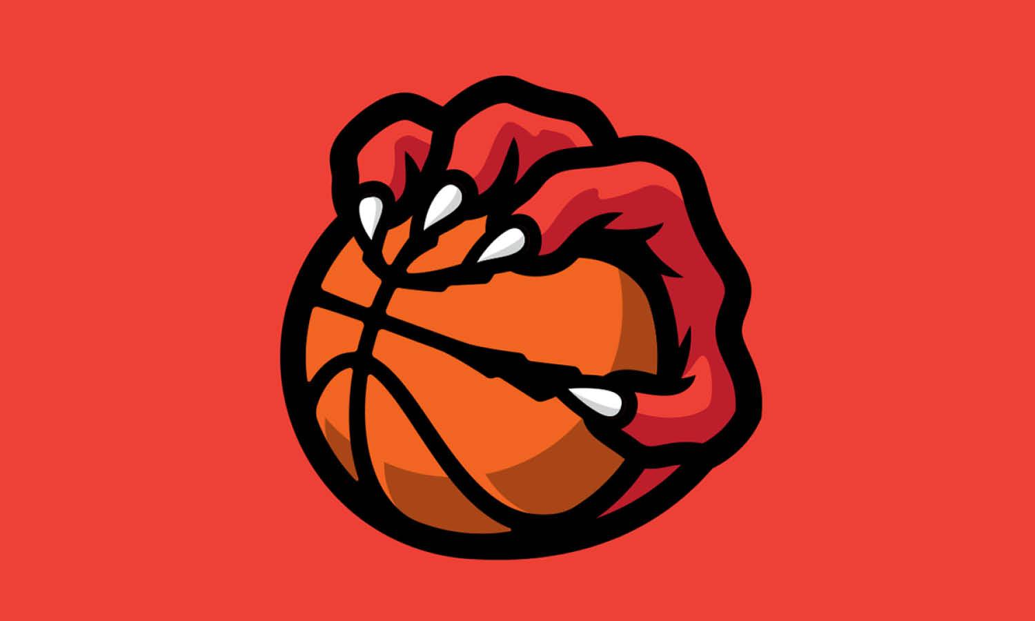
A clever twist always makes a logo more memorable. Add hidden messages or dual imagery that rewards people who look closer. For example, a basketball logo that hides a flame in the ball’s pattern or a corporate team logo where negative space forms a handshake. These subtle touches spark curiosity and creativity, giving your team logo design an element of surprise and sophistication.
Experiment With Unique Color Pairings
Color psychology can amplify your logo’s personality. Go beyond the predictable and explore bold combinations—like electric blue with neon orange, or metallic gold with matte black. These unusual contrasts can make your team logo design pop while expressing teamwork and diversity. You can even create gradients or textured color overlays that evoke emotion, giving your logo more dimension and energy.
Add Motion And Modern Elements
Modern logos are leaning into fluid shapes and digital-inspired elements. You can integrate motion lines, abstract geometry, or layered transparency to convey collaboration and progress. For esports or tech-oriented teams, pixel effects, glowing accents, or 3D illusions can give a futuristic edge. On the other hand, hand-drawn lines or brush textures can add warmth and personality—perfect for community or creative teams.
A creative team logo design doesn’t just unite members; it becomes a visual symbol of pride. By combining meaningful symbols, expressive typography, inventive shapes, bold colors, and modern details, you can craft a logo that not only looks amazing but also captures your team’s heart and story in every line and curve.
What Are The Best Layouts For Team Logo Design?
A team logo design thrives on balance, structure, and storytelling. The way elements are arranged—the layout—can make or break its impact. A well-thought-out layout not only makes your logo visually appealing but also enhances recognition, energy, and meaning. Whether you’re designing for a sports team, esports squad, or creative collective, the right composition can unify your identity while making your emblem unforgettable. Let’s explore five of the best layouts to inspire your next team logo design.
Circular Layout for Unity and Strength
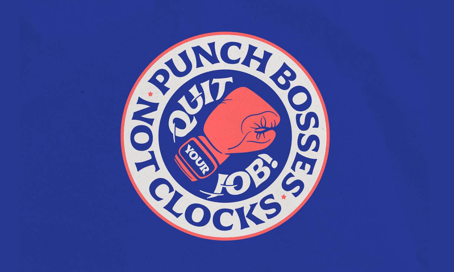
A circular logo layout symbolizes completeness and togetherness—ideal for teams that value collaboration and shared goals. It naturally draws the eye inward, keeping all elements centered and cohesive. Many iconic team logo designs use circles because they fit perfectly on badges, uniforms, and digital platforms. You can position your main icon at the center with text curving along the edges, creating a polished and timeless look that communicates unity and teamwork.
Shield Layout for Power and Tradition
The shield layout is a classic choice that exudes courage, strength, and legacy. It’s perfect for teams that want a heroic and professional presence. The structure allows room for multiple layers—such as a bold emblem, mascot, or initials at the center, surrounded by banners or stars. This style gives your team logo design a powerful, institutional feel, ideal for sports clubs, academic teams, or organizations with a proud tradition. A shield layout instantly conveys authority and pride.
Horizontal Layout for Modern Simplicity
A horizontal or landscape layout offers a sleek, modern twist on traditional designs. It’s straightforward and adaptable—ideal for teams that want a clean, minimal, and versatile mark. Placing the icon on the left and text on the right creates a professional, balanced flow that works well across websites, banners, and merchandise. This layout emphasizes clarity and scalability, ensuring your team logo design stays legible and stylish even in smaller sizes.
Emblem Layout for Vintage Personality
An emblem layout merges imagery and text within a single contained shape, making it one of the most visually dynamic formats. Think of old-school sports crests or retro patches—each tells a story through intricate layering. This approach is perfect for teams that love tradition with a creative edge. An emblem layout in team logo design combines heritage and modernity, showcasing detailed artwork without losing structure. It’s ideal for teams who want their logo to feel classic yet full of character.
Stacked Layout for Impact and Flexibility
The stacked layout—where elements are layered vertically—creates a strong, bold presence. It’s great for logos with initials, mascots, or slogans. You can place the icon on top, followed by the team name and tagline, giving a sense of hierarchy and emphasis. This design shines in print, jerseys, and digital branding because it commands attention while staying compact. A stacked team logo design is all about vertical balance and visual power.
Ultimately, the best layout depends on your team’s story and vibe. Circular logos feel united, shields feel heroic, horizontals feel modern, emblems feel vintage, and stacked layouts feel bold. The magic lies in finding the composition that matches your team’s identity and turns your logo into a true symbol of pride and purpose.
What Shapes Work Best For Team Logo Design?
Shapes play a powerful role in a team logo design. They don’t just form the outline of the logo—they tell a story about personality, strength, and unity. Every curve, edge, and corner adds emotion and meaning. Choosing the right shape can transform a simple design into a bold emblem that instantly connects with your audience. Whether your team is fierce and competitive or collaborative and creative, here are five shape ideas that bring the perfect balance of impact and identity to your team logo design.
Circles for Unity and Balance
Circles are one of the most popular choices for team logo design because they symbolize unity, teamwork, and harmony. They naturally draw the eye toward the center, creating a feeling of togetherness. Circular logos work beautifully for sports teams, clubs, and organizations that value equality and inclusion. They also fit well on patches, jerseys, and digital icons. When paired with bold typography or dynamic symbols, circles create a professional yet friendly look that feels both strong and approachable.
Shields for Power and Protection
If you want your team to radiate authority and strength, a shield-shaped logo is a timeless choice. Shields are deeply symbolic—they represent defense, courage, and honor. This shape has been used for centuries in heraldry and sports logos to evoke trust and tradition. In team logo design, the shield layout allows room for layers: a mascot, initials, or a motto. It’s especially effective for competitive teams who want to look fearless, disciplined, and heroic.
Triangles for Energy and Direction
Triangles bring a sharp, dynamic edge to a team logo design. Their angular form conveys power, ambition, and motion. When pointing upward, they symbolize progress and leadership. This makes them ideal for teams that want to communicate drive and determination. Triangles can also be combined into creative compositions—interlocking shapes or abstract patterns—to express unity within strength. Their bold geometry captures movement, making them a great fit for athletic teams or fast-paced organizations.
Squares and Rectangles for Stability
Squares and rectangles communicate structure, reliability, and confidence. They’re perfect for teams that value organization and balance over flashiness. A square-based team logo design feels solid and grounded—ideal for corporate or professional teams that want to emphasize consistency and dependability. When used creatively with overlapping shapes or negative space, squares can also feel modern and innovative while keeping a strong sense of order and trust.
Abstract and Custom Shapes for Creativity
For teams that want to break boundaries, abstract shapes offer limitless possibilities. You can blend geometric elements, organic curves, or unique silhouettes to form something truly original. A custom team logo design shape lets you express the team’s personality in an artistic, unconventional way. Whether it’s a flame symbolizing passion or a lightning strike for speed, abstract forms capture emotion and creativity that traditional shapes might not.
In the end, the best shape for your team logo design depends on your story. Circles unify, shields protect, triangles energize, squares stabilize, and custom shapes inspire. The perfect form is the one that not only looks great—but also captures your team’s heart, purpose, and pride.
What Fonts Work Best For Team Logo Design?
Choosing the right font for a team logo design is like picking the perfect uniform—it defines your team’s personality, confidence, and energy. Fonts aren’t just letters; they’re visual emotions that instantly convey your spirit to the world. Whether your team radiates boldness, creativity, or camaraderie, the right typography can bring that to life. Let’s explore five fun and effective font styles that can elevate your team logo design to championship level.
Bold Sans-Serif Fonts for Strength and Unity
When it comes to team identity, bold sans-serif fonts like Montserrat, Bebas Neue, or Oswald shout confidence and teamwork. These fonts are clean, legible, and full of presence. They give off a modern, professional look that feels cohesive across uniforms, banners, and digital spaces. The geometric shapes and thick strokes reflect power and solidarity—perfect for sports teams or corporate groups who want to display unity and dominance.
Script Fonts for Energy and Motion
Script fonts add a touch of dynamism to a team logo design. They give a sense of movement and flair, which works especially well for teams in fast-paced fields—like racing, cheerleading, or esports. Think of fonts such as Pacifico, Lobster, or Brush Script. These styles introduce a sense of fun and momentum while still being stylish. Just be sure to balance the script with simple symbols or colors so it doesn’t feel overwhelming.
Vintage and Retro Fonts for Character and Tradition
Some teams value heritage and nostalgia over modernity. Vintage fonts like College Block, Varsity, or Old Standard TT instantly recall classic team aesthetics and timeless spirit. These fonts evoke a sense of legacy—perfect for clubs, schools, or teams that have a proud history. Pairing these typefaces with bold icons or badges can make the logo feel both iconic and emotional, representing the deep roots of the group.
Custom and Handwritten Fonts for Personality
If your team has a unique story or creative edge, a custom or handwritten font could be your secret weapon. Hand-drawn lettering adds authenticity and personality that no off-the-shelf font can replicate. Whether your logo includes brush strokes, rough textures, or stylized lines, this approach makes your team logo design instantly recognizable. It’s a great way to showcase individuality while keeping the sense of collaboration intact.
Geometric and Futuristic Fonts for Modern Teams
For tech teams, esports organizations, or modern startups, geometric fonts like Exo, Orbitron, or Raleway bring a sleek, futuristic vibe. These fonts emphasize innovation, progress, and precision. They often use symmetrical lines and unique letterforms that appeal to digital-first teams. A geometric font can make your team logo design stand out in high-tech environments or modern branding landscapes where sharpness and clarity are key.
In the end, the best font is one that feels true to your team’s spirit. Whether you’re aiming for boldness, creativity, heritage, or innovation, the typography you choose will be the voice that speaks for your team—loud, proud, and full of personality.
Conclusion
A well-crafted team logo design goes beyond aesthetics—it’s a visual expression of unity, purpose, and pride. Every element, from color and typography to layout and shape, plays a vital role in communicating your team’s character. The right design not only strengthens recognition but also fosters a sense of belonging among members. Whether your team stands for innovation, tradition, or collaboration, a thoughtfully designed logo helps solidify that identity. In essence, a powerful team logo design becomes more than a symbol—it’s the heartbeat of teamwork, inspiring confidence and connection in every space it appears.
Let Us Know What You Think!
Every information you read here are written and curated by Kreafolk's team, carefully pieced together with our creative community in mind. Did you enjoy our contents? Leave a comment below and share your thoughts. Cheers to more creative articles and inspirations!



Leave a Comment