30 Best Youtuber Logo Design Ideas You Should Check

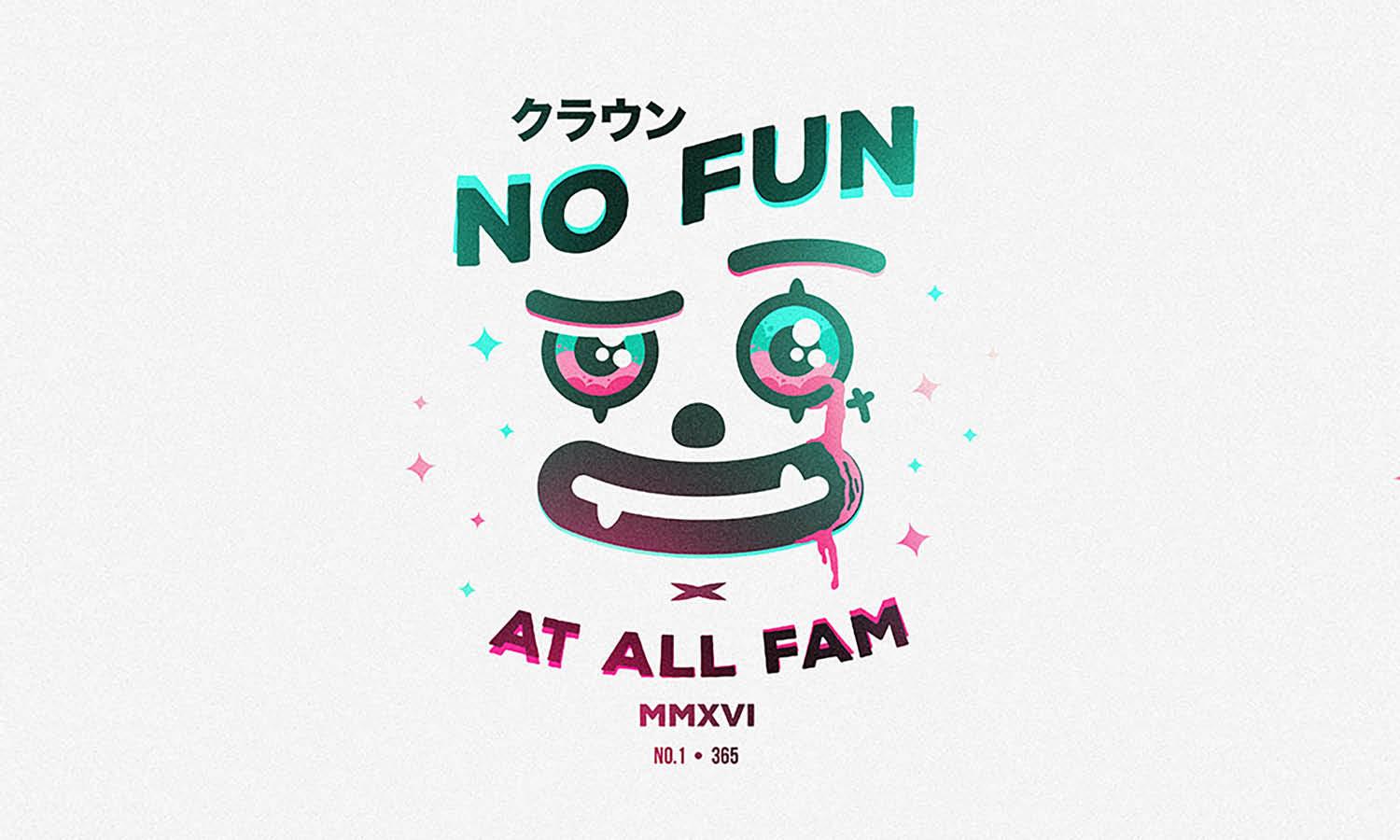
Source: Kaye Huett, Megan, Dribbble, https://dribbble.com/shots/15030969-Megan
When it comes to standing out on YouTube, nothing grabs attention faster than a strong and memorable logo design. For creators, a YouTuber logo design is more than just a small graphic—it’s the face of their channel, the first impression for viewers, and a key part of building a recognizable brand. Whether you run a gaming channel, a lifestyle vlog, or a tech review hub, the right logo design can instantly set the tone for your content and connect with your audience.
In this article, we’re diving into some of the best ideas that can inspire your next big logo. From bold typography that makes your channel name unforgettable, to playful icons that reflect your personality, the world of YouTuber logo design is full of possibilities. Think vibrant colors that pop on thumbnails, sleek minimalist styles that work across all platforms, and custom illustrations that make your channel stand out in a sea of creators.
If you’re serious about elevating your YouTube presence, exploring unique logo design ideas can help shape your identity and grow your subscriber base. Let’s take a look at some creative directions you can check out to bring your channel branding to life.
Youtuber Logo Design Ideas

Source: Giga Khurtsilava, Pointless Blog, Dribbble, https://dribbble.com/shots/2364625-PointlessBlog

Source: Goce Veleski, Charles Cornell, Dribbble, https://dribbble.com/shots/13104309-Charles-Cornell

Source: Alan Oronoz, Raiza Revelles, Dribbble, https://dribbble.com/shots/5838453-Raiza-Revelles

Source: Broworks, Sevou, Dribbble, https://dribbble.com/shots/14553526-Sevou-Logo-Redesign

Source: Iblowyourdesign, Badskull, Dribbble, https://dribbble.com/shots/10680561-Badskull-Gaming-logo-Youtube-logo

Source: Youssef Salama, Behance, https://www.behance.net/gallery/235051579/logo-for-youtube-channel

Source: Kübra Yüksel, Behance, https://www.behance.net/gallery/110211557/Youtuber-logo-design

Source: SakibHasanRabby, Youth TV, Dribbble, https://dribbble.com/shots/17220957-Youth-TV-Logo-Design

Source: Chelsea Burkett, Mav, Dribbble, https://dribbble.com/shots/15290911-Mav-logo

Source: Jahid Hasan, Best Days, Dribbble, https://dribbble.com/shots/11931014-Best-Days-Logo

Source: Jahid Hasan, Markiplier’s Heroes, Dribbble, https://dribbble.com/shots/3306373-Markiplier-s-Heroes-Sports-Logo

Source: Miroslav Sidor, Hk Rider, Behance, https://www.behance.net/gallery/113846335/HK-RIDER

Source: Harvy Sevillano, Ratorix, Dribbble, https://dribbble.com/shots/4920072-Ratorix

Source: Mathieu Beaulieu, Chef Rycan, Dribbble, https://dribbble.com/shots/3449494-Avatar-Chef-Rycan

Source: Eric Lauritzen, MicBergsma, Dribbble, https://dribbble.com/shots/3621215-MicBergsma

Source: Jerry Okolo, The Puzzle, Dribbble, https://dribbble.com/shots/8183090-The-Puzzle

Source: Prerak, Unboxed, Dribbble, https://dribbble.com/shots/3682152-Logo-for-Unboxed

Source: Bolde, Roberto Jorge, Dribbble, https://dribbble.com/shots/6247424-Roberto-Jorge-Logotype

Source: Jerry Okolo, Spill That Tea, Dribbble, https://dribbble.com/shots/12018664-Spill-That-Tea

Source: Jerry Okolo, Ill CLub Media, Dribbble, https://dribbble.com/shots/9521359-Ill-Club-Media

Source: Pantelis Vatoum, Cat Von K, Behance, https://www.behance.net/gallery/106257229/Cat-Von-K-Logo

Source: Gracielle Pestana, Gabo Cozinha, Dribbble, https://dribbble.com/shots/3435585-Gabo-Cozinha

Source: Ana Carolina Guandique Hernández, P'Majo, Behance, https://www.behance.net/gallery/118086665/Youtuber-Branding-PMajo

Source: Henrique Melo, Behance, https://www.behance.net/gallery/230322537/Banner-for-YouTube-Channel

Source: Jay Braga, Picoca, Dribbble, https://dribbble.com/shots/6899316-Picoca

Source: Broworks, Sevou, Dribbble, https://dribbble.com/shots/14553526-Sevou-Logo-Redesign

Source: Chelsea Burkett, Wildfern, Dribbble, https://dribbble.com/shots/17418733-wildfern-plant-hobbyist

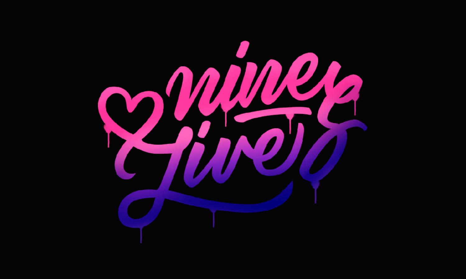
Source: Markis Leopoldo Angelo Elo, Nine Lives, Dribbble, https://dribbble.com/shots/5375010-Nine-Lives

Source: Erik Lauritzen, Mitch's Scooter Stuff, Dribbble, https://dribbble.com/shots/14117772-Mitch-s-Scooter-Stuff

Source: Kaye Huett, Megan, Dribbble, https://dribbble.com/shots/15030969-Megan
What Types of Logo Designs Work Best for Youtubers?
A great Youtuber logo design is like the opening act for your channel—it sets the tone, captures attention, and leaves a lasting impression. But with so many styles to choose from, what types of logo designs work best for Youtubers? Here’s a breakdown of five standout styles to consider for your channel’s visual identity.
Icon-Based Logos: Small but Mighty
Icon-based logos are compact, versatile, and memorable. These designs use a simple symbol or graphic to represent your channel, making them perfect for YouTube profile pictures, thumbnails, and merch. Think of YouTube’s classic play button—it’s instantly recognizable and speaks volumes with minimal effort. If your channel has a niche focus, like gaming or cooking, consider incorporating icons related to your theme to strengthen your brand identity.
Typographic Logos: Bold Words, Big Impact
Sometimes, all you need is the right font. Typographic logos rely solely on text, using creative typography to express your channel’s personality. Whether it’s a sleek sans-serif font for a modern vibe or a playful script for something more casual, these logos are clean, direct, and incredibly versatile. Adding unique tweaks, like a custom letterform or subtle embellishment, can make your typographic Youtuber logo design truly one of a kind.
Mascot Logos: Bring Your Channel to Life
Mascot logos feature illustrated characters or avatars that represent your channel’s personality. Perfect for gamers, comedians, or animated content creators, these designs are fun, engaging, and packed with character (literally). A well-designed mascot logo can create a strong emotional connection with your audience, making your channel feel more approachable and relatable.
Combination Logos: The Best of Both Worlds
Why choose between icons and typography when you can have both? Combination logos blend graphics and text for a balanced design that’s visually appealing and informative. This style works well for channels with diverse content because it offers flexibility. You can use the full logo when space allows or just the icon for smaller formats, ensuring your brand stays consistent across platforms.
Abstract Logos: Creative and Unique
For Youtubers who want to stand out, abstract logos are the way to go. These designs use shapes, colors, and patterns to create a distinctive look that’s open to interpretation. Abstract logos work particularly well for tech, music, or art-focused channels, as they convey innovation and creativity. Keep in mind, though, that simplicity is key—an overly complex design can confuse viewers instead of attracting them.
When deciding on the best Youtuber logo design for your channel, consider your content, audience, and personal style. Icon-based logos deliver clarity and simplicity, while typographic logos make a bold statement. Mascot logos bring personality, combination logos offer versatility, and abstract designs let your creativity shine. Whichever style you choose, make sure it captures the essence of your channel and leaves a lasting impression on your viewers!
What Shapes Are Effective In YouTuber Logo Design?
When it comes to creating a YouTuber logo design that stands out, shapes play a massive role. The form you choose isn’t just a random decision—it sets the mood, communicates personality, and influences how viewers connect with your channel. A well-thought-out shape can make your brand instantly recognizable and leave a lasting impression. Here are five fun and unique ways shapes can enhance your YouTuber logo design:
Circles For Community And Connection
Circles are one of the most versatile shapes in YouTuber logo design. They represent unity, friendliness, and inclusivity, which makes them perfect for creators who want to build a welcoming vibe. From lifestyle vloggers to family channels, circular logos instantly feel approachable. Plus, circles fit beautifully into profile icons, giving your channel a neat and polished look.
Triangles For Energy And Direction
Triangles bring a bold, edgy feel to a YouTuber logo design. They symbolize movement, energy, and growth—ideal for gaming, tech, or fitness creators. Pointing upward, triangles suggest ambition and success, while dynamic layouts can add excitement to your brand. They also echo the iconic “play” button, instantly tying your logo back to the YouTube experience.
Squares And Rectangles For Stability
Squares and rectangles send out a message of structure, strength, and reliability. If your content is focused on education, tutorials, or reviews, these shapes can emphasize professionalism and trust. A YouTuber logo design with these shapes often feels grounded and serious, helping viewers know they can depend on your content for valuable information.
Abstract Shapes For Creativity
Sometimes, breaking away from traditional forms can be the most powerful move. Abstract shapes in YouTuber logo design let you express originality and uniqueness. Swirls, splashes, or asymmetrical icons give your brand a one-of-a-kind identity that stands out in a crowded field. This approach is great for artists, entertainers, or experimental creators who want their creativity to shine from the very first glance.
Icons And Symbolic Shapes For Storytelling
Beyond basic geometry, symbolic shapes can bring your story to life. Think microphones for podcasters, controllers for gamers, or film reels for movie reviewers. These icons add instant clarity to your YouTuber logo design, making it easy for viewers to understand what your channel is all about. By mixing symbolism with clean design, you can create a logo that is both playful and informative.
In the end, the best shapes for a YouTuber logo design depend on the personality of your channel and the connection you want to make with your audience. Whether you lean toward circles for community, triangles for energy, or abstract icons for creativity, choosing the right shape can transform your channel identity and help you stand out in style.
What Are Creative Ideas For A YouTuber Logo Design?
A YouTuber logo design is more than a stylish graphic—it’s the signature of your channel and the mark that followers instantly recognize. The best logos aren’t just pretty pictures; they tell a story, spark curiosity, and connect emotionally with your audience. If you’re brainstorming how to make your channel’s logo shine, here are five fun and creative ideas to help you stand out.
Playful Use Of Typography
Typography is a fantastic way to inject personality into your YouTuber logo design. Bold, quirky fonts can highlight energy, while sleek and modern typefaces work perfectly for professional or tech-related content. You can even customize letters with creative flourishes, like turning the letter “O” into a camera lens or adding subtle arrows that reference the play button. Typography-based logos often look fresh and versatile across thumbnails, banners, and merchandise.
Personalized Mascots Or Characters
Adding a mascot or illustrated character to your YouTuber logo design is a creative way to build connection. Think of a cartoon version of yourself, a fun animal that represents your vibe, or a fantasy creature tied to your niche. Mascots bring warmth and memorability, especially for gaming, lifestyle, or family channels. They’re also flexible—you can animate or adapt them for special intros, channel art, or social media campaigns.
Bold Color Palettes That Pop
Color is one of the most powerful creative tools in a YouTuber logo design. Vibrant, high-contrast palettes instantly catch attention on screens crowded with competing content. If you want energy and excitement, neon shades are a go-to. For sophistication, deep monochromes or gradients deliver sleek impact. Playing with color combinations—like red and black for power, or teal and yellow for freshness—can make your logo unforgettable and consistent across all branding.
Icons Inspired By Your Niche
Nothing makes a logo clearer than an icon directly tied to your channel’s theme. A gaming channel could use a controller or pixel art design, while a beauty channel might feature a lipstick silhouette or mirror motif. Educational creators can incorporate books, lightbulbs, or pens. This approach not only makes your YouTuber logo design visually engaging, but also gives new viewers an instant clue about the type of content you create.
Minimalist And Versatile Designs
Sometimes less really is more. A clean, minimalist YouTuber logo design can carry enormous impact when executed well. Geometric shapes, simple monograms, or sleek outlines ensure your logo stays sharp even in small sizes. Minimalist styles are timeless, easy to remember, and adaptable across different platforms—making them perfect for creators who want sophistication without clutter.
A creative YouTuber logo design should reflect both your content and your personality. Whether you’re experimenting with typography, crafting a mascot, or keeping it minimal, the right design can give your channel an identity that feels authentic, playful, and uniquely yours.
What Colors Work Best For Youtuber Logo Design?
Choosing the right colors for your Youtuber logo design is like picking the perfect outfit—it needs to fit your personality, make a statement, and grab attention. Colors are powerful tools that evoke emotions and create instant connections with your audience. But which colors work best for a Youtuber logo design? Let’s dive into five impactful color strategies to make your logo shine.
Bold and Bright for Energy and Excitement
If your channel is all about gaming, entertainment, or action-packed content, bold and bright colors like red, neon green, or electric blue can make your Youtuber logo design pop. These colors convey energy and enthusiasm, helping your logo stand out in a sea of competitors. Red, for instance, is also associated with YouTube itself, making it a dynamic and familiar choice.
Minimalist Neutrals for Sleek Sophistication
For tech, educational, or minimalist channels, neutral tones like black, white, and shades of gray work wonders. These colors exude professionalism and elegance, making your Youtuber logo design look clean and modern. Pairing a neutral base with a subtle accent color can create a timeless, versatile logo.
Pastels for a Soft and Friendly Feel
Pastel colors like baby blue, soft pink, or mint green are perfect for lifestyle, beauty, or family-focused channels. These hues are calming, inviting, and approachable, giving your logo a friendly vibe that resonates with a wide audience. A pastel palette also lends itself well to a clean, Instagram-worthy aesthetic.
Contrasting Colors for Maximum Impact
Using contrasting color combinations like black and yellow, blue and orange, or purple and green can make your Youtuber logo design visually striking. This approach works especially well for logos that need to grab attention quickly. The contrast not only boosts visibility but also adds an edge of creativity to your brand’s identity.
Custom Colors for Unique Branding
Sometimes, the best colors for your Youtuber logo design aren’t the ones everyone else is using. Custom shades that are uniquely yours can set your brand apart and make it instantly recognizable. Consider blending colors or creating a gradient that represents your channel’s personality. A custom color scheme ensures your logo remains distinctive and memorable.
When picking colors for your Youtuber logo design, think about the message you want to send to your audience. Bold and bright colors scream excitement, while neutrals offer sophistication. Pastels add a touch of softness, contrasting colors maximize visibility, and custom shades make your logo uniquely yours. The right color palette doesn’t just make your logo look good—it creates a lasting impression that sticks with your viewers long after they’ve clicked “subscribe”!
What Are Affordable Options For YouTuber Logo Design?
Not every creator has a huge budget to splash on branding, but that doesn’t mean your channel can’t have a professional look. A YouTuber logo design can be affordable, stylish, and perfectly suited to your brand with the right approach. The trick is to explore options that balance creativity with cost-effectiveness. Here are five fun and practical ideas to help you get a logo without breaking the bank.
Free Online Logo Makers
There are tons of free tools that make YouTuber logo design a breeze. Platforms like Canva or Hatchful offer customizable templates where you can play with colors, fonts, and icons. These drag-and-drop editors are beginner-friendly, allowing you to create something eye-catching in minutes. While the results might not be entirely unique, they’re perfect for new YouTubers testing out ideas before investing in more custom work.
Budget-Friendly Freelancers
Hiring freelancers is another affordable way to get a unique YouTuber logo design. Websites like Fiverr or Upwork connect you with designers from around the world who offer services at different price points. You can find creative talent willing to design personalized logos for as little as $20–$50. The best part? You’re still getting a human touch that ensures your logo feels original and aligned with your channel’s theme.
DIY With Design Software
If you enjoy hands-on creativity, try designing your own YouTuber logo design with software like Photoshop, Illustrator, or even free programs like GIMP. This option requires a bit of time and effort, but it gives you complete control over the final look. Even simple geometric shapes, paired with smart color choices and playful fonts, can result in a professional logo. Plus, you’ll learn new design skills along the way—an investment in itself.
Logo Contests And Design Platforms
Some platforms allow you to launch contests where multiple designers submit ideas for your YouTuber logo design, and you pick your favorite. While this option isn’t always free, it’s often more affordable than hiring a professional agency. You get a variety of creative options to choose from, ensuring you find something that matches your personality and channel style.
Use Of Pre-Made Templates And Assets
If you want something quick and polished, pre-made logo templates can be an affordable solution. Marketplaces like Envato Elements or Creative Market sell ready-to-edit designs at low prices. You simply tweak them with your channel name and brand colors. This option provides a semi-custom look without the hefty price tag, making it great for creators on a tight budget.
An affordable YouTuber logo design options are everywhere—you just need to decide how much time, creativity, and money you want to invest. From free tools to budget-friendly freelancers, you can craft a logo that’s fun, unique, and totally channel-worthy without draining your wallet.
Conclusion
A YouTuber logo design doesn’t have to come with a hefty price tag to make an impact. With options ranging from free online tools and DIY software to affordable freelancers and pre-made templates, creators have plenty of budget-friendly ways to craft their channel’s identity. The key is choosing a solution that reflects both your style and your content, ensuring your logo feels authentic and memorable. By exploring creative yet affordable approaches, you can design a logo that grows with your channel, builds recognition, and strengthens your overall brand presence—all without stretching your wallet too thin.
Let Us Know What You Think!
Every information you read here are written and curated by Kreafolk's team, carefully pieced together with our creative community in mind. Did you enjoy our contents? Leave a comment below and share your thoughts. Cheers to more creative articles and inspirations!


Leave a Comment