30 Best Baker Logo Design Ideas You Should Check

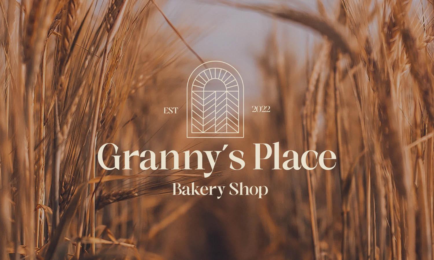
Source: Gulzar Alshan, Bakery Branding Identity, Behance, https://www.behance.net/gallery/142093029/Bakery-Branding-identity
Are you on a quest to find the perfect baker logo design that not only captures the essence of your brand but also makes it unforgettable? Well, you’re in the right place! In this article, we’re diving into the world of creativity and aesthetics to bring you some of the best baker logo design ideas that are sure to inspire. Whether you’re starting a quaint little bakery, reinventing an established one, or simply dreaming up a side hustle, the right logo can speak volumes. From minimalist masterpieces to charming, detailed illustrations, each design has the potential to turn your bakery into a brand.
We’ll explore fun and unique logo concepts that resonate with your target audience, ensuring that your brand stands out in the competitive market. Get ready to unleash your bakery's true potential with these top-notch design inspirations that blend tradition with modern flair. Let's bake up some success with styles that are as delicious as the treats you create!
Baker Logo Design Ideas

Source: Preethika Asokan, Breaded, Behance, https://www.behance.net/gallery/115313765/Breaded-Branding

Source: City Davies, The Angry Baker, Behance, https://www.behance.net/gallery/56390767/The-Angry-Baker-Brand-Identity

Source: Pietra Galvão, Henzo, Behance, https://www.behance.net/gallery/74247139/BAKERY-HENZO-Branding-logo

Source: Marina Zakharova, Cozy Bakery, Dribbble, https://dribbble.com/shots/26518515-Cozy-Bakery-Logo-design

Source: Invade Design, Felicidad, Behance, https://www.behance.net/gallery/108963571/Felicidad-Bakery

Source: Mucca Design, Frenchette Bakery, Behance, https://www.behance.net/gallery/145522607/Frenchette-Bakery

Source: Maniac Studio, Nud, Behance, https://www.behance.net/gallery/137867447/Nud

Source: Mmpx Studio, Andor, Behance, https://www.behance.net/gallery/137349115/Andor-Bakery-Coffee

Source: Sebastián Olivos, Bread Feast, Behance, https://www.behance.net/gallery/131795195/Bread-Feast-Branding

Source: Vinay Gowtham M, Oneiro Boulangerie, Behance, https://www.behance.net/gallery/87490067/Oneiro-Boulangerie-Brand-Identity-Design

Source: Md Sayem, Freshy Bakery, Dribbble, https://dribbble.com/shots/26662417-Freshy-Bakery-Logo-Design

Source: Maxim Durbailov, Dribbble, https://dribbble.com/shots/25047811-Chef-Baker-Logo

Source: Jeroen van Eerden, Blue Mountain Bakery, Dribbble, https://dribbble.com/shots/20466942-Blue-Mountain-Bakery-Logo-Design

Source: Dustin Holmes, Bakehouse Hong Kong, Behance, https://www.behance.net/gallery/125187309/Bakehouse-Hong-Kong

Source: Democràcia Estudi, Molt Bakery, Behance, https://www.behance.net/gallery/109020625/Molt-Bakery

Source: Rumi Rumika, Brunelie Bakehouse, Dribbble, https://dribbble.com/shots/26555310-Brunelie-Bakehouse-Bakery-Logo-Brand-Identity

Source: Kelly Loh, Oishi Bakery Rebranding, Behance, https://www.behance.net/gallery/121624317/Oishi-Bakery-Rebranding

Source: RoadPen, Alpaka Bakery, Dribbble, https://dribbble.com/shots/24683403-Alpaka-Bakery-Logo

Source: Cristie Stevens, Dribbble, https://dribbble.com/shots/5840592-Bakery-Logo

Source: Ulysses Design Co, Adesso, Dribbble, https://dribbble.com/shots/25488030-Brand-Identity-for-Adesso-Bakehouse

Source: Emir Kudic, Butter & Crumbs Brand Identity Project, Behance, https://www.behance.net/gallery/145326791/Butter-Crumbs-Brand-Identity-Project

Source: Nirakaar Designing, Casablanca Bakery Branding, Behance, https://www.behance.net/gallery/119853355/Casablanca-Bakery-Branding

Source: Cameron Jennings, Saltadena Bakery, Dribbble, https://dribbble.com/shots/9104162-Saltadena-Bakery-Cake-Shop

Source: Vektora Branding, Flourish, Dribbble, https://dribbble.com/shots/24888231-Flourish-Logo-Animation

Source: Rene Camargo, Benedito Calixto Bakery, Behance, https://www.behance.net/gallery/88473959/Benedito-Calixto-Bakery

Source: Daydrift, Dribbble, https://dribbble.com/shots/25134970-Logo-for-Bakery-Wedding-Cake-Maker

Source: Coolab Creative Studio, Branding Donna Confeitaria Artesanal, Behance, https://www.behance.net/gallery/94207603/Branding-Donna-Confeitaria-Artesanal

Source: Asrar Mousli, The Orangery Tearoom Patisserie, Behance, https://www.behance.net/gallery/24001845/The-Orangery-Tearoom-Patisserie

Source: Cobra Studio, Forno Mariani Branding, Behance, https://www.behance.net/gallery/97101199/Forno-Mariani-Branding

Source: Gulzar Alshan, Bakery Branding Identity, Behance, https://www.behance.net/gallery/142093029/Bakery-Branding-identity
What Is Essential in a Baker Logo Design?
Creating a baker logo design that really pops is like perfecting your signature dish—it takes a mix of the right ingredients, a touch of creativity, and a sprinkle of passion! When you're whipping up a logo for your bakery, there are several key elements you must consider to ensure your brand looks as good as your baked goods taste. Here’s what’s essential in crafting a baker logo design that rises to the occasion:
Clear Brand Identity
At the heart of any successful baker logo design is a clear reflection of the bakery's identity. Are you a rustic, artisan bread shop? Or perhaps a trendy cupcake boutique? Your logo should give a taste of your bakery’s style, specialty, and spirit. This means choosing images, fonts, and colors that align perfectly with the vibe you want to communicate. It’s not just about looking good—it’s about making sure your logo tells your story at a glance.
Memorable Imagery
Whether it’s a whisk, a rolling pin, or a loaf of bread, incorporating relevant imagery can greatly enhance your logo’s memorability and relatability. Choose symbols that are directly connected to baking or your specific bakery offerings. This imagery should be simple yet distinctive enough to be easily recognized at a small size or from a distance. Think of it as the decorative icing on your logo cake—make it unique and delightful!
Appetizing Color Palette
Color can influence mood and feelings, so picking the right palette for your baker logo design is crucial. Warm tones like browns, reds, and yellows can evoke feelings of warmth and comfort, reminiscent of a fresh batch of cookies straight out of the oven. On the other hand, soft pastels can reflect a sweet, delicate touch, perfect for a patisserie or dessert shop. Choose colors that not only complement each other but also help convey the flavor of your brand.
Legible Typography
The choice of font in your logo design is key to ensuring that your bakery’s name is readable and impactful. Whether you choose a flowing script to convey elegance and flair or a bold sans-serif for a modern and clean look, make sure that your typography is not only beautiful but also functional. After all, your logo will be displayed everywhere from your storefront to your packaging, so it needs to be clear and easy to read at a glance.
Scalability and Versatility
A great baker logo design should work well across various mediums and sizes—from the sign above your shop to the top of your website. It should be scalable, meaning it looks just as good on a small cookie label as it does on a large banner. This versatility extends to different formats as well, ensuring that your logo can be adapted for digital use, print, and even merchandise without losing its charm or clarity.
By baking these essential elements into your logo design, you’ll ensure that your bakery not only stands out from the crowd but also leaves a lasting impression on your customers. Remember, a great baker logo design is the first taste consumers will have of your bakery, so make it as irresistible as your treats!
What Imagery Works Best in Baker Logo Designs?
When it comes to crafting the perfect baker logo design, the imagery you choose is the cherry on top of your brand identity cake! Effective logo imagery can transform your bakery from just another shop on the street to a memorable landmark in the minds of your customers. Here are five fun and unique imagery ideas that will help your baker logo design rise to the occasion:
Whimsical Whisks and Rolling Pins
Nothing screams "bakery" more than the tools of the trade. Using illustrations of whisks, rolling pins, or mixing bowls can instantly communicate your bakery’s purpose. Design these elements with a touch of whimsy—think playful lines, dynamic swirls, or even cartoonish styles. This approach not only adds a fun element to your logo but also makes it approachable and inviting.
Delectable Dough Creations
Imagine a logo that features an irresistible, fluffy loaf of bread or a perfectly twisted pretzel. Using imagery of your best-selling items or specialty goods can act as a visual taste test for potential customers. These icons not only look appetizing but also promise the same satisfaction in every bite, creating a direct connection between your logo and the delicious experience you offer.
Classic Chef’s Hats and Aprons
Incorporating a chef’s hat or an apron into your logo can give it a professional yet homely feel. These symbols are universally recognized and suggest a sense of craftsmanship and care in baking. They can be stylized to match the vibe of your bakery, whether it's more traditional or has a modern twist. Plus, they send a clear message that there's a master baker at work here!
Enchanting Ingredient Sprinkles
Whether it’s a dusting of flour, a sprinkle of sugar, or a cinnamon stick, showcasing ingredients in your logo can evoke the freshness and quality of your baked goods. This strategy not only highlights the natural appeal of your products but also underlines your commitment to quality and authenticity. It's a subtle nod to the careful selection of ingredients that go into making each item perfect.
Typographic Treats
Sometimes, the name of your bakery itself can be the star of the logo. Creative typography, where letters are decorated with icing, topped with cherries, or dusted with flour, can make for a highly effective and memorable logo design. This technique combines the brand name with visual elements of baking, reinforcing your identity every time your logo is seen.
By choosing the right imagery for your baker logo design, you create a visual feast that can attract and retain customers, making them eager to discover what's baking in your oven. With these imaginative ideas, your bakery logo is sure to be as delightful as the treats you serve!
What Style Should My Baker Logo Design Have?
Deciding on the style of your baker logo design is like choosing the perfect frosting for a cupcake—it needs to complement the base while making its own statement. The style of your logo sets the tone for your brand and influences how customers perceive your bakery. Let’s sift through five style options that could make your baker logo design as enticing as your baked goods!
Classic and Traditional
For bakeries that pride themselves on generations-old recipes and a cozy, nostalgic vibe, a classic and traditional logo style is a perfect match. This style often features elegant serif fonts, simple color palettes, and perhaps a classic emblem or crest. Such a logo whispers of heritage and time-honored traditions, promising the same homemade taste that has been savored for years.
Modern and Minimalist
If your bakery is all about innovation, clean eating, or a chic urban appeal, then a modern and minimalist logo design might be the way to go. This style uses clean lines, sparse color schemes, and sans-serif typography to create a sleek and contemporary look. A minimalist logo not only looks great on digital platforms but also appeals to a younger, trend-sensitive audience.
Rustic and Artisanal
Embrace the handcrafted, earthy essence of your artisanal bakery with a rustic logo style. This approach often includes elements like wood textures, parchment paper backgrounds, or illustrations of wheat and grains. Fonts might be more rugged or handwritten, enhancing the artisanal feel. This style tells the story of meticulous craftsmanship and the wholesome goodness of freshly baked, organic products.
Playful and Whimsical
Is your bakery filled with colorful cupcakes, whimsical cake designs, or a fun atmosphere for families? A playful and whimsical logo could be the cherry on top. Bright colors, fun typefaces, and cute illustrations of baked goods or magical elements can make your logo memorable and engaging. This style is perfect for bakeries that want to project a friendly, approachable, and joyful image.
Elegant and Sophisticated
For high-end patisseries or bakeries that offer gourmet desserts, an elegant and sophisticated logo style might be most fitting. This design often features luxe fonts, subdued color palettes, and minimalist but chic graphics. An elegant logo can convey the luxury and exclusivity of your offerings, appealing to a clientele with a taste for the finer things in life.
Choosing the right style for your baker logo design is crucial in ensuring that it resonates with your target audience and reflects the unique flavor of your brand. Whether you knead a traditional touch or a sprinkle of modern flair, your logo is the face of your bakery—make it as delectable as your desserts!
What Shapes Work Best in a Baker Logo Design?
Picking the right shapes for your baker logo design is like selecting the perfect cookie cutter for your dough—it shapes how people will see and remember your brand. When you're designing a logo for a bakery, the shapes you choose can sweeten your brand's appeal and make your logo more digestible to customers. Let's explore five shape ideas that can help your baker logo design rise above the rest!
Circular and Oval Shapes
Circles and ovals are a baker's best friend. These shapes are inherently pleasing and evoke a sense of unity and perfection, much like a well-rounded pie or a perfectly baked loaf of bread. Circular logos can suggest community, warmth, and comfort—emotions that are right at home in a bakery. Using these shapes in your logo can make your brand feel more welcoming and wholesome.
Organic and Freeform Shapes
To convey the handmade, artisanal quality of your bakery goods, consider incorporating organic and freeform shapes into your logo design. These irregular, non-geometric shapes can mimic the natural forms of dough and pastries, suggesting a personal touch and craftsmanship. They're perfect for bakeries that want to highlight their unique, handcrafted products.
Rectangular and Square Shapes
For a more structured and stable look, rectangles and squares can be effective. These shapes project strength and reliability, providing a sense of trust and solidity. This is particularly appealing for bakeries that want to emphasize their establishment as a dependable, go-to spot for fresh bread, cakes, and pastries. These shapes are also versatile for branding across various media, from store signs to business cards.
Triangle Shapes
Triangles can inject a sense of excitement and dynamism into your baker logo design. They point upwards, conveying progress and growth, or they can be styled to look like slices of pie or cake. Using triangles creatively can make your logo stand out and give it a cutting-edge feel, suitable for a modern bakery that prides itself on innovative flavors and designs.
Heart Shapes
Nothing says "baked with love" quite like a heart-shaped logo. This shape can be especially effective for bakeries that aim to project a cozy, loving atmosphere where every treat is made with passion and care. Heart shapes can attract a clientele looking for comfort foods and a warm, inviting environment, making them perfect for small, community-focused bakeries.
When designing your baker logo, think of these shapes as ingredients in your recipe for branding success. Each shape brings its own flavor to the mix, and choosing the right one can help your bakery's brand identity come alive. Just like in baking, a little creativity goes a long way—so don’t be afraid to experiment with shapes to find the perfect fit for your bakery’s logo!
What Fonts Are Best for a Baker Logo Design?
Choosing the right font for your baker logo design is like selecting the perfect icing for a cake—it needs to complement the base and enhance the overall appeal. The font you choose plays a pivotal role in conveying your bakery’s personality and brand message. So, let’s whip up some ideas on what types of fonts can help your baker logo design truly stand out and speak to your customers!
Handwritten Script Fonts
There’s something irresistibly charming about a handwritten script font in bakery logos. These fonts often resemble beautiful hand lettering that one might find on a custom cake or a chalkboard menu in a cozy café. They convey a sense of warmth, personal touch, and artisanal quality, making them a sweet choice for bakeries that want to highlight their homemade, crafted with love ethos.
Serif Fonts
For a touch of elegance and tradition, serif fonts are a fantastic choice. These fonts are associated with reliability and timelessness, which can help establish your bakery as a staple in the community. A well-chosen serif font can make your logo appear more sophisticated and trustworthy, perfect for bakeries with a long history or those specializing in classic, refined pastries and breads.
Modern Sans-Serif Fonts
If your bakery has a more contemporary or minimalist vibe, a clean, modern sans-serif font can convey clarity and modernity. These fonts are straightforward and easy to read, which makes them highly effective for a clean and polished look. They work well for urban, trendy bakeries that aim to attract a younger demographic or those emphasizing new, innovative baking techniques.
Decorative and Novelty Fonts
To inject some fun and uniqueness into your baker logo design, consider using decorative or novelty fonts. These can include stylized fonts that mimic the shape of twisted dough, icing, or even incorporate thematic elements like leaves, stars, or hearts. These playful fonts are perfect for children’s bakeries, specialty shops, or seasonal pop-ups looking to make a bold and memorable impression.
Vintage and Retro Fonts
Channeling the nostalgia of a bygone era, vintage and retro fonts can be an excellent choice for bakeries that want to celebrate heritage and tradition. Whether it’s a font that looks like it came straight from a 1950s diner or a rustic design that evokes the feel of an old-world European bakery, these fonts can add character and a sense of history to your logo. They are particularly effective for bakeries located in historic districts or those that specialize in traditional baking methods and recipes.
The font you choose for your baker logo design can greatly influence how customers perceive your bakery. It can make them feel at home, excited, or intrigued. Remember, the best font for your bakery will align with your brand’s personality and goals, helping to create a cohesive and appealing identity. So, roll out your creativity and let your font tell the delicious story of your bakery!
Conclusion
A thoughtfully crafted baker logo design is crucial for any bakery looking to establish a strong market presence. An effective logo serves as the face of your brand, blending memorable imagery, a suitable color palette, and legible typography to resonate with your target audience. By ensuring that your logo reflects your bakery’s unique identity and remains versatile across various applications, you set the foundation for brand recognition and customer loyalty. Remember, a well-designed baker logo not only attracts attention but also tells the story of your brand's quality and craftsmanship, making it a key ingredient in your business's success.
Let Us Know What You Think!
Every information you read here are written and curated by Kreafolk's team, carefully pieced together with our creative community in mind. Did you enjoy our contents? Leave a comment below and share your thoughts. Cheers to more creative articles and inspirations!





Leave a Comment