30 Best Candy Logo Design Ideas You Should Check

Source: Danielle Hames, Peppermint Panda, Behance, https://www.behance.net/gallery/118334923/PEPPERMINT-PANDA-BRANDING
In the vibrant world of confections, the right candy logo design can make all the difference between being just another sweet treat on the shelf and becoming a memorable brand icon. Whether you’re launching a new candy brand or looking to revitalize an established one, diving into the realm of creative logo design is essential. This article is your golden ticket to discovering the most delightful and effective candy logo design ideas that will captivate consumers and sweeten your brand’s appeal.
From whimsical characters to mouth-watering color palettes, the best candy logo designs encapsulate the joy and excitement that candy brings into our lives. They create instant connections, evoke nostalgia, and generate excitement—all crucial ingredients for a successful candy brand. So, buckle up and prepare to indulge in a visual feast of the most inspiring candy logo designs. Whether you’re looking for a splash of playful charm or a touch of vintage elegance, this roundup has something to spark every designer’s imagination. Get ready to be dazzled by these creative confections that stand out in the competitive candy aisle!
Candy Logo Design Ideas

Source: Trey Ingram, Sweet Station, Dribbble, https://dribbble.com/shots/5555555-Sweet-Station

Source: Alen Pavlovic, Candyplane, Dribbble, https://dribbble.com/shots/11110674-Candyplane

Source: Ahmed Creatives, Goatipop, Dribbble, https://dribbble.com/shots/15146858-Goatipop

Source: Jessica Daniela, Jolly Joy, Behance, https://www.behance.net/gallery/237103379/JOLLY-JOY-BRAND-IDENTITY

Source: Almahdy Elhwity, Purple Sugar, Behance, https://www.behance.net/gallery/162996523/Purple-Sugar-Logo-Brand-Identity

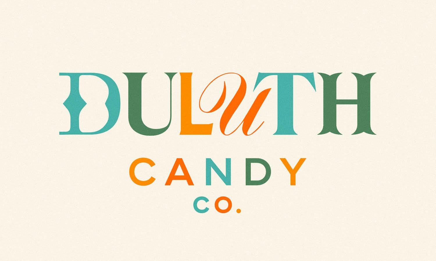
Source: Studio MPLS, Duluth Candy Co, Behance, https://www.behance.net/gallery/132929017/Duluth-Candy-Co

Source: Masha Makka Blinpeaks, Behance, https://www.behance.net/gallery/208180199/packaging-for-a-box-of-fruit-candies

Source: Sasha Litvinenko, Makorol, Dribbble, https://dribbble.com/shots/8417939-Makorol-logo

Source: Aratu Design, Seu Lado Doce, Behance, https://www.behance.net/gallery/128285629/Seu-Lado-Doce-Brand-Identity

Source: Maycon Prasniewski, Anne Schuartz, Dribbble, https://dribbble.com/shots/14054494-Anne-Schuartz-Sweet-Maker

Source: Andrii Kovalchuk, Candyshop, Dribbble, https://dribbble.com/shots/17068893-Candy

Source: Ariana Sánchez, Chuchulucos, Dribbble, https://dribbble.com/shots/16222808-Chuchulucos

Source: Alvaro Arismendi, Dulces Poderes, Behance, https://www.behance.net/gallery/193920595/DULCES-PODERES-Visual-Identity

Source: Nadia Parentini, Zigulí, Behance, https://www.behance.net/gallery/75054567/ZIGULI-Logo-and-Pack-Redesign

Source: Casign, Cloud Sugar, Dribbble, https://dribbble.com/shots/15528839-Cloud-Sugar

Source: Tridente Studio, Good Boy Candy, Dribbble, https://dribbble.com/shots/15783083-good-boy-Candy

Source: Jerry Okolo, Lolly May, Dribbble, https://dribbble.com/shots/7967949-Lolly-May

Source: Leila Howell, Lottie, Dribbble, https://dribbble.com/shots/4482013-Lottie-Logo

Source: Luke Bott, Candy Central, Dribbble, https://dribbble.com/shots/2557925-Candy-Central

Source: Rasya, Sweet Tales, Dribbble, https://dribbble.com/shots/14938955-sweer-tales-cotton-candy

Source: Farz Designs, Colleen Candies, Dribbble, https://dribbble.com/shots/7971333-COLLEEN-CANDIES

Source: Brent Schoepf, Dcco, Dribbble, https://dribbble.com/shots/6140401-DCCO

Source: Yuliia Hrabynska, Candy Safari, Behance, https://www.behance.net/gallery/195697033/Candy-Safari-Brand-Identity-Candy-Brand

Source: Konstantin Reshetnikov, Martin Sweets, Dribbble, https://dribbble.com/shots/10754025-Martin-Sweets

Source: Valerie Durak, Lolli & Pops, Behance, https://www.behance.net/gallery/93612503/Lolli-Pops

Source: Ashley Gorman, Sweet Sisters, Dribbble, https://dribbble.com/shots/2840299-Sweet-Sisters-Logo-GIF

Source: SG Kivett, Scull House Sweets, Dribbble, https://dribbble.com/shots/14008756-Sweet-Branding

Source: Kate Libby, Pixie Sweets, Dribbble, https://dribbble.com/shots/14136934-Pixie-Sweets

Source: Brandon Moore, Good Ash Sweets, Dribbble, https://dribbble.com/shots/6562712-Good-Ash-Sweets

Source: Danielle Hames, Peppermint Panda, Behance, https://www.behance.net/gallery/118334923/PEPPERMINT-PANDA-BRANDING
What Features Are Important in a Candy Logo Design?
Candy logo design is an art form that requires a balance of creativity, fun, and strategic branding. When it comes to designing a logo for a candy brand, there are several key features that are essential to make the design effective and memorable. Here are five important aspects to consider :
Color Palette: The Sweet Spectrum
The use of color in candy logo design is crucial as it not only grabs attention but also evokes specific emotions and associations. Bright, vibrant colors are typically used to convey fun and excitement, reminiscent of walking into a candy store. Colors like pink, red, and yellow are popular choices as they are often associated with sweetness, love, and happiness. However, it's important to balance these bright hues with softer tones to ensure the logo isn’t overwhelming and maintains a sense of professionalism.
Font Style: The Flavor of Text
Typography in a candy logo should reflect the playful and whimsical nature of the brand. Curvy, bold fonts are often favored as they resemble the fun shapes and textures of candies. Script fonts can also be used to add a touch of elegance or nostalgia, reminiscent of old-fashioned candy shops. The key is to ensure that the text is legible and complements the overall design, creating a cohesive look that is both appealing and readable.
Imagery: Visual Treats
Incorporating imagery that is directly related to candy can be a powerful tool in logo design. This could include illustrations of candies, confectionery tools, or abstract shapes that mimic the look of sweets. These images not only make the logo more visually appealing but also help in instantly communicating the nature of the business. It’s important to be creative yet simple with these visuals to ensure that the logo remains recognizable and scalable across different mediums.
Brand Personality: Sweet Character
The personality of the brand should shine through in the logo design. Whether the brand is playful and fun, elegant and sophisticated, or quirky and unique, the logo should reflect these qualities. This helps in establishing a brand identity and ensures that the logo resonates with the target audience. For instance, a brand targeting a younger demographic might opt for a more playful and colorful logo, while a luxury confectionery brand might choose a more refined and minimalist design.
Memorability: Lasting Sweet Impressions
Ultimately, the goal of a candy logo is to be memorable. This can be achieved through unique and creative design elements that set the brand apart from competitors. The logo should be distinctive and easily recognizable, ensuring that it sticks in the minds of consumers. This might involve a unique color combination, an innovative use of typography, or a cleverly designed icon that captures the essence of the brand.
Effective candy logo design is a blend of vibrant colors, playful typography, relevant imagery, brand personality, and memorability. By focusing on these key features, designers can create a logo that not only looks appealing but also effectively communicates the brand's identity and values, leaving a sweet and lasting impression on the audience.
How Can I Use Color to Make My Candy Logo Design Pop?
In the world of candy logo design, color is not just an aspect; it's the heart of creativity. Using color effectively can make your candy logo not only pop but also communicate your brand's essence with vibrancy and flair. Here are five key ways to use color to make your candy logo design stand out :
Embrace the Power of Color Psychology
Every color has a story and an emotion attached to it. In candy logos, you want to tap into colors that evoke feelings of joy, excitement, and sweetness. Think bright and playful hues like bubblegum pink, sunshine yellow, or mint green. These colors can instantly uplift the mood and are closely associated with fun and happiness, perfect for a candy brand. However, it’s important to understand your brand's personality to choose the right shades. A luxury chocolate brand, for example, might lean towards rich, darker colors like burgundy or gold.
Contrast for Attention
Contrast is a designer's best friend. Using contrasting colors can make certain elements of your logo stand out. For instance, pairing a light pastel with a bold primary color can make your logo jump out. This technique is particularly effective in highlighting your brand name or a key visual in the logo. Remember, the goal is to catch the eye, not to strain it, so finding a balance in contrast is key.
Create a Unique Color Palette
While it's easy to fall back on typical 'candy' colors, standing out might mean creating a unique color palette that sets you apart from competitors. This could mean using unconventional color combinations or choosing a less saturated tone for a more sophisticated look. The uniqueness of your color palette can be a significant factor in making your logo memorable.
Use Color to Tell a Story
Colors can be narrative. In your candy logo, use colors to tell the story of your brand. Are you all about organic, natural flavors? Then earthy tones and greens can communicate this. Is your brand about explosive, unexpected flavors? Vibrant, neon colors might be your go-to. The colors in your logo should be a reflection of what your candy brand stands for.
Consistency Across Branding
Consistency in color usage across all branding materials reinforces brand recognition. The colors in your logo should be mirrored in your packaging, website, and marketing materials. This consistency helps in building a strong brand identity and ensures that your customers associate those specific colors with your brand. It’s not just about the logo; it’s about creating a cohesive brand experience.
Using color in candy logo design is all about balance, creativity, and understanding your brand's story and audience. The right use of color can make your candy logo not just a visual treat but a memorable emblem of your brand's sweet journey.
What Symbols Work Best for Candy Logos?
When it comes to crafting a sweet and successful candy logo design, the symbols you choose can be as vital as the flavors you offer. Symbols in a logo not only communicate your brand's message but also make it more relatable and memorable to your audience. Here are five delightful and effective symbols to consider when designing a candy logo that captures the essence of your brand while tickling the taste buds of your potential customers:
Candies and Confections
The most obvious yet effective symbols for a candy logo are images of the candies themselves. Whether you're showcasing hard candies, gummy bears, lollipops, or chocolate bars, including a stylized version of your product can instantly communicate what you sell. These icons are eye-catching and can be styled in a multitude of colors and shapes to reflect the uniqueness of your brand and its products.
Ribbons and Wrappers
A ribbon or a wrapper partially unwrapped conveys a sense of excitement and surprise, similar to the feeling of opening a new candy. This symbol can add a playful and festive flair to your candy logo design, suggesting a gift-like quality that candy often represents. It's perfect for brands that want to emphasize the joy and specialness of their treats.
Sparkles and Twinkles
To convey the magical, whimsical side of your candies, incorporating sparkles or twinkles can be very effective. This element works particularly well for candy targeted at children or for products that want to highlight a fantastical, dreamy quality. Sparkles can make your logo pop and give it a lively, enchanting feel that promises delight.
Fruits and Natural Elements
If your candy brand focuses on natural flavors or organic ingredients, using symbols of fruits, leaves, or even water droplets can reinforce this message. A cherry or strawberry, for instance, not only adds a splash of color but also communicates freshness and natural taste. These symbols help set expectations for the flavor profiles of your candies and can appeal to health-conscious consumers.
Smiles and Faces
Adding a smiling face or creating a character out of your candy logo can forge a stronger emotional connection with your audience. A character, whether it's a piece of candy with a face or a fun creature holding your product, can give your brand a friendly persona. This approach is particularly effective for brands looking to create a long-standing mascot that can be used in various marketing materials.
Each of these symbols has the potential to make your candy logo design not just seen but remembered. The choice depends on what you want your brand to communicate. Is it the joy and fun of eating candy, the quality of ingredients, or the magical experience your products create? By selecting the appropriate symbols, you can ensure your logo will resonate well with your target audience, making your candy not just a treat, but a sweet experience to remember.
What Typography Is Most Effective for Candy Logo Designs?
When diving into the delicious world of candy logo design, typography plays a crucial role in setting the tone and personality of your brand. The right font not only makes your logo visually appealing but also communicates your brand’s essence. Here are five key points to consider when selecting typography for your candy logo :
Playful and Fun Fonts: The Sweet Spot of Candy Logos
Candy logos often call for fonts that are playful and fun, mirroring the joy and whimsy associated with candy. Fonts with rounded edges, soft curves, and bubbly forms are great choices as they evoke a sense of fun and approachability. Think about fonts that mimic the shapes of candies or the fluidity of chocolate. These types of fonts are instantly engaging and communicate a sense of fun, making them perfect for candy brands, especially those targeting children or families.
Bold and Readable: Making a Statement
Visibility is key in any logo design, and candy logos are no exception. Bold fonts make a statement and ensure that your brand name is easily readable, even from a distance. This is especially important for product packaging and signage. However, bold doesn’t have to mean heavy; you can choose a font that is bold yet retains a sense of playfulness or elegance, depending on your brand's personality.
Custom Typography: A Unique Flavor
For a truly unique candy logo, consider custom typography. This allows you to create a font that is entirely unique to your brand, helping you stand out in a crowded market. Custom fonts can incorporate elements that reflect your specific type of candy or brand ethos, such as incorporating candy-like elements into the letters or using a font style that harks back to the era your brand draws inspiration from.
Color and Typography: A Sweet Combination
The interplay of color and typography can significantly enhance the appeal of your candy logo. Using colors effectively within the font, such as gradients that mimic candy textures or colors that complement your overall color scheme, can make your logo more dynamic and engaging. Be careful not to overdo it – the text should remain legible and cohesive with the overall design.
Font Pairing: Harmony in Design
Sometimes, using a single font isn’t enough to convey all the facets of your brand. Pairing two complementary fonts can add depth and versatility to your logo. For example, a playful, whimsical font for the brand name paired with a more straightforward, readable font for a tagline or additional information can be effective. The key is to ensure the fonts complement each other and maintain the overall cohesiveness of the design.
Selecting the right typography for your candy logo design involves balancing playfulness with readability, considering custom typography for uniqueness, effectively using color within the font, and mastering the art of font pairing. A well-chosen font can turn your logo into a delightful visual treat that attracts and retains your target audience’s attention.
What Are Some Iconic Candy Logo Designs?
In the colorful world of candies, certain logos have become as iconic as the sweets they represent. These designs not only capture the essence of the brand but also create lasting impressions on candy lovers of all ages. Here are five iconic candy logo designs that have stood the test of time and continue to dominate the sweet world with their visual appeal:
Hershey’s Kisses
The logo for Hershey’s Kisses is as delightful as the chocolate itself. Featuring the image of a single Hershey's Kiss with the distinctive plume peeking out, it's a simple yet brilliant visual pun that integrates the product's unique shape directly into the brand identity. The use of silver and blue in the logo mirrors the classic foil wrapper, making it instantly recognizable. This clever design encapsulates the brand’s promise of simple, pure pleasure in a small, sweet package.
M&M’s
The M&M’s logo is as fun and vibrant as the candy-coated chocolates themselves. With its bold, rounded typography and bright color palette, the logo perfectly reflects the playful, friendly nature of the brand. The addition of the lowercase ‘m’ on each candy piece in the logo adds a personal touch, reinforcing the brand’s casual and approachable vibe. M&M’s logo is a testament to how effective branding can be used to convey a sense of fun and inclusivity.
Toblerone
Toblerone’s logo incorporates the distinctive triangular shape of its chocolate bars, which is inspired by the Swiss Alps. This clever use of imagery not only highlights the product's unique selling point but also pays homage to its Swiss heritage. The hidden image of a bear within the mountain design adds an element of surprise and reinforces the logo’s connection to the city of Bern, Switzerland, known for its bears and the high quality of its chocolate.
Cadbury
Cadbury’s logo, with its signature purple color and elegantly scripted font, evokes a sense of luxury and comfort. The iconic script has been associated with the brand since the early 20th century, providing a touch of personal handwriting that suggests tradition and quality craftsmanship. This color and font choice make Cadbury products stand out on shelves and convey a rich, creamy texture promised by its chocolates.
Jelly Belly
Jelly Belly’s logo is as colorful and assorted as the jelly beans it represents. Utilizing a rainbow spectrum in its branding, the logo matches the product's fun and quirky nature. The playful, whimsical font used in the logo appeals directly to the brand’s diverse audience, inviting them to experience a variety of flavors. The bright colors also play a psychological role in enhancing the attractiveness and taste expectation of the candy.
These candy logo designs demonstrate the power of visual branding in the confectionery industry. Each one uses color, shape, and typography to tell a story, evoke emotions, and create brand loyalty. By understanding the elements that make these logos successful, brands can develop a candy logo design that not only stands out in a crowded market but also becomes a beloved symbol of sweetness for generations.
Conclusion
A well-crafted candy logo design is essential for any confectionery brand looking to make a lasting impression. These logos not only attract attention with their vibrant colors and imaginative motifs but also communicate the brand's story and values to consumers. Whether you're starting a new candy business or revamping an existing one, investing in a professional candy logo design can significantly enhance brand recognition and customer appeal. Remember, your logo acts as a visual ambassador, so it's crucial to design one that resonates well with your target audience and stands out in the competitive market.
Let Us Know What You Think!
Every information you read here are written and curated by Kreafolk's team, carefully pieced together with our creative community in mind. Did you enjoy our contents? Leave a comment below and share your thoughts. Cheers to more creative articles and inspirations!





Leave a Comment