
10 Tips to Create a Good Youtuber Logo Design

Source: Markis Leopoldo Angelo Elo, Dribbble, https://dribbble.com/shots/5375010-Nine-Lives
Your logo is often the first visual element people notice before they watch a single video. A well-planned Youtuber logo design helps introduce your personality, communicate your content style, and make your channel easier to remember. Even in a crowded platform filled with creators, a recognizable logo can strengthen your identity and create a more professional appearance. A successful logo does much more than look attractive. It should represent your niche, remain clear at small sizes, and fit naturally across profile pictures, video watermarks, thumbnails, and social media. Fortunately, creating an effective logo does not require complicated artwork. By focusing on thoughtful design decisions instead of temporary trends, you can build a visual identity that grows alongside your channel. These practical tips will help you create a logo that is distinctive, versatile, and built for long-term success.
Why A Strong Youtuber Logo Design Matters
A logo acts as a visual shortcut that helps viewers recognize your content before they even read your channel name. As people repeatedly see the same logo on thumbnails, banners, community posts, and social platforms, they begin to associate it with your videos and personality. This familiarity strengthens your personal brand over time.
Build A Memorable Personal Brand
Your logo should reflect what makes your channel unique. A gaming creator may choose bold graphics and energetic colors, while an educational channel often benefits from a cleaner, more professional appearance. When your visual identity matches your content, new visitors immediately gain a better understanding of what to expect.
Create A Professional First Impression
People naturally judge visual quality within seconds. A polished logo signals that you care about your content and your audience. Even if your channel is still small, a thoughtful design can increase credibility and encourage visitors to explore more of your videos instead of leaving after their first impression.
Tip One: Define Your Channel Identity Before Designing
Before opening any design software, spend time defining what your channel represents. Think about your primary content, your personality, and the type of audience you want to attract. These decisions provide direction for every design choice that follows. For example, a technology reviewer, travel vlogger, fitness coach, and comedy creator all communicate very different messages. Trying to combine every interest into one logo usually creates confusion. Instead, identify the core theme that best represents your channel today.
Tip Two: Choose A Logo Style That Matches Your Content
Different logo styles communicate different personalities. Selecting the right format helps viewers quickly understand your brand before watching your videos.
Mascot Logos
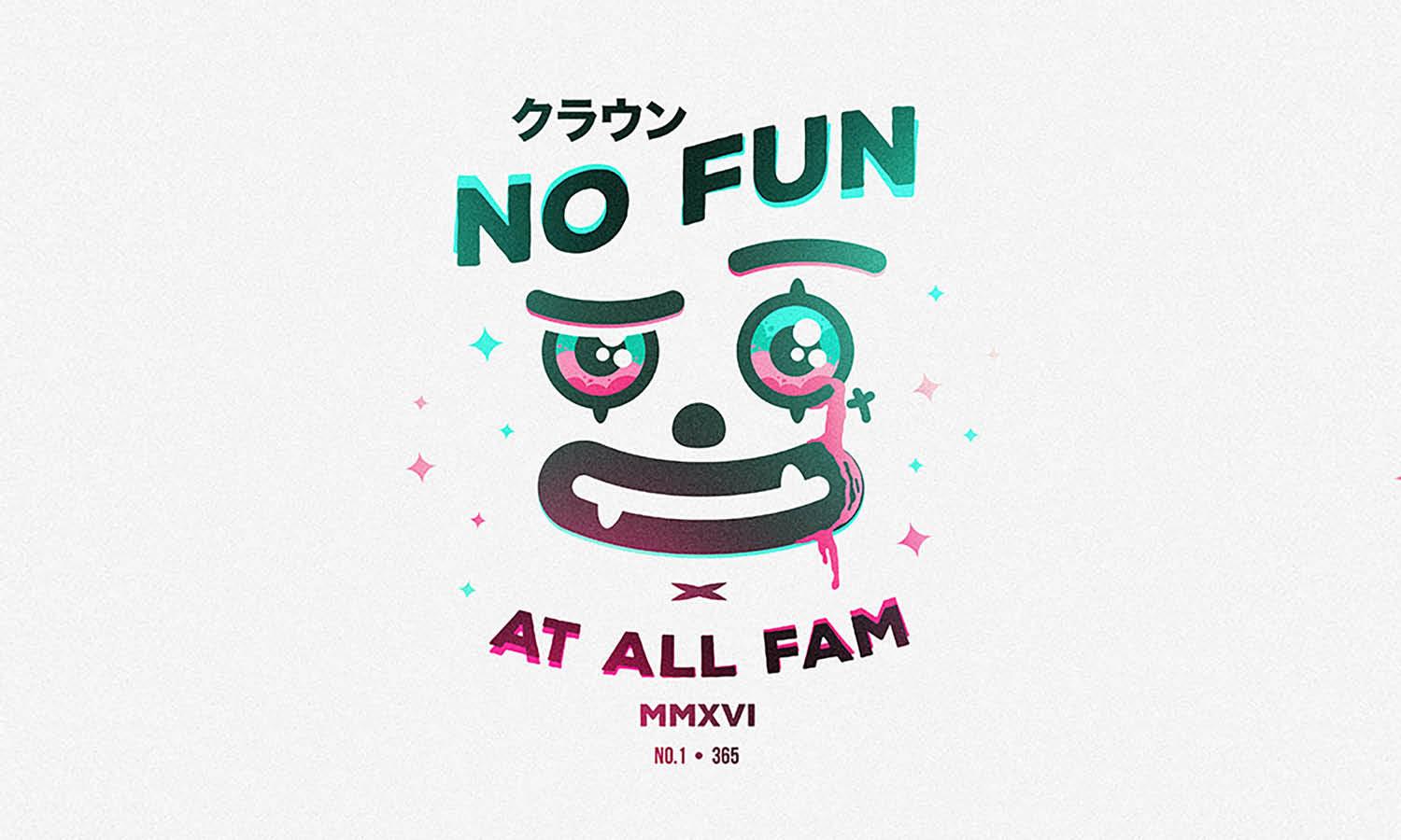
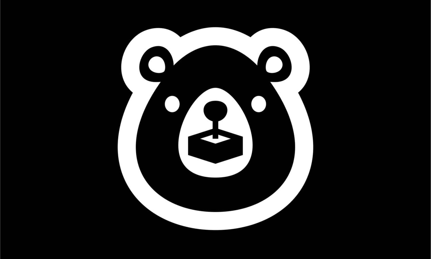
Mascot logos work well for creators who want an expressive, friendly identity. Illustrated characters can add personality and become memorable symbols for gaming, animation, entertainment, or family-oriented channels.
Wordmarks And Lettermarks
If your channel name is distinctive, a clean wordmark or lettermark may be the strongest option. This style emphasizes typography while keeping the overall design simple and highly recognizable.
Combination Logos
Many creators benefit from combining an icon with text. This flexible approach allows you to use the full logo for banners while using only the symbol as a profile picture or watermark. It also creates greater versatility across different platforms and screen sizes.

Source: Giga Khurtsilava, Dribbble, https://dribbble.com/shots/2364625-PointlessBlog
Tip Three: Pick Colors That Reflect Your Personality
Color influences how people perceive your brand before they consciously evaluate your content. Bright colors often communicate excitement and energy, while darker palettes suggest sophistication or authority. Soft colors may create a calm, welcoming atmosphere. Instead of choosing colors simply because they are popular, consider the emotions you want viewers to experience. A cooking channel may benefit from warm, inviting tones, while a productivity creator might prefer clean blues or neutral colors that emphasize clarity. Limiting your palette to two or three primary colors also improves consistency.
Tip Four: Use Readable Typography At Every Size
Many YouTube logos appear inside small circular profile images, making typography especially important. Decorative fonts that look impressive on a large screen often become difficult to read when reduced to thumbnail size. Choose a typeface that reflects your personality without sacrificing clarity. Bold sans-serif fonts usually provide excellent readability, while custom lettering can work if it remains simple enough to recognize instantly. Pay attention to spacing between letters as well. Crowded typography reduces legibility and weakens your visual identity. Testing your logo at multiple sizes helps ensure viewers can easily recognize your channel name wherever it appears.
Tip Five: Keep The Design Simple And Easy To Recognize
One of the biggest mistakes new creators make is trying to include too many ideas in a single logo. Cameras, microphones, gaming controllers, speech bubbles, stars, gradients, and multiple fonts may all seem meaningful individually, but together they often create visual clutter. A simple design is usually easier to recognize, remember, and reproduce across different platforms. Ask yourself whether every shape, icon, or decorative detail genuinely supports your brand. If it does not add meaning, consider removing it.
An effective Youtuber logo design communicates your identity quickly rather than asking viewers to study every detail. Clean shapes, balanced spacing, and a clear focal point make your logo stronger whether it appears on a phone screen, desktop monitor, or printed merchandise.
Tip Six: Make Your Logo Look Great Across Every Platform
Your logo should perform well wherever your audience encounters it, not just on your YouTube homepage. A flexible design maintains its quality across different layouts and display sizes without losing clarity.
Profile Pictures
Profile pictures are often displayed inside small circles. Make sure the most important part of your logo stays centered and remains recognizable even when cropped tightly.
Banners And Video Watermarks
A banner gives you more space, while a watermark is much smaller. Creating variations of the same logo allows you to maintain a consistent identity without forcing one layout to fit every situation. Simplified versions often work better for watermarks because unnecessary details disappear at reduced sizes.
Social Media Profiles
Many creators build communities across Instagram, TikTok, X, Facebook, or Discord. Using the same logo, colors, and typography across every platform helps viewers recognize your brand instantly and creates a unified online presence.

Source: Kaye Huett, Dribbble, https://dribbble.com/shots/15030969-Megan
Tip Seven: Add Unique Details Without Overcomplicating The Design
Originality does not require a complicated illustration. Sometimes a distinctive color combination, a custom letterform, or a subtle graphic element is enough to make your logo memorable. Think about features that genuinely connect to your content. An artist might incorporate a brushstroke into a letter, while a science creator could use a clean geometric accent inspired by their subject. These small touches create personality without overwhelming the overall design. The key is balance. Every unique element should strengthen recognition rather than compete for attention.
Tip Eight: Avoid Design Trends That Fade Quickly
Design trends constantly change, especially on digital platforms. Effects that look modern today may feel outdated within a few years, making your branding appear older than your content. Instead of relying on exaggerated shadows, complex gradients, or fashionable visual effects, focus on timeless design principles such as balance, proportion, readability, and consistency. These qualities remain effective regardless of changing trends. Refreshing your branding occasionally is perfectly normal, but your core identity should not depend on temporary styles.
Tip Nine: Test Your Logo Before Making It Permanent
Even a well-designed logo can reveal unexpected problems once it is used in real situations. Before finalizing your design, test it across the places where your audience will actually see it. A few simple checks can help you catch issues that are easy to overlook during the design process.
Gather Feedback From Your Target Audience
Share a few logo concepts with friends, fellow creators, or people who match your intended audience. Instead of asking which one they like best, ask what each logo communicates. Their answers will show whether your design reflects your channel's personality or sends mixed signals. Pay attention to recurring feedback rather than individual opinions. If several people mention that the text is difficult to read or the icon feels unrelated to your content, those patterns are worth addressing before launching your brand.
Check Visibility On Different Devices
View your logo on smartphones, tablets, laptops, and larger monitors. Test both light and dark backgrounds, and reduce the size until it matches a typical YouTube profile picture. You should still be able to recognize the overall shape and read any important text. It is also helpful to print the logo in black and white or remove the colors temporarily. If the design remains clear without relying on color alone, it is more likely to perform well in different situations.
Tip Ten: Create A Flexible Logo System For Future Growth
As your channel expands, your branding will likely appear in more places than you originally expected. You may create merchandise, launch a website, start a podcast, or publish content across multiple social platforms. Planning for that growth early makes future updates much easier. Instead of designing only one version of your logo, build a small logo system. This can include a full horizontal logo, a simplified icon, a monochrome version, and a transparent version for overlays and watermarks. Each variation should share the same colors, typography, and visual identity while adapting to different layouts. A flexible Youtuber logo design saves time because you will not need to redesign your branding every time you expand your content.
Frequently Asked Questions About Youtuber Logo Design
Can I Use A Stock Icon For My YouTube Logo?
You can use a stock icon only when its license permits commercial branding and logo use. However, widely available graphics may make your channel look generic and could also appear in other creators’ designs. Customizing the shape, colors, or lettering can help create a more distinctive identity.
Which File Formats Should A YouTube Logo Include?
Keep an editable vector file, such as SVG, AI, or EPS, for resizing and future updates. You should also export high-resolution PNG files with transparent backgrounds and JPG versions when needed. Preparing full-color, monochrome, and simplified variations makes the logo easier to use across different applications.
When Should A Creator Redesign An Existing Logo?
Consider redesigning when your content direction, audience, or channel name has changed significantly, or when the current logo no longer works at small sizes. Avoid changing it simply because a trend appears popular. Retaining familiar colors or shapes can preserve recognition while giving the identity a cleaner update.
Should A Youtuber Logo Include The Creator’s Face?
Using your face can work well when your personality is central to the channel, especially for vlogs, commentary, coaching, or lifestyle content. A simplified portrait or recognizable illustration often performs better than a detailed photograph. Channels built around broader topics may benefit from a symbol or lettermark instead.
Conclusion
A memorable YouTube brand begins with thoughtful design rather than complicated graphics. By defining your channel identity, choosing the right logo style, using readable typography, selecting purposeful colors, and designing for flexibility, you can create a logo that represents your content with confidence. Every decision should support recognition, consistency, and long-term usability across YouTube and other platforms. As your channel grows, a well-crafted Youtuber logo design becomes more than a graphic—it becomes a familiar symbol that helps viewers recognize, trust, and remember your content wherever they find it.
Let Us Know What You Think!
Every information you read here are written and curated by Kreafolk's team, carefully pieced together with our creative community in mind. Did you enjoy our contents? Leave a comment below and share your thoughts. Cheers to more creative articles and inspirations!
Related Articles









Leave a Comment