10 Tips to Create a Good Chocolate Logo Design

Source: index™ Studio, Behance, https://www.behance.net/gallery/145739645/Hence-Chocolate-Branding
A strong chocolate logo design does more than look tasty—it builds instant recognition, communicates quality, and sets the mood before anyone opens the wrapper. Whether you’re branding a bean-to-bar maker, a cozy café, or a playful confectionery, the right logo helps customers understand what makes your chocolate special. Color, typography, and symbolism all work together to suggest richness, warmth, and indulgence, while still staying clear at small sizes on labels and social icons.
Because chocolate brands often compete on shelves, your logo must be distinctive and flexible. It should print well on foil, kraft paper, boxes, and stamps, and it should also read clearly in one color for embossing or hot-stamp finishes. Most importantly, it needs to match your brand voice—luxury, artisan, nostalgic, fun, or health-focused—so people feel confident choosing your product.
Great logos also leave room for growth. You may later need a secondary badge, a monogram, or a simplified icon for wax seals, website favicons, and social avatars.
In this guide, you’ll learn practical ways to shape a chocolate logo design that feels delicious, professional, and memorable. From choosing the right cocoa-inspired palette to simplifying details for packaging, these tips will help you create a mark that customers crave.
Choose Colors That Reflect Chocolate
Color plays a powerful role in creating an appealing chocolate logo design. The right palette can instantly communicate richness, sweetness, and indulgence. Chocolate brands often rely on warm, deep tones such as cocoa brown, dark chocolate, caramel, and cream because these colors naturally remind people of delicious chocolate treats. When customers see these tones, they immediately associate the brand with flavor, comfort, and quality.
A well-planned chocolate logo design usually starts with a dominant chocolate-inspired color and then adds complementary shades. For example, dark brown paired with gold can give a luxurious and premium feeling, while milk chocolate combined with soft beige or cream can create a warm and friendly look. Some brands also introduce subtle accent colors like red, burgundy, or copper to make the logo stand out without losing its chocolate identity.
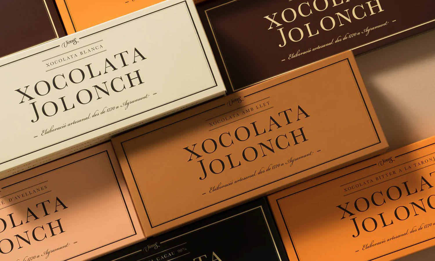
It is also important to consider how the colors will appear on packaging. Chocolate products are often displayed on wrappers, boxes, labels, and gift sets, so the logo must remain clear and attractive on different materials. Rich tones tend to work well on both light and dark backgrounds, making them practical for many packaging styles.
Finally, consistency matters. Once you choose the main colors for your chocolate logo design, they should be used consistently across branding materials such as packaging, websites, and marketing visuals. Consistent color usage helps customers quickly recognize the brand and builds a strong visual identity in a competitive chocolate market.
Use Elegant And Sweet Typography
Typography is another essential element that shapes a memorable chocolate logo design. The typeface you choose influences how customers perceive the brand. Because chocolate is often associated with indulgence and pleasure, many chocolate brands use elegant, flowing, or slightly decorative fonts that evoke a sense of sweetness and craftsmanship.
Script fonts are commonly used in chocolate logo design because they feel smooth and luxurious, similar to melted chocolate. A well-designed script typeface can suggest premium quality and handcrafted products. However, it is important to ensure that the lettering remains readable, especially when the logo appears on small packaging labels or social media icons.
Some chocolate brands prefer serif fonts for a more classic and sophisticated appearance. Serif typefaces can communicate tradition, heritage, and reliability, which works well for long-established chocolate makers or brands that want to highlight artisanal processes. On the other hand, modern sans-serif fonts may suit contemporary chocolate brands that want a clean and minimal identity.
The key is balance. A chocolate logo design should feel elegant without becoming overly complex. Designers often customize typography by adjusting letter spacing, curves, or small decorative elements. These subtle refinements can make the logo feel unique while still keeping it simple enough to remain memorable and versatile across packaging, signage, and digital platforms.
Incorporate Chocolate-Themed Icons
Visual symbols are a powerful way to make a chocolate logo design instantly recognizable. Incorporating chocolate-themed icons helps communicate what the brand offers without requiring too many words. Simple illustrations such as cocoa beans, chocolate bars, dripping chocolate, truffles, or cocoa pods can quickly signal the product category and make the logo feel delicious and inviting.
When selecting an icon for a chocolate logo design, it is important to keep the symbol clear and meaningful. Overly detailed illustrations may look attractive at large sizes but can become difficult to recognize when the logo is used on small packaging or digital platforms. A simplified icon with clean lines often works better because it stays readable and memorable across different applications.
Designers can also stylize chocolate-related imagery to give the logo a unique personality. For example, a cocoa bean can be turned into a geometric shape for a modern brand, while a flowing chocolate swirl can suggest luxury and indulgence. These creative interpretations help the chocolate logo design stand out in a crowded market where many brands compete for attention.
The key is to ensure that the icon complements the typography rather than overpowering it. A balanced combination of symbol and text creates a cohesive logo that feels professional and easy to recognize. When done thoughtfully, chocolate-themed icons can make the logo more engaging while reinforcing the delicious identity of the brand.

Source: Maxim Ali, Behance, https://www.behance.net/gallery/74880817/Wild-and-Tasty
Highlight Texture And Richness
Chocolate is loved not only for its taste but also for its rich texture and smooth appearance. A thoughtful chocolate logo design can capture this sensory experience visually. By suggesting the creamy, glossy, or velvety texture of chocolate, a logo can evoke feelings of indulgence and quality before customers even taste the product.
Designers often use soft curves, flowing shapes, and smooth lines to represent the natural movement of melted chocolate. Rounded forms can create a sense of warmth and comfort, which aligns perfectly with the experience of enjoying chocolate. These design choices help the chocolate logo design feel inviting and luxurious.
Subtle visual effects can also suggest texture without making the logo overly complicated. For example, gentle gradients or layered shapes can hint at depth and richness while still keeping the logo clean and modern. However, it is important to use these techniques carefully so the logo remains versatile across packaging, print materials, and digital media.
Another way to highlight richness in a chocolate logo design is through thoughtful contrast. Pairing dark chocolate tones with lighter cream or caramel colors can create visual depth and make the design feel more appetizing. When texture and richness are expressed through shapes and colors, the logo becomes more emotionally engaging and helps the brand communicate the delicious experience of its chocolate products.
Keep The Chocolate Logo Design Simple
Simplicity is one of the most important principles in creating a successful chocolate logo design. While chocolate itself may feel rich and indulgent, the logo representing the brand should remain clear, balanced, and easy to recognize. A simple design helps customers remember the brand more easily and ensures the logo works across different platforms, from product packaging to websites and social media.
When designing a chocolate logo design, it can be tempting to add many decorative elements such as detailed illustrations, complex patterns, or multiple colors. However, too many elements can make the logo look cluttered and difficult to read. Instead, focusing on a few strong visual components—such as a clear symbol, a distinctive typeface, and a consistent color palette—creates a cleaner and more professional result.
A simple chocolate logo design also improves versatility. Chocolate brands often print their logos on wrappers, boxes, gift packaging, labels, and even embossed seals. A minimal design ensures that the logo remains recognizable even when printed in small sizes or single-color formats. This flexibility is essential for maintaining consistent branding across many products and materials.
Another advantage of simplicity is timelessness. Trends in design change quickly, but a clean and straightforward chocolate logo design can remain effective for many years. By avoiding overly trendy details and focusing on clarity and balance, designers can create a logo that continues to represent the brand well as it grows and evolves.
Create A Warm And Indulgent Feeling
Chocolate is strongly associated with comfort, pleasure, and indulgence. A successful chocolate logo design should capture these emotions and communicate them visually. When customers see the logo, they should immediately feel a sense of warmth and temptation that reflects the delicious experience of enjoying chocolate.
One way to create this feeling is through soft and inviting shapes. Rounded forms, flowing curves, and smooth lines can resemble melted chocolate and help the logo appear friendly and approachable. These shapes naturally suggest sweetness and richness, which are key qualities in a chocolate brand.
Color also plays a major role in building a warm atmosphere. Deep cocoa browns, creamy beige tones, caramel shades, and touches of gold can create a luxurious and comforting look. When used thoughtfully, these colors enhance the overall chocolate logo design and make the brand feel more appealing to customers browsing store shelves.
Typography can further strengthen this emotional connection. Elegant scripts or smooth serif fonts often give a chocolate logo design a sense of craftsmanship and quality. These subtle details can help the brand feel more premium while still remaining inviting.
By combining warm colors, gentle shapes, and refined typography, designers can craft a chocolate logo design that not only looks attractive but also evokes the comforting and indulgent experience that chocolate lovers expect.
Make The Chocolate Logo Design Memorable And Unique
A memorable chocolate logo design helps a brand stand out in a competitive market filled with sweets, desserts, and confectionery products. When customers walk through a store or browse online, they often see many chocolate brands at once. A distinctive logo can capture attention quickly and stay in the customer’s mind long after they leave the shelf.
To create a unique chocolate logo design, it is important to avoid generic symbols or overly common visual styles. While elements like cocoa beans, chocolate bars, and swirls can be effective, they should be presented in a creative way. Designers might experiment with unusual shapes, stylized illustrations, or custom lettering to give the logo a signature look that feels different from competitors.
Another way to build memorability is through strong visual balance. A clear combination of symbol, typography, and color helps the chocolate logo design feel cohesive and easy to recognize. If the logo is too complicated or crowded with details, people may struggle to remember it.
Consistency also strengthens recognition. When the same chocolate logo design appears on packaging, advertisements, websites, and social media, customers begin to associate that visual mark with the brand’s taste and quality. Over time, this recognition builds trust and familiarity.
Ultimately, a memorable chocolate logo design becomes a visual signature for the brand. When customers can recognize the logo instantly, it increases the chances that they will reach for that product again and again.

Source: Paul Lee, Behance, https://www.behance.net/gallery/130323705/HOMER
Balance Vintage And Modern Elements
Chocolate has a long and rich history, and many chocolate brands like to highlight tradition in their visual identity. At the same time, modern design trends help brands feel fresh and relevant. A successful chocolate logo design often finds the right balance between vintage charm and contemporary style.
Vintage design elements can add a sense of heritage and craftsmanship to the logo. Decorative frames, classic serif typography, and traditional color palettes can suggest that the chocolate brand values quality and time-tested techniques. These details are especially effective for artisanal or handcrafted chocolate companies that want to emphasize authenticity.
However, relying too heavily on vintage details may make a chocolate logo design feel outdated. To keep the logo visually appealing to modern audiences, designers can combine traditional elements with clean lines, simplified icons, and balanced layouts. This blend creates a logo that respects the past while still feeling current.
For example, a chocolate logo design might use a classic serif typeface but pair it with a minimal cocoa bean icon or a streamlined badge shape. Subtle adjustments like these help maintain elegance without overwhelming the design.
By thoughtfully combining vintage inspiration with modern simplicity, designers can create a chocolate logo design that feels timeless, stylish, and suitable for both traditional packaging and contemporary digital platforms.
Ensure The Logo Works On Packaging
A practical chocolate logo design must work beautifully on product packaging. Chocolate brands rely heavily on packaging to attract customers, whether the product appears on store shelves, gift boxes, or online marketplaces. Because of this, the logo should be clear, flexible, and visually appealing when printed on wrappers, boxes, labels, and promotional materials.
When creating a chocolate logo design, designers should consider how the logo will appear at different sizes. A logo that looks great on a large sign may lose clarity when printed on a small chocolate bar wrapper. Keeping shapes simple and typography readable helps maintain visual impact across many packaging formats.
Color usage also plays an important role in packaging design. Chocolate products often use materials such as foil, paper, cardboard, or embossed textures. The chocolate logo design should maintain its identity whether printed in full color, stamped in gold, or displayed in a single color. Testing the logo on multiple background colors and packaging styles helps ensure it remains recognizable.
Another important factor is placement. The logo should integrate naturally with other packaging elements such as product names, flavor descriptions, and illustrations. A well-balanced layout ensures the chocolate logo design remains the main visual anchor without overwhelming the overall packaging design.
By designing with packaging in mind from the beginning, brands can create a chocolate logo design that not only looks attractive but also performs effectively across real-world applications.
Design A Chocolate Logo That Tells A Story
A great chocolate logo design often communicates more than just the brand name—it tells a story. Many successful chocolate brands connect their identity to themes such as craftsmanship, origin, tradition, or indulgence. When the logo reflects this narrative, it becomes more meaningful and memorable to customers.
Storytelling in a chocolate logo design can be expressed through symbols, typography, and overall visual style. For example, a brand that focuses on organic or bean-to-bar chocolate might incorporate cocoa pods or natural elements into the logo. Meanwhile, a luxury chocolate brand may use elegant typography and refined shapes to suggest sophistication and high-quality ingredients.
Typography can also help communicate the brand’s story. Handcrafted lettering can suggest artisanal production, while classic serif fonts can evoke heritage and tradition. When these visual elements work together, the chocolate logo design becomes a visual introduction to the brand’s values and personality.
Consistency is key when telling a story through design. The same visual language used in the logo should extend to packaging, advertising, and digital platforms. This creates a cohesive brand identity that customers can easily recognize.
Ultimately, a thoughtful chocolate logo design gives customers a glimpse into the brand’s character. When people connect emotionally with that story, the logo becomes more than a symbol—it becomes part of the brand experience.
Conclusion
A thoughtful chocolate logo design can make a powerful first impression and help a brand stand out in a competitive market. By combining rich colors, inviting typography, meaningful symbols, and a simple yet memorable layout, designers can create a logo that reflects the indulgent experience of chocolate. It is also important to ensure the logo works well across packaging, digital platforms, and marketing materials. When all these elements come together, a chocolate logo design becomes more than just a visual mark—it becomes a recognizable symbol that communicates quality, warmth, and the delicious personality of the brand.
Let Us Know What You Think!
Every information you read here are written and curated by Kreafolk's team, carefully pieced together with our creative community in mind. Did you enjoy our contents? Leave a comment below and share your thoughts. Cheers to more creative articles and inspirations!




Leave a Comment