
10 Tips To Create A Good Construction Logo Design

Source: Rahul Bhogal, Behance, https://www.behance.net/gallery/115192241/Spline-Group-branding
A construction company earns trust by delivering quality work, meeting deadlines, and maintaining high safety standards. Long before clients see completed projects, however, they often encounter the company's logo. A well-planned construction logo design helps create a positive first impression by communicating professionalism, reliability, and confidence. It appears on everything from trucks and safety equipment to websites, business cards, and project signs, making it an essential part of a company's identity. Creating an effective logo is about more than combining construction-related graphics with bold text. Every design choice should support the image your business wants to project while remaining practical across different applications. The following tips explain how to build a construction logo design that reflects your expertise, distinguishes your business from competitors, and continues representing your company effectively as it grows.
Tip One: Understand Your Construction Brand
Before sketching ideas or choosing colors, define what your company represents. Construction businesses often specialize in different markets, and your logo should immediately support that positioning rather than trying to appeal to everyone.
Define Your Services
Think about the work your business performs most often. Residential builders, commercial contractors, renovation specialists, roofing companies, and infrastructure firms all benefit from different visual approaches. A logo designed for luxury home construction may emphasize refinement, while an industrial contractor may require a stronger, more technical appearance.
Know Your Ideal Clients
Your audience influences many design decisions. Homeowners often respond to logos that feel approachable and dependable, while developers and commercial clients may expect a cleaner, more corporate style. Understanding who hires your company helps create a construction logo design that speaks directly to those customers.
Tip Two: Choose Symbols That Represent Construction
Visual symbols help people recognize your industry quickly, but they should also communicate your company's unique identity rather than looking identical to every competitor.
Use Meaningful Industry Elements
Construction logos commonly feature buildings, rooftops, cranes, steel beams, blueprints, or geometric architectural shapes. These elements work best when simplified into clean graphics that reinforce your brand rather than dominating the entire design. A subtle reference often feels more professional than an overly detailed illustration.
Avoid Generic Icons
Many construction companies rely on identical hard hats or crossed hammers downloaded from stock graphics. While these instantly suggest construction, they rarely make a business memorable. Consider creating a custom icon inspired by your company's initials, building style, or architectural forms. Distinctive imagery helps customers remember your brand after seeing it only once.
Tip Three: Select Colors That Inspire Trust
Color strongly influences how people perceive your business. The right palette reinforces your company's personality while maintaining a professional appearance across printed and digital materials.
Build A Professional Color Palette
Blue communicates dependability and professionalism, making it one of the most popular choices for construction logo design. Gray suggests stability and structural strength, while black creates authority and confidence. Orange and yellow introduce visibility and energy, making them useful accent colors because they also connect with construction safety equipment. Green may suit businesses that focus on sustainable building practices.
Keep Color Choices Consistent
Using too many colors can make a logo feel disorganized. Limiting the palette to two or three coordinated colors improves recognition and makes branding easier across uniforms, vehicles, signage, and marketing materials. Consistency also reduces printing costs and helps maintain a polished appearance.

Source: La Libertat (TNC), Behance, https://www.behance.net/gallery/104628959/PEITA-PAINTING-CONSTRUCTION-Branding
Tip Four: Use Strong And Readable Typography
Typography carries as much weight as the graphic symbol. Even an excellent icon cannot compensate for lettering that is difficult to read or poorly matched to the business.
Prioritize Legibility
Construction companies display logos in many environments, including moving trucks, roadside signs, helmets, equipment, and embroidered uniforms. Bold sans-serif and slab serif typefaces usually perform well because they remain clear from both short and long viewing distances. Avoid decorative fonts that lose clarity when reduced.
Match The Brand Personality
Different typefaces create different impressions. A modern contractor may benefit from clean geometric lettering, while a company with decades of family history may prefer typography that communicates tradition and craftsmanship. The font should complement your overall brand image instead of competing with the symbol.
Tip Five: Keep The Layout Clean And Balanced
An organized layout makes your logo easier to understand and more versatile across different branding materials.
Organize Elements Clearly
Most successful construction logos include three main components: the symbol, the company name, and sometimes a short tagline. Arrange these elements so viewers naturally notice the company name while the symbol reinforces the brand. Avoid making every component compete equally for attention.
Leave Adequate White Space
White space allows individual elements to breathe and improves readability. Crowding text against graphics creates visual tension and makes reproduction more difficult, especially on smaller items. A balanced composition helps the construction logo design remain professional across business cards, websites, equipment decals, and large outdoor signs.
Tip Six: Design For Every Branding Application
A logo that looks impressive on a computer screen may not perform equally well on construction equipment or large job-site signage. Designing with practical applications in mind helps your branding remain consistent wherever people encounter it.
Think Beyond Digital Use
Construction companies place their logos on vehicles, hard hats, reflective safety vests, machinery, fences, invoices, proposals, and promotional materials. Each application has different size and printing requirements. During the design process, imagine how the logo will appear in these real-world situations rather than judging it only on a digital mockup.
Test Multiple Sizes
Reduce the logo to a small size for business cards or social media profile images, then enlarge it for truck graphics and building signage. If important details disappear or the text becomes difficult to read, simplify the design. A successful construction logo design should remain recognizable and professional regardless of where it appears.
Tip Seven: Make Your Logo Different From Competitors
The construction industry is highly competitive, and many companies use similar colors, icons, and layouts. Standing apart helps your business become easier to recognize and remember.
Highlight What Makes Your Company Unique
Think about what separates your business from others. You may specialize in luxury custom homes, environmentally responsible construction, commercial projects, rapid project completion, or historic building restoration. Allow those strengths to influence the logo instead of relying solely on standard construction imagery. Your identity should reflect the value your company delivers.
Build A Timeless Identity
Design trends change regularly, but construction companies often keep the same logo for many years. Avoid effects that may quickly become outdated, such as excessive gradients, complex shadows, or fashionable design styles that sacrifice longevity. A timeless logo reduces the need for frequent redesigns while maintaining a consistent brand image.

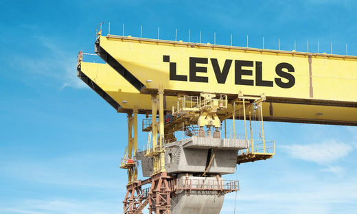
Source: Milk Network, Behance, https://www.behance.net/gallery/31421643/Levels-Contracting-est
Tip Eight: Simplify Every Design Element
Simple logos are generally easier to recognize, reproduce, and remember. Removing unnecessary complexity allows the most important visual elements to stand out.
Remove Visual Distractions
Evaluate every shape, line, and decorative effect in the design. If an element does not strengthen the logo's message or improve recognition, consider removing it. Clean, intentional designs usually appear more confident than logos overloaded with decorative details.
Focus On Memorability
An effective construction logo design should leave a lasting impression after only a brief glance. Strong silhouettes, balanced proportions, and uncomplicated compositions help customers remember your business long after they have seen your trucks, advertisements, or project signs.
Tip Nine: Ensure The Logo Works In Black And White
Although full-color logos are common, many construction applications still require single-color reproduction. Testing the design without color helps ensure it remains functional in every situation.
Test Without Color
Convert the logo to black and white during the design process. The symbol, typography, and overall composition should still communicate clearly without relying on color contrast. If important details disappear, simplify the artwork until it remains recognizable in monochrome.
Improve Versatility
Construction companies frequently use logos on engraved equipment, embroidered uniforms, rubber stamps, blueprints, and technical documents where full color may not be available. A logo that performs equally well in black and white provides greater flexibility while maintaining a consistent brand identity.
Tip Ten: Review And Refine Before Finalizing
The final stage of logo development is careful evaluation. Small improvements can significantly increase readability, balance, and long-term usability.
Gather Real Feedback
Share the logo with employees, trusted clients, suppliers, or industry colleagues. Ask specific questions about readability, professionalism, and first impressions instead of simply asking if they like it. Practical feedback often reveals issues that are easy to overlook during the design process.
Make Final Adjustments
Use the feedback to refine spacing, alignment, proportions, typography, or color balance where necessary. Review the logo across digital and printed applications one final time before adopting it as your official brand identity. Taking extra time during this stage helps ensure the construction logo design continues representing your business effectively for years.
Conclusion
Every completed building leaves a lasting impression, and your logo should do the same for your brand. It often appears before a client reads a proposal or visits a job site, making it one of the hardest-working assets your business owns. A construction logo design that reflects your company's character can strengthen recognition across years of projects without constant redesign. Instead of following short-lived design trends, invest in an identity that supports your reputation as your portfolio grows. When your logo consistently communicates confidence and professionalism, it becomes a valuable business asset that helps your company stay recognizable in a competitive industry.
Let Us Know What You Think!
Every information you read here are written and curated by Kreafolk's team, carefully pieced together with our creative community in mind. Did you enjoy our contents? Leave a comment below and share your thoughts. Cheers to more creative articles and inspirations!
Related Articles








Leave a Comment