30 Best Tailor Logo Design Ideas You Should Check

Source: Mike Knapek, Timothy & Co, Dribbble, https://dribbble.com/shots/6364615-Timothy-Co-Branding
In the world of bespoke fashion, a sharp, stylish tailor logo design isn’t just an accessory—it’s a statement. Whether you’re launching a new tailoring business or revamping your branding, a logo is the thread that ties your identity together. A perfect logo captures the artistry of your craft and the sophistication of your brand, giving customers a glimpse of the quality they can expect. From timeless needle-and-thread motifs to sleek modern designs, the possibilities are as endless as fabric swatches in a tailor's shop.
This article showcases some of the best tailor logo design ideas to spark your imagination and inspire your brand. Whether you're a fan of classic monograms, vintage sewing icons, custom embroidery patches, or minimalist typography, there’s something here for everyone. Not only do these ideas look fantastic, but they also embody the values and attention to detail that tailoring represents.
So, get ready to pin down the perfect logo that will make your brand unforgettable. With the right design, your logo can become the signature of your business—just like the hem on a perfectly tailored suit. Dive in and find your design inspiration to create a logo that fits like a glove!
Tailor Logo Design Ideas

Source: Liam Foster, Harrow, Behance, https://www.behance.net/gallery/87610825/Harrow-Menswear-Brand-IdentityDesign

Source: Mike Knapek, Timothy & Co, Dribbble, https://dribbble.com/shots/6364626-Timothy-Co-Monogram-Design

Source: SB Brands, Malik Bros, Behance, https://www.behance.net/gallery/41520591/Malik-Bros-Tailor-Goods

Source: Mathilde Peyrigué, Ferguson, Behance, https://www.behance.net/gallery/19320695/Ferguson

Source: Cameron Maher, Made in London, Dribbble, https://dribbble.com/shots/15282584-Made-in-London-Custom-Tailor-30-Days-of-Logos

Source: Reshma Mallecha, James Barry, Dribbble, https://dribbble.com/shots/9919044-James-Barry-Identity

Source: Albert Klimovych, Herringbone, Dribbble, https://dribbble.com/shots/9518629-Herringbone

Source: Carolyn Honsvick, Cat + Tailor., Behance, https://www.behance.net/gallery/44257711/Logo-C-Cat-Tailor

Source: Gj Graphix, Tailor Ike, Behance, https://www.behance.net/gallery/201777015/Tailor-Ike-Logo-Branding-(Fashion-Logo)

Source: Sofiia Korniiets, Behance, https://www.behance.net/gallery/216055341/A-logo-for-a-tailor-studio

Source: Nirmal Bhoi, Behance, https://www.behance.net/gallery/204392563/Tailor-Logo-Design

Source: Blake Cale, Mamba Tailoring Co., Dribbble, https://dribbble.com/shots/3486754-Mamba-Tailoring-Co

Source: Deep Bear, Tailor Enrico Abate, Dribbble, https://dribbble.com/shots/5916925-Logo-Tailor-Enrico-Abate

Source: Graham Ebetsch, Boulevardier, Dribbble, https://dribbble.com/shots/10764173-Boulevardier-Badge-Update

Source: Geoffrey Dorne, Story Tailor, Dribbble, https://dribbble.com/shots/2991681-Story-Tailor-logo

Source: Mirismoil Usmonov, Sarto Bespoke, Dribbble, https://dribbble.com/shots/2209915-Sarto-Bespoke

Source: Christopher Dirdjohadi, Ramayana, Behance, https://www.behance.net/gallery/59727969/Ramayana-Bespoke-Tailor

Source: Nour Zaffer, Mr. Tailor, Behance, https://www.behance.net/gallery/105420227/Mr-Tailor-Rebranding-Trial

Source: Babo Design, Cò Lả Tailor, Behance, https://www.behance.net/gallery/214412505/CO-L-TAILOR-Logo-Branding-Babo-Design

Source: Omar Hamo, Tailor Elegance, Behance, https://www.behance.net/gallery/97987561/TAILOR-ELEGANCE-BRAND

Source: Saif Ur Rehman, Tailor Tag, Behance, https://www.behance.net/gallery/89441665/Tailor-Tag-Brand-Identity-Design

Source: Ferdyzal Oktama, Prime Tailor, Behance, https://www.behance.net/gallery/86042047/PRIME-TAILOR-Brand-Identity

Source: MƏN Corporate Branding, Sock Tailor, Behance, https://www.behance.net/gallery/103255375/Sock-Tailor

Source: Graphlings Studio, Mind Tailor, Behance, https://www.behance.net/gallery/81734467/Mind-Tailor

Source: Phumelele Success Chonco, Westmeed, Behance, https://www.behance.net/gallery/71586477/Westmeed-Tailors-Logo-Design

Source: Aykhan Safarli, Sartoria Enzo, Behance, https://www.behance.net/gallery/68354217/Sartoria-Enzo-Logo

Source: Roberto De Simone, Giovanni De Simone, Behance, https://www.behance.net/gallery/68830181/Logo-Design-for-a-Personal-Tailor

Source: Mark Bax, Mio Lusso, Behance, https://www.behance.net/gallery/60595419/Mio-lusso

Source: Laura Sauchelli, Musella Dembech, Behance, https://www.behance.net/gallery/47497063/Musella-Dembech

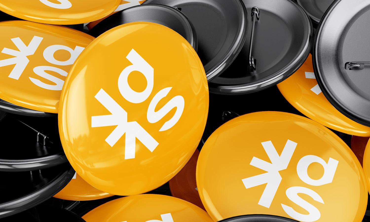
Source: Mike Knapek, Timothy & Co, Dribbble, https://dribbble.com/shots/6364615-Timothy-Co-Branding
What Elements Should Be Included in a Tailor Logo Design?
Creating a tailor logo design that captures the heart and soul of your business is no small feat. A great logo not only looks good but also speaks volumes about your craftsmanship and attention to detail. To make your tailor logo design truly exceptional, it’s essential to include elements that resonate with your brand and appeal to your target audience. Here are five key elements to consider:
Sewing Tools and Icons
Nothing says “tailor” like classic sewing tools. Think of timeless icons like needles, spools of thread, scissors, thimbles, or measuring tapes. These elements immediately communicate the essence of your craft and help potential customers recognize your expertise. Whether you choose to go vintage or modern, sewing-related imagery adds a touch of authenticity to your logo design.
Elegant Typography
Typography is the backbone of any logo design, and for a tailor logo, the font choice can make or break the look. Script fonts or serif fonts exude sophistication, giving your logo a bespoke feel. For a more contemporary approach, clean sans-serif fonts work wonders. Be sure to choose typography that aligns with your brand's personality—whether it’s elegant, edgy, or timelessly classic.
Color Palette That Speaks Elegance
Your color palette should evoke the feelings you want associated with your brand. Tailor logos often lean on colors like black, gold, navy, or burgundy to convey luxury and professionalism. Softer hues like beige or pastels can add a more approachable, artisan vibe. Keep your colors simple and cohesive to ensure the design looks polished across all mediums.
Monograms and Initials
Monograms are a popular choice for tailor logo designs, especially for high-end or boutique businesses. Using initials or a creative arrangement of your brand’s name adds a personal and sophisticated touch. A well-designed monogram can stand alone as a powerful representation of your brand while giving your logo an elegant, timeless aesthetic.
Tailored Visual Balance
Your logo should reflect the precision and balance that tailoring represents. A well-crafted design is like a perfectly stitched seam—it’s symmetrical, clean, and aligned. Incorporate shapes or lines that evoke this sense of order. For instance, geometric frames or straight-line patterns can give your logo a polished, professional appearance that mirrors the meticulous nature of tailoring.
A tailor logo design isn’t just a symbol—it’s the visual embodiment of your craftsmanship and style. By including elements like sewing tools, elegant typography, a sophisticated color palette, monograms, and balanced visuals, you’ll create a logo that fits your brand perfectly. Just like a well-tailored suit, a great logo should feel effortless, unique, and timeless.
What Shapes Work Best in Tailor Logo Design?
When it comes to crafting the perfect tailor logo design, selecting the right shapes can be as crucial as choosing the finest fabric for a bespoke suit. Shapes aren't just geometric; they're symbolic, carrying weight and meaning that can define your brand's identity. Let's stitch together a pattern that not only fits your brand perfectly but also appeals to your clientele with these five shape tips:
Circles for Continuity and Connection
Circles are a fantastic choice for tailor logos due to their association with continuity, wholeness, and perfection. They suggest a seamless customer service experience and the endless possibilities in custom tailoring. Using a circle in your logo can imply that every client will receive the personal touch and attention to detail that only a skilled tailor can provide. It’s like ensuring every hem is perfectly rounded and every button neatly sewn.
Squares and Rectangles for Stability and Trust
Squares and rectangles convey stability, reliability, and trustworthiness—qualities every tailor wants their brand to embody. These shapes are associated with strength and professionalism and are often used to instill confidence in potential customers. In tailor logo design, incorporating square or rectangular elements can give the impression of a business that prides itself on precision and tradition.
Triangles for Dynamism and Growth
Triangles are energetic and dynamic shapes that can bring a sense of movement and excitement to your tailor logo design. Pointing upwards, they symbolize growth and aspiration, which can be particularly appealing if your tailor shop prides itself on innovative designs or progressive fashion trends. This shape can make your logo stand out as cutting-edge, just like the latest fashion-forward cuts and styles you offer.
Needle and Thread Motifs
Incorporating the shapes of needles and threads can add a direct nod to your craft. This imagery is not only instantly recognizable but also highly relevant to your profession. A stylized needle threading through fabric, or a thread looping to form letters or frames, can create a unique visual that tells a story of craftsmanship and detail—ensuring that the logo is not just seen but felt.
Tailored Custom Shapes
Custom shapes that mimic actual aspects of tailoring, such as a silhouette of a suit or the outline of a dress, can be very effective. These tailored shapes help potential clients instantly recognize your specialty, whether it’s men’s suits, women’s couture, or general alterations. Like a perfectly fitted garment, a custom-shaped logo tailored to your specific audience can enhance your brand’s visibility and appeal.
Whether you opt for circles that emphasize customer care, squares that denote reliability, dynamic triangles, specific needle and thread motifs, or custom tailored shapes, your logo should reflect the precision and elegance of your tailoring. Just as you would select a fabric with the right texture and pattern, select shapes that complement and enhance your brand's story.
What Is the Best Way to Incorporate Initials in Tailor Logo Designs?
In the finely stitched world of tailor logo design, incorporating initials is like personalizing a bespoke suit—it adds a unique signature that's distinctly yours. Initials in a logo not only carve out a memorable identity but also lend an air of sophistication and exclusivity. Here are five snazzy tips to ensure your initials not only fit perfectly into your tailor logo design but also elevate your brand's style:
Monogram Magic
The art of monogramming is a classic technique where two or more letters are intertwined to create a single symbol. This method works wonderfully for tailor logos, offering a blend of tradition and personalization. Opt for elegant, flowing scripts or bold, modern typefaces to bring your initials to life. Think of it as crafting a monogram that’s as tailored as the suits you make—classic, crisp, and utterly chic.
Creative Letter Manipulation
Take the letters of your initials and twist them into shapes that reflect your tailoring business. Perhaps the curves of a "S" can mimic the silhouette of a needle, or the crossbar of a "T" could double as a measuring tape. This approach is not just creative but also gives a visual clue about what you do, making your logo instantly recognizable and highly memorable.
Incorporate Tailoring Icons
Integrating tailoring elements like scissors, threads, or buttons with your initials can set your logo apart. These icons can be subtly worked into the design of the initials themselves. For example, the loop of a “P” could end in a scissor handle, or a “B” could be stitched with a thread. This method helps to convey your craft through design, showcasing both your industry and your creativity.
Geometry and Symmetry
Using geometric shapes to frame or form your initials can add a modern touch to your logo. Squares, circles, or triangles can provide a clean, symmetrical background that makes the initials stand out. This structured approach can imply precision and balance, qualities esteemed in both good design and fine tailoring.
Color and Contrast
Choose colors that enhance the visibility and impact of your initials. A monochromatic scheme with shades of the same color can lend elegance and subtlety, while contrasting colors can make the initials pop and draw attention. Additionally, consider using textures or patterns, like pinstripes or a chevron, within the initials to add depth and a hint of fashion flair.
Incorporating initials into your tailor logo design isn't just about branding; it’s about embedding a part of your identity into every piece of communication. By using monograms, creatively manipulating letters, integrating industry icons, applying geometric shapes, and playing with color and contrast, you create a logo that’s as bespoke as the garments you tailor.
How Do I Combine Vintage and Modern Styles in Tailor Logo Design?
Mixing vintage and modern styles in a tailor logo design can feel like threading a needle with silk and steel—challenging but incredibly rewarding. This blend of old and new creates a timeless yet contemporary brand identity that can appeal to a broad audience. If you're ready to stitch together the past and the present into one stunning logo, here are five points to guide your design needle:
Choose a Timeless Typography
The right font can bridge decades. Start with a classic serif font that screams vintage charm, known for its elegance and readability. Then, twist it with a modern sans-serif for your tagline or vice versa. This juxtaposition of old and new in your typography can create a striking balance, giving your tailor logo design a foot in both worlds. Imagine a logo where the brand name is in a stately, old-world serif, and the slogan in a clean, minimalist sans-serif—classic yet crisp!
Incorporate Retro Colors with a Modern Twist
Color palettes can be a canvas for your creativity. Vintage colors tend to be muted and earthy, like olive greens, mustard yellows, or brick reds. Modern palettes often lean towards bold and bright or stark monochromes. For your tailor logo, choose a primary vintage color and accent it with a modern hue. For instance, a deep vintage burgundy accented with a vibrant modern teal can make your logo pop while maintaining a sophisticated look.
Utilize Symbols that Span Generations
Some images are timeless—like scissors, needles, or a classic mannequin. Start with these vintage symbols but render them with a sleek, modern design technique such as minimalist lines or geometric shapes. This approach not only honors the craftsmanship of tailoring but also packages it in a fresh and contemporary way. It’s like wearing a tailor-made suit with a trendy pair of sneakers—unexpected yet undeniably stylish.
Blend Geometric and Organic Shapes
Incorporating both geometric and organic shapes can add depth and interest to your logo design. Geometric shapes often convey a sense of modernity and precision, while organic shapes can soften the look and give it a more vintage, human touch. For instance, a geometric square or circle containing an organic, flowing thread or fabric pattern can symbolize the merging of precise cutting and natural fabric flow.
Create a Story with Layered Design Elements
Layering different elements can reflect the depth and history of tailoring while keeping the look modern and clean. For example, a textured background reminiscent of old paper or fabric can serve as a canvas for a sleek, modern font or icon. This layering not only adds visual interest but also tells a story of tradition and innovation coming together. It’s like patchworking different eras into a single piece of art.
Combining vintage and modern elements in your tailor logo design requires a careful balance—much like tailoring itself. This approach can make your brand appealing to those who appreciate the heritage of tailoring and those attracted to modern aesthetics.
What Are Some Innovative Tailor Logo Designs?
Embarking on the quest for an innovative tailor logo design is much like tailoring a fine suit—it requires creativity, precision, and a splash of daring! In a market where standing out is as vital as the cut of a bespoke garment, your logo must not only reflect your craftsmanship but also capture the imagination. Here are five innovative tailor logo design ideas that stitch together uniqueness and style, ensuring your brand not only fits perfectly but also turns heads:
Interactive Elements
Imagine a logo that changes subtly with its context or platform. Interactive logos are not just memorable; they engage potential clients in a way static logos cannot. For a tailor, this could mean a logo where the scissors close, a needle threads, or fabric folds differently depending on where and how the logo is viewed. This dynamic element could be particularly effective on digital platforms where motion can be integrated seamlessly.
Hidden Symbols
In the world of tailor logo design, the clever use of negative space to hide symbols can be particularly striking. A needle that doubles as a sleek line within a letter, or a spool of thread that forms the 'O' in your brand name, can create a visual double-take that makes your logo unforgettable. Hidden symbols not only intrigue but also embed a sense of clever craftsmanship and attention to detail—qualities highly valued in tailoring.
Fabric Texture Prints
Utilizing textures in logo design can add depth and authenticity to your brand. For tailors, incorporating fabric textures—such as herringbone, tweed, or silk patterns—into the logo's background or lettering can evoke the tactile quality of textiles. This innovative approach not only visually communicates what you do but also appeals directly to the senses, allowing your logo to feel as good as it looks.
Eco-Friendly Designs
With sustainability being a hot topic, eco-friendly logo designs can resonate well with a contemporary audience. For a tailor, this could mean a logo that incorporates green motifs, earth-toned colors, or symbols representing upcycling, like a thread that turns into a leaf. This approach not only positions your brand as environmentally conscious but also modern and innovative.
Cultural Fusion
Tailoring often involves a deep appreciation for cultural heritage, and a logo that melds different cultural design elements can reflect a globally-minded, inclusive brand. Whether it’s combining Western tailoring scissors with the elegant curves of Eastern calligraphy, or incorporating traditional African fabric patterns into your design, this type of logo celebrates diversity and broadens your brand’s appeal across different demographics.
Whether through interactivity, hidden meanings, tactile textures, eco-conscious elements, or cultural fusion, your logo can go beyond traditional boundaries and reflect the modern, dynamic nature of your tailoring business. Just like a perfectly tailored suit, the right logo should be a perfect fit for your brand, crafted with care, and designed to make an impression that lasts.
Conclusion
An effective tailor logo design serves as the cornerstone of your brand identity, encapsulating the essence of craftsmanship and elegance inherent to your business. Whether through the clever integration of initials, the use of timeless monograms, or the strategic application of color and shapes, each element should be thoughtfully chosen to reflect both tradition and innovation. Remember, a well-designed tailor logo not only attracts attention but also builds lasting impressions, fostering a sense of trust and quality in your clients' minds. Elevate your branding with a logo that is as meticulously crafted as the garments you tailor.
Let Us Know What You Think!
Every information you read here are written and curated by Kreafolk's team, carefully pieced together with our creative community in mind. Did you enjoy our contents? Leave a comment below and share your thoughts. Cheers to more creative articles and inspirations!





Leave a Comment