30 Best Piano Logo Design Ideas You Should Check

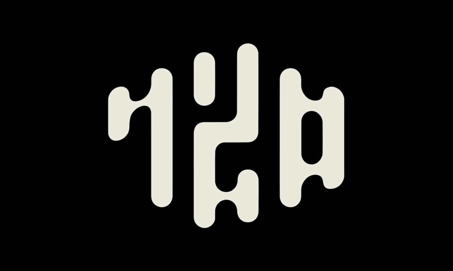
Source: Smalr.Design, Piano Hand, Dribbble, https://dribbble.com/shots/15330108-piano-hand
When it comes to creating a Piano inspired brand identity, a well-crafted logo can strike the perfect chord between elegance and creativity. A Piano logo design doesn’t just symbolize music—it evokes sophistication, rhythm, and timeless artistry. Whether you’re designing for a music school, a piano bar, a recording studio, or even a lifestyle brand with a musical edge, the right logo can make your audience stop and listen.
What makes Piano logo design so exciting is the versatility of its visual elements. From sleek black-and-white keys arranged into abstract shapes, to grand piano silhouettes reimagined in modern minimalism, the possibilities are endless. Designers often play with curves of the instrument, integrate notes or treble clefs, or experiment with typefaces that mirror the harmony of piano strings. The result? A logo that feels both iconic and unforgettable.
This article will showcase some of the best Piano logo design ideas worth checking out. You’ll see how designers transform a familiar instrument into clever marks that capture personality, professionalism, and passion. Whether you’re aiming for a bold concert hall statement or a subtle boutique feel, these ideas will inspire you to compose a logo that truly sings.
Piano Logo Design Ideas

Source: MyGraphicLab, Musical Book, Dribbble, https://dribbble.com/shots/19937233-Musical-Book-logo

Source: Second Eight, Play Piano, Dribbble, https://dribbble.com/shots/5911764-Play-Piano

Source: Nokta Graphics, Crown Piano Service, Dribbble, https://dribbble.com/shots/19318985-Crown-Piano-Service

Source: Temis Logo & Stationary, Clicbeat, Dribbble, https://dribbble.com/shots/14796054-Logo-Design-for-Clicbeat

Source: Reynald Espuelas, El Piano, Behance, https://www.behance.net/gallery/235039095/El-Piano-Logo-Brand-Identity

Source: Designollo, Love Piano, Dribbble, https://dribbble.com/shots/6179470-Love-Piano-Logo

Source: Sazeed Ahmed, Musical Piano Cat, Dribbble, https://dribbble.com/shots/11935436-Musical-Piano-Cat

Source: Alex Aperios, Pianoramix, Dribbble, https://dribbble.com/shots/11132402-Pianoramix-Logo-01

Source: Zzoe Iggi, Piano Door Logo, Behance, https://www.behance.net/gallery/80746971/Piano-Door-Logo

Source: Marcus Williamson, Wuot Concerts, Dribbble, https://dribbble.com/shots/6122012-WUOT-Concerts-pt-II

Source: Honarmandst, Hermes Music School, Dribbble, https://dribbble.com/shots/14162656-HERMES-MUSIC-SCHOOL

Source: Sava Stoic, Synth Temple, Dribbble, https://dribbble.com/shots/12299078-Synth-Temple

Source: Voronoi, Piano, Dribbble, https://dribbble.com/shots/3478896-Piano

Source: Singaraja, Music by Nature, Dribbble, https://dribbble.com/shots/8502813-Music-by-nature

Source: B®andits, Piano Map, Dribbble, https://dribbble.com/shots/2718751-Piano-Map

Source: Lipon Rayhan, Melokits, Behance, https://www.behance.net/gallery/186859287/MeloKits-Branding-Visual-Identity

Source: Akdesain, Piano, Dribbble, https://dribbble.com/shots/7671946-Piano

Source: Premium Design, Piano Music, Behance, https://www.behance.net/gallery/187998113/Piano-Music-logo

Source: Designollo, Gorilla Music, Dribbble, https://dribbble.com/shots/6297468-Gorilla-Music

Source: Lydia Taxiarchioti, Organsmic The Band, Behance, https://www.behance.net/gallery/68972011/Organsmic-The-Band

Source: Nagual, Music House, Dribbble, https://dribbble.com/shots/19956310-Music-house-logo

Source: Nadir Balcikli, Mann Music, Dribbble, https://dribbble.com/shots/5019982-Mann-Music

Source: Mads Tang, Piano Forte, Behance, https://www.behance.net/gallery/76141117/Piano-Forte-Logo

Source: Nicu Zaporojan, Musical Note, Dribbble, https://dribbble.com/shots/6083611-Musical-Note-and-Piano-Minimal-Logo

Source: Pino Studio, Music Tower, Dribbble, https://dribbble.com/shots/14897242-MUSIC-TOWER

Source: Sava Stoic, Conservatory, Dribbble, https://dribbble.com/shots/3706776-Conservatory

Source: Edward Stone, Elton John, Dribbble, https://dribbble.com/shots/9757094-Elton-John-Logo

Source: Aal Muksit Ahmed Qurishe, The Pianist, Dribbble, https://dribbble.com/shots/20265326-The-Pianist

Source: Smalr.Design, Piano Hand, Dribbble, https://dribbble.com/shots/15330108-piano-hand

Source: Sava Stoic, Connected Voices, Dribbble, https://dribbble.com/shots/14969243-Connected-Voices
What Symbols Pair Well With Piano Logo Design?
A Piano logo design becomes even more dynamic when paired with the right symbols. Symbols not only add layers of meaning but also help the design tell a fuller story about music, passion, and creativity. Whether you’re designing for a music school, a bar, or a professional pianist, the right symbolic elements can make the logo unforgettable. Here are five symbols that pair beautifully with Piano logo design.
Musical Notes And Clefs
The most natural companion to a piano motif is the musical note. Whether it’s a treble clef, bass clef, or flowing notes, these elements instantly reinforce the idea of sound and melody. In Piano logo design, notes can be integrated into keys, wrapped around circular shapes, or even used as part of the typography. They inject rhythm and emphasize the universal language of music.
Headphones And Microphones
For brands connected with recording studios or modern music production, symbols like headphones and microphones pair well with piano visuals. Adding these to a Piano logo design creates a contemporary edge, suggesting that the brand isn’t just about tradition but also embraces modern soundscapes. It blends the timelessness of the piano with the pulse of technology.
Elegant Crowns And Laurels
Crowns and laurel wreaths give a logo a sense of prestige and achievement. In Piano logo design, these symbols work particularly well for music academies, competitions, or high-end performance venues. A piano paired with a crown suggests mastery, while laurel wreaths symbolize honor and recognition. It’s a way to make the logo feel regal and authoritative.
Stars And Sparkles
Stars have a magical quality that makes them perfect for logos aiming to capture imagination and creativity. They suggest talent, brilliance, and performance. In Piano logo design, stars can be scattered around piano keys, worked into curves of a grand piano silhouette, or placed above lettering. This combination is ideal for live performance spaces or brands with a focus on entertainment and glamour.
Abstract Waves And Sound Lines
Music isn’t just about what you see—it’s about what you feel. That’s why abstract wave lines or soundwave symbols work wonders when paired with piano imagery. These elements symbolize vibration, movement, and emotion. In Piano logo design, waves can flow across piano keys or form a background that suggests the energy of music in motion. This pairing feels modern, expressive, and deeply connected to sound.
In essence, Piano logo design becomes truly expressive when paired with complementary symbols. From timeless notes to modern soundwaves, each symbol adds personality and narrative. The right combination ensures the logo feels alive, full of rhythm, and perfectly in tune with the brand’s identity.
What Elements Combine Well with Pianos in Logos?
When it comes to piano logo design, the melody of creativity doesn't have to end at the keyboard. There’s a whole orchestra of elements that can harmonize beautifully with the grandeur of a piano, making your logo sing to the tune of uniqueness and brand identity. Let’s explore five dynamic components that blend perfectly with pianos in logos, striking the right chord with your audience!
Musical Notes and Staff Lines
The most melodious companion to a piano in your logo design is undoubtedly musical notes. Integrating notes or staff lines can add a touch of rhythm and flow, conveying a clear connection to music. This pairing not only emphasizes the musical aspect but also injects a dynamic movement into the design. Imagine a series of notes cascading from the lid of a grand piano or a treble clef gracefully forming part of the piano's body – these designs can be both enchanting and memorable.
Vintage Microphones
For those looking to evoke a sense of nostalgia or target an audience that appreciates classical music or jazz, incorporating a vintage microphone with a piano can set the stage. This combination suggests live performances and can appeal to audiences who cherish the old-school charm of sitting by the piano in a smoky room, listening to heartfelt tunes. It’s a visual symphony that speaks volumes about the musical heritage your brand could be associated with.
Abstract Art
If you’re aiming for a modern twist, why not play around with abstract art? Abstract elements can transform a conventional piano logo into a piece of modern art. Think geometric shapes, bold splashes of color, or even a minimalist approach with just a few sleek lines to suggest the piano's form. This style can make your logo stand out in a sea of more traditional designs and appeal to a contemporary audience that values creativity and innovation.
Floral and Nature Motifs
Adding floral or natural motifs to a piano logo can soften its appearance and add a layer of visual interest that suggests growth, harmony, and beauty. Flowers winding around the piano legs or a tree silhouette forming the backdrop of an upright piano can symbolize the organic and soothing nature of music. This approach works well for brands that want to highlight ecological values or the therapeutic aspects of music.
Cultural Symbols
To make a piano logo truly resonate with a specific demographic, incorporating cultural symbols can be a game changer. Whether it’s integrating elements from traditional African patterns, Asian calligraphy, or Art Deco influences from the Roaring Twenties, each design choice can tell a deeper story about the brand’s heritage or the cultural richness of its music. This not only personalizes the logo but also connects it meaningfully with its target audience.
By mixing these elements with the central theme of a piano, your logo design doesn’t just represent a brand—it becomes a portrayal of a musical journey. Whether your vibe is retro, modern, naturalistic, or culturally rich, there’s a way to make those piano keys visually sing your brand’s unique tune!
What Shapes Work Best In Piano Logo Design?
When it comes to Piano logo design, shapes are the heartbeat of creativity. They set the tone, carry the rhythm, and give the logo its unique identity. A good designer knows that the right shape can transform a simple logo into a masterpiece that resonates with elegance and musical passion. Let’s break down five shapes that work best when crafting a Piano logo design.
Rectangular Key Patterns
Nothing screams piano louder than the iconic rectangular keys. Designers often use alternating black and white rectangles to instantly signal music and sophistication. Whether lined up in a straight row or cleverly arranged into abstract patterns, these shapes create a strong visual link to the instrument. They also bring structure and balance, making them a timeless choice.
Circular Harmony
Circles symbolize unity, rhythm, and timeless flow—perfect qualities for music brands. In Piano logo design, circular shapes can enclose keys or notes, creating a feeling of completeness. A circular logo feels approachable yet polished, making it a great choice for schools, orchestras, or even luxury piano lounges.
Silhouettes Of Grand Pianos
The curvy, elegant outline of a grand piano is instantly recognizable. This shape communicates sophistication and prestige. It works beautifully for concert halls, professional pianists, or high-end brands aiming to highlight class. The silhouette itself acts as a bold statement, even without extra details.
Geometric Abstractions
Sometimes, less is more. Triangles, diamonds, or hexagons infused with piano elements can create a modern twist. These shapes appeal to brands that want to stand out with fresh energy while still keeping the essence of the piano intact. Geometric abstractions show that a logo can be innovative without losing its roots in tradition.
Wave-Like Curves
Music is all about flow, and wave-like curves capture that motion beautifully. In Piano logo design, curves can represent melodies dancing across the keys. This shape works especially well for brands that want to feel artistic, fluid, and expressive—perfect for creative studios or contemporary pianists.
In the world of Piano logo design, shapes are more than just outlines; they’re the rhythm and soul of the brand. From the structure of keys to the grace of curves, each choice sets a different mood. Whether aiming for classic elegance or bold modernity, the right shape ensures that your logo not only looks good but also feels like music.
What Colors Work Best for Piano Logo Designs?
When you think of piano logo design, you might first picture classic black and white, like the keys themselves. However, the palette of possibilities extends far beyond these basics, offering a range of hues that can convey different emotions and brand values. Let's dive into a colorful exploration of which shades hit the right notes for your piano logo design!
Classic Black and White
Starting with the quintessential duo, black and white represent the piano keys and are synonymous with elegance and simplicity. This color combination is not only iconic but also incredibly versatile, suitable for almost any brand, from upscale concert halls to trendy music schools. Using black and white can give your logo a timeless feel, making it easy to recognize and incredibly powerful in terms of brand recall.
Rich Blues
Blue tones are often associated with trust, dependability, and calmness—qualities that music companies might want to project. From deep navy to soft sky blue, incorporating blue into your piano logo can suggest professionalism and serenity. Imagine a deep blue grand piano logo for a jazz club or a cerulean splash behind a minimalist piano silhouette for a music therapy center; both use blue to communicate their unique brand stories.
Vibrant Reds
If you want your piano logo to pop with passion and energy, red is your go-to color. It’s bold, dynamic, and can inject a logo with a sense of excitement and modernity. Red is particularly effective for brands that want to stand out in a competitive market or convey a strong emotional impact. A red piano might be perfect for a brand that specializes in contemporary music genres or seeks to attract young, energetic musicians.
Elegant Golds
For a touch of luxury and sophistication, gold can elevate a piano logo to new heights. Gold is often associated with high-quality, premium services and can work wonders for a brand that wants to portray itself as the gold standard in music education or performance. A gold-trimmed piano logo against a black background can look extremely chic and appealing, especially for high-end music venues or exclusive piano manufacturers.
Soft Pastels
Pastel colors such as light pink, lavender, mint, and baby blue can lend a gentle, inviting feel to your piano logo design. These colors are great for brands that aim to appear friendly, accessible, and nurturing. Consider using pastels for music schools for children, piano therapy services, or any brand that wants to convey safety and warmth. A pastel piano amidst a soft, dreamy background could make your logo feel like a welcoming first note in a lullaby.
Color is a powerful tool in logo design, capable of transforming a simple icon into a compelling story about your brand. Whether you choose the stark contrasts of black and white, the serene vibes of blues, the fiery passion of reds, the luxurious whispers of gold, or the calming touch of pastels, the right colors can make your piano logo sing with personality and purpose.
What Are Some of the Best Creative Styles for Piano Logo Design?
When it comes to piano logo design, the creative styles you choose can set the tone for your entire brand. From the sleek and modern to the intricate and classic, each style sings its own melody. Let's explore five fabulous creative styles that could make your piano logo design not just seen, but heard!
Minimalist Modern
In the world of piano logo design, sometimes less is more. A minimalist approach can focus on clean lines, simple shapes, and limited colors, highlighting the essence of the piano without any clutter. This style works wonderfully for brands aiming for a contemporary, chic look. Picture a sleek, single-line piano silhouette or a geometric abstraction of piano keys. These designs are not only visually striking but also highly adaptable across various media, from business cards to billboards.
Vintage Art Deco
Step back in time with a vintage Art Deco style that screams luxury and sophistication. This style is perfect for capturing the golden age of piano music, with its rich decorations and bold geometric patterns. An Art Deco piano logo can incorporate elements like ornate lines, symmetrical shapes, and glamorous golds and blacks, ideal for upscale music venues, jazz clubs, or antique piano restoration services. It's a surefire way to add a touch of nostalgia and elegance to your branding.
Hand-drawn Whimsical
If your brand has a playful or approachable side, a hand-drawn, whimsical style might hit the right note. This creative approach often features irregular lines, fun patterns, and a cartoonish feel, perfect for children’s music schools or casual music workshops. Imagine a charming, sketch-style piano surrounded by musical notes floating whimsically around it. This style can make your logo feel personal and friendly, inviting potential customers to engage with your brand on a more intimate level.
Futuristic and Abstract
For the forward-thinking music tech companies or contemporary music producers, a futuristic and abstract style can reflect innovation and modernity. This style can play with abstract forms, merging parts of a piano with digital or cyber elements, using metallic colors, and incorporating sleek, dynamic motion into the design. A logo with abstract piano keys transforming into sound waves or digital pixels could perfectly represent a brand at the cutting edge of music technology.
Classical Ornate
Embracing the rich history of classical music, an ornate style can make your logo appear prestigious and authoritative. This design style works well for classical concert halls, opera houses, and traditional music institutions. It often features intricate details such as filigree, flourishes, and elegant typefaces, creating a sophisticated and timeless look. A logo with a detailed, baroque-inspired piano encased in a lavish decorative frame could communicate a deep respect for the classical music heritage.
Each of these styles offers a unique way to convey your brand's personality and values through your piano logo design. Whether you choose the simplicity of minimalism, the nostalgia of vintage, the fun of whimsy, the innovation of futurism, or the elegance of classical ornate, your logo will not just represent your brand—it will sing its praises.
Conclusion
A well-crafted Piano logo design strikes the perfect balance between elegance and creativity, making it a powerful tool for any brand in the music world and beyond. From the use of distinctive shapes to the integration of meaningful symbols, each design choice can reflect personality, professionalism, and passion. Whether it’s the sleek silhouette of a grand piano, the harmony of musical notes, or abstract elements that capture rhythm, the right approach ensures your logo resonates with audiences. A thoughtful Piano logo design doesn’t just look stylish—it communicates artistry and leaves a lasting impression on everyone who sees it.
Let Us Know What You Think!
Every information you read here are written and curated by Kreafolk's team, carefully pieced together with our creative community in mind. Did you enjoy our contents? Leave a comment below and share your thoughts. Cheers to more creative articles and inspirations!


Leave a Comment