
30 Best Law Firm Logo Design Ideas You Should Check

Created by Janiel Vasconcelos | https://www.behance.net/gallery/72691805/Elioenai-Frota-Lawyer-Brand-Identity
Law firm logo design isn't just about scales and gavels anymore. It's a vibrant world where creativity meets professionalism, offering a unique opportunity to make your firm stand out in a sea of competition. In this article, we're diving into the best law firm logo design ideas that are shaking up the legal industry. Think bold colors, sleek fonts, and imaginative symbols that convey trust, authority, and innovation – all wrapped up in a memorable visual identity.
Gone are the days when law firms would stick to the tried-and-tested (read: dull) approach to branding. Today, your logo is not just a part of your letterhead; it's the face of your digital presence, the first impression on social media, and a silent ambassador of your firm's values. That's why we're bringing you a curated collection of the most inspiring law firm logo designs out there. From minimalist chic to avant-garde artistry, these logos are more than just designs – they're a statement.
Let's embark on a fun and unique journey through the world of law firm logo design. We'll explore how traditional symbols like the Lady Justice are being reimagined, the role of typography in conveying strength and reliability, and how color palettes can transform the perception of your firm. By the end of this article, you'll have a treasure trove of ideas to create a logo that not only stands out but speaks volumes about your law firm's identity. Strap in – this is going to be a delightful ride through the intersection of law and design!
Law Firm Logo Design Ideas
1. Carla Perdigão

Created by Bruno Ruscão | https://www.behance.net/gallery/135294779/Carla-Perdigao-Lawyer-Visual-Identity
2. Tomasz Elsner Kancelaria

Created by Łukasz Radoliński | https://www.behance.net/gallery/94578387/Tomasz-Elsner-Kancelaria-Law-Office-visual-identity
3. Ladun

Created by Abdelrahman Khaled | https://www.behance.net/gallery/110546963/Ladun
4. Sync Legal

Created by Lukas Juškonis | https://www.behance.net/gallery/138402749/Sync-legal
5. Lais Monteiro

Created by Guto Negrão | https://www.behance.net/gallery/119824539/Lais-Monteiro-Advogada
6. TAWAZUN

Created by Nourhan Mohamed | https://www.behance.net/gallery/139225263/Law-firms-logo
7. Rodrigues Uchoas

Created by Gabriel Eich | https://www.behance.net/gallery/123984501/Rodrigues-Uchoas-Law-Firm-Identity
8. Daoust Siroy

Created by David Julien | https://www.behance.net/gallery/89535357/Daoust-Siroy-Branding
9. Alliance

Created by Bladesmith Branding | https://www.behance.net/gallery/106069329/Alliance
10. Campos e Farias

Created by Rodolfo Ventura | https://www.behance.net/gallery/138906407/Campos-e-Farias
11. BINDA

Created by Guto Negrão | https://www.behance.net/gallery/127517683/BINDA-Advocacia
12. Veiga & Lobato

Created by Guto Negrão | https://www.behance.net/gallery/134849239/Veiga-Lobato-Advocacia
13. Janaina Gimenes

Created by Matheus Garcia | https://www.behance.net/gallery/110947195/Janaina-Gimenes-Branding
14. Soares & Castro

Created by ADD Branding | https://www.behance.net/gallery/90251643/Soares-Castro
15. Formigoni & Franco

Created by Angel Angulski | https://www.behance.net/gallery/135912417/Formigoni-Franco-Identidade-Visual
16. Thais Merino

Created by Rafael Posada | https://www.behance.net/gallery/107083701/Thais-Merino-Advocacia-Criminal
17. West Matos

Created by Guto Negrão | https://www.behance.net/gallery/123098701/West-Matos-Advocacia
18. BCCB

Created by David Silva | https://www.behance.net/gallery/102537099/BCCB-Advocacia-Brand-Identity
19. FB&PS
Created by Propale *Com | https://www.behance.net/gallery/68791845/FB-PS-Advogados-Associados-Branding
20. Pro et Contra
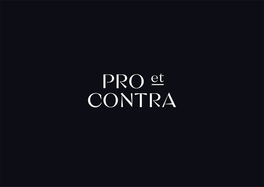
Created by Lera Shaposhnikova | https://www.behance.net/gallery/54570139/Pro-et-Contra
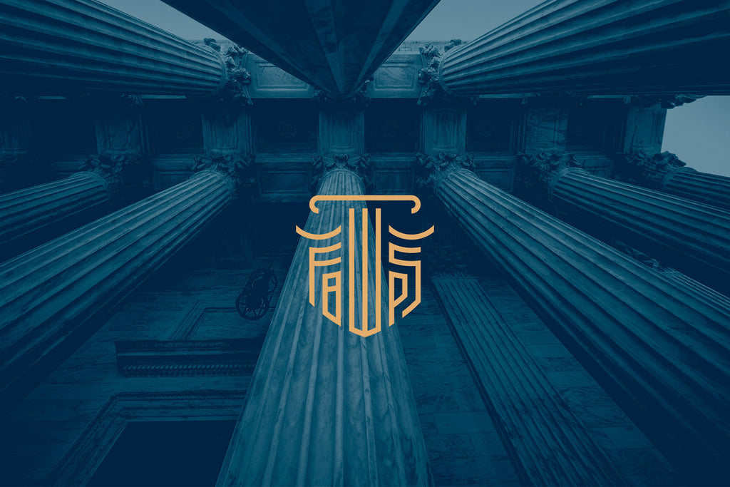
21. Elioenai Frota
Created by Janiel Vasconcelos | https://www.behance.net/gallery/72691805/Elioenai-Frota-Lawyer-Brand-Identity
22. LEGANTA

Created by Andrés Castañeda | https://www.behance.net/gallery/114939165/LEGANTA-Brand-Identity
23. Tugne Rodrigues

Created by Rafael Posada | https://www.behance.net/gallery/53379551/Tugne-Rodrigues-Advocacia
24. LEGACY GROUP

Created by Rishav Kar | https://www.behance.net/gallery/111993885/LEGACY-GROUP-CONCEPTUAL-BRANDING
25. Ernie J Hernandez

Created by Mario Gonzalez | https://www.behance.net/gallery/133383853/Ernie-J-Hernandez-Branding
26. Koberstain

Created by Victor Berriel | https://www.behance.net/gallery/116203305/Koberstain
27. GSA Law

Created by Studio Don Ramon | https://www.behance.net/gallery/96062983/GSA-Law-Office
28. Cunha Lima & Lacerda

Created by Micael Micmas | https://www.behance.net/gallery/96940011/Cunha-Lima-Lacerda-Advogados
29. Shimene Alves

Created by Igor Autran | https://www.behance.net/gallery/136234737/Shimene-Alves-Advocacia
30. Smith Hobbs

Created by Eugenio Errico | https://www.behance.net/gallery/97254889/Smith-Hobbs-Law-Firm
What Are the Challenges in Creating Law Firm Logo Designs?
Creating a law firm logo design is like trying to fit the entire essence of the legal eagle world into a tiny, visual nutshell. It's challenging, fun, and a bit of a tightrope walk between tradition and innovation. Here, we'll dive into the top five challenges that designers face when crafting these miniature masterpieces.
Balancing Tradition with Modernity
Law is one of the oldest professions, steeped in tradition and often resistant to change. This can make it tricky to create a law firm logo design that respects the firm's heritage while also appealing to the modern client. Do you go with the classic Lady Justice or try something edgier? It's like trying to recommend a smartphone to someone who still loves their rotary phone!
Conveying Trust and Authority
In the world of law, trust and authority are everything. Your logo needs to scream "You can count on us!" without actually, well, screaming. It's about finding that sweet spot where the design is both reassuring and professional. Imagine trying to whisper confidently in a room full of shouters – that's the challenge here.
Differentiation in a Crowded Market
Ever noticed how many law firm logos seem to look the same? Scales here, a gavel there, maybe a column or two. Standing out in this crowded marketplace is like trying to be heard at a rock concert. You've got to be creative without losing the essence of what a law firm stands for. It's a bit like trying to wear a bright pink suit in a room full of black and grey – it’s bold, but it needs to be done right.
Simplicity vs. Over-Complexity
A great law firm logo design should be simple enough to be memorable, but not so simple that it becomes generic. It's a fine line between creating something unique and creating something that looks like it was drawn by a kindergartener with a crayon. You want a logo that can be etched in someone's memory, not something that fades faster than a chalk drawing in the rain.
Adaptability Across Various Platforms
In today's digital age, your logo needs to look equally snazzy on a giant billboard and on a tiny smartphone screen. It’s like making a hat that looks equally fabulous on an elephant and a mouse. The design needs to be versatile enough to adapt across different mediums without losing its charm or readability. This means thinking about colors, sizes, and how the logo will look in black and white for those old-school newspaper ads.
In conclusion, designing a law firm logo is no walk in the park. It's a complex puzzle where you need to juggle tradition with innovation, convey trust and authority, stand out in a crowded field, maintain simplicity without being dull, and ensure adaptability across various mediums. But when done right, it can turn a law firm's brand into an iconic symbol that resonates with clients and sets the firm apart in the legal landscape. After all, a logo isn't just a design – it's the story of a firm told in a single glance.
Which Target Audience Should I Keep in Mind When Creating Law Firm Logo Designs?
Diving into the realm of law firm logo design, one key question pops up: who are you designing for? Identifying the target audience is like being a detective in a world of design – it's crucial, intriguing, and can make or break your case. So, let's uncover the five key audiences to consider when creating that perfect law firm logo.
The Corporate Clan
If your law firm is all about suiting up and talking mergers and acquisitions, your target audience is the corporate world. These are the big guns – CEOs, business owners, and the like. They’re looking for something sleek, professional, and as sharp as their own business acumen. Think of creating a logo that's like a firm handshake in a boardroom – confident, strong, and to the point.
The Everyday Individuals
Maybe your firm is more about helping the average Joe and Jane with their legal battles. In this case, your audience is the general public. They want something relatable and reassuring – a logo that says, "We’re here to help YOU." This is like being the friendly neighbor in the world of law firm logo design – approachable, trustworthy, and always there when you need them.
The Niche Navigators
Some law firms specialize in particular areas like environmental law, entertainment, or intellectual property. Here, your target audience is more specific, with unique needs and interests. Your logo should be like a GPS, clearly guiding these niche clients to your doorstep. It's about combining the essence of your specialty with the universal language of law and order.
The Tech-Savvy Trendsetters
In an era where legal tech is booming, perhaps your firm caters to a more digitally-inclined audience. These are the innovators, the startup gurus, and the tech enthusiasts. They’re looking for something modern, edgy, and ahead of its time. Think of a logo that’s like the latest smartphone – it's smart, savvy, and speaks the language of the future.
The Global Giants
If your law firm has its eyes on the international stage, your audience is global. These clients are from different cultures, speak various languages, and have diverse legal needs. Your logo should be like a world traveler – adaptable, culturally sensitive, and fluent in the language of international law. It's about creating a design that crosses borders as smoothly as an experienced diplomat.
In essence, knowing your audience in law firm logo design is like being a chef in a multi-cuisine restaurant. You need to know who's coming to dine and what they love to eat. Whether it's the corporate executives, the everyday people, niche experts, tech enthusiasts, or the global clients, your logo should serve up exactly what they’re looking for. It should capture the essence of your firm's specialties while speaking directly to the hearts (and legal minds) of your intended audience. Remember, a well-designed logo isn’t just a pretty face for your firm; it’s a silent ambassador that communicates your firm’s identity and values to the world.
What Symbolisms Are Suitable for Law Firm Logo Designs?
When it comes to law firm logo design, choosing the right symbolism is like picking the perfect accessory for your outfit – it needs to complement, convey a message, and catch the eye. In the legal world, certain symbols resonate deeply with tradition, authority, and justice. Let's explore five key symbolisms that can make your law firm logo stand out while staying true to the ethos of the legal profession.
The Classic Scales of Justice
This is the LBD (Little Black Dress) of law firm logo design – timeless, elegant, and universally recognized. The scales represent balance and impartiality, essential values in the legal field. Incorporating this symbol can instantly communicate your commitment to fairness and equity. But remember, just like the LBD, it's all about how you wear it – or in this case, how you creatively integrate it into your design.
The Mighty Pillars or Columns
Reminiscent of ancient Greek and Roman architecture, pillars or columns symbolize strength, support, and stability – qualities every client seeks in a law firm. Using these in your logo is like saying, "We’re as sturdy and reliable as those magnificent ancient structures." It’s a nod to the historic foundations of law, with a promise of enduring support.
The Wise Owl
Often associated with wisdom, knowledge, and a keen understanding of complexities, the owl makes for a unique and intellectual symbol in law firm logo designs. It’s like having a wise old professor as your mascot, suggesting that your firm is not just about legal expertise, but also about deep insight and strategic thinking.
The Trustworthy Shield
A shield in your logo can symbolize protection, security, and defense – key aspects that clients seek in legal representation. Using a shield tells your clients, “We’ve got your back.” It’s like being the legal world’s superhero, ready to shield clients from legal woes and adversities.
The Gavel
While a bit on the nose, a gavel is undeniably associated with the law and justice system. It represents authority, decisiveness, and the finality of judgments. Incorporating a gavel in your logo is akin to giving it a stamp of legal authenticity. It’s like saying, “We mean business, and we’re here to deliver justice.”
Incorporating these symbols into your law firm logo design can powerfully communicate your firm’s values and specialties. However, the real art lies in how these symbols are interpreted and presented. A modern twist to the scales, a stylized owl, or an abstract shield can make your logo not only symbolic but also memorable and unique.
Remember, a logo is the face of your law firm. It’s not just about looking good; it’s about telling a story, your story. The right symbolism can transform your logo from a mere graphic to a meaningful emblem that resonates with your clients and sets the tone for your firm’s brand identity. So, choose wisely, design creatively, and let your law firm’s logo be a beacon of justice, wisdom, and trust in the legal landscape.
What Are Some Creative Ideas for Law Firm Logo Designs?
When it comes to law firm logo design, it's time to think outside the courtroom and bring some creative flair to the table. Gone are the days of staid, stuffy designs – today's law firms are all about showcasing their unique identity and approach. Let's explore five creative ideas that can inject some pizzazz into your law firm's branding.
Geometric Sophistication
Who said law and geometry don’t mix? Embrace sharp lines, clean angles, and symmetrical shapes to create a logo that’s as precise as your legal arguments. Think of a design that incorporates the firm's initials in a geometric pattern. It’s like a puzzle where every piece fits perfectly, symbolizing the meticulous nature of your legal practice.
Colorful Personality
Break free from the traditional navy and gray palette. Introduce bold and unconventional colors to make your logo pop. A dash of bright green or a splash of royal purple can make your logo stand out in the sea of monochrome law firm logos. It's like being the peacock in a flock of pigeons – eye-catching and memorable.
Minimalist Elegance
Sometimes, less is more. A minimalist logo with clean, uncluttered design can convey sophistication and modernity. Think of a sleek, single-line drawing or a crisp, minimalist font. It’s like the legal world’s version of a sleek, black turtleneck – simple, stylish, and timeless.
Historical Twist
Blend the old with the new by incorporating traditional legal symbols, like the scales of justice, in a modern way. Imagine redesigning these classic symbols with a contemporary twist – like scales made of sleek, digital lines or a gavel with a futuristic look. It’s like having a foot in the storied history of law while reaching out to the future.
Personalized Illustrations
Go beyond generic symbols and create a custom illustration that tells your firm's story. It could be something related to the firm's history, location, or area of expertise. For instance, if your firm is in a coastal city, you might include a subtle wave pattern. It’s about adding a touch of personality to your logo, making it as unique as your firm's story.
In crafting a law firm logo design, the goal is to merge creativity with professionalism. You want a logo that not only stands out but also resonates with the values and ethos of your firm. It should be a visual representation of who you are as a legal entity – reliable, distinctive, and forward-thinking.
Remember, your logo is often the first impression potential clients will have of your firm. It's not just a graphic; it's an introduction. By infusing creativity into your logo design, you’re not just branding your firm; you’re setting the tone for your client relationships, the cases you attract, and the overall image of your practice. So, let your logo be bold, be different, and most importantly, be a true reflection of your law firm's character and ethos.
What Are the Common Mistakes in Law Firm Logo Designs?
Navigating the world of law firm logo design can be as tricky as a high-profile court case. There are pitfalls to avoid and best practices to follow. So, let's play legal detective and uncover the five common mistakes often made in law firm logo designs. Avoiding these blunders can be the difference between a logo that wins the case for your brand and one that gets dismissed in the court of public opinion.
Overcomplicating the Design
Complexity in law? Yes. Complexity in logos? No, thank you. A common slip-up is cramming too many elements into the logo. Remember, your logo is not a legal brief; it doesn't need to include every detail about your firm. Overly complex logos are like confusing legal jargon – they just don't communicate effectively. Keep it simple, clean, and to the point.
Underestimating the Power of Color
Choosing the wrong color palette is like wearing a beach outfit to court – it just doesn't convey the right message. Many law firms fall into the trap of using dull, lifeless colors that fail to resonate with their audience. While you don't need a rainbow, thoughtful use of color can breathe life into your logo and help convey your firm's personality.
Sticking Too Close to Stereotypes
Scales, gavels, and pillars – oh my! While these are traditional symbols of the legal profession, relying too heavily on them can make your logo look like every other law firm on the block. It's like being the tenth lawyer to argue the same point in court – not very impactful. Dare to be different and think outside the courtroom box.
Neglecting Versatility
A great logo looks good on a business card, a website, a billboard, and even on a little promotional pen. A common mistake is designing a logo that looks fabulous in one format but falls apart in others. Your logo needs to be the legal eagle that soars across all platforms, maintaining its integrity and impact.
Forgetting About the Target Audience
Designing a logo without considering who you're trying to attract is like a lawyer addressing the wrong jury. If your firm specializes in corporate law, a playful and whimsical design might not resonate with your business-minded clients. Similarly, a too-stern logo might intimidate individual clients seeking personal legal aid. Understand your audience and tailor your logo to suit their expectations and needs.
In conclusion, crafting a successful law firm logo design is a delicate balance of creativity, simplicity, and relevance. Avoid the pitfalls of overcomplication, color missteps, stereotypical imagery, lack of versatility, and audience disconnect. Remember, your logo is a visual handshake – it's the first and lasting impression you make. A well-designed logo not only distinguishes your firm but also communicates your values and professionalism. So, approach your law firm's logo design as you would a complex legal case – with strategy, thoughtfulness, and an eye for detail. That way, you'll create a logo that not only stands out in the legal landscape but also stands the test of time.
Conclusion
Law firm logo design is a critical aspect of branding that encapsulates a firm's identity and values. An effective logo strikes the perfect balance between professionalism and creativity, making a memorable impression on potential clients. It's not just about aesthetics; it's about crafting a visual narrative that resonates with your target audience. Whether you're opting for traditional symbolism or innovative graphics, the key is to create a versatile and meaningful design that stands out in the competitive legal market. Remember, your logo is more than just an image; it's the face of your law firm, a symbol of trust, expertise, and your commitment to justice.
Let Us Know What You Think!
Every information you read here are written and curated by Kreafolk's team, carefully pieced together with our creative community in mind. Did you enjoy our contents? Leave a comment below and share your thoughts. Cheers to more creative articles and inspirations!
Leave a Comment