10 Tips to Create a Good Sunlight Logo Design

Source: Jessie Maisonneuve, Dribbble, https://dribbble.com/shots/18041346-Good-Days-mascot
A strong sunlight logo design can instantly communicate warmth, optimism, energy, and clarity. Because sunlight is closely associated with life, growth, hope, and positivity, it can be a powerful visual idea for many kinds of brands. From wellness businesses and travel companies to creative studios and eco-friendly products, this style of logo can help create an inviting first impression. When used thoughtfully, a sunlight logo design can feel vibrant and memorable without looking overly complicated.
Creating an effective logo, however, takes more than simply placing a sun icon next to a brand name. A good design should reflect the brand’s personality, use balanced shapes, and remain clear across different sizes and platforms. Details such as color choice, line style, spacing, and typography all play a major role in making the final result look polished and professional. The best sunlight-inspired logos feel bright and expressive while still staying clean and versatile.
In this article, you will explore practical tips to create a good sunlight logo design that looks attractive and works well in real branding situations. These ideas will help you build a logo that feels fresh, meaningful, and visually strong.
Understand The Meaning Behind Sunlight Logos
Before starting any sunlight logo design, it is important to understand the symbolism behind sunlight. The sun is widely recognized as a symbol of energy, warmth, positivity, growth, and new beginnings. Because of this universal meaning, sunlight imagery can communicate powerful emotions in a very simple visual form. Many brands use sunlight elements to create a feeling of optimism and trust, which helps them connect more easily with their audience.
When designing a sunlight logo design, think about how the sun relates to the brand's message. For example, a wellness brand might use sunlight to represent health and vitality, while a travel company may use it to suggest adventure, freedom, and beautiful destinations. Understanding the deeper meaning behind the symbol allows designers to create a logo that feels intentional rather than decorative.
Another important factor is the style of the sun itself. A rising sun may represent hope and new opportunities, while a bright full sun can suggest strength, power, and confidence. By choosing the right visual interpretation, the sunlight logo design becomes more meaningful and memorable.
Designers should also consider cultural associations with sunlight. In many cultures, the sun represents life and guidance, which makes it a positive symbol for brands that want to inspire and motivate their customers. Taking the time to understand these meanings helps ensure that the final logo communicates the right message clearly.
Use Simple And Recognizable Sun Shapes
Simplicity plays a major role in creating an effective sunlight logo design. While it may be tempting to add many details to the sun symbol, a clean and recognizable shape often creates a stronger visual impact. Simple designs are easier for people to remember, and they also work better across different branding materials.
A common approach is to start with basic geometric shapes such as circles, lines, or subtle rays. These simple elements can quickly communicate the idea of sunlight without making the logo feel crowded. In many successful logos, the sun is represented by only a few rays or even a partial circle, yet the meaning is still clear.
Keeping the design simple also improves versatility. A sunlight logo design must look good on websites, packaging, social media, signage, and printed materials. Complex details may disappear when the logo is scaled down, but a minimal sun shape remains clear and readable in almost any size.
Another advantage of simple shapes is flexibility. Designers can combine the sun icon with typography, landscapes, or abstract elements while still maintaining visual balance. By focusing on recognizable forms and avoiding unnecessary decoration, the sunlight logo design becomes more timeless, professional, and adaptable for long-term brand use.
Choose Warm And Inviting Color Palettes
Color plays a crucial role in any sunlight logo design because it helps express the warmth, brightness, and positivity associated with the sun. The right color palette can instantly communicate energy and optimism, making the logo feel more welcoming and engaging. Designers often use warm tones to reflect the natural appearance of sunlight and create an emotional connection with the audience.
Common colors used in a sunlight logo design include yellow, orange, and soft gold. These colors naturally represent sunlight and can make the design feel lively and cheerful. Yellow often symbolizes happiness and clarity, while orange suggests warmth, creativity, and enthusiasm. When combined carefully, these tones can create a vibrant visual identity that feels energetic without becoming overwhelming.
However, warm colors should be balanced with neutral tones to maintain visual harmony. Shades like white, soft gray, or subtle earth tones can help support the brightness of the sun element while keeping the overall design clean and professional. This balance ensures the logo remains visually comfortable to look at.
Designers should also think about how the color palette will appear across different platforms. A good sunlight logo design should maintain its impact whether it appears on a website, packaging, social media, or printed materials. By choosing warm and inviting colors thoughtfully, the logo can consistently communicate brightness and positivity while strengthening the brand’s visual identity.

Source: Tornike Uchava, Dribbble, https://dribbble.com/shots/18100106-Abstract-sun-symbol
Balance Light Rays With Clean Composition
Light rays are one of the most recognizable elements in a sunlight logo design. They help illustrate the idea of brightness, expansion, and energy radiating outward from the sun. However, using too many rays or overly complex shapes can make a logo look cluttered. Maintaining a clean composition ensures that the sunlight element remains clear and visually appealing.
When adding rays to a sunlight logo design, designers should focus on balance and spacing. Evenly distributed rays often create a sense of harmony and structure, which makes the logo feel stable and professional. Some designs use only a few rays to keep the symbol minimal, while others use soft lines or geometric patterns to represent light in a more stylized way.
Another effective technique is controlling the thickness and length of the rays. Thin rays can create a delicate and elegant appearance, while thicker rays may feel bold and energetic. The choice depends on the personality of the brand and the overall style of the logo.
Composition also plays an important role. The sunlight element should work naturally with the brand name, icon, or other design elements. Proper spacing between the sun, rays, and typography helps the logo feel organized and readable. A well-balanced sunlight logo design not only looks visually pleasing but also ensures that the symbol remains clear across different sizes and applications.
Select Typography That Matches The Energy
Typography is an important part of a successful sunlight logo design because it helps communicate the personality and tone of the brand. While the sun symbol captures attention visually, the typography reinforces the message and makes the logo feel complete. Choosing the right typeface ensures the design feels balanced and professional.
When selecting fonts for a sunlight logo design, consider styles that reflect warmth, positivity, and clarity. Rounded sans-serif fonts often work well because they appear friendly, modern, and approachable. These typefaces complement the soft and radiant qualities associated with sunlight. In contrast, sharp or overly decorative fonts may distract from the simplicity of the sun symbol.
Another important consideration is readability. A logo must remain clear across different sizes and platforms, so the typography should be easy to read whether it appears on a website, product packaging, or social media graphics. Clean letterforms help maintain clarity while allowing the sun element to remain the visual focus.
Designers can also experiment with subtle customizations. For example, a letter may include a small ray shape or curved detail that connects visually with the sun icon. These small touches can make the sunlight logo design feel unique while still keeping the overall style clean and professional.
By choosing typography that matches the energy of the sun symbol, the entire logo becomes more cohesive. The result is a design that feels warm, inviting, and memorable for audiences.
Keep The Sunlight Logo Design Minimal
Minimalism is one of the most effective approaches when creating a sunlight logo design. A simple and focused design allows the core idea of sunlight to stand out clearly without unnecessary distractions. Minimal logos are easier to recognize, easier to reproduce, and often feel more modern and timeless.
When designing a sunlight logo design, try to reduce the number of elements used in the composition. Instead of combining many symbols or decorative shapes, focus on a strong central sun icon supported by clean typography. This approach ensures the logo communicates its message quickly and clearly.
A minimal design also improves versatility. Logos must appear across many different applications, including websites, business cards, packaging, and promotional materials. Complex details may become difficult to see when the logo is scaled down, but a minimal sunlight logo design remains clear and recognizable at almost any size.
Another advantage of minimalism is visual elegance. A clean circle representing the sun, paired with a few balanced rays, can often be more powerful than an overly detailed illustration. Simple designs also adapt well to different color versions, such as monochrome or single-color applications.
By focusing on simplicity, designers can create a sunlight logo design that feels modern, flexible, and memorable. Minimal elements allow the concept of light and positivity to shine through without overwhelming the viewer.
Experiment With Negative Space For Creativity
Negative space can be a powerful design technique when creating a memorable sunlight logo design. In logo design, negative space refers to the empty or unused area around and within elements. Instead of leaving this space inactive, designers can use it creatively to form hidden shapes, symbols, or visual messages. This technique often makes a logo feel clever, modern, and visually engaging.
In a sunlight logo design, negative space can be used to form subtle sun rays, horizons, or even abstract landscapes. For example, a circle representing the sun might contain a hidden path, wave, or mountain formed by the empty space inside it. These visual tricks can add depth and meaning to the design while still keeping the overall style simple.
One of the advantages of using negative space is that it allows designers to add creativity without making the logo look crowded. Instead of adding more shapes or icons, the design uses existing space more effectively. This keeps the sunlight logo design clean and balanced while still offering a unique visual element.
Designers should also make sure the negative space remains clear and readable. If the hidden shapes are too complicated, viewers may not notice them. The best negative space logos feel natural and easy to understand at first glance.
When used thoughtfully, negative space can transform a simple sunlight logo design into something more memorable and distinctive, helping the brand stand out while maintaining a clean and professional appearance.

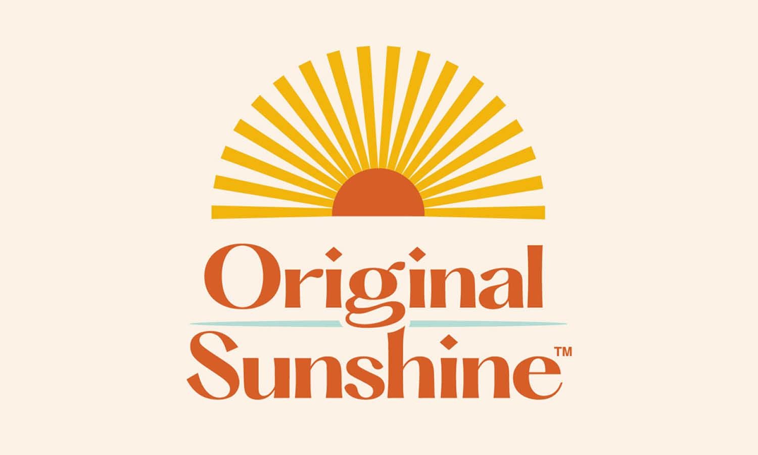
Source: Aleisha Samek, Dribbble, https://dribbble.com/shots/17938788-Original-Sunshine
Make The Logo Versatile For Different Media
Versatility is an essential quality of any successful sunlight logo design. A logo should work well across many platforms, including websites, social media profiles, packaging, advertisements, and printed materials. If the design only looks good in one format, it may lose effectiveness when applied to other media.
When designing a sunlight logo design, consider how it will appear in both large and small sizes. A logo might look impressive on a website banner, but it should also remain clear when used as a small icon or mobile app symbol. Clean shapes and balanced proportions help ensure the design stays readable in every situation.
Color variations are also important. While a full-color sunlight logo design may look vibrant, the logo should still function well in black and white or single-color versions. Many branding materials, such as stamps, engravings, or monochrome prints, require simplified color versions of the logo.
Designers should also test the logo on different backgrounds. A good sunlight logo design should remain visible whether it appears on light, dark, or textured surfaces. Creating alternate versions with adjusted colors or outlines can help maintain visibility.
By designing with versatility in mind, the sunlight logo design becomes more practical for real-world branding. A flexible logo ensures the brand identity remains consistent and recognizable across every platform where the audience encounters it.
Use Gradients Carefully To Represent Light
Gradients can be a useful tool when creating a sunlight logo design because they help simulate the natural transition of light. Sunlight rarely appears as a flat color in nature. Instead, it shifts between warm yellows, soft oranges, and glowing gold tones. By applying gradients carefully, designers can create a sense of brightness and depth that reflects the natural feeling of sunlight.
However, gradients should be used thoughtfully to avoid making the logo look overly complicated. A good sunlight logo design should remain clean and easy to recognize. Using too many gradient layers or extreme color transitions can distract from the main symbol. Instead, subtle color blending often creates a more elegant and professional appearance.
A common technique is to use a soft gradient within the sun shape itself. For example, a brighter yellow center can gradually transition into a deeper orange toward the edges. This effect gives the logo a glowing appearance while still maintaining a simple structure.
Designers should also consider how gradients will appear across different devices and print materials. Some printing methods may not reproduce complex gradients perfectly. For this reason, it is helpful to create a simplified version of the sunlight logo design that still looks strong without gradient effects.
When used in moderation, gradients can enhance the visual warmth of a sunlight logo design. They help represent the natural glow of sunlight while keeping the logo modern, vibrant, and visually appealing.
Test The Sunlight Logo Design At Different Sizes
Testing a logo at different sizes is a crucial step in the design process. A sunlight logo design should look clear and recognizable whether it appears on a large banner or a small social media icon. Without proper scaling tests, important details may disappear or become difficult to read.
Designers often start by viewing the logo at very small sizes. This helps reveal whether the sun icon, rays, and typography remain visible. If the details become blurry or crowded, the design may need to be simplified. A strong sunlight logo design usually relies on clean shapes and balanced spacing so it stays clear even at smaller scales.
It is also helpful to test the logo in both horizontal and compact formats. Some branding materials require wide layouts, while others need square or vertical versions. Creating adaptable variations ensures the sunlight logo design remains flexible across different uses.
Another useful test is placing the logo on realistic mockups such as packaging, business cards, or digital screens. Seeing the design in real contexts helps identify any visual issues that might not be obvious during the design stage.
By carefully testing size variations, designers can ensure that the sunlight logo design remains professional and effective in every situation. This step helps create a logo that consistently represents the brand across all platforms.
Conclusion
A well-crafted sunlight logo design can communicate warmth, optimism, and energy while creating a memorable visual identity for a brand. By focusing on clear symbolism, balanced composition, thoughtful color choices, and readable typography, designers can build logos that feel both inviting and professional. Techniques such as minimal design, creative negative space, and careful use of gradients can further enhance the visual impact. Most importantly, testing the logo across different sizes and media ensures the design remains effective everywhere it appears. With these practical tips, creating a strong and versatile sunlight logo design becomes a more confident and rewarding process.
Let Us Know What You Think!
Every information you read here are written and curated by Kreafolk's team, carefully pieced together with our creative community in mind. Did you enjoy our contents? Leave a comment below and share your thoughts. Cheers to more creative articles and inspirations!


Leave a Comment