30 Best Wave Logo Design Ideas You Should Check

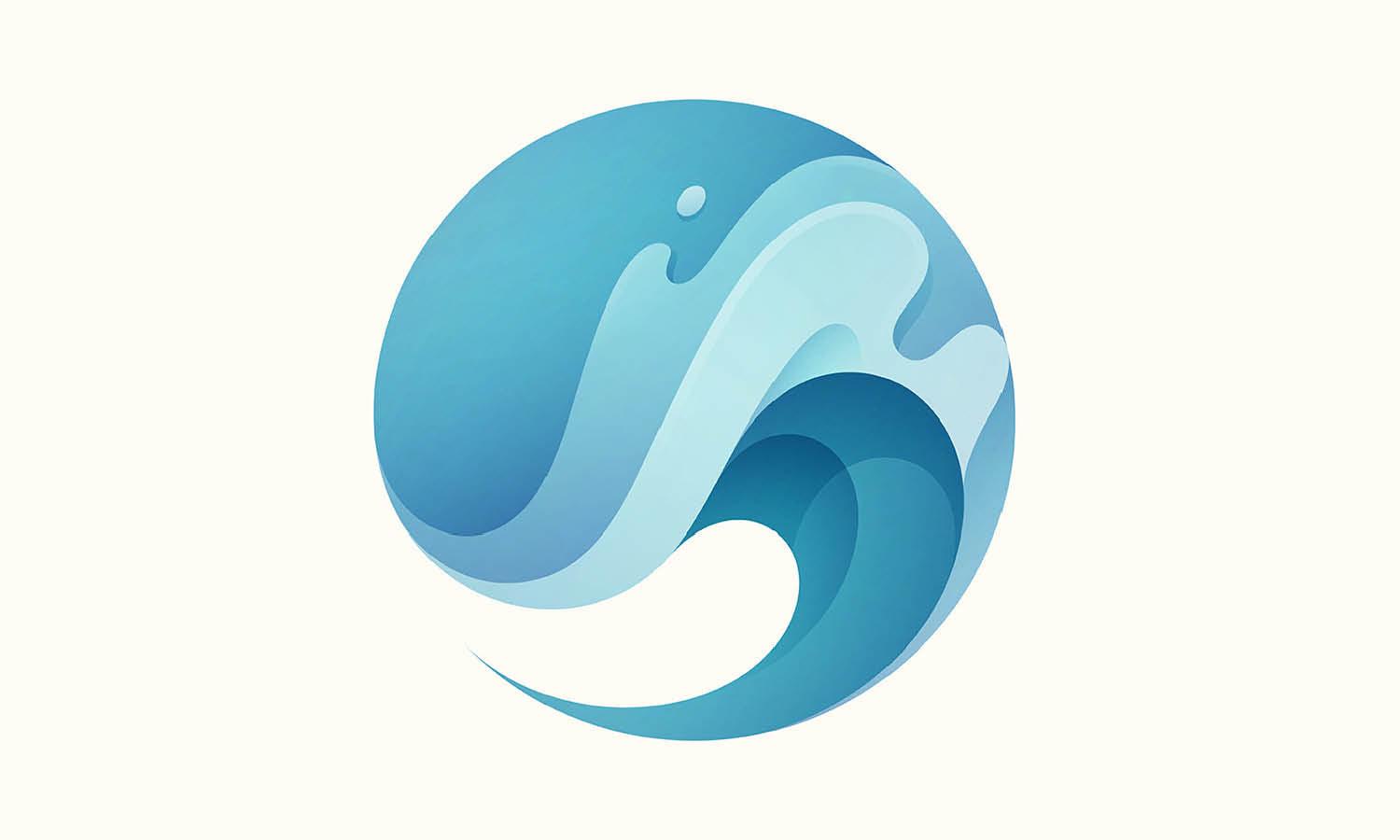
Source: Nagual, Aqua Beauty - Logo Design, Dribbble, https://dribbble.com/shots/11014572-Aqua-beauty
If you’re drawn to the rhythm of the ocean and the energy of movement, wave logo design is your perfect creative playground. Waves have long symbolized fluidity, power, and freedom — elements that instantly bring life to a brand. Whether you’re designing for a surf brand, wellness retreat, or eco-friendly company, wave-inspired logos can capture that sense of flow and vitality that audiences love.
From minimalist wave lines that evoke calm serenity to bold, dynamic curls that shout adventure, wave logo design offers endless room for creativity. Designers often experiment with gradients, abstract shapes, and even typography that mimics water’s natural motion. The result? A logo that feels alive and effortlessly memorable.
This article will explore some of the best wave logo design ideas to check, showcasing different interpretations that balance aesthetic appeal and symbolic depth. You’ll discover styles that suit modern startups, coastal cafés, travel brands, and more — all crafted with the spirit of the sea in mind. Get ready to dive in and let these designs inspire your next creative splash!
Wave Logo Design Ideas

Source: Myriam Metais, Michel Morel • Artiste Peintre, Behance, https://www.behance.net/gallery/233011219/Logo-Branding-Michel-Morel-Artiste-Peintre

Source: Kiran Farzana, Behance, https://www.behance.net/gallery/238701125/Drift-Logo-Brand-Design-Minimal-Nature-Inspired

Source: Małgorzata Wójcik, Wave Bank, Behance, https://www.behance.net/gallery/216935241/WAVE-BANK-Visual-identity

Source: Iryna Kahal, Prostir Khvyli, Behance, https://www.behance.net/gallery/217786859/Wave-space-A-Cozy-Coffee-Space-Branding

Source: Yoga Perdana, Wave Logo Concept, Dribbble, https://dribbble.com/shots/17459154-Wave-Logo

Source: Bojan Oreskovic, Wavehunt - Logo Design, Dribbble, https://dribbble.com/shots/11485408-Wavehunt

Source: Roma Korolev, S with Water Waves Concept, Dribbble, https://dribbble.com/shots/14509889-S-with-water-waves-concept

Source: Konstantin Reshetnikov, Sunwave - Logo Concept, Dribbble, https://dribbble.com/shots/11609054-Sunwave

Source: Alex Aperios, The Outsiders - Surf Logo, Dribbble, https://dribbble.com/shots/14000171-The-Outsiders-Surf

Source: Harry Lee, The Wave, Behance, https://www.behance.net/gallery/55408667/The-Wave

Source: Yoga Perdana, Wave Logo Concept, Dribbble, https://dribbble.com/shots/15938559-Wave-Logo

Source: Mohibul Asif, Behance, https://www.behance.net/gallery/217896103/Letter-W-Wave-Logo-Design

Source: Núria Ortiz, Gooddays, Behance, https://www.behance.net/gallery/193565541/Gooddays-Brand-design

Source: PrstiPerje, Death Waves - Logo Concept, Dribbble, https://dribbble.com/shots/4872693-Death-Waves

Source: 98 studio, Royal State, Behance, https://www.behance.net/gallery/103326813/ROYAL-STATE-logo/

Source: Seas Design, Next Wave Dental, Behance, https://www.behance.net/gallery/213473855/Next-Wave-Dental

Source: Megan Nixon, Wave Logo Concept, Dribbble, https://dribbble.com/shots/17142214-Wave-Logo

Source: Gennady Savinov, Seawave - Logo Design, Dribbble, https://dribbble.com/shots/15524555-Seawave-Logo

Source: Kazal Islam, Megawave - Modern Wave Logo, Dribbble, https://dribbble.com/shots/17236982-Wave-logo-modern-logo-MW-letter-logo-Market-logo-online-market

Source: Esraa Mohammed, Nirvana, Behance, https://www.behance.net/gallery/187674945/Nirvana-Brand-Identity

Source: Pedro Julien, Wave ID Grid Logo Design, Dribbble, https://dribbble.com/shots/7165931-Wave-Id-Grid

Source: John Jehl, Wave Radio, Behance, https://www.behance.net/gallery/100672319/Wave-Radio-Logo

Source: Deividas Bielskis, Knarr - Nautical Logo, Dribbble, https://dribbble.com/shots/6582061-Knarr

Source: Dimitrije Mikovic, Sound Planet - Logo Design, Dribbble, https://dribbble.com/shots/4459964-Sound-Planet

Source: Maxime Mignon, Wavely Studio, Behance, https://www.behance.net/gallery/236714677/Logo-Wavely-Studio

Source: Lera Matchenko, Nordic Wave, Behance, https://www.behance.net/gallery/237279957/Nordic-Wave-Seafood-restaurant-identity

Source: Vlad Smolkin, Open Earth - Logo Design, Dribbble, https://dribbble.com/shots/17937459-Open-Earth

Source: Drømedia Company, Meditation Wave, Behance, https://www.behance.net/gallery/110722401/Meditation-Wave-Logo

Source: Denisse Alanis, Wave Vacation Rental Management, Behance, https://www.behance.net/gallery/191551307/Wave-Vacation-Rental-Management-Brand

Source: Nagual, Aqua Beauty - Logo Design, Dribbble, https://dribbble.com/shots/11014572-Aqua-beauty
What Are The Best Inspirations For Wave Logo Design?
When it comes to creating a wave logo design, inspiration flows as freely as the ocean itself. Waves symbolize energy, adaptability, and continuous motion—making them a favorite among designers who want to capture a sense of life and momentum in their work. Whether you’re designing for a surf shop, an eco-conscious brand, or a tech startup, finding the right inspiration can help you craft a logo that truly rides the tide of creativity. Here are five of the best sources of inspiration for wave logo design that will make your concept stand out.
Nature’s Dynamic Movements
The most powerful muse for wave logo design is, of course, the ocean itself. Study the different forms waves take—gentle ripples, crashing curls, or symmetrical swells—and interpret their motion visually. Think about how water interacts with light, the textures of foam, and the rhythm of tides. A simple swoosh can suggest calmness, while a spiraling crest conveys energy and adventure. Observing real waves helps you capture authentic motion and natural balance in your design.
Surf And Coastal Culture
Surfing communities and coastal lifestyles are overflowing with design inspiration. From surfboards and beach signage to local surf brands, you’ll find playful typography, vibrant blues, and organic curves everywhere. These aesthetics communicate freedom and connection to nature—qualities that work beautifully in a wave logo design. Borrow from these cultural elements but give them your own creative twist. A modern or retro coastal vibe can instantly make your logo feel approachable and full of life.
Minimalist And Geometric Patterns
Sometimes less is more. Minimalist wave logo design often uses clean, flowing lines or geometric shapes to suggest motion without overcomplicating the visual. Consider how a single curve or parallel line can represent rhythm, continuity, or flow. By focusing on simplicity and balance, geometric designs can make waves look timeless and versatile across various applications—from business cards to websites and product packaging.
Abstract Art And Fluid Motion
Abstract art is another rich source of inspiration for wave logo design. Think about brush strokes, gradients, or abstract shapes that convey movement and emotion rather than literal representation. Using color blending and asymmetrical forms, you can create a logo that feels alive and expressive. This approach works especially well for creative brands, lifestyle companies, or wellness businesses that value artistry and individuality.
Marine Life And Nautical Elements
Adding subtle touches of marine life—like shells, dolphins, or sails—can complement your wave logo design and enhance its storytelling. These elements bring personality and thematic depth, transforming a simple wave into a meaningful emblem. You might incorporate a wave curling around a ship’s anchor or blending with a fish’s tail to symbolize unity with nature. This style can be playful, elegant, or symbolic, depending on your brand’s tone and message.
Inspiration for wave logo design is everywhere—from the real ocean to abstract imagination. Each ripple or crest holds potential to express your brand’s identity in motion, fluidity, and freedom. The key is to find the right blend of creativity and symbolism that lets your design truly make a splash.
What Are Some Unique Approaches To Wave Logo Design?
Wave logo design is an exciting creative journey that allows you to combine natural elements with the artistry of design. While waves are often associated with fluidity, energy, and motion, the way you incorporate them into a logo can take on many unique forms. Whether you're looking to infuse elegance, modernity, or a playful vibe into your brand identity, there are countless ways to approach wave logo design. Let’s dive into five unique approaches that will make your wave logo stand out from the crowd!
Combining Waves with Negative Space
One of the most striking ways to incorporate waves into a logo design is by using negative space. By carefully crafting wave shapes with gaps or by framing them with empty space, you can create a clean, minimalistic effect that draws attention to the subtle beauty of the design. This technique often results in a logo that feels sophisticated and visually interesting, allowing the wave to appear seamlessly integrated with other elements or even hidden within the design. Negative space wave logos can evoke a sense of simplicity and elegance while maintaining depth and complexity.
Geometric Wave Patterns
If you want to modernize the classic wave logo design, consider using geometric shapes. By transforming traditional wave curves into angular, straight-edged, or segmented forms, you can create a more structured and contemporary look. Geometric waves are great for brands that want to convey precision, technology, and innovation while still tapping into the natural symbolism of waves. These shapes are often used in tech, digital, and startup logos to signify cutting-edge progress, while still feeling connected to the flow and movement of the ocean.
Dynamic Motion Effects
To bring your wave logo design to life, consider adding dynamic motion effects that visually represent the constant movement of water. This can be done by layering multiple wave shapes that interact with one another, creating a sense of fluid motion. You could also play with gradients or shading to simulate the ripple effect or the transition of a wave as it approaches the shore. Such an approach brings energy to the logo, making it feel more alive and vibrant. Brands in industries like sports, entertainment, or adventure can benefit from this energetic, action-oriented design.
Organic Wave Forms
Instead of sticking to rigid shapes or stylized representations, you can take a more organic, freeform approach to wave logo design. This method involves creating smooth, flowing curves that mimic the natural shape of waves without relying on geometric precision. The fluidity of organic waves can evoke feelings of freedom, calm, and adaptability, making it ideal for brands that want to present themselves as approachable, human-centered, and versatile. Organic wave logos also feel timeless and are often used by wellness, lifestyle, and eco-conscious brands that prioritize harmony with nature.
Incorporating Abstract Elements
For a truly unique approach to wave logo design, consider incorporating abstract elements that are inspired by waves but are open to interpretation. By blending the fluidity of water with unexpected shapes, textures, or patterns, you can create a logo that is both artistic and mysterious. These abstract waves can be integrated with other symbols, such as mountains, trees, or geometric patterns, creating a deeper narrative for the brand. An abstract wave logo often invites curiosity and provides an opportunity for the audience to engage with the design on a more emotional level. This approach is perfect for creative industries, art galleries, or brands that want to spark imagination.
Wave logo design offers limitless possibilities for creativity. Whether you’re opting for clean negative space, geometric precision, dynamic motion, organic curves, or abstract artistry, these unique approaches will help you craft a wave logo that feels fresh, impactful, and aligned with your brand’s message. By experimenting with different styles and techniques, you can create a wave logo that’s truly one of a kind!
What Colors Work Best In a Wave Logo Design?
When it comes to wave logo design, color is everything. The right palette can amplify the message your logo is conveying, making it more impactful, memorable, and aligned with your brand’s identity. Waves naturally evoke feelings of fluidity, movement, and energy, so choosing the right colors for your wave logo design can help emphasize those emotions. Let’s explore five colors that work wonders in wave logos and the unique vibes they bring!
Ocean Blues
When most people think of waves, they picture the deep, rich blues of the ocean. Shades of blue are often the go-to choice for wave logo design, as they evoke feelings of calmness, stability, and trustworthiness. Lighter blues convey serenity and peace, while deeper blues suggest depth, professionalism, and confidence. Whether you’re designing for a wellness brand, a tech company, or a travel agency, ocean blues perfectly capture the natural beauty and consistency of the sea, making your logo feel grounded and authentic.
Turquoise and Teal
If you want to add a pop of vibrancy and freshness to your wave logo design, consider using turquoise or teal. These shades of blue-green offer a refreshing take on the classic blue, evoking images of tropical beaches, clear waters, and sunny skies. Turquoise and teal are playful yet calming, making them great choices for brands in the hospitality, lifestyle, and eco-friendly sectors. These colors infuse your wave logo with a sense of relaxation and adventure, perfect for attracting a modern, energetic audience.
Soft Greens
For brands with a focus on sustainability, nature, or wellness, soft greens can complement wave logo designs beautifully. Green is the color of growth, renewal, and harmony, and when paired with the fluidity of waves, it can create a logo that feels connected to both the environment and personal well-being. Whether it’s a pale mint or a rich moss green, these shades bring a grounded and earthy feel to your wave logo design, evoking nature’s calming influence and its cycle of renewal.
Sunset Oranges and Yellows
Waves don’t always have to be depicted in cool tones. Incorporating warm colors like sunset oranges, yellows, and golds into your wave logo design can evoke warmth, energy, and excitement. These colors can remind people of golden sunsets over the ocean or the warmth of the sun on a summer day. They create an inviting, optimistic vibe and are especially effective for brands in the hospitality, travel, or creative industries. A wave logo with a warm color palette can also symbolize change, growth, and transformation, making it perfect for brands that want to inspire progress and positivity.
Monochrome or Black and White
Sometimes, less is more. For a sleek, modern, and minimalistic wave logo design, black and white or monochrome color schemes can be incredibly effective. The contrast between black and white adds sophistication and versatility, allowing your wave design to remain timeless and adaptable across various mediums and backgrounds. Monochrome wave logos can convey elegance and professionalism, making them ideal for luxury brands, high-end services, or companies aiming for a minimalist aesthetic. This classic combo is versatile enough to work in any industry, from fashion to tech to wellness.
Color plays a crucial role in wave logo design, influencing how your logo is perceived and what it communicates about your brand. By thoughtfully choosing your colors, you can infuse your design with the perfect blend of emotion, energy, and meaning that resonates with your audience!
What Fonts Pair Well With A Wave Logo Design?
Choosing the right font to pair with your wave logo design is just as important as picking the perfect wave shape or color. The font you use can elevate the overall aesthetic, reinforcing the message and feel of your brand. Whether you're looking for something modern, classic, or playful, the font you choose should complement the fluidity and energy of your wave logo design. Let's explore five fonts that pair exceptionally well with wave logos and how they can bring out the best in your design!
Lobster
Lobster is a bold, cursive font with a distinctive, friendly vibe. Its flowing lines and curves make it a natural fit for wave logo designs. Just like the waves themselves, Lobster’s swooping letters mimic the movement of water, adding a sense of fluidity to the logo. This font is especially great for brands that want to project warmth and approachability, making it ideal for companies in the lifestyle, hospitality, or even food industries. Lobster’s unique style ensures your wave logo stands out with personality and flair.
Montserrat
If you're looking for a more modern and geometric approach, Montserrat is a fantastic choice. This sans-serif font features clean, straight lines and bold forms, making it perfect for pairing with more stylized wave logo designs. The contrast between the sharpness of Montserrat and the natural curves of a wave logo creates a harmonious balance between structure and flow. Montserrat works well for brands in the tech, corporate, or startup industries, where professionalism and modernity are key. Its simplicity and readability make it versatile for both small and large-scale applications.
Pacifico
Pacifico is a playful and casual script font that instantly evokes a sense of beachy vibes and carefree spirit—making it an excellent pairing for wave logo design. Its soft curves and rounded edges give it an organic feel, much like the waves it complements. Pacifico works wonderfully for brands that want to convey a sense of fun, energy, and adventure, such as surf companies, outdoor brands, or vacation resorts. The fluidity of the font and the wave design together create a cohesive, relaxed aesthetic that feels inviting and light-hearted.
Raleway
Raleway is an elegant sans-serif font known for its clean and sophisticated lines. Its versatility makes it a great choice for pairing with wave logos, especially if you want to keep things sleek and modern without sacrificing personality. The simplicity of Raleway complements the dynamic shapes of wave logos without overwhelming them, creating a refined and balanced look. This font is perfect for luxury brands, wellness companies, or any business aiming for an upscale, contemporary image. Raleway’s subtle elegance pairs well with wave designs that feature more intricate or abstract elements.
Playfair Display
If you want to add a touch of sophistication and timeless style to your wave logo design, Playfair Display is the font for you. With its high contrast between thick and thin strokes and its classic, serif style, this font adds a sense of luxury and elegance to any logo. Pairing Playfair Display with a wave logo design gives your brand a refined, yet dynamic look—especially when combined with waves that represent power and sophistication. Playfair Display is ideal for high-end services, fashion, or artistic brands where elegance and professionalism are essential.
Pairing the right font with your wave logo design can create a lasting impression and help communicate the values and personality of your brand. By choosing a font that complements your wave logo, you can ensure your design is both cohesive and visually compelling. So, get ready to create a logo that flows effortlessly with style and meaning!
What Backgrounds Work Best For Wave Logo Design?
Choosing the right background for a wave logo design is just as important as shaping the wave itself. The background sets the tone, mood, and energy of your logo, helping the wave stand out or flow naturally within the composition. Whether you’re aiming for something calm and coastal or bold and energetic, the right background can transform a simple concept into a memorable emblem. Here are five creative background ideas that perfectly complement any wave logo design.
Oceanic Gradients And Water Textures
Nothing pairs better with a wave logo design than a background inspired by the ocean itself. Gradients that transition from deep navy to turquoise mimic the natural depth of seawater and evoke feelings of movement and tranquility. Subtle water textures—like ripples, foam, or reflections—can add depth without overpowering the logo. This background style works beautifully for surf brands, marine companies, or even lifestyle products, creating a sense of connection to the sea.
Minimalist Solid Colors
Sometimes, simplicity speaks the loudest. A solid color background allows your wave logo design to breathe and shine on its own. Shades of blue, white, or sandy beige are classics, but don’t be afraid to experiment with unexpected hues like coral, teal, or even sunset orange. These choices can convey warmth, creativity, and freshness. The minimalist background approach makes your design versatile—it can fit on digital platforms, product labels, or signage without losing clarity.
Natural And Textured Surfaces
If you want your wave logo design to feel organic and grounded, textured backgrounds inspired by nature are a great choice. Think driftwood textures, beach sand patterns, or stone gradients that subtly enhance the oceanic theme. These backgrounds bring tactile warmth and authenticity to the design, making it perfect for eco-friendly brands, outdoor gear companies, or sustainable fashion labels. They provide a hint of earthiness while still keeping the wave as the focal point.
Abstract Artistic Backdrops
For a more modern or dynamic look, abstract backgrounds can bring energy and creativity to your wave logo design. Watercolor splashes, digital brushstrokes, or gradient swirls can evoke motion and fluidity, reinforcing the spirit of the wave. These backgrounds allow for expressive experimentation—you can use cool blues for serenity or bright, energetic tones for vibrancy. This approach is especially fun for surf festivals, creative studios, and adventure brands that thrive on movement and color.
Transparent And Negative Space Options
Sometimes, the best background is no background at all. A transparent or white backdrop lets your wave logo design adapt effortlessly to any medium—whether it’s embroidered on a shirt, printed on packaging, or displayed on social media. This choice emphasizes shape, flow, and color contrast. When paired with clever use of negative space, it creates an airy, balanced look that feels timeless and sophisticated.
A great background complements the rhythm and personality of your wave logo design. From textured depth to clean simplicity, the key is to let your wave feel alive, as if it’s moving across the surface. Choose a background that enhances that natural motion—and watch your logo flow effortlessly into visual harmony.
Conclusion
A well-crafted wave logo design captures the essence of motion, freedom, and natural balance. The choice of background—whether bold, minimal, or textured—can elevate the visual story your brand tells. Every detail, from gradient tones to negative space, contributes to how the wave interacts with its environment. A strong wave logo design flows effortlessly across mediums, leaving a memorable impression that feels both timeless and modern. When your design mirrors the fluid rhythm of the ocean, it not only stands out but also connects emotionally with your audience, symbolizing strength, adaptability, and creativity.
Let Us Know What You Think!
Every information you read here are written and curated by Kreafolk's team, carefully pieced together with our creative community in mind. Did you enjoy our contents? Leave a comment below and share your thoughts. Cheers to more creative articles and inspirations!


Leave a Comment