30 Best Apple Logo Design Ideas You Should Check

Source: Tory Cunningham, Portland Cider Company, Dribbble, https://dribbble.com/shots/19345237-Portland-Cider-Company
Are you ready to take a juicy bite of creativity with your next project? Today, we're diving into a world where freshness meets design, exploring the best apple logo design ideas that are sure to make your brand pop! Imagine a logo that's as crisp as a fresh autumn apple, one that captures the essence of innovation and simplicity—all rolled into a visually stunning emblem.
From sleek, minimalist apples that speak volumes in just a glance, to playful, colorful renditions that burst with energy, the variety of apple logo designs is as diverse as it is captivating. These logos aren't just designs; they're a bold statement of identity, a declaration of creativity that resonates with audiences everywhere.
Whether you're starting a new venture in the health industry, launching an eco-friendly initiative, or simply looking to refresh your brand with a touch of nature's elegance, the right apple logo design can set the stage for your success. Stay tuned as we showcase some of the most inspiring and imaginative apple logo designs that will leave you eager to start sketching your own!
Apple Logo Design Ideas

Source: Rebekah Rhoden, Fall Sunday Social graphic, Dribbble, https://dribbble.com/shots/19501145-Fall-Sunday-Social-graphic

Source: Art'M, Peel, Dribbble, https://dribbble.com/shots/10856684-Peel

Source: Nour Oumousse, Half an Apple, Dribbble, https://dribbble.com/shots/18555665-Half-an-Apple

Source: Nebojsa Matkovic, Formosa, Dribbble, https://dribbble.com/shots/20125143-Formosa

Source: Badr Edd, eatzy, Dribbble, https://dribbble.com/shots/18507679-eatzy

Source: Halo Branding, Xmas Warm-up 05 Sweet Apple Pops, Dribbble, https://dribbble.com/shots/9455413-Xmas-Warm-up-05-Sweet-Apple-Pops

Source: Cameron Jennings, Cloud Mountain Farm Center, Dribbble, https://dribbble.com/shots/20825237-Cloud-Mountain-Farm-Center

Source: Mt Projectss, Applelaxy, Behance, https://www.behance.net/gallery/217795947/APPLELAXY

Source: Prio Hans, Colorful Apple Illustration, Dribbble, https://dribbble.com/shots/11716979-Colorful-Apple-Illustration

Source: Sandro laliashvili, Healthy Apple, Dribbble, https://dribbble.com/shots/4015878-Healthy-Apple

Source: Sazzad Hossain onu, Apple juice logo, Dribbble, https://dribbble.com/shots/19299397-Apple-juice-logo

Source: Petra Lee, Every Meal, Dribbble, https://dribbble.com/shots/14972182-Every-Meal

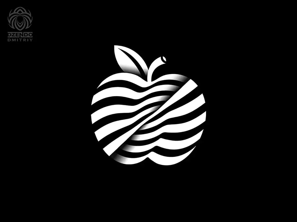
Source: Dmitriy Dzendo, Apple logo, Dribbble, https://dribbble.com/shots/15352695-Apple-logo

Source: VASK®️ Studio, Appleheart, Dribbble, https://dribbble.com/shots/16106122-Appleheart

Source: Jeremiah Britton, Brooklyn Bridge Apple, Dribbble, https://dribbble.com/shots/14445750-Brooklyn-Bridge-Apple

Source: Alex Anderson, Rotten Apple, Dribbble, https://dribbble.com/shots/16298283-Rotten-Apple

Source: Yana Duganova, Forelsket, Dribbble, https://dribbble.com/shots/12341081-Forelsket

Source: Aleisha Samek, Ava Mae’s Apple Orchard, Dribbble, https://dribbble.com/shots/16874884-Ava-Mae-s-Apple-Orchard

Source: Sergey Yakovenko, Apple logo mark, Dribbble, https://dribbble.com/shots/5677316-Apple-logo-mark

Source: Alex Tass, Apple icon logo design symbol digital meets organic, Dribbble, https://dribbble.com/shots/15599102-Apple-icon-logo-design-symbol-digital-meets-organic

Source: Alamgir H., pinapple Logo Design, Dribbble, https://dribbble.com/shots/20419543-pinapple-Logo-Design

Source: aief, apple, Dribbble, https://dribbble.com/shots/13756381-apple

Source: Luke Harrison, Apple Of My Eye II, Dribbble, https://dribbble.com/shots/7192656-Apple-Of-My-Eye-II

Source: Yana Duganova, Forelsket, Dribbble, https://dribbble.com/shots/12341081-Forelsket

Source: Lucas L.w., Behance, https://www.behance.net/gallery/123375269/apple-logo

Source: MT Projectss, Applez, Dribbble, https://dribbble.com/shots/15194460-Applez

Source: Damian Orellana, City Apple, Dribbble, https://dribbble.com/shots/18203194-City-Apple

Source: Stefan Kitanović, Nachash Cider, Dribbble, https://dribbble.com/shots/17095599-Nachash-Cider

Source: Damian Orellana, Temptation, Dribbble, https://dribbble.com/shots/16347783-Temptation

Source: Tory Cunningham, Portland Cider Company, Dribbble, https://dribbble.com/shots/19345237-Portland-Cider-Company
What Are the Key Elements of a Successful Apple Logo Design?
Crafting an apple logo design that's both memorable and effective is a bit like making the perfect apple pie—the ingredients need to be just right! Here are five key elements that can help ensure your apple logo design is as appealing as a freshly picked orchard delight.
Simplicity is the Core
The most successful logos are often the simplest ones. For an apple logo design, the focus should be on creating a clean and recognizable image that can be easily remembered. Think of it this way: if your logo were an apple, you’d want it to be as straightforward and appealing as a crisp, red Gala, not a fruit salad!
Color Matters
Choosing the right color for your apple logo can make a huge difference in how it’s perceived. Apples come in a variety of colors, and each color conveys different emotions and messages. Red suggests energy and passion, green communicates health and freshness, while yellow can evoke a sense of happiness and creativity. Select a color that aligns with the brand’s values and audience preferences.
Flexibility Across Media
A great apple logo design must work well across different media and platforms. Whether it's displayed on a giant billboard, embroidered on a shirt, or featured on a website, the logo should maintain its integrity and continue to be effective. Test your design in various sizes and formats to ensure it’s versatile enough to meet all branding needs.
Uniqueness and Memorability
What makes your apple stand out in a market saturated with fruit? Your apple logo should have a unique twist that makes it memorable. This could be a clever play on the apple shape, an unexpected color combination, or a symbolic element that tells a story. The goal is to make sure that when people see your apple, they think of your brand and not the fruit section at the grocery store.
Symbolism and Connection
An apple can symbolize many things—knowledge, health, temptation, or even innovation (think of the bitten apple of a certain tech giant). Decide what your apple should represent and weave this symbolism naturally into the design. This adds depth to the logo and can forge a stronger connection with your audience.
Incorporating these elements into your apple logo design isn't just about creating a pretty picture; it’s about making a statement that resonates with people on multiple levels. Get these ingredients right, and your logo will be as enticing as the aroma of warm apple pie, drawing people in and leaving a lasting impression. Remember, a successful logo is the one that stays fresh in the minds of your audience.
What Color Schemes Work Best for Apple Logo Designs?
Choosing the right color scheme for your apple logo design can be as crucial as picking the perfect apple for a pie—not just any apple will do! Let’s slice into the color wheel and discover five vibrant schemes that can make your apple logo design truly delicious.
Classic Red and Green
There’s nothing more iconic than the red and green of an apple. This color combination evokes the natural colors of many apple varieties and can signal freshness, vitality, and natural goodness. Red grabs attention with its boldness while green speaks of health and renewal. Together, they're a powerhouse duo for any brand looking to emphasize nature and freshness in their identity.
Sunny Yellow and Warm Brown
Imagine the golden glow of a ripe Golden Delicious apple. Yellow offers a cheerful, energetic vibe, which is perfect for brands wanting to appear accessible and friendly. Pair it with warm brown accents that remind one of tree branches or cinnamon, and you have a color scheme that’s both comforting and inviting.
Elegant Black and Silver
If your brand aims for a more luxurious or sophisticated market, black and silver can convey a sense of sleek modernity and high-end appeal. This palette can make your apple logo look more like a designer label, perfect for tech companies or upscale food products.
Vibrant Pink and White
For a more playful and youthful vibe, why not try a pink and white color scheme? This combination can give your logo a fresh, trendy, and fun feel, appealing especially to younger demographics and modern startups. Pink can be vibrant and energetic, while white adds a clean, minimalistic backdrop that helps the colors pop.
Bold Blue and Gray
Blue is often associated with trust, dependability, and professionalism. By integrating shades of blue with gray, you create a stable and strong color scheme that can work well for corporate brands or businesses aiming to project reliability and strength. This palette is less traditional for an apple but can set a brand apart in industries like technology or finance.
Selecting the right color scheme for your apple logo design isn’t just about aesthetic appeal—it’s about crafting a visual identity that resonates with your brand’s core values and speaks directly to your target audience’s tastes and emotions.
What Are Some Creative Apple Logo Design Ideas?
When it comes to cooking up some fresh apple logo designs, creativity is key! Let's blend some fun and unique ideas into our design kitchen and see what new and exciting concepts we can concoct for that perfect apple logo design.
The Geometric Apple
Who says an apple has to be round? Playing with geometric shapes like hexagons or triangles to form the outline of an apple can result in a striking and memorable logo. This approach is not only modern and sleek but also creates a distinct visual identity that can stand out in a crowded marketplace.
The Hidden Element Apple
Imagine an apple logo where the apple isn’t immediately obvious. Maybe it’s cleverly hidden in the negative space between two elements, or perhaps it's formed by abstract shapes that hint at an apple rather than explicitly showing it. This type of design challenges the viewer, engaging them in a visual puzzle that, once solved, leaves a lasting impression.
The Eco-Friendly Apple
For brands that are all about sustainability, why not reflect this in your apple logo design? Think green leaves, earthy tones, and elements that symbolize growth and nature. You could even incorporate materials into the design that suggest recyclability or organic quality, like a textured background that looks like recycled paper.
The Retro Apple
Dive back into the groovy vibes of the past with a retro-styled apple logo. Use bold, vibrant colors and vintage fonts to evoke nostalgia. A retro logo can be particularly effective for brands looking to connect with audiences through a sense of heritage and timelessness or those looking to stand out with a distinctly old-school cool.
The Artistic Apple
Turn your apple into a piece of art. This could involve watercolor brush strokes, ink splatters, or even a graffiti style. An artistic apple logo can convey creativity and uniqueness, appealing to an audience that values art and innovation. It’s a great way to show that your brand thinks outside the conventional and is unafraid to express itself.
These creative apple logo design ideas are just the start—your brand's vision, mission, and values should always play a key role in shaping the final design. So whether you opt for a minimalist approach or something bold and intricate, make sure your apple logo is ripe with purpose and personality!
What Shapes Complement an Apple Logo Design?
Creating an apple logo design that's truly a-peel-ing might start with a simple apple shape, but combining it with other geometric or organic forms can turn a basic concept into a brilliant brand identity. Here are five shapes that can complement your apple logo design, adding layers of meaning and visual interest to make your brand shine.
Circle
The circle is a natural companion to the apple shape, echoing its curves and continuity. It can symbolize wholeness and community, reinforcing the friendly and inclusive qualities of a brand. Circles can be used subtly around the apple or as part of the background, creating a sense of unity and protection, wrapping the apple in a warm embrace.
Leaf Shapes
Integrating leaf shapes into your apple logo can enhance its natural look and emphasize eco-friendly values. Leaves can be stylized or realistic, added to the apple stem or used in the lettering of the logo. This not only strengthens the association with nature but also adds a dynamic and organic touch to the design.
Squares and Rectangles
For a more structured and stable look, incorporating squares or rectangles can ground your apple logo design. These shapes suggest reliability and professionalism, making them ideal for brands in the education, technology, or health sectors. They can frame the apple or be used in a patterned background to contrast the organic shape of the apple.
Spirals
Spirals can add a whimsical and dynamic element to your apple logo design. They represent growth, creativity, and the idea of continuous development. A spiral could swirl out from the apple, suggesting innovation and expansion, which is perfect for startups and tech companies looking to convey a sense of forward-thinking and evolution.
Arrows
Using arrows in conjunction with an apple shape can imply movement, direction, and ambition. They can point upwards to signify growth and success or surround the apple to indicate comprehensive service or coverage. Arrows add a modern, energetic feel to the logo, aligning well with brands that aim to convey progress and action.
Mixing these shapes with your apple logo not only enhances the visual appeal but also allows you to communicate more about your brand's story and values through design. The best logos are those that capture both the essence of what you offer and the hearts of those you serve. So, choose shapes that resonate with your brand identity and watch your apple logo grow from concept to iconic symbol!
What Fonts Pair Well with an Apple Logo Design?
Pairing the perfect font with your apple logo design is like finding the right type of apple for your pie—it can make all the difference in the world! The font you choose can amplify the message of your logo and reinforce the brand identity you want to portray. Here are five fabulous fonts that are sure to complement your apple logo design, adding a dash of style and personality.
Helvetica
This classic sans-serif font is a designer’s go-to for a reason. With its clean, crisp lines and modern feel, Helvetica pairs beautifully with a simple apple logo design, enhancing its readability and versatility. It’s a fantastic choice for brands looking to communicate reliability, professionalism, and modernity.
Garamond
If your apple logo leans towards the traditional or vintage, Garamond might be the font for you. This elegant serif font exudes sophistication and can give your logo a timeless look. It's particularly suitable for brands that want to convey heritage, quality, and a classic aesthetic.
Futura
Bold and beautiful, Futura is another sans-serif font that works well with apple logos designed to make a strong, forward-thinking impression. Its geometric shapes and clean lines mirror the simplicity of an apple, making it a great match for tech companies or innovative food brands.
Brush Script
For those who want a more relaxed and approachable look, Brush Script offers a casual and friendly vibe with its hand-drawn appearance. This font pairs well with apple logo designs that are playful and whimsical, ideal for businesses in the education, children’s products, or organic food sectors.
Baskerville
Sophisticated yet understated, Baskerville is a serif font that offers a bit of old-world charm without looking dated. It’s a fantastic choice for apple logos that aim to strike a balance between modern and classic, providing readability and elegance in equal measure. This font works well for companies in the publishing, academic, or luxury goods industries.
Choosing the right font for your apple logo design not only enhances the overall aesthetics but also ensures that the logo communicates effectively with your target audience. Whether you go for something bold and modern or elegant and timeless, the right typography will help your apple logo bloom into a brand identity that's as tasty and appealing as the fruit itself!
Conclusion
In the vast orchard of brand identities, an apple logo design stands out for its potential to combine simplicity with profound meaning. Whether you opt for a minimalist approach or incorporate intricate elements, the key is to create a logo that resonates with your audience and remains adaptable across various applications. Embracing the right colors, shapes, and fonts can transform a simple apple into a powerful symbol of your brand's core values and vision. As you craft your apple logo design, remember that the best logos are those that capture the essence of the brand in a way that is both timeless and appealing.
Let Us Know What You Think!
Every information you read here are written and curated by Kreafolk's team, carefully pieced together with our creative community in mind. Did you enjoy our contents? Leave a comment below and share your thoughts. Cheers to more creative articles and inspirations!


Leave a Comment