
Complete Guide: Create A Successful Logo Design

Source: Felix Baky, ParkWise Logo Deign & Brand Identity, Behance, https://www.behance.net/gallery/214883707/ParkWise-Logo-design-Brand-Identity
A successful logo design helps a business build recognition, trust, and a clear visual identity. Customers often form impressions within seconds, so a logo needs to communicate the right personality and level of professionalism without feeling confusing or overcomplicated. Color, typography, symbols, and composition should work together to make the brand easier to recognize and remember.
Creating an effective logo takes more than creativity alone. Designers need to understand the brand, its audience, and the message it wants to communicate before developing visual concepts. Simplicity, originality, versatility, and consistency all play an important role because a logo must perform across websites, packaging, social media, signage, and printed materials. The following principles can help you create a logo that is distinctive, practical, and strong enough to support a brand for years.
Understand the Brand Identity
Every successful logo design starts with a clear understanding of the brand. A logo should visually reflect the company's personality, values, products or services, positioning, and target audience. Before sketching concepts, designers should learn what the business stands for, what makes it different from competitors, and what impression it wants customers to remember.
Understanding the audience is just as important. A playful consumer brand may benefit from energetic colors and approachable typography, while a premium company may need a more refined and understated visual language. The goal is not simply to decorate the brand, but to translate its character into a recognizable visual mark. Good research also reveals common visual conventions within an industry, helping designers decide when to follow familiar cues and when meaningful differentiation would be more effective.
Keep the Design Simple
Simplicity is one of the strongest foundations of an effective logo. Clean designs are generally easier to recognize, remember, reproduce, and scale. When a logo contains too many details, effects, colors, or competing elements, it can quickly become difficult to understand and may lose clarity when displayed at smaller sizes.
Simple does not have to mean generic. A strong logo reduces an idea to the elements that matter most while still preserving personality and distinction. Designers should remove anything that does not support the concept or brand message. This makes the logo more versatile and helps it remain visually effective across both digital and printed applications. A useful test is to view the logo briefly and ask whether its main idea can still be understood without additional explanation.
Choose Colors Carefully
Color has a strong influence on how people perceive a brand, so the palette should support the intended personality and message. Blue can suggest trust, stability, or professionalism, while red may communicate energy, confidence, or urgency. These associations can be useful, but context matters more than relying on color psychology alone. Industry conventions, audience expectations, cultural associations, and competitor colors should also be considered.
A limited palette is usually easier to manage and recognize than a complicated combination of colors. Designers should also test the logo in black and white to make sure the concept remains effective without color. A strong palette should support the identity without becoming the only reason the logo is recognizable. It is also important to check contrast on both light and dark backgrounds so the colors remain practical in everyday brand applications.

Source: Simonas Kotovas, Arctrade Logotype, Dribble, https://dribbble.com/shots/23181718-Arctrade-logotype
Select Readable Typography
Typography can communicate a brand's personality almost immediately. Sans-serif typefaces often feel modern, clean, and direct, while serif styles can appear more established, elegant, or traditional. Whatever direction you choose, the typeface should reflect the character of the brand rather than being selected simply because it is fashionable.
Readability should always remain a priority. Decorative lettering may look impressive at a large size but become difficult to understand on a small screen, business card, or product label. Designers should test letter spacing, weight, alignment, and scale in realistic situations. If custom lettering is used, it should still be easy to read at a glance and visually balanced with any accompanying symbol or icon.
Create a Memorable Concept
A memorable logo is usually built around a clear idea rather than decoration. Meaningful symbolism, distinctive shapes, clever use of negative space, or an unexpected visual relationship can give customers something specific to remember. The strongest concepts connect directly to the brand instead of relying on visual tricks that have little strategic purpose.
Originality is important, but it should never make the logo unnecessarily difficult to understand. Designers should avoid copying competitors or depending too heavily on familiar visual formulas. A simple concept with one distinctive feature is often more memorable than a complicated design trying to communicate several ideas at the same time. The aim is to create something recognizable, relevant, and easy to associate with the brand.
Focus on Versatility
A logo must work in many environments, not only in the presentation where it was originally designed. It should remain clear on websites, social media profiles, packaging, uniforms, stationery, advertisements, and large-scale signage. Testing the logo at different sizes and against different backgrounds helps reveal problems with detail, contrast, spacing, and legibility before the design is finalized.
A practical logo system may include horizontal, stacked, icon-only, and monochrome versions. These variations should feel like parts of the same identity rather than separate designs. A versatile system gives the brand flexibility while maintaining recognition wherever the logo appears. Providing suitable vector and raster file formats also helps teams use the identity correctly without stretching, blurring, or recreating the artwork unnecessarily.
Avoid Short-Lived Design Trends
Design trends can provide useful inspiration, but building a logo around a temporary visual effect can shorten its useful life. Popular gradients, decorative treatments, type styles, or graphic effects may feel fresh today but quickly become dated as visual preferences change. Most businesses need a logo that can remain recognizable and relevant for years rather than one that reflects only a specific moment in design culture.
Timelessness comes from a strong concept, balanced proportions, and thoughtful visual choices rather than from avoiding every modern influence. Designers can still use contemporary ideas where they support the brand, but those choices should never overpower the underlying concept. The brand's identity should remain stronger than the style of the moment.

Source: Ana Couto, Natura & Co - Marca Corporative, Behance, https://www.behance.net/gallery/214975975/Natura-Co-Marca-Corporativa
Use Balanced Composition
Balanced composition makes a logo feel intentional, polished, and easier to process visually. Typography, symbols, spacing, and proportions should support one another rather than compete for attention. Uneven alignment, awkward proportions, or cramped spacing can make even a promising concept feel unfinished.
Designers should evaluate negative space, visual weight, symmetry or intentional asymmetry, and the relationship between the symbol and wordmark. Small adjustments can make a noticeable difference to the overall clarity of the design. Testing the logo at multiple sizes is especially useful because proportion problems that seem minor on a large artboard may become much more obvious in real-world applications.
Gather Feedback and Revise
Feedback can help designers identify issues that are difficult to notice after working closely on the same concept for a long period. Clients, team members, or representative users may reveal confusion about readability, symbolism, tone, or brand relevance. The most useful feedback explains what feels unclear or ineffective rather than simply expressing a personal preference.
Revisions should strengthen the concept instead of changing direction after every comment. Designers can refine typography, spacing, color, proportions, or composition while protecting the core idea. A successful logo design is rarely fully resolved in the first draft. Thoughtful iteration allows promising concepts to become more polished, practical, and aligned with the brand's goals.
Ensure Long-Term Brand Consistency
Once the logo is finalized, consistent use helps build recognition and familiarity. Colors, proportions, spacing, and approved variations should remain consistent across websites, social media, packaging, advertising, stationery, and other customer touchpoints. Frequent or unnecessary changes can weaken recognition and make the brand appear less organized.
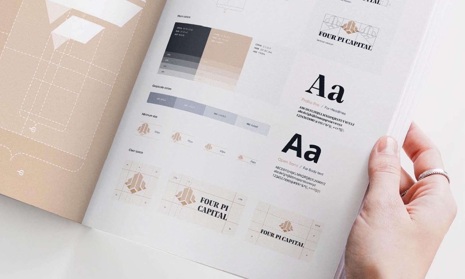
Clear brand guidelines can help prevent those problems. They may define approved logo versions, clear-space requirements, minimum sizes, color values, acceptable backgrounds, and incorrect uses. Consistency does not mean using exactly the same logo file in every situation. Instead, it means applying the same visual identity rules across appropriate formats. This gives internal teams, vendors, and partners clear guidance while reducing accidental changes to the brand.
Frequently Asked Questions
What Makes a Logo Design Successful?
A successful logo is distinctive, relevant to the brand, easy to recognize, and practical across different applications. It should communicate the right personality without relying on unnecessary detail. Strong logos also remain legible at different sizes and support a consistent visual identity as the brand grows.
How Many Colors Should a Logo Use?
There is no fixed number of colors that every logo should use, but many effective designs rely on a limited palette because fewer colors are easier to reproduce and manage consistently. The priority is choosing colors that support the brand and remain clear in real applications. The logo should also work well in monochrome when full color is unavailable.
Should a Logo Follow Current Design Trends?
Design trends can influence the visual direction, but they should not control the entire concept. A logo built mainly around a short-lived style may age quickly. It is generally better to prioritize brand relevance, simplicity, and strong proportions, then use current aesthetics only when they genuinely strengthen the identity.
How Do You Know When a Logo Is Finished?
A logo is ready when the concept clearly reflects the brand, remains readable and recognizable at different sizes, works in the required formats, and has been tested in realistic applications. Feedback should no longer reveal major communication problems, and final refinements should focus on consistency rather than introducing entirely new ideas.
Conclusion
Creating a successful logo design requires strategy as much as creative skill. Strong results begin with understanding the brand and its audience, then develop through simple concepts, suitable typography, purposeful color, balanced composition, and careful testing. Versatility and consistency are equally important because a logo needs to perform across many formats for years. Designers should refine their work through useful feedback rather than chasing trends or adding unnecessary detail. When every visual choice supports the brand and the final mark remains clear, memorable, and adaptable, the logo can become a lasting part of the company's identity.
Let Us Know What You Think!
Every information you read here are written and curated by Kreafolk's team, carefully pieced together with our creative community in mind. Did you enjoy our contents? Leave a comment below and share your thoughts. Cheers to more creative articles and inspirations!
Related Articles










Leave a Comment