Create A Successful Logo Design in 5 Minutes

Sources: Plus X, URG Corporate Identity Development, Behance, https://www.behance.net/gallery/145117097/URG-Corporate-Identity-Development
Designing a successful logo in just five minutes may sound daunting, but with the right approach and tools, it's entirely possible. A logo is more than just a small piece of art; it's the foundational face of your brand that communicates your business identity to the world. The key to crafting a successful logo design quickly is to focus on the essentials: simplicity, relevance, and memorability. Whether you're a startup founder looking to launch your brand or a seasoned marketer refreshing an existing logo, the principles of effective logo design remain the same.
This article will guide you through the steps to create a logo that not only looks professional but also captures the essence of your brand and stands out in a competitive marketplace. By following these streamlined tips, you’ll be able to develop a visually appealing and impactful logo that resonates with your target audience and strengthens your brand's identity. Let’s dive into how you can achieve a successful logo design swiftly and effectively.
Understand Your Brand Brief
Achieving a successful logo design starts with a thorough understanding of your brand brief. This initial step is crucial as it lays the foundation for a logo that truly represents your brand’s identity and appeals to your target audience. Begin by defining your brand’s mission, values, and objectives. What does your brand stand for? What unique qualities do you want to highlight through your logo? Knowing these elements helps tailor a design that resonates with your audience effectively.
Next, identify your primary audience. Who are your customers? Understanding their preferences, age, demographics, and psychographics allows you to design a logo that speaks directly to them. A successful logo design connects on an emotional level with its viewers, making the brand memorable and relatable.
Also, consider your brand’s personality. Is it formal or casual? Innovative or traditional? The personality should reflect in the typography, colors, and style of your logo, ensuring consistency across all marketing materials.
Lastly, study your competitors. What are their logo designs? A distinctive logo can help you stand out in a crowded marketplace. Analyzing competitors can also inspire you to think differently and innovate within your niche.
Choose A Simple Concept
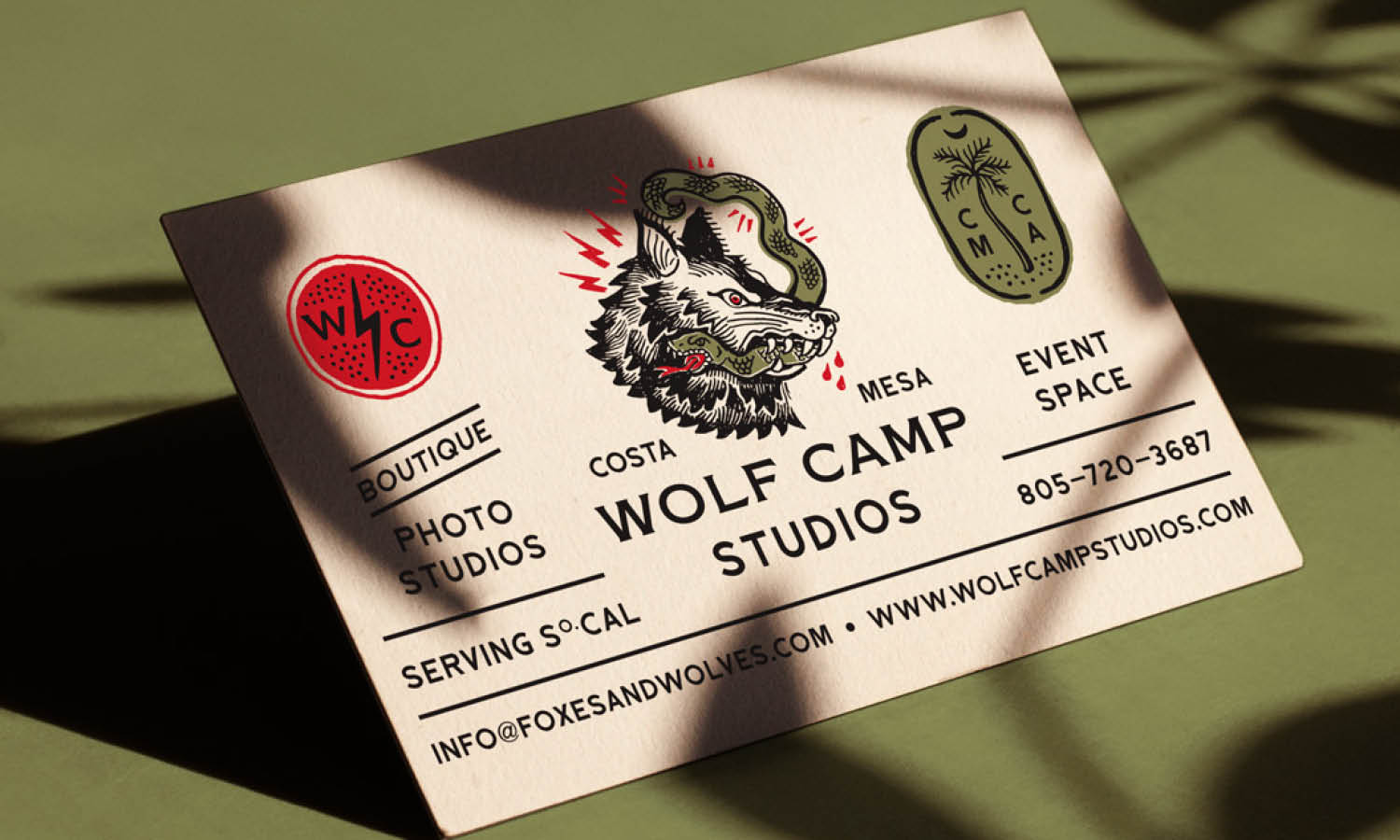
When it comes to successful logo design, simplicity often trumps complexity. A simple logo design ensures that your brand is easily recognizable and memorable. Simplicity in logo design doesn’t mean mundane; it means focusing on the essential elements and doing away with unnecessary ones. This approach allows your logo to be versatile across various platforms and sizes.
Start by focusing on a single core idea or symbol that encapsulates your brand’s essence. Whether it’s a shape, letter, or an abstract form, this core element should convey your brand’s identity clearly and concisely. Avoid the temptation to incorporate multiple ideas that can make the logo feel cluttered or diluted.
The color scheme should also be simple, using minimal colors to maintain clarity and impact. Each color chosen should have a purpose, contributing to the overall message and emotions you wish to evoke in your audience. Typography is another critical aspect where simplicity plays a key role. Select one or two fonts that reflect your brand’s character while ensuring legibility across all media. Overly decorative fonts can detract from the logo’s readability and impact.
Focus On Versatility
A successful logo design must be versatile to effectively represent the brand across various mediums and applications. Versatility means that the logo performs well whether it’s on digital platforms, print media, merchandise, or large-scale advertising. Start by ensuring that your logo is scalable. It should maintain its impact and legibility when scaled down to fit on a business card or scaled up for a billboard.
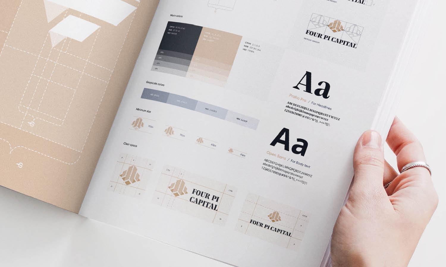
Use a simple, clean design that can be easily understood and recognized in different contexts. This can be achieved by avoiding overly intricate details that might blur or become unrecognizable at smaller sizes. Consider the adaptability of your logo in monochrome as well as in color. This is crucial for instances where full-color printing isn’t feasible, ensuring that the logo remains effective even in single-color representations.
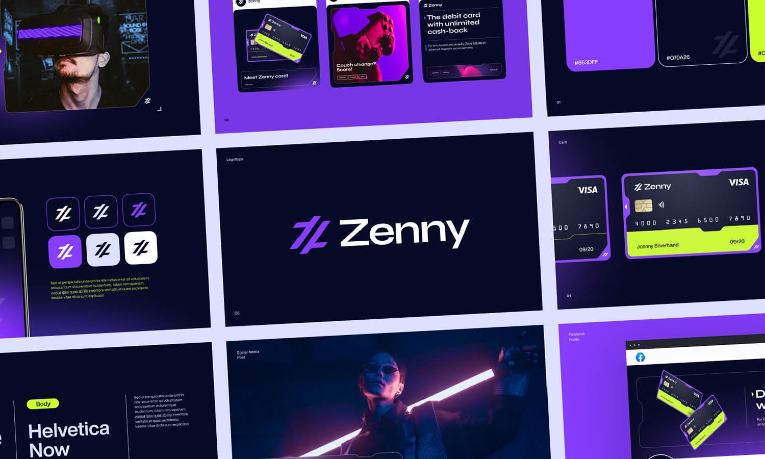
Additionally, think about how the logo will look in various formats. A successful logo design should be easy to adapt into horizontal or vertical layouts and suitable for both light and dark backgrounds. This flexibility enhances the logo’s usability across diverse platforms without compromising its visual integrity.
Incorporate Symbolism Smartly
Integrating symbolism into your logo can transform a simple design into a powerful communicator of your brand's values and story. Symbolism in logo design involves the use of images, shapes, and colors that represent deeper meanings, conveying messages at a glance. This can significantly enhance the effectiveness of your successful logo design.
When selecting symbols, it's crucial to deeply understand the brand’s ethos and the perceptions of your target audience. Symbols should resonate on a cultural and emotional level, reflecting the brand’s identity and aspirations. For instance, a tree might symbolize growth and stability, which could be ideal for financial or environmental organizations.
Shapes are equally important; each shape carries its own psychological impact. Circles suggest community and unity, squares represent stability and balance, and triangles can indicate movement or direction, depending on their orientation.
To smartly incorporate symbolism, designers should aim for simplicity and clarity. The symbol should be easily recognizable and avoid clichés to stand out in the market. By thoughtfully merging symbolism into your logo design, you not only enhance visual appeal but also strengthen brand identity and connection with your audience, making your logo memorable and meaningful.

Source: Incade Design, Marquee | Hotel, Behance, https://www.behance.net/gallery/141036091/Marquee-Hotel
Pick A Strong Color Palette
Selecting the right color palette is vital in creating a successful logo design. Colors have the power to convey emotions and set the tone of your brand. Each color has specific psychological impacts and cultural associations that can influence customer perception.
To choose an effective color palette, start by considering the brand’s personality and the message you want to communicate. Bold colors like red and orange can evoke excitement and passion, while blues and greens are often associated with tranquility and trust. A strong color palette is concise; typically one to three primary colors suffice to create a memorable and cohesive look.
It’s also important to ensure that your chosen colors stand out against competitors and catch the viewer’s attention. Check the common color schemes within your industry and try to differentiate your brand without straying too far from customer expectations.
Moreover, consider the functionality of your color choices. They should work well in various applications, from digital media to print. This includes testing how the colors look in both full color and greyscale. Ensuring that your logo is recognizable and effective in black and white is crucial for situations where color printing is not an option.
Incorporate Visual Balance
Incorporating visual balance is essential in crafting a successful logo design. Balance ensures that the logo is aesthetically pleasing and conveys stability and harmony. There are several types of balance to consider: symmetrical, asymmetrical, and radial. Symmetrical balance is achieved when elements are mirrored on either side of a central line, promoting a sense of formality and order. Asymmetrical balance uses different elements that have equal visual weight on either side, offering a more dynamic and modern feel. Radial balance involves elements radiating from a central point, which can create a strong focal area.
To achieve visual balance, start by arranging the components of your logo so that they feel stable and anchored. Consider the weight of each element, including colors, shapes, and typography. Elements should be distributed so that they do not make the logo feel lopsided or visually uncomfortable.
Use alignment to enhance the structured look of your logo. Proper alignment of text and imagery prevents the design from appearing chaotic and helps in maintaining the viewer’s focus. Additionally, the proportion of elements should be managed carefully. The size of each component should complement each other rather than overpower.
Avoid Clutter
Creating a successful logo design involves making sure that the design is clear and uncluttered. Clutter can dilute a brand's message and make the logo difficult to recognize and remember. To avoid clutter, focus on the essential elements that represent the brand effectively. Start by defining the core aspects of your brand’s identity and ensure that each element in the logo serves a purpose.
Limit the number of colors, fonts, and shapes used in the logo. A common mistake is trying to incorporate too many ideas or design elements at once. This not only confuses the audience but can also detract from the logo’s functionality, particularly in small sizes or when viewed from a distance.
Keep typography clean and straightforward. Choose a single font or two complementary fonts at most. Overly decorative or multiple fonts can make the text hard to read and the overall design appear busy. Simplicity is key in logo design. Evaluate each component and ask whether it adds real value to the logo. Use negative space effectively to create breathing room around elements, enhancing overall readability and impact.
A clean and simple logo not only looks more professional but is also easier to apply across various media. It reproduces well, whether on a digital screen, printed material, or merchandise. By avoiding clutter in your logo design, you ensure that your brand is communicated clearly and memorably, resonating with your target audience efficiently.
Utilize Negative Space
One effective technique in creating a successful logo design is the strategic use of negative space. Negative space, often overlooked, plays a critical role in logo design by forming shapes that capture attention and enhance memorability. For instance, the famous FedEx logo uses negative space between the ‘E’ and ‘x’ to create an arrow, symbolizing speed and precision. This subtle yet powerful use of negative space can significantly add to the narrative of your brand.
When designing a logo, consider how the background space can interact with your design elements to form meaningful patterns or symbols. This approach not only makes your logo aesthetically pleasing but also embeds a deeper meaning, enhancing brand storytelling. By incorporating negative space effectively, your logo can communicate more with less, making it easy for consumers to recognize and remember your brand.
To master this technique, start by sketching simple shapes and observe the spaces between them. Experiment with different configurations to see how negative spaces can complement your design. Remember, a successful logo design using negative space should be simple yet evocative, capable of conveying the brand’s essence at a glance. This minimalist strategy can elevate your logo from ordinary to iconic, ensuring it makes a lasting impression in the minds of your audience.

Source: Meteora Agency, Artmodul Branding, Behance, https://www.behance.net/gallery/124227715/Artmodul-Branding
Use the Right Tools
Selecting the right tools is essential for crafting a successful logo design. In today’s digital age, a plethora of design software is available, ranging from vector-based applications like Adobe Illustrator to web-based tools like Canva. Each tool offers unique features that can enhance your logo design process.
Vector graphics software, such as Adobe Illustrator, is the industry standard for logo design. Vector tools allow designers to create scalable logos that maintain their clarity and quality at any size, which is crucial for logos that appear on everything from business cards to billboards. These programs offer advanced features like path editing and color management, which are vital for creating precise and flexible logo designs.
Alternatively, simpler tools like Canva provide templates and user-friendly interfaces that are ideal for beginners or those needing to create a logo quickly. While these tools may lack the advanced customization capabilities of professional software, they are sufficient for designing simple, effective logos without a steep learning curve.
Prepare for Future Modifications
A successful logo design is not only timeless but also adaptable to future branding needs. As markets evolve and brands grow, your logo may require updates to stay relevant and effective. Preparing for these modifications from the beginning can save time and maintain brand consistency over the years.
When designing a logo, consider using a modular approach, where different elements of the logo can be updated or rearranged without losing the overall identity of the brand. For example, a logo may include an emblem that can be used independently of the brand name or vice versa.
It’s also crucial to keep original design files and document the design choices made, such as color codes and typography details. This documentation will be invaluable for any designer who works on the brand in the future, ensuring they can make adjustments without diluting the brand's core elements.
Additionally, consider how your logo will appear across various media and technological platforms. A successful logo design must be versatile enough to adapt to different backgrounds, sizes, and formats. Ensuring your logo is designed in a vector format will facilitate these changes, allowing the logo to be resized or modified without loss of quality.
Conclusion
Creating a successful logo design is a strategic blend of creativity, precision, and understanding of branding. Each step from conceptualization to the final design plays a pivotal role in how effectively the logo communicates the brand’s core values and appeals to the target audience. Remember, a great logo is more than just a beautiful image; it’s a critical component of your brand’s identity. By focusing on simplicity, adaptability, and meaningful symbolism, and utilizing the right tools, you can develop a logo that not only looks professional but also has a lasting impact in the marketplace.
Let Us Know What You Think!
Every information you read here are written and curated by Kreafolk's team, carefully pieced together with our creative community in mind. Did you enjoy our contents? Leave a comment below and share your thoughts. Cheers to more creative articles and inspirations!


Leave a Comment