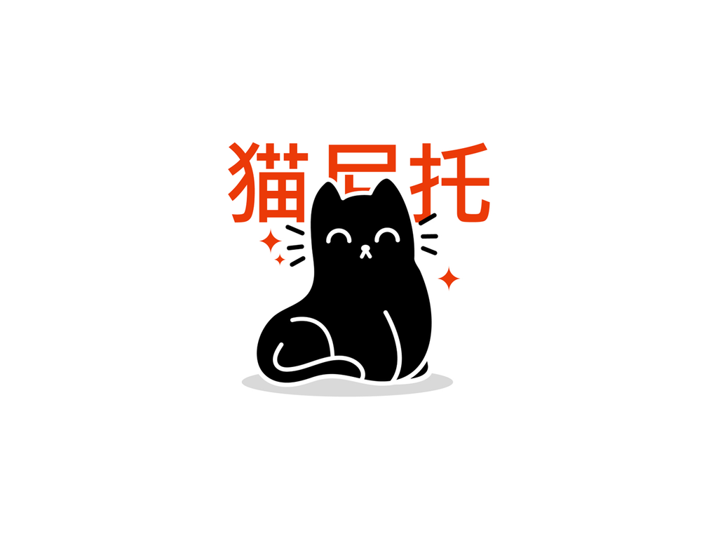
10 Tips To Create A Good Cat Logo Design

Created by Damian Orellana | https://dribbble.com/shots/18311244-Bodega-Cat-Badge-pt-I
Cats have been our cute, elegant, and intriguing companions for us for a long time. These fascinating creatures have a special place in our culture. So much so that the internet is flooded with cat images. Thus, it is hardly surprising if their form or likeness has been used in many artworks and designs.
The feline form is beautiful and certainly worth noticing. Most importantly, they are familiar to us, which makes them ideal for artworks and designs. Of course, these include branding. Many businesses have been using cat images to communicate comfort, agility, luxury, and even security.

Created by Brethren Design Co | https://dribbble.com/shots/18268467-Umami-Flavor-Co-Branding-02
Note that the use of the feline form is not limited only to cat-related businesses like pet shops, veterinary clinics, or animal hospitals. It can be used in any industry. This comes as no surprise, as cats are beautiful creatures that everybody loves.
As we are familiar with their form, we can easily recognize them in abstract logos, even if it is just a single cat’s eye or the curve of a cat’s tail. That shows how familiar the form is to us. Cats are basically universal symbols that we all can recognize instantly.
Considering a cat logo design for your brand? You’ve come to the right place. For a brand, a logo is really important. It is one of a brand’s graphics representations. It is what the people see and creates the first impression about the brand. This is why you want to create a good logo for your brand.

Created by Lucian Radu | https://dribbble.com/shots/17350554-Geometric-Cat-Logo
Here’s the problem: creating a good logo is not as easy as it sounds. It takes time, energy, and resources. No worries. We are here to help. To make the logo creation process easier for you, we have collected ten tips that will help you create a good cat logo design.
10 Tips To Create A Good Cat Logo Design
- Understand Your Audience
- Know Your Brand and Values
- Check Your Biggest Competition
- Choose a Fitting Design Style
- Choose a Representing Color Scheme
- Use Fonts To Add Extra Personality
- Create Your Own Cat Elements
- Remember, Less Is More
- Show Your Diversity
- Listen, Revise & Finalize

Created by Logorilla | https://dribbble.com/shots/18216851-mysticat
1. Understand Your Audience
A good logo design starts with understanding your audience. Why is understanding your audience so important?
A good logo design connects with the audience. Through the logo, a brand communicates messages to and evokes emotions from its audience. A brand cannot accomplish this without understanding its target audience first.

Created by Alexandra Erkaeva | https://dribbble.com/shots/10880951-Cat-s-Gallery
If you start right away and don’t take your audience into account, the logo is unlikely to be effective. If you fail to understand your audience, it may result in your audience not connecting with the logo. Or worse, they don’t receive the message you want to deliver through the logo. Of course, neither is ideal.
So, before you put the feline form in your brand’s graphics representation, you should focus on getting to know your audience. Conduct market research, check out your competition, and interview customers if you already have them.
These will allow you to gain insight into your audience’s thought processes as well as whether they will or will not buy from you.

Created by VASK®️ Studio | https://dribbble.com/shots/15700247-curiouscat
2. Know Your Brand and Values
Besides understanding your audience, you should also know your brand and values. Customers nowadays care about not just the value but also the authenticity of the brands they purchase from.
About 86% of customers report that they take authenticity into account when deciding which businesses to support. Here’s the good news: a logo provides you with the opportunity to show your values and authenticities.

Created by Logorilla | https://dribbble.com/shots/16142669-chat-cat
Through a logo, you can show your audience the most important aspects of your company. When you incorporate your values, you will gain the following benefits:
- Allowing your customers to know what matters the most to your company
- Helping your customers to know what they support when they purchase from your company
- Gaining the attention of customers who share and support similar values
Failing to let your customers know about your values can hurt your brand. You might even lose customers. That’s how important it is. When you know your brand and values, you can effectively incorporate your values into the cat logo design.
Make sure to articulate your values clearly within your company. You can conduct market research so you can articulate your values to your target demographic more effectively.

Created by Alexandra Erkaeva | https://dribbble.com/shots/18108665-Mr-Meow
3. Check Your Biggest Competition
While your company’s cat logo design must be unique, you don’t need to reinvent the wheel. Copying other designers’ ideas is a no-no. But there’s no harm in finding inspiration from them. This includes your competition.
If you don’t know where to start on your logo creation process, just check out your competition. Your competition has a similar, if not the same, target demography as you. When you check out your competition, you can learn what works well with your target audience.

Created by Alexandra Erkaeva | https://dribbble.com/shots/15546415-Catbob
You can also learn what to avoid and what makes your competition different from you. After that, you can emphasize the differences you found in your brand logo design. This will help you create a logo that stands out from the crowd.
Logo designs that incorporate the feline form are common, regardless of the industry you’re in. You probably find a lot of cat logo design ideas. Be sure to set your brand logo design apart.
For example, if many of your competitors are using traditional logo design styles, you can opt for a more modern and exciting one. Likewise, if they use monochrome color schemes, opt for more colorful ones. And so on.

Created by Andrii Kovalchuk | https://dribbble.com/shots/14563164-Cat-And-Moving
4. Choose a Fitting Design Style
You need to choose a design style. Not just any design style, however. If you want to create a good logo design, you should choose a fitting design style for your brand. Note that there is no one-size-fits-all design style that is right for every brand. There is only one that is right for your brand.
- Classic: A classic style refers to the style that keeps things simple and doesn’t involve unusual color palettes, fonts, or graphics. It tells the audience that the brand is down-to-earth and reliable.
- Vintage: The vintage design often features hand-illustrated and worn elements in beige and brown colors, which evoke feelings of nostalgia.
- Modern and minimalist: The modern and minimalist style fits brands who want to tell their customers that they are up-to-date, modern, and know what counts. The design incorporates simple lines, minimal lines, and plenty of whitespaces.
- Fun and quirky: Going out of the box is not a bad idea. The fun and quirky styles tend to use cute and colorful elements, giving off a friendly and positive vibe.
- Handcrafted: The handcrafted design style conveys a clear message: the brand is individualistic and unique. None other is like it.

Created by Jaysx1 | https://dribbble.com/shots/15033838-Preview-01
5. Choose a Representing Color Scheme
When you create a cat logo design, you should start in black and white. That’s not to say colors are not important, however. When you start designing in black and white, you will be focused on the design elements. After you have the elements figured out, choose a fitting color scheme for the design.
Note that different colors have different meanings. If you decide to use colors in your brand’s graphics representation, you should think about what each color means. For example:
- Red: The color red is often associated with passion. So, it is the perfect choice for a brand that is passionate, youthful, and wants to stand out.
- Orange: Orange is less intense than red, but it is just as energetic. It is a vibrant and playful color.
- Yellow: Cat logo design ideas that use yellow appear friendly and more accessible. Yellow gives off a cheerful and youthful vibe.
- Blue: Blue is cool and calming. It is also associated with trustworthiness, reliability, and maturity.
- Green: Green is a very versatile color. The color can work for just about any brand in any industry.
- Black: Black is a simple yet modern, sleek, and luxurious color.

Created by Omega-Pixel | https://dribbble.com/shots/17000375-The-cat-coder
6. Use Fonts To Add Extra Personality
If you decide to use text in your logo, be sure to try different fonts and typographies. Don’t pick the first font that you see because you think it is interesting. Rather, try some fonts before deciding which one to use.
Why? Because a font completes a logo. It can depict the personality as well as the professionalism of the brand. Thus, it is a very important consideration to keep in mind. Picking the right font will:
- Make your message a lot clearer
- Further reflect your brand’s personality, values, and story
- Complement the image, if your logo is a combination mark that uses both text and an image
Here are four basic font types to give you an idea.
- Serif fonts: Serif fonts are a classic option. These fonts make a logo look high-end and timeless. They are also quite versatile.
- Sans-serif fonts: Sans-serif fonts are the ideal choice to give a clean, modern look. They are sleek and simple.
- Script fonts: The handwriting-like qualities of script fonts make them very unique. They can be down-to-earth and elegant.
- Display fonts: These fonts are highly stylized and decorative, the perfect choice to grab the audience’s attention.

Created by Milos Djuric | https://dribbble.com/shots/10409244-Black-Magic
7. Create Your Own Cat Elements
If you’re using text in your cat logo design, the next thing to consider is the casing. You need to decide whether to use uppercase or lowercase. Like the font, you should try them. There is no one-size-fits-all solution here. Some logos look better in uppercase, some in lowercase, and some combine both.
If you want to give a more authoritative feel, using uppercase will be the better option. Uppercase is great for communicating strength and professionalism. If, on the other hand, you want your brand to appear more approachable and friendlier, using lowercase will be ideal as it gives off a laid-back and casual vibe.

Created by Hamza | https://dribbble.com/shots/15408884-Meow-Catwalk
The right casing will capture your brand’s personality. Not only that, but it will also show customers what they can expect from your brand and further tell your brand’s story. If you fail to pick the right casing, your audience might not respond to your logo. Worse yet, they might respond to it negatively.
So, do take your time and experiment with the casing. If possible, run some testing and get a third-party opinion, preferably from your target audience or customers. See how they react to the chosen casing.

Created by Logorilla | https://dribbble.com/shots/11948549-flying-cat-approved-design
8. Listen, Revise & Finalize
As uncomfortable as it sounds, revisions are your friend. Whether you create your own logo design or work with a professional graphic designer, there will be revisions. That’s not a bad thing, really. Good logos don’t happen by accident. They are carefully designed. Revisions are a part of the process.
Before deciding to use a logo, make sure that it reflects your brand accurately and that your customers will respond to it positively. To achieve this, prepare yourself to conduct as many revisions as needed.

Created by Farhad Ghanemi | https://dribbble.com/shots/16431906-CatWise-Logo
Through revisions, you can fine-tune a rough, initial design idea into a refined design that truly and accurately reflects your brand.
The benefits of conducting revisions include:
- Being able to create a logo that represents the brand accurately, being able to experiment with different design elements
- Being able to work directly with your target audience, and allowing you to see what logo type they respond to best
Be prepared to conduct revisions. Running some testing can help to fine-tune the details further. Creating a logo can be a long process. But when done right, you will be rewarded handsomely. You can think of it as a long-term investment for your brand.

Created by merci | https://dribbble.com/shots/19028957-Fat-Cat-CBD
9. Remember, Less Is More
When it comes to designing a logo, your mindset should be looking for what you can take away rather than add to your design. Remember, less is more. That doesn’t mean you can’t add interesting details or unique personal touches, however.
Loud and maximalist logos do have their time to shine. But it is difficult to go wrong with a clean and simple design. The fewer elements a design has, the better. Fewer elements mean there are few elements to compete for the audience’s audiences.

Created by Tamara Radke | https://dribbble.com/shots/16467932-Domsy
With a “less is more” mindset, you can make the elements that your logo does have count. Having fewer elements means your logo is simpler and easier for the audience to not just recognize but also memorize.
You want to make it easy for your audience to recognize and memorize your brand. In short, keep it simple. A simpler design is easier to absorb, after all. The simpler it is, the easier to communicate a message. Conversely, a more complex design is more difficult to absorb.
Deliver your message, include necessary elements but don’t overcomplicate the design. Strive for simplicity because when it comes to designing a logo, less is certainly more.

Created by Andrii Kovalchuk | https://dribbble.com/shots/18417057-Cat
10. Show Your Diversity
It goes without saying that a logo should help a brand differentiate itself from the competition. It should make the brand different. This is true even if you’re focusing on a certain niche. Even in such a case, your cat logo design should help your brand to stand apart from the others.
Keep in mind that being different can mean going out of the box with the styles, colors, fonts, as well as formats. We understand that it can be difficult to be different, but the importance can’t be understated.
If you fail to set your brand apart from the rest, your brand might be overlooked by your audience. What are the benefits of being different when it comes to designing a logo? There are plenty; the following are the most important ones.
- It allows you to tell your story.
- It creates a more recognizable and memorable representation of your brand. Since your logo is different and stands out, the audience won’t be as likely to confuse it with others in the industry.
- It creates a value proposition for your customers. When your brand is different, you give your customers a reason to choose you over the competition.

Created by Omega-Pixel | https://dribbble.com/shots/15142553-Luna-Loves-Goods
Final Words
Cats are undoubtedly beautiful and fascinating creatures. Regardless of the industry, your business is in, incorporating the feline form can be a good idea. The form is aesthetically beautiful and very easy to memorize and recognize.
Always keep in mind that the process will take time, energy, and resource. Above all, never rush the process. A good cat logo design takes time to create, but the benefits will be worth the time, energy, and resource.

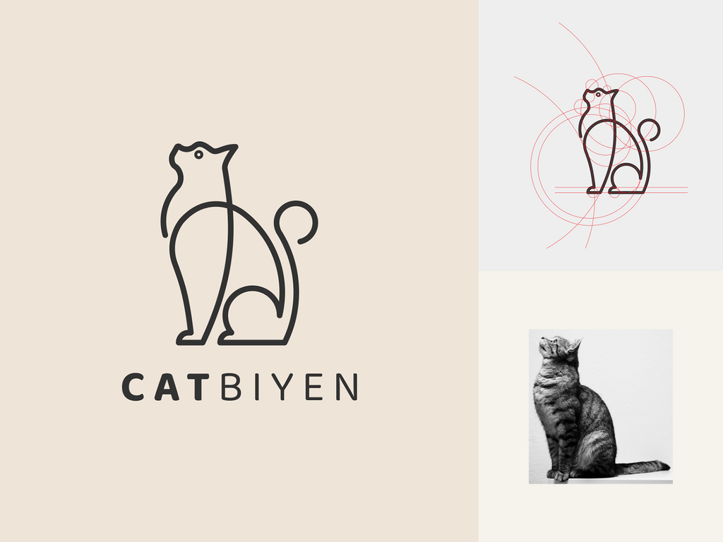
Created by estedesigns | https://dribbble.com/shots/16555424-CATBIYEN-logo
If anything, you want to take your time, especially when it comes to knowing your audience, brand, and values. If you know these, you will be better equipped to decide which design styles, colors, fonts, and typographies to use.
You don’t need to reinvent the wheel, either. If you don’t know where to start at all, you can start by checking out your competition. Look at their logo designs. See what elements work well. Of course, copying them is a no-no, but as we said, there’s no harm in finding inspiration from them.
We hope our tips above make the creation process easier for you and jumpstart your creative process. At the very least, they should provide you with an insight into where to start.


Leave a Comment