10 Tips To Create A Good Cafeteria Logo Design
Here are some inspiring tips you can easily follow to create a fantastic cafeteria logo design!

Created by Silvia Moran Ponce | https://www.behance.net/gallery/112512879/La-Empanaderia
A good cafeteria logo design comes a long way. While delicious food and excellent service are what keep customers coming, it is the cafeteria’s logo that brings them in in the first place. It is what comes to the mind of your customers when they think of your brand. That is how important a logo is.
Creating a logo can be a daunting task. Still, it needs to be done. A logo is the cornerstone of good business branding. It is what you will include in social media posts, marketing materials, business cards, presentation decks, and others. Your cafeteria’s logo is what differentiates it from others.
Building a brand can help you attract new business and develop customer loyalty. Creating a good brand visual representation is a good place to start in brand building.

Created by Faikar | https://dribbble.com/shots/16000053-Beans-Leaf-Cafeteria-Logo-Design-Concept
A logo is particularly important for a business like a cafeteria. This is because you have plenty of competitors who sell similar products and services. This is true even if your cafeteria fills a certain niche. A logo allows your cafeteria to stand out from competitors and be memorable to your customers.
How do you create a good one? What kind of style should your brand's visual representation have? While we can’t tell you exactly how yours should be, we can give you some tips to help you create a good one.
Our tips will help you create a good visual representation for your cafeteria, regardless of whether you are a beginner or a pro designer or if you want to hire a designer to work on your cafeteria’s logo. At the least, you will learn what to look out for when a visual representation of your brand.

Created by Rita Radkiewicz | https://www.behance.net/gallery/121504013/plantacia-vegan-canteen-identity
10 Tips To Create A Good Cafeteria Logo Design
- Look At The Popular Competitors
- Research Potential Market’s Behaviour
- Start Finding Good References
- Decide Your Visual Styles
- Sketch A Few Rough Ideas
- Don’t Forget To Experiment With Shapes.
- Choose A Bold Font
- Choose A Representative Color
- Keep A Good Amount Of Empty Space
- Use A Logo Mockup For A Nice Preview
1. Look At The Popular Competitors
One of the first things to do when creating a cafeteria logo design style is to study your competitors. You want one that really differentiates your cafeteria from others. That’s why it should stand out, not blend in. Your cafeteria can’t stand out if you don’t look at the popular competitors.
Looking at your popular competitors allows you to gain some inspiration. An important thing to note is that while you can be inspired by your competitors, avoid imitating their design at all costs.

Created by Salvador Munca | https://www.behance.net/gallery/77861617/CAFEINA
Stay away from similar shapes, fonts, and even color combinations used by your competitors. Your design should be entirely unique. You want one that reminds your customers about your brand, not your competitors’ brand.
Also, looking at the popular competitors can give you an idea about what not to do with a logo. For example, some of your competitors may use inappropriate font or colors for their visual representation that doesn’t really fit their overall theme.
The main goal of creating a visual representation for your brand is differentiation. You want one that allows your brand to stand out. Looking at the popular competitors is the first step to doing it.

Created by medula design | https://www.behance.net/gallery/112869637/garden-restaurante-caf-bar-branding-concept
2. Research Potential Market’s Behaviour
You can’t create a good brand visual representation if you don’t consider your target audience. So, do research your potential market’s behavior. A good design is one that resonates with your target audience. Keep in mind that the design is all about your target audience and not about you.
As such, you might need to take your own taste and preferences of the cafeteria logo design style so that you can create a design that really resonates with your target audience. Thus, researching your potential market’s behavior becomes necessary.

Created by Paola Estrada | https://www.behance.net/gallery/104303739/Loma-Escondida
While your design should resonate with your potential market, that doesn’t mean you need to follow the market leaders. Is following the trends a bad thing? Not necessarily. Trends aren’t always a bad thing. But you also need to realize that they aren’t always the best thing, either.
What you want is a visual representation that stands out, not the one that blends in. It should communicate clearly what your brand is all about. The design and style should go along with your brand identity.
If you identify, target, and appeal to your potential market properly, your logo might be remembered by people for a lifetime.

Created by Lina Bassiouny | https://www.behance.net/gallery/141101149/Singular-Cafeteria
3. Start Finding Good References
While a good cafeteria logo design is one that is entirely unique, it doesn’t mean you need to reinvent the wheel. There is nothing to be ashamed of in getting inspired by other designers’ work. In fact, finding good references is something that will help you create a good one.
In general, logos can be divided into two categories: typographic and symbolic. Typographic logos are those that involve typing out the name of the place with a unique font, design, and color. This is a good option if your cafeteria’s name is not long.
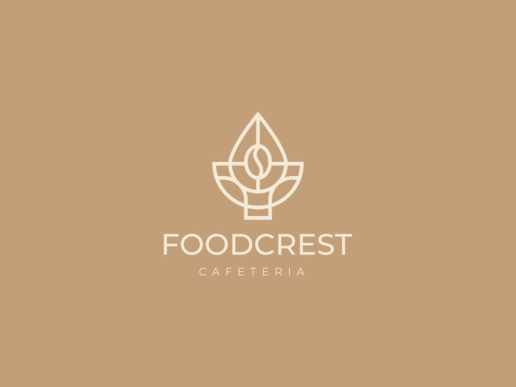
Created by Biswajit Guchait | https://dribbble.com/shots/16684920-Foodcrest-Cafeteria
Symbolic logos are the ones that use a symbol. Typically, these logos are just a symbol. They don’t include the name of the place. Unless your cafeteria already has a solid reputation, you want to include the name of your cafeteria in it.
There are lots of places where you can find good cafeteria logo design samples for both categories. One thing to keep in mind is that while you can get some ideas from other designers’ work, you can’t completely copy them.
Your cafeteria logo design should be entirely unique. Completely copying other people’s work is not a way to create it.

Created by Felipe Lannes | https://www.behance.net/gallery/132284303/TKS-Confeitaria
4. Decide Your Visual Styles
A logo is not just a crucial part of a brand. It is also one of a brand’s visual representations. That is why it is important to decide your visual styles. If you don’t have visual styles, you won’t be able to create a good visual representation of your brand that is unique, differentiates, and tells a story.
The question is, how do you decide your visual styles? To decide your visual styles, you will need to consider factors such as the size and its placements, color palette, appropriate fonts that reflect your brand, iconography that sets your brand apart, and brand voice.

Created by Karla Hernández | https://www.behance.net/gallery/113588503/GALANI
If you hire a designer to work on your brand's visual representation, make sure you tell them the above so you will get a visual representation that fits and represents your brand well.
In addition to that, make sure that your brand has a consistent color theme. This will not only make designing easier but also help with brand awareness.
Also, think about your brand voice. Your brand should look and sound a certain way. For example, do you want your cafeteria to be seen as a casual diner or an exclusive food destination?

Created by Renan Ramos | https://www.behance.net/gallery/124638419/Central-Park-Caf
5. Sketch A Few Rough Ideas
Sketching is an important part of the design process. There are several reasons why. Firstly, your first idea is seldom your best. When you sketch a few rough ideas, you will know which idea is the best one. Not to mention it helps to brainstorm ideas, too.
Secondly, sketching save a lot of time in the designing process. With sketching, you will know what is good and what is not. You won’t have to deal with last-second revisions. These save a lot of your time.

Created by David Silva | https://www.behance.net/gallery/126762629/Hub-Cafeteria
Thirdly, sketching separates concepts from details. You can’t create a good visual representation for your brand if you don’t pin down the concepts first. That’s exactly what sketching does. It allows you to focus on the important parts. You can improve the details once you grasp the concepts.
Fourthly, sketching is fun and boosts your creativity. Designing a visual representation for your cafeteria doesn’t mean you can’t have fun with it.
Note that when you sketch, don’t worry about the quality of your sketches. Just sketch and let your ideas flow. You can improve on your sketches later on. The most important thing here is to get your ideas out.

Created by Tayla Menezes | https://www.behance.net/gallery/139172929/Adocicada-Confeitaria
6. Don’t Forget To Experiment With Shapes.
Good designs don’t happen by accident. They are deliberately created using the psychology of shapes. This is why when you create a visual representation for your brand, you want to experiment with shapes.
Why is it important? Because each shape conveys particular messages. For example, ellipses, ovals, and circles tend to send out a positive emotional message. Using a circle in a design can suggest friendship, community, love, and relationships.
On the other hand, straight-edged logo shapes like triangles and squares convey stability and balance. Logos with straight lines and precise shapes also send out messages like efficiency, strength, as well as professionalism.

Created by Tatevik Kerobyan | https://www.behance.net/gallery/119002657/HAVQ-Cafe-bar
Besides conveying stability and balance, triangles are also associated with law, religion, science, and power.
The implications of shapes are not limited to these shapes only, however. They extend to typefaces, too. For example, angular and jagged typefaces may appear dynamic or aggressive, while soft rounded ones give a youthful appeal.
When you create a visual representation for your cafeteria, make sure to keep the psychology of shapes in mind. This way, it can have a certain style and, at the same time, send direct and indirect messages to your customers.

Created by Sara Neves | https://www.behance.net/gallery/126168105/ASANTE-Coffee
7. Choose A Bold Font
Choosing the right font is necessary. When choosing a font, you want one that communicates your brand to your customers. Each font has its own personality, and different fonts convey different attributes.
For example, the serif fonts like Times New Roman, Georgia Italic, Baskerville, and Trajan communicate respect for tradition, reliability, and comfort. Sans-serif fonts like Calibri, Helvetica Bold, Franklin Gothic, and Myriad Italic communicate neatness and novelty.
If you want to communicate style, elegance, progress, or decisiveness, use modern fonts like ITC Avant Garde Extra Light or Futura. Likewise, if you want to communicate creative thought and elegance, use script fonts like Lavanderia or Bickham Script.

Created by Vish Sisters | https://www.behance.net/gallery/130756249/MMM-FOOD-logo-design-branding-fast-food
After choosing a font that communicates your brand the best, the next thing to decide is the weights and variations of the font. If your cafeteria’s name is short, choosing a thick weight will be a good idea. Conversely, if your cafeteria’s name is long, choosing a thin weight will be the better option.
When you choose the right font, it will benefit not just your logo but also your brand. Chosen inappropriately, it may undermine trust and bad associations. So, take your time and choose a font carefully.

Created by Fabiano Diniz | https://www.behance.net/gallery/135883043/Ouro-Verde
8. Choose A Representative Color
Color can impact how a customer feels about a brand. This is why you want to choose a representative color for your logo. Choose a color or colors that represent your brand’s aesthetic and convey the right message.
For example, if you want to convey vintage, homemade, or wholesome, use brown. If you want to convey healthy, eco-friendly, vegetarian, or vegan, use green. If you want to convey love, energy, and passion, use red.
In other words, you need to know about color psychology. Note that you don’t need to delve deep. Learning the basics should be sufficient.

Created by Borja Estudio | https://www.behance.net/gallery/136972267/Branding-EL-Buen-Caf-_-Cafeteria
Knowing the colors your competitors use is a good idea as well. You don’t want to use the exact same color as them. Remember, a good brand visual representation differentiates. It doesn’t blend in. So, choose a representative color.
Before you choose what color(s) to use, experiment with several colors and try to make a beautiful color palette with them. See what color(s) suits your design.
While choosing a representative color is crucial, you should start the designing process in black and white. After you have a well-designed logo, you can then choose what color(s) to use it.

Created by S A R O O R I | https://www.behance.net/gallery/116015277/RONIS
9. Keep A Good Amount Of Empty Space
When designing, don’t assume that you need to fill in every single inch of it. A good cafeteria logo design has a good amount of empty space. Empty space or white space here refers to the space left in between different elements in a design.
White space is divided into two types, active and passive. Active white space is an empty space that you make with conscious effort in order to make the design more structured and emphasized. Passive white space is the opposite. It is an empty space that occurs naturally.

Created by Anna Ivanova | https://www.behance.net/gallery/119428773/Capra-Brand-Identity
Regardless of the type, you want to keep a good amount of empty space in your design. Empty space not only gives our eyes a break but also calls attention to secondary shapes. This makes the logo all the more eye-catching without looking visually overwhelming.
Moreover, empty space improves the design as it won’t look cluttered. The presence of empty space makes even the smallest elements in the design to become more noticeable. Empty space allows a logo to integrate seamlessly into different formats, platforms, and designs as well..

Created by Tatyana Pyatovski | https://www.behance.net/gallery/141669931/Cafe-Korean-Chicken
10. Use A Logo Mockup For A Nice Preview
A logo mockup is a representation of what a logo design will look like in real life. It is a template that can be used to present a design in a more creative and realistic way.
Why do you want to use a mockup? Firstly, a mockup can help you set up your cafeteria business faster. This is true even if you don’t have the skills to create a logo on your own yet. When you use a mockup, you won’t need to do everything from scratch.

Created by FUNDAMENTAL Studio | https://www.behance.net/gallery/102255833/Coffeelin
Secondly, when you use a mockup, you can create a good visual representation for your brand that looks not just unique but also professional. Most importantly, it helps you create a design that stands out, which is something you want to achieve with the design.
Thirdly, using a mockup also saves time. Even if you already have the skills to create a logo on your own, the process of designing takes time. A mockup helps to make the process quicker.
In short, when you use a logo mockup for a nice preview, it will be easier for you to create a good cafeteria logo design.

Created by Pix by Pix | https://www.behance.net/gallery/125194135/Puppa
Final Words
Designing takes time. There is no need to rush the process. A good logo that takes time is a lot better than a mediocre and easily forgettable one that is finished quickly. So, do take your time. After all, a good logo comes a long way.
The good news is that you don’t need to start from scratch or reinvent the wheel. You can learn from your competitors, whether direct or indirect. From them, you can learn what works and what doesn’t. Gain inspiration, but never imitate.
When you design, try to make it as simple as possible. You may want to remove a very detailed design. Keep it simple so that it can be remembered easily by your customers.

Created by Studio Cohe | https://www.behance.net/gallery/98974847/Cabine-Cafeteria
Also, avoid using too many colors. While a colorful design may look attractive, the more colors you use, the harder it becomes to balance them. A color balance is important in the design, so limit the color you are using.
Most importantly, your design needs to appeal to your target audience, be appropriate to the overall theme of your cafeteria, and reflect what your brand stands for. We hope our 10 tips above help you create a good cafeteria logo design.





Leave a Comment