30 Best Winery Logo Design Ideas You Should Check

Source: Sérgio Fonseca, Bonventi, Behance, https://www.behance.net/gallery/134593751/BONVENTI-Vinicola-e-Hospedaria
Winery logo design is more than just a pretty emblem on a bottle; it’s the visual expression of a vineyard’s story, tradition, and taste. This article will showcase some of the best ideas for winery logo design that mix creativity, sophistication, and a dash of rustic charm. From classic vineyard motifs like grapevines, barrels, and rolling hills to bold modern takes with minimal shapes and elegant typography, these concepts are crafted to make wine brands unforgettable. Think of how a swirling line can mimic the pour of a fine red, or how earthy colors can instantly evoke the warmth of a cellar. Winery logos can range from ornate crests perfect for heritage brands to sleek icons suited for trendy urban wineries.
By blending time-honored symbols with fresh design trends, you can create a winery logo design that resonates with wine lovers and stands out on shelves or tasting menus. Whether you’re starting a boutique vineyard or refreshing a long-standing brand, these ideas will help spark inspiration and guide you toward a logo that feels authentic, enticing, and timeless—just like a great bottle of wine.
Winery Logo Design Ideas

Source: Mau Maria, João Rita Barroso, Behance, https://www.behance.net/gallery/129366233/Joao-Rita-Barroso-Winemaker

Source: Tomatdesign ®, Burgundy, Behance, https://www.behance.net/gallery/125772283/Burgundy-Brand-Identity

Source: Peter Voth, Cuvee Balo, Dribbble, https://dribbble.com/shots/17429383-T-rley-Sauvignon-Blanc-pt-II

Source: Dusan Sol, Domeniile Dumbrava, Dribbble, https://dribbble.com/shots/17879667-Domeniile-Dumbrava-Logo

Source: Maxim Durbailov, Dribbble, https://dribbble.com/shots/26516759-Winery-Logo

Source: Anastasia Luts, Dribbble, https://dribbble.com/shots/24604417-Winery-Logo

Source: Hristijan Stankovski, Bovin Winery, Behance, https://www.behance.net/gallery/101175981/BOVIN-WINERY-%28Unofficial-Identity%29

Source: Dimitrije Mikovic, Roveria Boutique Winery, Dribbble, https://dribbble.com/shots/25068249-Roveria-Boutique-Winery

Source: Nicole Sgroi, The Next Vintage, Dribbble, https://dribbble.com/shots/26483192-The-Next-Vintage-Branding-2025

Source: Industria ®, Atao, Behance, https://www.behance.net/gallery/138226291/ATAO-Reserve-Red-Blend

Source: Luiz Arthuso, Sibuna Winery, Behance, https://www.behance.net/gallery/76699491/Sibuna-Winery-Visual-Identity

Source: Yossi Belkin, The Amon, Dribbble, https://dribbble.com/shots/13868189-The-Amon

Source: Victor Weiss Studio, RB5 Vinícola, Behance, https://www.behance.net/gallery/65330823/RB5-Vinicola-Visual-brand

Source: Sabrina Rusu, Vulpea Neagră, Behance, https://www.behance.net/gallery/216671719/Vulpea-Neagra-Logo-Design-Branding

Source: Max Lippolis, Familia Morgan, Behance, https://www.behance.net/gallery/86005019/Familia-Morgan

Source: Blank Design Studio, Bebber Winery, Behance, https://www.behance.net/gallery/200799931/Bebber-Winery

Source: Eleonora Casalini, Tenuta Fioraluna, Dribbble, https://dribbble.com/shots/25521867-Tenuta-Fioraluna-Winery-Brand-Identity

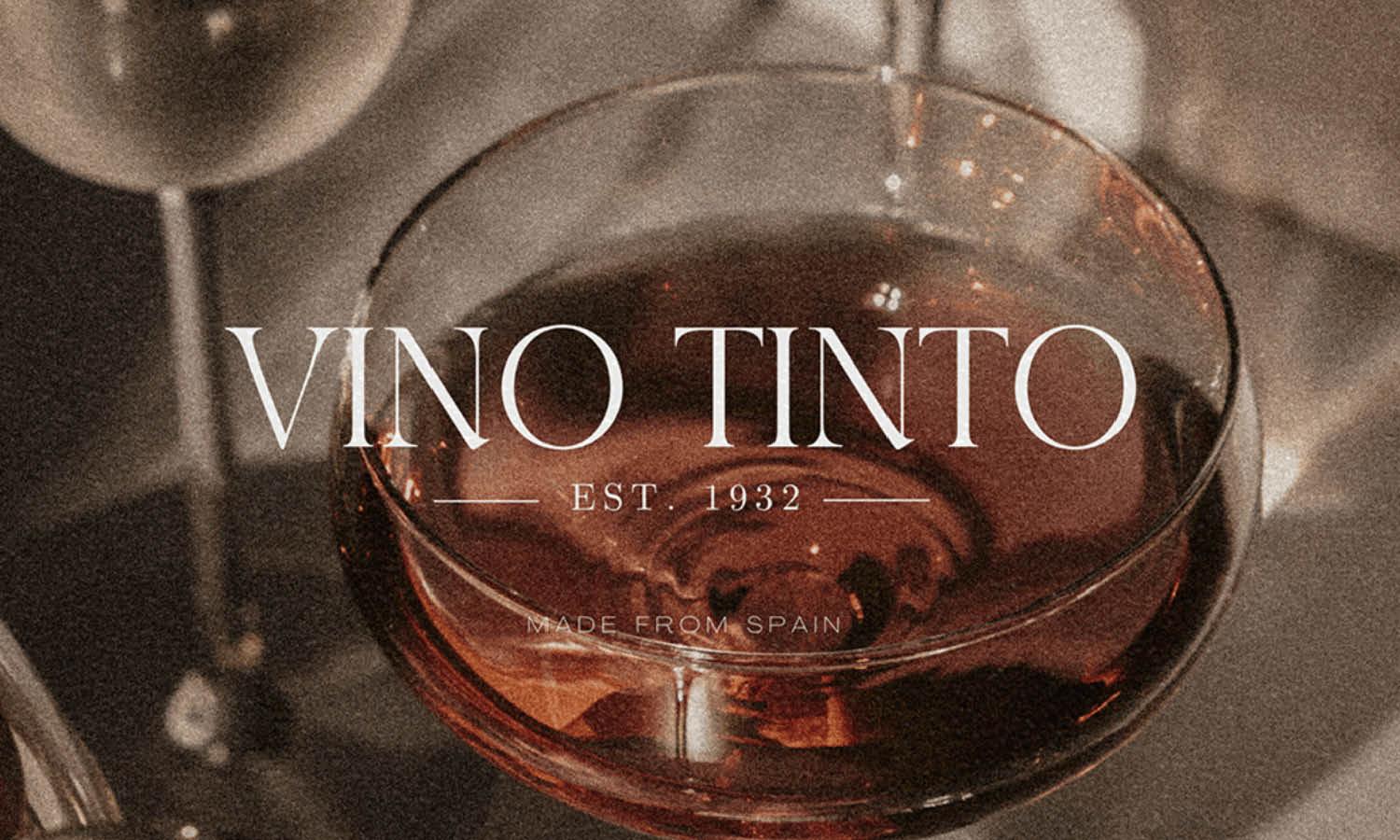
Source: Studio Kyes, Vino Tinto, Behance, https://www.behance.net/gallery/145884901/Vino-Tinto-Winery-Branding

Source: Affinity Creative Group, Hahn, Behance, https://www.behance.net/gallery/138478039/Hahn-Appellation-Series

Source: Liad Nimni, Archaía Elláda, Behance, https://www.behance.net/gallery/114127943/ARCHAIA-ELLADA

Source: Ilshat Mukhamadeev, Château Miraval Winery, Behance, https://www.behance.net/gallery/217225481/Chateau-Miraval-Winery-vinodelnja

Source: 2tigers Design Studio, Weightstone, Behance, https://www.behance.net/gallery/62381279/Weightstone-Vineyard-Estate-Winery

Source: Kristian Grljevic, Castle Hill Winery, Dribbble, https://dribbble.com/shots/18929677-Castle-Hill-Winery

Source: Anna Babicheva, Wild Hills, Dribbble, https://dribbble.com/shots/7362438-Wild-Hills-Winery-Logo

Source: Pena Design Studio, Damaskios Winery, Behance, https://www.behance.net/gallery/63243283/Damaskios-Winery

Source: Alina Petukhova, Vina Del Sol, Behance, https://www.behance.net/gallery/215440021/Vina-Del-Sol-Private-winery-Brand-identiti

Source: Luminous Design, Limnos Wines, Behance, https://www.behance.net/gallery/42658571/Limnos-Wines

Source: Dom Moreci, Renwood Winery, Behance, https://www.behance.net/gallery/45862445/Renwood-Winery-Rebranding-project

Source: Kateryna Subach, Behance, https://www.behance.net/gallery/133645563/Winery-logo

Source: Sérgio Fonseca, Bonventi, Behance, https://www.behance.net/gallery/134593751/BONVENTI-Vinicola-e-Hospedaria
What Classic Elements Define A Winery Logo Design?
Creating a winery logo design that feels timeless yet memorable is like crafting a signature wine—every detail matters. Classic elements give winery logos their sense of heritage, authenticity, and sophistication, while still allowing for playful creativity. Below are five key elements that define a classic winery logo design, each offering its own personality and charm to your brand.
Iconic Vineyard Symbols
Grapevines, bunches of grapes, wine barrels, and rolling hills are staples in winery logo design because they instantly communicate what your brand is about. These motifs evoke the natural beauty of vineyards and the artisanal process behind every bottle. Whether detailed illustrations or simplified silhouettes, these symbols connect audiences to the heart of winemaking.
Elegant Typography
Classic winery logo design often features refined, serif typefaces or hand-lettered scripts that exude elegance and tradition. The right typography can feel like a vintage label or a handwritten signature from the winemaker. Pairing fonts thoughtfully can also balance old-world charm with modern readability.
Heritage-Inspired Crests And Badges
Crests, shields, and badges are common in winery logo design because they signal legacy and prestige. These shapes often house other visual elements—like initials, vines, or glasses—creating a compact yet striking mark. They’re ideal for family-run vineyards or brands with a rich history.
Classic Color Palettes
Colors like deep burgundy, earthy greens, warm golds, and muted creams dominate classic winery logo design. These shades mimic wine tones, vineyards at harvest, and sunlit cellars, giving the logo a sense of authenticity and warmth. They also stand out beautifully on labels, signage, and packaging.
Subtle Wine Glass Or Bottle Motifs
Another defining element in winery logo design is the clever inclusion of wine glasses, bottles, or corkscrews. These icons can be stylized or hidden within letterforms, adding a layer of sophistication and discovery for viewers. This approach creates a memorable logo without feeling overly literal.
By blending these five elements—vineyard symbols, elegant typography, heritage crests, classic colors, and subtle wine-related motifs—you can craft a winery logo design that feels both iconic and inviting. These components not only reflect tradition but also leave room for unique twists that make your brand stand out, much like the perfect pairing of wine and food.
What Fonts Work Best for Winery Logo Design?
Selecting the perfect font for your winery logo design is like choosing the right cheese to complement a fine wine—it can enhance the experience and bring out the best in both. When crafting a logo for your winery, the typography isn't just a practical choice; it sets the tone, communicates your brand's ethos, and can even influence customer perception. Let’s uncork some knowledge and pour out five types of fonts that have proven effective in winery logo design.
Serif Fonts
For a touch of tradition and elegance, serif fonts are a timeless choice. They are often associated with trustworthiness and sophistication, making them a fantastic pick for wineries that want to emphasize their heritage or the classic quality of their wines. Fonts like Garamond, Times New Roman, and Bodoni create a sense of establishment and reliability, essential for brands that pride themselves on their history and traditional winemaking techniques.
Script Fonts
If you want to add a personal touch or an artisanal feel to your logo, script fonts are the way to go. These fonts mimic handwriting and can range from clean and modern to ornate and decorative. For wineries, a well-chosen script font can convey elegance and exclusivity, suggesting that each bottle of wine is crafted with individual care and attention. Popular choices in this category include Lavanderia and Allura, which blend readability with artistic flair.
Modern Sans Serif Fonts
For wineries aiming to project a contemporary, clean, and accessible image, modern sans serif fonts are an excellent choice. These fonts are straightforward and highly legible, which makes them versatile for digital and print media. Fonts like Helvetica, Futura, and Montserrat offer a sleek, modern look that can appeal to a younger, trendier audience, aligning perfectly with brands known for innovative winemaking techniques or sustainable practices.
Decorative or Custom Fonts
When standing out is the goal, decorative or custom fonts can make your winery logo truly unique. These fonts often incorporate elements that are directly related to the brand’s theme or location. For example, a font that includes subtle grapevine elements or one that reflects the architectural style of your winery's estate can create a strong visual connection to the brand’s identity. Custom fonts are particularly effective in ensuring your logo is one-of-a-kind and memorable.
Combination Fonts
Sometimes, mixing font styles can capture the best of all worlds—tradition and modernity, elegance and approachability. Using a serif font for the winery’s name and a sans serif for a tagline or vice versa can balance readability with character. This strategy is particularly effective for wineries that wish to highlight multiple aspects of their brand personality. For instance, a bold serif paired with a minimalist sans serif can convey both the robust history and the modern approach of the winery.
When choosing the font for your winery logo design, it's important to consider not only the aesthetic appeal but also how well the font represents your brand's story and values. The right font will not only be visually appealing but also resonate with your target audience, enhancing your brand's presence both on the shelf and in the minds of wine lovers.
What Are the Best Symbols to Use in Winery Logo Design?
Designing a logo for a winery is like being a vintner: it’s all about choosing elements that blend well together to create a memorable and captivating label. In the world of winery logo design, symbols are the visual berries that add flavor and identity to your brand. Choosing the right symbols can help convey your winery’s story, values, and the essence of your wines. Let's uncork some creativity and explore five great symbols to use in winery logo design that can help your brand stand out in the vineyard of competitors.
Grapes and Vine Leaves
This is the quintessential choice for any winery logo, symbolizing the raw materials and the craft of winemaking. Grapes can be stylized in various ways—bunches, single berries, abstract forms—and can communicate everything from luxury to rustic charm. Vine leaves add a touch of elegance and are a nod to the vineyard itself, evoking images of lush, green vines laden with fruit. These symbols connect directly with the nature of the product and are instantly recognizable to wine lovers.
Wine Barrels
Symbolizing aging and craftsmanship, barrels are a fantastic symbol for wineries that want to highlight the traditional aspects of their wine-making process. A barrel can evoke a sense of history and quality, suggesting that the wine has been developed with care and expertise. It’s a great symbol for brands that pride themselves on their artisanal methods and the maturity of their product.
Corks and Corkscrews
Often overlooked, these symbols can add a playful or sophisticated touch to your logo design, depending on their style. Corks and corkscrews represent the opening of new experiences and celebrations, tying in well with the social aspect of wine drinking. They can be designed in a sleek, modern style or with a more traditional, detailed approach to suit different brand personalities.
Chateau or Estate Imagery
Including an image of a chateau, villa, or estate in your logo can lend an air of prestige and authenticity. This symbol is particularly effective for wineries with a significant history or picturesque location. It tells a story of heritage and place, which can be very appealing to customers who value the provenance of their wines. This symbol can be rendered in a detailed illustration or a simplified iconographic form.
Abstract Wine Glasses and Bottles
For a more modern and minimalist approach, abstract representations of wine glasses and bottles can make for a sleek and stylish logo. These symbols are universally recognized and can be stylized to convey a variety of themes, from luxury and sophistication to fun and accessibility. They work well for urban wineries or brands that want to emphasize a chic, contemporary image.
When selecting symbols for your winery logo design, consider how each symbol can be tailored to reflect your unique brand identity and the message you want to convey to your audience. Cheers to creating a visual identity that resonates deeply with your clientele and beautifully expresses the essence of your wines!
What Textures Bring Depth To Winery Logo Design?
Textures can transform a winery logo design from flat and ordinary to rich and memorable, just like a full-bodied wine. They add layers of meaning, evoke sensory experiences, and create a signature look that resonates with customers. When thoughtfully used, textures give a logo personality, depth, and a sense of authenticity that connects to the craft of winemaking. Below are five textures that bring remarkable depth to winery logo design.
Rustic Wood Grain
Wood grain textures mirror the barrels, tasting tables, and cellar doors that are so integral to the wine experience. Incorporating a subtle wood pattern into a winery logo design can suggest tradition, warmth, and craftsmanship. This texture works especially well for family-owned vineyards or brands that emphasize their artisanal roots.
Vintage Paper And Label Wear
A faded paper or lightly distressed texture evokes old wine labels, parchment maps of vineyards, and handwritten notes from winemakers. In a winery logo design, this texture signals heritage and timelessness, adding a touch of nostalgia that makes the brand feel established and trustworthy.
Grape Leaf Veining
The intricate lines of grape leaves can become a delicate yet powerful texture in a winery logo design. This organic pattern celebrates the heart of the vineyard—the vines themselves—while adding a refined, natural aesthetic. It’s perfect for brands that want to emphasize sustainability or a close connection to the land.
Stone Or Masonry Patterns
Stone textures reference wine caves, cellar walls, and the rugged terrain of vineyard landscapes. Integrating a subtle stone pattern into a winery logo design suggests strength, endurance, and authenticity. It’s an ideal choice for wineries that want to highlight their heritage or unique location.
Metallic Foil Effects
Although not a texture in the tactile sense, metallic foil effects create a visual texture that exudes luxury and sophistication. Gold, copper, or silver highlights in a winery logo design mimic the shimmer of a wine pour or the glow of a sunset over the vineyard. This texture elevates the brand and signals premium quality.
By blending these textures—rustic wood grain, vintage paper wear, grape leaf veining, stone patterns, and metallic foil effects—you can create a winery logo design that feels layered, tactile, and inviting. Each choice tells a story about the vineyard’s character and gives the logo an unforgettable personality, just like the perfect finish on a glass of wine.
What Is the Best Shape for a Winery Logo Design?
Choosing the right shape for a winery logo design is akin to selecting the perfect glass to serve a robust Cabernet or a delicate Chardonnay—it enhances the presentation and affects the perception. In the world of winery logo design, the shape of the logo can communicate a lot about the brand’s style and story, setting the stage for the viewer’s first impression. Here’s a lively swirl through five fantastic shapes that can encapsulate the essence of your winery in a way that’s as pleasing to the eye as your wine is to the palate.
Circle
Circles are immensely popular in logo design because of their versatility and the feelings of unity, wholeness, and infinity they evoke. For wineries, a circular logo can represent the endless pleasure of wine tasting, the communal aspect of sharing a bottle, or the perfection of a well-balanced vintage. Circles are also excellent for labels as they provide a smooth and prominent display on wine bottles, making your brand easy to recognize and aesthetically pleasing.
Crest or Shield
If your winery prides itself on a rich history or a tradition of artisanal winemaking, incorporating a crest or shield shape can add a regal touch to your logo. This shape suggests heritage and trust, appealing to customers who value lineage and the artistry behind wine production. Crests and shields can also be embellished with other meaningful symbols like grapevines, barrels, or estate imagery to further emphasize your winery’s legacy.
Square or Rectangle
These shapes are associated with stability and reliability but don’t let their straightforwardness fool you—they can be styled to look incredibly modern and chic. For a winery with a contemporary edge or one that values precision and structure in their winemaking process, square or rectangular logos can communicate strength and modernity. Plus, they are highly adaptable for various marketing materials, from wine labels to digital platforms.
Organic Shapes
Think outside the conventional with shapes that mimic natural forms, like leaves, vines, or even the fluidity of wine pouring into a glass. Organic shapes are perfect for wineries that want to highlight their commitment to organic farming practices or their connection to the earth. These shapes can make a logo feel more approachable and connected to nature, ideal for brands that specialize in natural or biodynamic wines.
Custom Silhouettes
Why not tailor a unique shape that captures the essence of your specific brand? A silhouette of your winery’s estate, a distinct bottle shape, or even a profile of a wine glass can serve as a strong visual hook that makes your logo stand out. Custom silhouettes can be both sophisticated and memorable, providing a visual shorthand for your brand that is immediately recognizable.
When crafting your winery logo design, consider how different shapes can convey different messages and appeal to your target demographic. So, pick a shape that resonates with your brand’s story, and let it shape the way customers see—and remember—your wine.
Conclusion
A well-crafted winery logo design blends tradition, creativity, and storytelling to capture the true essence of a vineyard. By incorporating classic textures, elegant typography, and meaningful symbols, a winery logo design can express authenticity and build an emotional connection with wine lovers. These thoughtful elements not only elevate the look of your brand but also communicate its values and heritage at a glance. Whether you’re launching a boutique label or refining an established identity, investing in a distinctive winery logo design ensures your brand stands out as timeless, memorable, and full of character—just like your finest vintage.
Let Us Know What You Think!
Every information you read here are written and curated by Kreafolk's team, carefully pieced together with our creative community in mind. Did you enjoy our contents? Leave a comment below and share your thoughts. Cheers to more creative articles and inspirations!





Leave a Comment