30 Best Pilates Logo Design Ideas You Should Check

Source: Jai Taylor, Pilates At Studio 8, Dribbble, https://dribbble.com/shots/5472988-Logo-Pilates-At-Studio-8
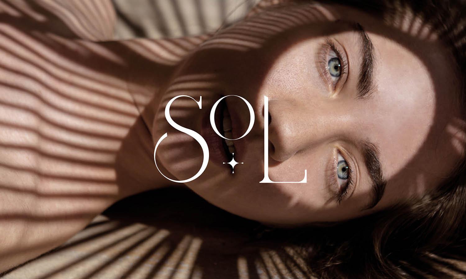
A pilates logo design isn’t just about balance and flexibility—it’s about translating calm energy and graceful movement into a powerful visual symbol. Whether you’re designing for a boutique studio or a wellness brand, the right logo can instantly communicate focus, flow, and strength. This article explores some of the best pilates logo design ideas that beautifully blend aesthetics with identity.
From minimalist silhouettes and elegant typography to organic shapes and soft color gradients, pilates logos often reflect the harmony between body and mind. Some designs use abstract human figures in motion, while others emphasize serenity through circular compositions and clean lines. You’ll also find clever uses of negative space and geometric balance that make each design feel dynamic yet grounded.
Whether you’re a designer seeking inspiration or a business owner ready to refresh your brand identity, these ideas will help you find a visual rhythm that captures the spirit of pilates. Get ready to discover logo concepts that breathe calm, balance energy, and move with intention—just like the practice itself.
Pilates Logo Design Ideas

Source: Alejandro Torres, Mindbody Pilates Studio, Dribbble, https://dribbble.com/shots/6179290-Mindbody-Pilates-Studio

Source: Alejandro Torres, Mindbody Pilates Studio, Dribbble, https://dribbble.com/shots/6179290-Mindbody-Pilates-Studio

Source: Miguel Angel Martinez, Flex Physio & Pilates, Behance, https://www.behance.net/gallery/211547615/Flex-Physio-Pilates

Source: Raksana Aliyeva, Womira, Behance, https://www.behance.net/gallery/232251891/Womira-Pilates-yoga-and-spa-center

Source: Tatiana Saburova, Sinto Studio, Behance, https://www.behance.net/gallery/228241257/Sinto-Studio-brand-identity-for-pilates-studio

Source: Stina Norgren, The Pilates Guy, Dribbble, https://dribbble.com/shots/1676262-The-pilates-guy

Source: Elizaveta Kushnirenko, Yoga Pilates Studio Branding, Behance, https://www.behance.net/gallery/237507129/YOGA-PILATES-STUDIO-BRANDING

Source: Studio Unik Design, Movimento, Behance, https://www.behance.net/gallery/178524725/Movimento-Pilates-e-Fisioterapia

Source: Savia Brands, Santé, Behance, https://www.behance.net/gallery/232941185/Sant

Source: Anastasia Malardyrova, Mew Form, Behance, https://www.behance.net/gallery/232047901/Mew-Form-pilates-club-brand-identity

Source: Daniel Moncada, Rea Studio, Dribbble, https://dribbble.com/shots/26823579-Rea-Studio-Fitness-Creator-Branding

Source: Julia Felix, Renata Firmino Pilates, Behance, https://www.behance.net/gallery/148375255/Identidade-Visual-Renata-Firmino-Pilates

Source: Paula Czachor, Pilates Studio Brand Identity, Behance, https://www.behance.net/gallery/213066213/Pilates-Studio-Brand-identity

Source: Ayska Niyoshaa, Trainer Pilates Woman Yoga, Behance, https://www.behance.net/gallery/137776733/Trainer-pilates-woman-yoga-logo-identity

Source: April Scarduzio, Simply Pilates, Dribbble, https://dribbble.com/shots/2908653-Simply-Pilates

Source: Renato AB, Movimood, Behance, https://www.behance.net/gallery/116526011/Movimood

Source: Naiany Assis, Apresentação de Marca, Behance, https://www.behance.net/gallery/208149273/Apresentacao-de-Marca-Fisioterapia-e-Pilates

Source: Vailio Agency, Plana, Dribbble, https://dribbble.com/shots/26758241-PLANA-Pilates-Studio-Identity

Source: Ulysses Design Co, Pilates Collective, Dribbble, https://dribbble.com/shots/26697303-Logo-Concept-02-Pilates-Collective

Source: Ulysses Design Co, Pilates Collective, Dribbble, https://dribbble.com/shots/26697326-Logo-Concept-01-Pilates-Collective

Source: Matías Figueroa, Vitaliv, Dribbble, https://dribbble.com/shots/26277558-Vitaliv-Pilates-Studio-Branding-with-Energy-Flow

Source: Niki A., Number Φ, Behance, https://www.behance.net/gallery/158132723/Visual-Identity-Strategy-Case-Study-Pilates-Studio

Source: Experimental Cargo, Bird Pilates, Behance, https://www.behance.net/gallery/150364481/BIRD-PILATES-Brand-Identity-Design

Source: Verena Tam, Anatis Pilates, Dribbble, https://dribbble.com/shots/5321241-ANATIS-PILATES

Source: Filip Lichtneker, Refeel, Dribbble, https://dribbble.com/shots/26253231-REFEEL-Yoga-Pilates-Studio

Source: Rachel Rippy, Studio Sunday, Dribbble, https://dribbble.com/shots/4007356-Studio-Sunday

Source: Sollara Brands, Evolura, Behance, https://www.behance.net/gallery/160142075/EVOLURA-Naming-Visual-Identity

Source: Evan Delagrange, Mindful Movements, Dribbble, https://dribbble.com/shots/10877353-Mindful-Movements

Source: Ansley Randall, Pilates On Third, Dribbble, https://dribbble.com/shots/5302429-Logo-design

Source: Jai Taylor, Pilates At Studio 8, Dribbble, https://dribbble.com/shots/5472988-Logo-Pilates-At-Studio-8
What Are The Best Inspirations For Pilates Logo Design?
When it comes to creating a memorable pilates logo design, inspiration often comes from the very essence of pilates itself—movement, balance, and mindfulness. A great logo should capture the peaceful energy of this practice while symbolizing strength, alignment, and control. If you’re looking for fresh inspiration to design a pilates logo that stretches creativity and style, here are five fun and thoughtful ideas to guide you.
The Human Silhouette In Motion
One of the most classic and powerful inspirations for pilates logo design is the human figure. Think of fluid poses—like the teaser, the roll-up, or the plank—stylized into elegant line art. These flowing silhouettes express motion and grace, reminding clients of the discipline’s physical artistry. A well-placed figure can evoke balance and body awareness without being overly literal. Simplified outlines or geometric representations of movement can make the logo look dynamic yet soothing.
The Circle Of Balance
Circles symbolize unity, wholeness, and centered energy—all core aspects of pilates philosophy. Using a circular motif in a pilates logo design can represent the flow of breath, the cycle of movement, or even the stability of a mat. Designers often play with open-ended circles, brush-stroke rings, or gradients within round shapes to add depth and softness. This simple yet elegant structure instantly communicates harmony and mindfulness.
Nature As A Visual Muse
Nature is another rich source of inspiration for pilates logo design. Elements like leaves, water waves, mountains, or sun rays can symbolize growth, calm, and rejuvenation. For example, a lotus flower might express spiritual alignment, while soft waves can reflect rhythm and breathing. Pairing natural forms with clean lines and modern typography can make the logo feel organic yet contemporary—perfect for studios that emphasize holistic wellness.
Abstract Geometry And Minimal Lines
Modern pilates brands often lean into minimalist geometry to express precision and control. Shapes like triangles, parallel lines, and symmetrical patterns mirror the body’s alignment during movement. A well-crafted abstract design can feel both sophisticated and futuristic. Using a limited color palette—soft grays, muted blues, or earthy neutrals—keeps the focus on structure and simplicity. Abstract geometry gives a pilates logo design that sleek, balanced aesthetic that appeals to modern audiences.
Typography That Breathes Calm
Fonts play a huge role in defining the personality of a pilates logo design. Elegant sans-serif or thin serif fonts evoke sophistication and professionalism, while handwritten or script fonts can suggest a more personal, boutique atmosphere. A gentle balance between spacing, curvature, and thickness can echo the principles of posture and poise found in pilates. Think of letters that flow naturally—clean, airy, and full of subtle energy.
Inspiration for pilates logos often begins with understanding the emotions behind the practice—calmness, control, and connection. Whether you draw from movement, nature, geometry, or typography, the best designs always feel centered and intentional. A pilates logo design should look as graceful and balanced as the movements it represents, creating a sense of visual wellness that resonates instantly.
What Are Some Creative Ideas For Pilates Logo Design?
Designing a pilates logo design is all about balance—just like the practice itself. The perfect logo should flow effortlessly, inspire calmness, and communicate both movement and mindfulness. Whether you’re designing for a boutique studio, a wellness brand, or a personal trainer, creativity is key to standing out while maintaining a sense of harmony. Here are five fun and creative ideas to bring your pilates logo design to life with personality and elegance.
Fluid Line Art That Captures Motion
One of the most creative ways to design a pilates logo is through expressive line art. Think of elegant, single-line drawings that form human figures in graceful poses like the teaser or the swan dive. These continuous lines create a sense of flow and energy, echoing the rhythm of pilates movements. You can experiment with varying line thicknesses to show depth and motion, giving the logo a dynamic yet tranquil vibe. This minimalist approach keeps the design airy, stylish, and perfectly balanced.
Shapes Inspired By The Pilates Equipment
Reformers, rings, and mats are not just tools—they can become iconic design elements. Using subtle outlines of pilates equipment within your pilates logo design adds a layer of storytelling. For example, a reformer’s frame could form part of a geometric border, or a circle ring could double as the letter “O” in a brand name. This idea connects instantly with enthusiasts while offering a clever, memorable twist that reflects authenticity and creativity.
Playing With Negative Space
Negative space is a playground for clever designers. It can transform a simple shape into a powerful symbol that hides deeper meaning. For instance, a silhouette of a person in a yoga-like pose can be formed between two curves or within a circle. You might even create abstract representations of balance by letting space breathe between geometric elements. When done right, this technique gives your pilates logo design a refined, intelligent look that delights viewers with its hidden artistry.
Natural And Organic Elements
Pilates is deeply connected to well-being and inner peace, making nature-inspired designs incredibly fitting. Consider integrating soft leaves, petals, or water ripples into your pilates logo design. These organic shapes suggest tranquility, renewal, and energy flow. Soft, muted tones like sage green, sand beige, or gentle lavender can enhance this theme beautifully. By blending nature with motion, your design can radiate serenity and health—qualities that perfectly embody the pilates lifestyle.
Typography With Personality
The right typography can make or break your logo’s tone. For a modern and approachable look, consider rounded sans-serif fonts that feel open and friendly. For a luxurious, boutique-style studio, slender serif or calligraphic typefaces can exude elegance and grace. You can also modify letterforms creatively—like turning an “A” into a pilates pose or extending a “T” to resemble stretching arms. Typography-led designs give your pilates logo design a clean, confident personality with a creative twist.
A creative pilates logo design doesn’t just look beautiful—it moves with intention. By merging symbolism, balance, and visual rhythm, your logo becomes a reflection of harmony itself. Each creative choice—whether in line, form, or type—should feel like a deep, mindful breath that captures the true spirit of pilates.
What Fonts Are Best for Pilates Logo Design?
Choosing the right font for a pilates logo design is like picking the perfect pose—it needs to balance style, functionality, and the essence of the brand. Fonts set the tone for your logo, making them a key player in conveying the calm, strength, and elegance that pilates embodies. Here are five font styles that work beautifully for pilates logo design, each bringing its own unique flair to the mat.
Sleek Sans-Serif Fonts
When it comes to modern pilates branding, sans-serif fonts take the crown. Clean, minimal, and easy to read, these fonts exude professionalism while keeping the design approachable. Think fonts like Helvetica, Futura, or Avenir—smooth and effortless, just like a well-executed pilates routine. Pair them with soft colors or abstract symbols to give off a contemporary, high-end vibe.
Script Fonts for Elegance
For those aiming to highlight the graceful side of pilates, script fonts are a stellar choice. These flowing, cursive-inspired fonts bring a sense of movement and sophistication to the design. Fonts like Great Vibes or Dancing Script are perfect for adding a touch of artistry while emphasizing the mindful, fluid nature of pilates. They work especially well for boutique studios or brands focusing on luxury and elegance.
Rounded Fonts for Approachability
Rounded fonts offer a friendly and inviting look that’s ideal for pilates studios wanting to create a sense of community. Fonts like Nunito or Poppins have gentle, rounded edges that convey softness and approachability while maintaining professionalism. These fonts pair beautifully with circular elements in a logo, reinforcing themes of unity and flow.
Thin Serif Fonts for a Sophisticated Look
If you’re aiming for a classy, timeless pilates logo design, thin serif fonts are a great pick. These fonts, like Didot or Playfair Display, combine elegance with readability, making them perfect for wellness brands with a more refined aesthetic. The subtle flair of serif fonts adds a touch of luxury, making them ideal for upscale studios or private pilates instructors.
Geometric Fonts for a Modern Twist
Geometric fonts are bold, trendy, and perfect for brands that want to stand out. Fonts like Montserrat or Gotham use clean, symmetrical shapes that convey balance and precision—qualities intrinsic to pilates. These fonts are versatile and work beautifully for dynamic, forward-thinking pilates businesses that want a modern edge in their branding.
Selecting the perfect font for a pilates logo design is all about aligning the style with your brand’s personality and values. Whether you’re going for sleek and modern, graceful and elegant, or approachable and friendly, these font styles can help create a logo that captures the spirit of pilates. Think of it as the typography equivalent of finding your flow—once you get it right, everything falls into place!
What Are the Best Shapes to Use in Pilates Logo Design?
Shapes are the unsung heroes of logo design. They set the tone, evoke emotions, and create visual harmony. When it comes to pilates logo design, choosing the right shapes can make all the difference in capturing the essence of movement, balance, and mindfulness. Here are five shapes that work beautifully in pilates logos, each with its unique charm and significance.
Circles for Wholeness and Unity
Circles are a go-to shape for pilates logo design because they symbolize unity, wholeness, and flow. They mimic the continuous movement and connection found in pilates practices. Whether it’s a standalone circular logo or a design with circular accents, this shape effortlessly conveys harmony and balance. Bonus points if you incorporate elements like a pilates ring or abstract curves within the circle!
Flowing Lines for Movement
Nothing says “pilates” like smooth, flowing lines that represent grace and fluidity. These shapes mimic the controlled and intentional movements in pilates exercises. Abstract waves, curves, or swooshes add a dynamic element to the logo, making it feel alive and in motion. They’re perfect for emphasizing the elegance and flexibility that pilates is all about.
Triangles for Strength and Stability
Triangles might not be the first shape that comes to mind, but they’re fantastic for adding a subtle sense of strength and structure to a pilates logo design. Think of the triangle as a visual anchor—it symbolizes stability, balance, and precision. A triangle placed strategically within a design can create a modern, powerful look while still maintaining the essence of pilates.
Organic Shapes for a Natural Touch
Pilates often connects with wellness and mindfulness, so using organic shapes—like abstract leaves, petals, or freeform designs—can bring a sense of calm and natural beauty to the logo. These shapes feel softer and more approachable, making them ideal for studios or brands that emphasize holistic health and relaxation. Organic shapes also pair well with earthy tones for a serene aesthetic.
Geometric Patterns for Modern Appeal
For brands that want a contemporary edge, geometric shapes like hexagons, rectangles, or diamonds can be a great choice. When arranged thoughtfully, these shapes create clean and eye-catching patterns that convey precision and professionalism. Geometric patterns are particularly effective for pilates brands that cater to a modern, urban clientele and want a polished, cutting-edge look.
The best shapes for pilates logo design depend on the personality of your brand and the message you want to convey. Circles and flowing lines bring balance and grace, triangles exude strength, organic shapes offer a natural vibe, and geometric patterns add a modern twist. Think of shapes as the foundation of your logo—a little creativity and thoughtful design can go a long way in building something truly unique and memorable!
What Are the Best Styles for Pilates Logo Designs?
Designing a pilates logo is like crafting a beautiful pose—it’s all about balance, creativity, and precision. A well-designed logo can speak volumes about your brand’s personality and connect with your audience on an emotional level. Whether you’re going for a modern look or something more artistic, there are plenty of styles to choose from to make your pilates logo design truly shine. Here are five of the best styles to inspire your next logo creation.
Minimalist and Clean
Less is more when it comes to minimalist logo designs. This style is perfect for pilates brands that value simplicity and elegance. By using clean lines, subtle typography, and a neutral color palette, minimalist logos convey professionalism and a sense of calm. Think of a simple lotus outline or a flowing line forming a pilates pose—sleek, stylish, and timeless.
Modern and Geometric
For pilates brands with a contemporary vibe, modern and geometric styles offer a bold and innovative look. This style uses sharp lines, symmetry, and geometric shapes to create a striking design. A circle symbolizing flow or a triangular motif representing strength can bring modernity to your pilates logo design while keeping it visually captivating.
Artistic and Hand-Drawn
If you want your pilates logo design to stand out, an artistic and hand-drawn style can add a unique, personal touch. This approach works especially well for boutique studios or brands that emphasize creativity and individuality. A hand-drawn lotus flower, a brushstroke pilates pose, or even freehand typography can create a logo that feels authentic and approachable.
Nature-Inspired and Organic
Pilates often aligns with wellness and mindfulness, making nature-inspired designs an excellent choice. This style incorporates elements like leaves, vines, or flowing water to evoke a sense of serenity and natural balance. Organic shapes and earthy tones work beautifully in this style, creating a logo that reflects the harmony between body, mind, and nature.
Luxurious and Elegant
For premium pilates studios or brands catering to a high-end audience, luxurious and elegant styles are the way to go. This style often includes thin serif fonts, gold or metallic accents, and intricate details. The goal is to create a logo that feels refined and sophisticated, appealing to clients who seek exclusivity and top-tier service.
The best style for your pilates logo design depends on your brand’s identity and target audience. Minimalist styles exude calm and professionalism, while modern and geometric designs bring an edgy appeal. Artistic logos add a touch of uniqueness, nature-inspired designs emphasize harmony, and luxurious styles scream sophistication.
Conclusion
A well-crafted pilates logo design reflects more than just a fitness brand—it symbolizes balance, control, and inner harmony. From fluid line art to nature-inspired forms, every creative element should express calm strength and purposeful movement. The right blend of shape, color, and typography helps capture the graceful rhythm that defines pilates. Whether you choose minimalist elegance or artistic abstraction, the goal is to design a visual identity that feels centered and inspiring. A thoughtful pilates logo design communicates wellness and discipline while leaving a lasting impression of mindful beauty.
Let Us Know What You Think!
Every information you read here are written and curated by Kreafolk's team, carefully pieced together with our creative community in mind. Did you enjoy our contents? Leave a comment below and share your thoughts. Cheers to more creative articles and inspirations!





Leave a Comment