Article: 30 Coolest Barbershop Brand Identity Design Ideas
30 Coolest Barbershop Brand Identity Design Ideas
Here are some of the coolest barbershop brand identity designs you should check!

Created by Michael Knapek | https://www.behance.net/gallery/87107709/The-Timeless-Barbershop-Logo-Branding
One of the design characteristics that you may encounter most often in barbershops is that they mostly use retro-classical styles for their design concepts. This branding concept has been used by barbershops for a long time and has been passed on to today's modern age. The use of this distinctive branding style makes it always unique and attracts attention.
With various classical retro ornaments, which are also combined with a similar typeface style, or color choices that make everything perfect, certainly, the logo design becomes more attractive. If you want to create a logo with a similar style for a business barbershop, you can take references from the 30 best barbershop logo designs that we will review below.
1. Caarter Barbershop & Bar

Created by Gabriel Sutherland | https://www.behance.net/gallery/99905817/Carter-Barbershop-Bar
The first on the list, we have a logo design for Barbershop by NSH. Even though it was only released in 2021, at a relatively young age, this chosen classical and retro style is something that makes the business look more professional and has experience in handling clients well.
The logo consists of a typeface and also a simple icon made in the middle. This icon was formed from the inspiration of the name of a business itself which consists of the letters N, S, and H. These three letters are combined into a complex and attractive form as the centerpiece of the logo design.
2. GALLITO BARBÓN
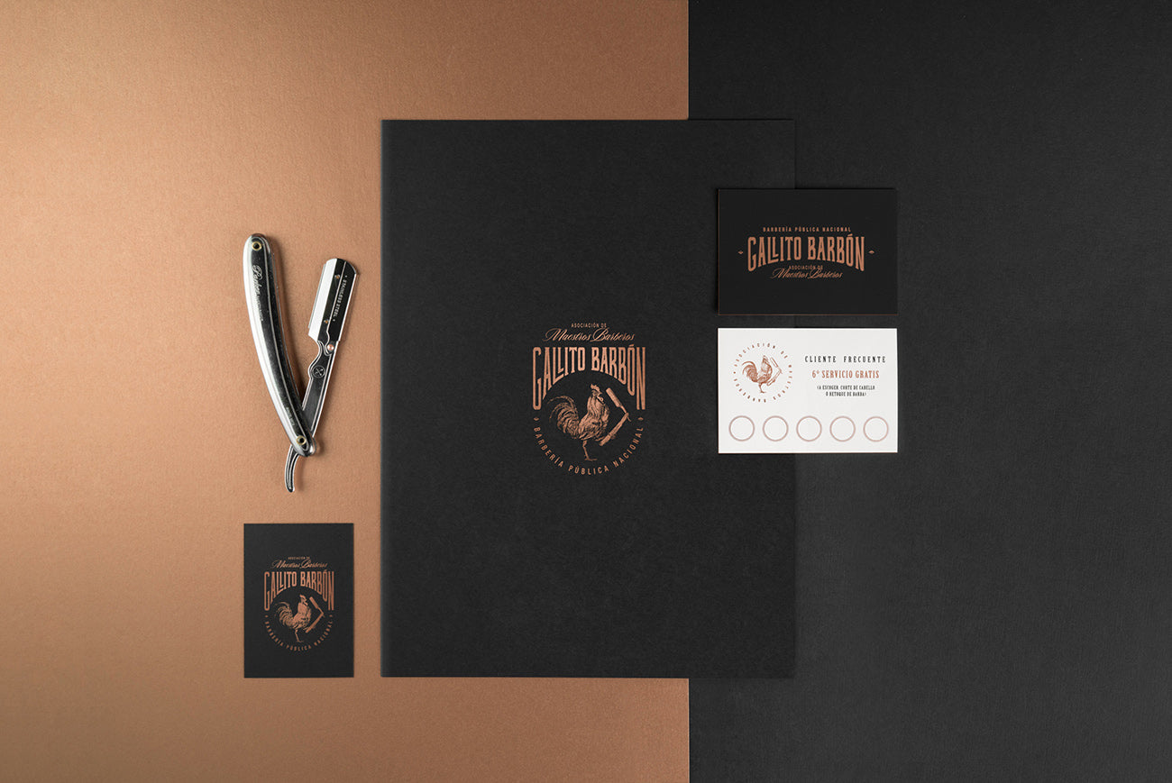
Created by Henriquez Lara Estudio | https://www.behance.net/gallery/77819197/GALLITO-BARBON
Although Edge Salon uses a simple and modern typeface, the placement of the typography style and also the icons used to make it look very attractive in retro vintage style; the logo design that is made matches the interior design of the barbershop itself.
Using a classical style that is packaged with a simpler and more modern look for more appeal to the current generation, this concept can be one of the concepts that inspire you.
3. HEWSTON'S

Created by Diego Leyva | https://www.behance.net/gallery/109513697/HEWSTONS
The designer for Fenix Barbershop presents an extraordinary logo display. The display is very detailed and complex, bringing us back to the old times in a good way. The main element in this logo mainly lies in the typeface used to write the name of the business. The writing is large and striking and is given various classical retro ornaments around it that make it look attractive.
Of course, this look will be very difficult to imitate and find in other barbershop businesses, making it look more distinctive and easy to recognize by customers.
4. 118 BARBEARIA

Created by Marcos Oliveira | https://www.behance.net/gallery/80492673/118-BARBEARIA
Stay clean and look fresh is the main motto used by this barbershop business so that its identity branding is more striking and distinctive. We can see that the motto is not only used as the basis of their business but also continued in their branding design, especially in their logo.
The appearance of the logo is very clean and neat, with icons and typefaces that are very simple and look modern. There is a simple icon in the form of a square comb which is used as a symbol of the business. Around it, various typefaces are displayed that combine classic and modern styles.
5. Shave&Brave

Created by Pavel Kovalenko | https://www.behance.net/gallery/96348311/Branding-design-Shave-Brave
If you like complex and detailed logo designs, which can make your business stand out much more than other businesses, then this logo design might be right for you. The Barbers Hood uses an amazing design style, with various ornaments and complex objects, as well as the typeface style used.
The gold, white, gray, and black colors combined in this design make the concept more lively and feel more impressive. The designer uses a retro vintage style, which is also slightly combined with a gothic style, as can be seen from the typeface, which is the main focus of this work.
6. NSH

Created by Utkir Musaboev | https://www.behance.net/gallery/136785961/Barbershop-by-NSH
The appearance of this barbershop branding is somewhat different from the other barbershops that we discussed earlier. While most of the barbershops used a classic retro style, the Farzad Barber used a simpler and more modern style. The designer uses an illustration of the business owner's face as the main symbol in the design.
The illustrations are made in a simple style, using thin lines to form the details of his face. A typeface with a similar style is also used next to the icon to indicate the name of the business.
7. Barber Republic

Created by Insigniada | https://www.behance.net/gallery/126215427/Barber-Republic-Barbershop-Branding
A very creative design. The icon display used in this work combines two main elements that are very typical of this barbershop business. The letter C of the business name and razor blade became the basis for the inspiration of the designer to produce this unique symbol.
The razor is shaped to form the letter C, with some additional details that make it look even more interesting.
8. The Final Cut

Created by Hadzovic | https://www.behance.net/gallery/113625143/The-Final-Cut-Barbershop-Brand-IdentityStefan%20
Veteranos is a barbershop that uses identity branding inspired by the classic New York barbershop style and combined with some modern touches. The display used is very distinctive and striking, with orange color combined with soft yellow and black.
The appearance feels a little masculine; according to the target customer, they are looking for. Although the typeface used is simple and modern, there is also an icon of a razor blade made in a vintage style, in harmony with the typography used.
9. FARGO

Created by Jenya Safronova | https://www.behance.net/gallery/75690279/FARGOBarbershopBrand-identity
Impressive and cool branding design. Inspired by the name of the business itself, the skeleton icon is used as the main symbol for the business.
This skeleton is depicted in a unique vintage illustration style, made while posing on a barber's pole, which is usually found in front of a barbershop. The appearance of this logo is made to match the style of their store. Using a cool retro style.
10. Stephen Nolan

Created by Ryan Nguyen | https://www.behance.net/gallery/140358625/Stephen-Nolan-603-Branding-and-Packaging
The rooster is an animal that is rarely seen and used by a barbershop to become its icon. However, this business always uses the rooster as their main symbol for reasons of a very interesting philosophy inspired directly by Mexican culture.
There, the rooster becomes a distinctive character with a masculine style that likes to brag about his strength and also bravery. This illustration of a rooster is made in a very detailed vintage style and also made with a unique pose, holding a razor at his feet.
11. L'Atelier Shelter

Created by Brand Brothers | https://www.behance.net/gallery/74530069/LAtelier-Shelter-Brand-identity
The skull illustration symbol is indeed very common in many illustration works, especially the design logo, which uses a retro vintage look. However, this barbershop uses a quite unique and different look. Instead of using a typical retro illustration style to depict their skull symbol, they use a more cartoony and cheerful style so that it looks unique and distinctive.
12. Blade Barbershop

Created by Ian Friedel | https://www.behance.net/gallery/137545247/Blade-Barbershop
The designer of the Nobre Barbershop logo has succeeded in designing a very interesting work with a creative style. The hair clipper, which is a typical tool of a barbershop, is used as the main symbol of this business itself. This object is illustrated with simple lines and circles and is made double and arranged in such a way that it looks very attractive.
13. Barbearia André Paiva

Created by Landerson Lineker | https://www.behance.net/gallery/117795033/Barbearia-Andr-Paiva
A sphynx cat is used as the main mascot of the business. The Rascal la Barberia uses red as the main color for their design branding.
The illustration of the cat symbol as their mascot is made in a unique style, with a rose tattoo on its neck and also razors on both sides, which makes it look a little fierce. The typeface used to describe the business name is also made in a similar style.
14. Butcher Barbers

Created by Isabelle Lin | https://www.behance.net/gallery/87184163/Butcher-Barbers-Visual-Identity-Design
The designer uses a retro classical style that is packaged with a simple appearance to make it look cleaner and neater.
The main icon in this work is the shape of the scissors, which are given various subtle details that make it look attractive. In addition to this scissors icon, the typeface of the business name is also made striking, with the size being made larger than other details in the design. The typeface used uses a more classic simple look, making it look elegant.
15. GENTLEMAN BARBERSHOP

Created by ELMOUKTADIR DESIGN | https://www.behance.net/gallery/120949767/GENTLEMAN-BARBERSHOP
Colonel Barbershop has a very creative branding display. Illustrations from business owners are presented as the main symbol but are given a touch of detail that makes them look impressive. The body and bust-up of this illustration are made of razor blades shaped to illustrate the shoulders as well as the shirt part of this illustration.
16. Barber Republic

Created by Insigniada | https://www.behance.net/gallery/126215427/Barber-Republic-Barbershop-Branding
The scissor hand is the main idea used by the designer to create the symbol of this barbershop. The main symbol of the barbershop is made from the illustration of the shape of the hand, with various barber tools replacing each finger of this hand.
17. Crave Barbershop

Created by Tariq Almohaisen | https://www.behance.net/gallery/137051823/Crave-Barbershop
A very beautiful and eye-catching work. By using a very distinctive retro concept, the designer created a logo design that was so impressive. There are many details in the form of ornaments and objects that are given to make this work unique. Shadows and depth provided by the designer are one of the main characteristics that make it look different from other design symbols.
18. Vas Barrabas

Created by XL Estudio | https://www.behance.net/gallery/53002223/Vas-Barrabas
Don Inacia is a barbershop that uses vintage classic style as its main branding identity. Red and blue are the main colors that complement each other in this work, giving it a distinctive appearance and easy to identify.
19. SAVAGE BARBERSHOP

Created by KARINA GORDZEY | https://www.behance.net/gallery/115876445/IDENTITY-SAVAGE-BARBERSHOP-ODESSA-2021
Using a creative look for their logo designs, the Razor Barbershop combines the monogram of the business name and also the razor, which is their mainstay tool. This razor is also a representation of their barber's name, so the continuity in this design is a very cool detail.
20. КАРОЧЕ ПОКАРОЧЕ

Created by FREEKGEEK DESIGN | https://www.behance.net/gallery/123393693/barbershop-karoche-pokaroche-BARBERSHOP-CONCEPT
The designer combines two things that are typical elements of a business. Classic blades and a sea lighthouse were chosen as the elements used by the designer to become the design inspiration for this barbershop.
Combining a unique navy style, this barbershop look still has the staple look of a barbershop but is given a touch that makes the design not generic and unique. Shave and Brave uses a more modern identity branding with a neat and clean design appearance.
21. BARBEARIA START

Created by Guilherme Vinicius | https://www.behance.net/gallery/131122647/IDENTIDADE-VISUAL-BARBEARIA-START
The golden brown color that is used as the main color in the branding design for Tiwolf Barber is very soft but classy, reminding you of strong, sturdy, and elegant wood. There is a unique symbol form that is added to the logo design.
This symbol is a combination of the mascot wolf and tiger from the barbershop itself, which is also combined with the shape of the barber pole.
22. Pemangkas Ramboet Ko Tang

Created by Hendono Sorick | https://www.behance.net/gallery/87348231/Pemangkas-Ramboet-Ko-Tang
Modern typefaces made with classic typographic styles always attract attention, one of which is used in this logo design for Balda. The main symbol consists of a simple and modern illustration figure of a man carrying an ax on his shoulder. The typeface containing the name and description of the business is placed in a circle around it which gives it a vintage look.
23. Keve Barber

Created by Elfath Office | https://www.behance.net/gallery/133849713/Keve-Barber-Full-identity
Very simple and minimalist, it looks like a type-only logo design, which doesn't give much detail in the form of objects or symbols, but only relies on the typeface of the business name.
It looks interesting, given a small detail in the form of using a crown shape to replace the letter W, which corresponds to the name of the business itself.
24. Veteranos

Created by Luiz Fabretti | https://www.behance.net/gallery/134714953/Veteranos-Barbearia
The symbol design for Soldier Barberia looks very masculine and impressive. There is an illustration in the form of the head of a man-made with such details. Around this illustration, some objects, such as wings and stars, were added to make it stand out even more.
25. Butcher

Created by Isabelle Lin | https://www.behance.net/gallery/87184163/Butcher-Barbers-Visual-Identity-Design
Another barbershop that also uses a skull as its main symbol, the Clipper and Co, looks very impressive. Even though they used a retro style and also a typical barbershop skull, the designer managed to create a unique and striking look. This skull illustration is made in a uniquely detailed style, with sleek hair, a barber pole at the back, and various other small details.
26. Chinaski

Created by Elvi Deisgn | https://www.behance.net/gallery/140939633/Chinaski-Barbershop-Brand-Identity
Simple and minimalist, although using a retro style, the designer still packs it in a more modern style. The Barbearia del Capo looks very attractive, with the mustache icon as one of the main elements in its design.
27. GRAF

Created by Iliya Yusko | https://www.behance.net/gallery/133712475/Barbershop-identity-design
The appearance of Melo Barber logo looks very exclusive and elegant, making the business look very elevated. Classic colors such as black, golden brown, and white are combined into a very attractive color scheme. The goal of the design to make remarkable work has been achieved very well.
28. The Timeless

Created by Michael Knapek | https://www.behance.net/gallery/87107709/The-Timeless-Barbershop-Logo-Branding
Brown Barber is a barbershop that uses elegant, classic personality branding but also still gives a modern impression. From the visual concept as well as the logo design itself, the designer uses a lot of typefaces that are modern in style but are made with vintage gay typography and are given classic colors that make it look amazing.
The choice of black, gold, and white as the main colors that represent the branding identity of this business is the right choice.
29. MELO
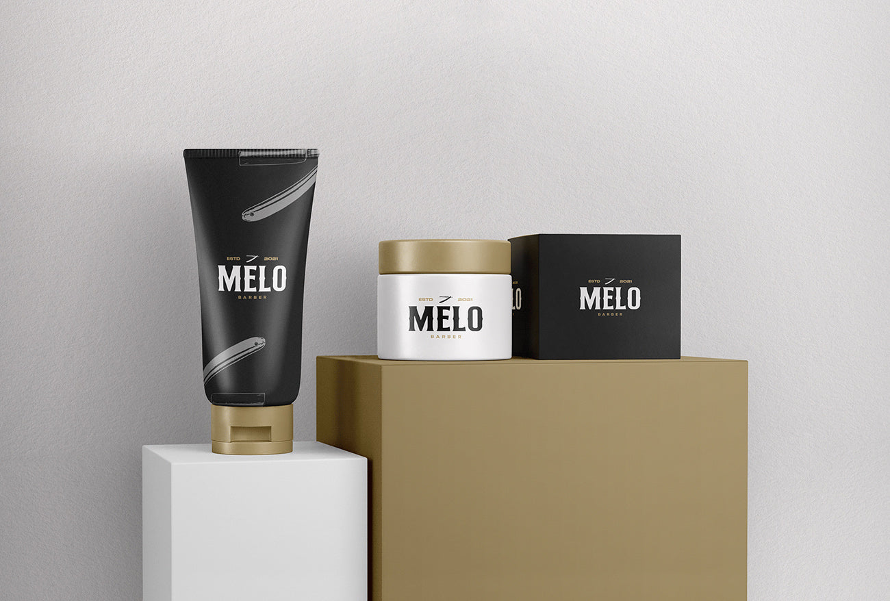
Created by Guilherme Vinicius | https://www.behance.net/gallery/116332403/Identidade-Visual-MELO-BARBER
The Da Vinci barbershop is known as a business that provides high-quality service. The designer displays this goal by using an elegant and high-quality design, presenting a very professional look.
The appearance not only manages to represent the branding identity of the company well, but the logo design also manages to stand out and attract attention.
30. Vali Haircut

Created by faton Berisha | https://www.behance.net/gallery/100426127/Vali-Haircut
This barbershop uses an amazing modern hip style. Combining the black and white monochrome style with some small red details in some places makes it look very striking. In the logo design itself, the Shaper Mustache uses a very stylish modern style typeface, with similar stylish icons that increasingly make it look perfect.
Even though it is made in a modern style, the design is still given some classic and vintage touches, a typical barbershop look.
Final Words
The various barber shop logo designs that have been mentioned above are inspirations that you can imitate to make your barbershop business logo even more impressive. These designs are the work of various talented and skillful designers who have succeeded in preserving the branding identity of the businesses they design for.
If there are ideas that interest you, you can use some of the elements or wow factors that you find in the inspiration and adopt them into your design. Remember, you can always observe, imitate, and modify other designs to make your work more amazing.
Let us know what you think!
The above references are some of the best artworks done by talented designers all over the world. Hope you enjoy, and don't forget to leave us a comment below! Cheers!




Leave a Comment