How to Use Visual Communication Effectively

Source: Fruzsi Fölföldi, Branding & Illustrations | Harlequin Chocolates, Behance, https://www.behance.net/gallery/128859547/Branding-Illustration-Harlequin-Chocolates
In the realm of information overload, the ability to use visual communication effectively stands as a paramount skill that can distinctly set apart professionals, businesses, and brands. Visual communication harnesses the power of visuals to convey messages more efficiently and effectively than words alone could ever achieve. Whether in marketing, education, or day-to-day business communications, the strategic integration of images, videos, icons, and designs plays a crucial role in engaging audiences.
This method of communication is not just about making things look appealing; it's a nuanced form of storytelling that taps into the visual instincts of the audience. By combining the right elements of color, form, and composition, visual communication can influence perceptions, evoke emotions, and prompt actions. As we delve deeper into how to harness this potent tool, we'll explore fundamental strategies and tips to enhance your ability to communicate visually. This guide will serve as a roadmap for anyone looking to improve their visual literacy in a digital age dominated by images and multimedia.
Identify the Target Audience
Understanding your target audience is a cornerstone of effective visual communication. The impact of visuals can be significantly enhanced when they are specifically tailored to the demographic characteristics, cultural backgrounds, and preferences of the intended viewers. Start by gathering data on your audience’s age, gender, education level, and professional field. Such insights will guide the choice of visual elements like colors, typography, and imagery, ensuring they resonate well with the viewers.
For instance, younger audiences may prefer bold, vibrant colors and modern designs, while a more mature demographic might appreciate subtler tones and classic styles. Additionally, consider the psychological and emotional states that your audience may be experiencing. For example, visuals intended for stress relief should employ calming colors and smooth lines, unlike those aimed at exciting or energizing the viewer, which might use dynamic shapes and bright contrasts.
Moreover, acknowledging the technological savviness of your audience is crucial. Determine the platforms they frequently use and optimize the visuals accordingly to ensure compatibility and ease of viewing. This tailored approach not only captivates but also builds a deeper connection with the audience, making your message more effective.
Set Clear Objectives
Setting clear objectives is essential in the realm of visual communication. Before you begin designing, clarify what you intend to achieve with your visuals. Goals can vary widely, from raising awareness about a new product, educating about a complex concept, to influencing consumer behavior or simply entertaining an audience. By defining these objectives upfront, you can strategically design your visual content to drive the desired outcomes.
Consider the action you want your audience to take after engaging with your visuals. Do you want them to visit a website, participate in an event, or perhaps make a purchase? Each objective should influence the design elements you choose, from the call-to-action placement to the visual storytelling techniques.
Moreover, the clarity of your objectives will help measure the success of your visual communication efforts. Establish metrics based on your goals, such as engagement rates, click-through rates, or educational outcomes, depending on what you are aiming to achieve.
Choose the Right Visual Medium
The choice of visual medium is pivotal in optimizing the impact of your visual communication. Each medium, from static images and infographics to videos and interactive presentations, has its strengths and caters to different aspects of communication. The decision should hinge on the nature of the message, the preferences of your target audience, and the context in which the communication will occur.
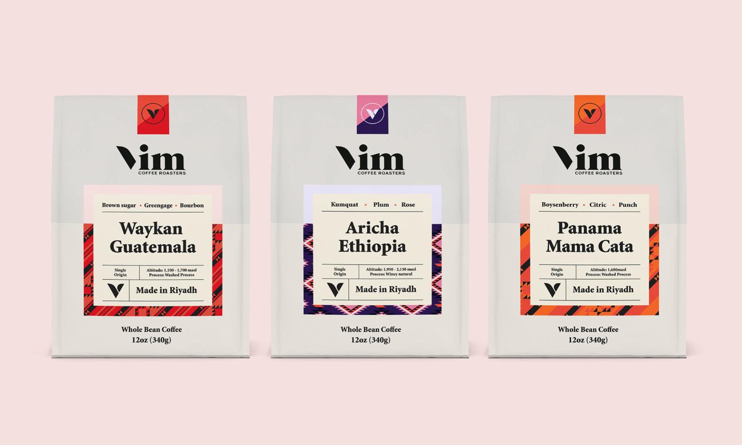
Static images are ideal for quick, clear messages and strong visual impacts in posters and social media. Infographics are excellent for communicating complex data and statistics succinctly, making them suitable for educational and professional contexts where detail and accuracy are paramount. Videos can evoke emotional responses and are highly effective for storytelling or demonstrating product use, engaging audiences more deeply. Interactive presentations and digital experiences cater to tech-savvy audiences, offering hands-on interaction that can significantly enhance understanding and retention.

Source: Joseph Lattimer, Qozo - Branding, Behance, https://www.behance.net/gallery/90499011/Qozo-Branding
Optimize Visual Hierarchy
Optimizing visual hierarchy is a critical technique in visual communication that organizes content in a way that naturally guides the viewer’s attention through the message according to its importance. Effective visual hierarchy makes it easier for audiences to process and understand information quickly and efficiently. Start by determining the most crucial element of your message and making it the focal point, using size, color, and placement to establish dominance.
Next, consider the secondary elements that support the main message. These should be noticeable but not overpowering, using smaller sizes or less contrasting colors. Layout and spacing also play significant roles; adequate spacing between elements can help reduce visual clutter, making each piece of information distinct and clear.
Typography hierarchy is another aspect to consider. Differentiate headings, subheadings, and body text using varying font sizes, weights, and styles. This not only adds visual interest but also helps in guiding the reader through the content logically and seamlessly.
Utilize Color Psychology
Color psychology is an invaluable tool in visual communication, influencing how people perceive and react to information. Colors have the power to evoke emotions and elicit responses, which can be strategically used to reinforce the message being conveyed. Understanding the emotional impact of different colors can significantly enhance the effectiveness of your visuals.
For example, blue is often associated with trust and calmness, making it an excellent choice for corporate communications or healthcare visuals. Red, known for its intensity, can be used to grab attention or evoke excitement, making it ideal for promotions or warnings. Green, symbolizing nature and growth, is perfect for environmental topics or health-related content.
When applying color psychology, consider the cultural context as colors may have different meanings in different cultures. This sensitivity can prevent miscommunications and ensure your message resonates well with diverse audiences.
Incorporating color strategically can also guide the viewer’s attention and highlight key areas of your visual content. Use contrasting colors for your call-to-action to stand out against the background or use a monochromatic scheme with varied intensities to create depth and focus.
Incorporate Effective Typography
Typography is a critical aspect of visual communication that involves the art and technique of arranging type to make written language legible, readable, and appealing when displayed. The choice of typeface, size, layout, and color of text can profoundly affect how information is perceived and absorbed.
A well-chosen typeface reinforces the message's tone. For example, serif fonts, like Times New Roman, are often used in formal or traditional contexts, while sans-serif fonts, like Helvetica, are seen as more modern and approachable. Script fonts can add elegance or a personal touch but may reduce readability in longer texts.
When incorporating typography in your visual communications, consider the readability and accessibility of your text. Ensure high contrast between text and background to aid visibility, particularly in busy or diverse lighting situations. Keep the text size large enough to be read easily from a normal viewing distance.
Furthermore, alignment and spacing are crucial; properly aligned and spaced text increases readability and creates a cleaner, more organized appearance. Utilize typographic hierarchy to guide the viewer’s attention to the most important information through variations in font size, weight, and color.
Leverage the Power of Symbols and Icons
Symbols and icons are potent tools in visual communication, enabling the conveyance of complex information and ideas in a straightforward, universally understandable form. These visual elements bypass linguistic barriers, making them indispensable in global communication. They can convey actions, objects, or concepts through simple imagery, facilitating quick recognition and understanding.
The effective use of symbols and icons can enhance navigation on digital platforms, guide users in software interfaces, or even direct behavior in physical spaces. For example, a red octagonal shape is globally recognized as a 'stop' signal, and a heart icon universally represents 'love' or 'like' on social media platforms.
When incorporating symbols and icons into your designs, ensure they are clear and concise, avoiding overly intricate designs that might confuse the viewer. Consistency is crucial; once you assign a meaning to a symbol or icon, it should be used consistently across your communication materials to build recognition and prevent misinterpretation.

Source: Studio Soleil, Who Murdered The Minutes, Behance, https://www.behance.net/gallery/89228467/Who-Murdered-The-Minutes
Create a Focal Point
Creating a focal point in visual communication is essential to direct the viewer’s attention to the most important part of your message. A focal point draws the eye and serves as the center of interest in your composition, ensuring that the key elements are noticed and remembered by the audience.
To establish a strong focal point, you can use various techniques such as strategic placement, contrasting colors, larger sizes, or unique textures. For instance, placing an important product image at the center or making it larger than other elements can naturally draw attention to it. Using a bold color against a muted background also effectively highlights the focal area.
The focal point should be aligned with the overall objective of the visual message. Whether you're designing a marketing poster or a web interface, the focal point should clearly communicate the desired action or key information. This could be a brand logo, a call to action button, or a key statistic in an infographic.
It’s also important to balance the focal point with other design elements to avoid overwhelming the viewer. The surrounding space, known as negative space, should support and enhance the focal point without competing for attention.
Incorporate Data Visualization
Incorporating data visualization is a powerful technique in visual communication that transforms complex data sets into clear, digestible visuals, facilitating easier understanding and quicker decision-making. Effective data visualization helps convey your message at a glance, emphasizing patterns, trends, and outliers without overwhelming the viewer with raw data.
Begin by choosing the right type of chart or graph for your data. Pie charts work well for showing proportions, bar charts are excellent for comparisons, and line graphs effectively display changes over time. Ensure that your visualizations are not only accurate but also aesthetically pleasing, maintaining a balance between functionality and design.
Simplicity is key. Avoid clutter by minimizing the use of heavy texts, excessive lines, or colors. Utilize colors to differentiate data points clearly but ensure they are not distracting from the main information. Label your axes clearly and provide a brief legend when necessary to aid in interpretation.
Furthermore, consider the scalability of your visualizations. They should be legible on all devices, from desktop monitors to mobile phones, ensuring that no detail is lost in different viewing contexts. By effectively using data visualization, you can enhance the persuasive power of your visuals, making complex information accessible and engaging, a crucial aspect of successful visual communication.
Emphasize Call-to-Action
A strong call-to-action (CTA) is crucial in visual communication to guide your audience towards the desired action, be it subscribing, purchasing, or simply engaging more deeply with your content. An effective CTA not only communicates what actions are available but also compels the audience to act, boosting conversion rates and achieving your communication goals.
To create a compelling CTA, use action-oriented language that incites enthusiasm or urgency, such as "Join Now," "Get Started," or "Learn More Today." Position your CTA prominently within your visual content, ensuring it stands out through the use of contrasting colors or an eye-catching design. This helps draw the viewer’s attention immediately to the action you want them to take.
Moreover, keep your message clear and concise. A straightforward CTA reduces confusion and helps the viewer understand exactly what is expected of them. If applicable, include a small incentive or benefit that the viewer will receive upon taking action, which can significantly enhance the effectiveness of the CTA.
Lastly, ensure that every piece of visual communication has a single, clear CTA. This focus prevents the audience from feeling overwhelmed by choices and increases the likelihood of them taking your desired action. By emphasizing and optimizing your call-to-action, you harness the full potential of visual communication to drive engagement and achieve specific outcomes.
Conclusion
Visual communication is an essential tool in today’s multimedia landscape, offering a dynamic way to convey messages swiftly and effectively. By mastering techniques such as optimizing visual hierarchy, utilizing color psychology, and incorporating data visualization, professionals can significantly enhance the clarity and impact of their messages. Remember, the ultimate goal of visual communication is not just to inform but to connect and inspire action among audiences. As you continue to implement these strategies, you'll find that your ability to communicate visually will not only improve but also become a key component of your overall communication success.
Let Us Know What You Think!
Every information you read here are written and curated by Kreafolk's team, carefully pieced together with our creative community in mind. Did you enjoy our contents? Leave a comment below and share your thoughts. Cheers to more creative articles and inspirations!


Leave a Comment