10 Tips To Use Letters For Logo Design

Source: Rise Wise, Dribbble, https://dribbble.com/shots/16992547-Mother-Plants
Letters play a powerful role in logo design because they combine typography, identity, and visual storytelling in one simple element. Many successful brands rely on letters to create memorable logos that are easy to recognize and communicate a clear message. Whether it is a single initial, a monogram, or a custom wordmark, using letters in logo design can help businesses build a strong and distinctive brand identity.
One of the main advantages of using letters in logo design is flexibility. Designers can experiment with shapes, spacing, and styles to create a visual mark that feels unique and meaningful. Letters can be transformed into creative symbols, merged together, or designed with artistic details that reflect the personality of a brand. Because of this versatility, letter-based logo design works well for companies of all sizes, from small startups to well-established brands.
Another reason letters are widely used in logo design is readability. When designed carefully, letter logos allow audiences to quickly understand and remember the brand name. This clarity makes letters an effective choice for businesses that want a simple yet impactful visual identity.
In this article, we will explore practical tips to use letters effectively in logo design. These ideas will help designers create letter-based logos that are visually appealing, memorable, and aligned with a brand’s identity.
Creating A Unique Identity With Custom Lettering
Custom lettering is a powerful technique that can transform ordinary letters into a distinctive logo design. Instead of relying only on standard fonts, designers can modify or draw letters to create a visual identity that feels original and memorable. This approach allows brands to stand out in a crowded market while maintaining a strong connection to their name.
In logo design, custom lettering gives designers the freedom to experiment with shapes, curves, and proportions. By adjusting the structure of letters, a designer can create a style that reflects the personality of the brand. For example, smooth and rounded letters can make a brand feel friendly and approachable, while sharp and geometric letters may communicate strength, precision, or innovation.
Another benefit of custom lettering in logo design is exclusivity. When letters are designed specifically for a brand, the logo becomes unique and difficult to replicate. This originality helps build a stronger brand identity because the letters themselves become recognizable visual elements associated with the company.
Designers often refine letters by adjusting line thickness, adding subtle details, or connecting characters creatively. Even small changes can make the logo design more engaging while still keeping the letters readable. Maintaining clarity is important because the audience should still recognize the brand name easily.
When used thoughtfully, custom lettering allows letters to function as both typography and graphic elements. This balance helps create a logo design that is visually distinctive, meaningful, and capable of representing the brand consistently across different platforms.
Balancing Simplicity And Creativity In Letter Logo Design
One of the most important principles in logo design is finding the right balance between simplicity and creativity. When working with letters, designers must ensure that the logo remains clear and recognizable while still offering a unique visual style. Achieving this balance helps create a logo design that is both memorable and functional.
Simplicity is essential because a logo often appears in many different sizes and contexts. Letters that are overly complex may look interesting at first, but they can become difficult to read when the logo is reduced for social media icons, mobile screens, or small printed materials. In logo design, clean and well-structured letters help maintain clarity across all applications.
At the same time, creativity plays a key role in making a letter-based logo stand out. Designers can explore subtle modifications such as adjusting letter spacing, merging characters, or adding distinctive shapes within the letters. These creative touches can give the logo personality without overwhelming the overall design.
Another useful approach is focusing on one unique feature within the letters. For example, a designer might modify a single letter to create a visual highlight while keeping the rest of the typography simple. This technique draws attention and makes the logo design more memorable.
By carefully balancing simplicity and creativity, designers can create letters that communicate clearly while still offering visual interest. This approach ensures the logo design remains effective, recognizable, and adaptable across various brand applications.
Using Negative Space In Letters For Smart Logo Design
Negative space is a creative technique that can add depth and meaning to letters in logo design. Instead of focusing only on the visible shapes of letters, designers also consider the empty space around and within them. This unused space can be transformed into subtle visual elements that make the logo design more clever and memorable.
When working with letters, negative space can be used to hide symbols, shapes, or patterns inside the typography. For example, a designer might create a small icon between two letters or carve a meaningful shape inside a character. This approach allows the logo design to communicate more than one idea while still keeping the letters clear and readable.
One of the advantages of using negative space in letters is that it adds creativity without making the design feel crowded. Because the additional element is formed by empty space, the logo design remains clean and balanced. This helps maintain simplicity while still giving the logo a distinctive visual twist.
Negative space can also improve visual harmony in letter-based logo design. Carefully placed gaps between letters can guide the viewer’s eye and create a smooth visual flow. Designers often adjust spacing and shapes to ensure that the hidden elements blend naturally with the overall typography.
When used thoughtfully, negative space turns ordinary letters into engaging design features. It encourages viewers to look more closely at the logo design and discover the hidden detail, making the brand more memorable. This technique is a powerful way to combine creativity and simplicity in letter-focused logo design.

Source: Loren Klein, Dribbble, https://dribbble.com/shots/14785634-Lettering-Collection
Selecting Colors That Enhance Letter Logo Design
Color plays an important role in how letters appear in logo design. While the structure of letters defines the shape of the logo, color adds emotion, personality, and visual impact. Choosing the right colors can make letters stand out and help communicate the character of a brand.
Different colors evoke different feelings, which is why designers carefully select palettes that match the brand identity. For example, blue letters in logo design often suggest trust and professionalism, while red can create a sense of energy and excitement. Neutral tones such as black, white, or gray can give letters a timeless and sophisticated appearance.
Color contrast is also important when designing logos with letters. Strong contrast between the letters and the background improves readability and ensures the logo design remains clear in various settings. Whether the logo appears on a website, packaging, or signage, the letters should remain easy to see and recognize.
Another consideration is color simplicity. Many successful logo design examples use only one or two colors for their letters. A limited color palette helps maintain visual clarity and allows the typography to remain the primary focus of the design.
Designers should also test how the letters appear in both color and monochrome versions. A strong letter-based logo design should remain recognizable even without color. By selecting thoughtful colors and maintaining good contrast, designers can enhance the visual strength and memorability of letters in logo design.
Combining Multiple Letters For A Strong Logo Design
Combining multiple letters is a popular technique in logo design because it allows designers to represent a brand name in a compact and creative way. Many brands use initials or monograms made from two or more letters to create a recognizable visual identity. When designed carefully, these combined letters can form a distinctive mark that is both simple and memorable.
In logo design, designers often merge letters in creative ways to build a cohesive symbol. For example, two letters can share a common line, overlap slightly, or connect through smooth curves. These techniques help transform ordinary letters into a unified design element rather than separate characters. The goal is to create harmony between the letters so they appear naturally connected.
Combining letters can also help simplify long brand names. Instead of displaying the full name in every application, a brand can use its initials as a compact logo design. This approach works especially well for companies with multiple words in their name, allowing the letters to function as a recognizable visual shorthand.
When merging letters in logo design, readability should remain a priority. Even if the letters overlap or interact, viewers should still be able to identify them easily. Clear structure and balanced spacing help maintain this clarity while preserving the creative style of the design.
By thoughtfully combining letters, designers can create a logo design that feels unique and visually balanced. This technique allows the letters to work together as a single symbol that represents the brand across many different platforms.

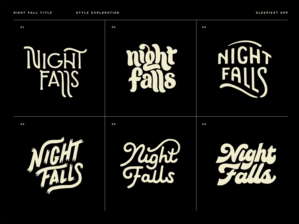
Source: Wells Collins, Dribbble, https://dribbble.com/shots/18837443-Night-Falls-Title-Concept-Sketches
Adjusting Letter Spacing And Proportions In Logo Design
Letter spacing and proportions play a significant role in the success of a logo design. Even when the letters themselves are well designed, poor spacing can make the logo appear unbalanced or difficult to read. Careful adjustment of these elements helps create a clean and professional visual result.
In logo design, spacing between letters is often referred to as kerning. Proper kerning ensures that the distance between each letter feels consistent and visually pleasing. If the spacing is too tight, the letters may appear crowded and hard to distinguish. If the spacing is too wide, the logo may lose its sense of unity.
Designers frequently adjust spacing manually rather than relying entirely on default typography settings. This allows them to fine-tune how letters interact with each other. For example, certain letter combinations may require slightly more or less space to maintain visual balance.
Proportion is another important factor when working with letters in logo design. Designers may adjust the height, width, or thickness of certain letters to create harmony across the entire wordmark or monogram. These subtle changes help ensure that the letters feel balanced and visually aligned.
Testing the logo at different sizes is also essential. Letters that look balanced on a large screen may appear cramped or uneven when scaled down. By refining spacing and proportions carefully, designers can create a logo design that remains clear, polished, and effective in various applications.
Ensuring Readability In Letter Logo Design
Readability is one of the most important factors when using letters in logo design. While creative typography can make a logo visually interesting, the letters must still be easy to recognize and understand. If viewers struggle to read the letters, the logo design may fail to communicate the brand name clearly.
In many cases, simplicity helps improve readability. Clean and well-structured letters make it easier for audiences to identify the brand quickly. When designing a logo, it is helpful to avoid overly complex shapes or decorative elements that may confuse the appearance of the letters. Even small adjustments, such as refining curves or simplifying strokes, can significantly improve clarity.
Size also plays a role in how letters appear in logo design. A logo often needs to work in multiple formats, from large signage to small icons on websites or social media. Designers should test the letters at different sizes to ensure they remain readable. If certain details disappear or become unclear when the logo is reduced, simplifying the letterforms may be necessary.
Spacing between letters is another factor that affects readability. Proper spacing ensures that each letter stands out while still forming a cohesive logo design. Balanced spacing prevents letters from blending together or appearing too far apart.
By focusing on readability, designers ensure that the letters in a logo design communicate the brand name clearly. A readable letter-based logo not only looks professional but also helps audiences remember and recognize the brand more easily.
Testing Letter Logo Design Across Different Platforms
A successful logo design must work effectively across many different platforms. Letters that look appealing on a design screen may appear very different when placed on websites, mobile apps, packaging, or printed materials. Testing the letters in various environments helps ensure the logo design remains consistent and recognizable.
One important step is checking how the letters appear at different sizes. A logo may look balanced when displayed large, but certain details might become unclear when the logo is scaled down. Designers should test smaller versions of the logo design to make sure the letters remain readable and visually clear.
Color variations should also be considered when testing letter logos. The letters should remain effective in both color and monochrome versions. This is important because logos often appear in different backgrounds, materials, or printing methods. A well-designed letter logo maintains its identity even when color is limited.
Digital platforms also require careful testing. Letters in logo design should look sharp and balanced on websites, social media profiles, and mobile screens. Designers may adjust spacing or thickness slightly to ensure the letters display clearly on digital devices.
By evaluating how letters perform across different platforms, designers can refine the logo design for versatility. This process ensures that the letters remain recognizable, consistent, and visually strong wherever the brand appears.
Conclusion
Using letters in logo design is a powerful way to create a clear and memorable brand identity. With thoughtful typography, balanced spacing, and creative techniques, letters can transform a simple concept into a distinctive visual mark. Designers can explore custom lettering, color choices, and layout adjustments to make a logo feel unique while still maintaining readability. When applied carefully, letters help communicate a brand name directly and strengthen recognition. A well-crafted letter-based logo design is versatile, timeless, and adaptable across different platforms, making it a reliable choice for businesses that want a strong and recognizable visual identity.


Leave a Comment